


文章目录
一、引言
二、各类图表特点、应用、代码实现及解释
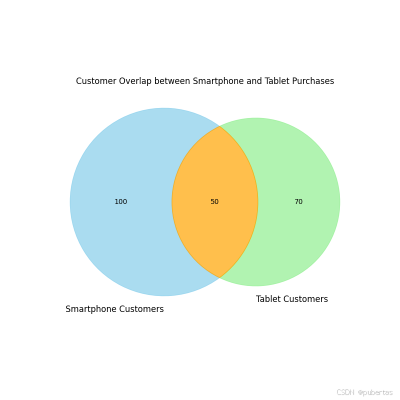
韦恩图(Venn Diagram)
特点:通过重叠圆形直观展示集合间逻辑关系,清晰呈现交集、并集和补集。
应用场景:在基因研究中分析不同物种基因重叠情况,在市场调研中探究不同客户群体特征重叠。例如,分析购买智能手机和购买平板电脑的客户群体重叠。
matplotlib 代码实现:
import matplotlib.pyplot as plt
from matplotlib_venn import venn2

# 模拟购买智能手机和购买平板电脑的客户数量
smartphone_customers = 150
tablet_customers = 120
both_customers = 50

# 创建图形并设置大小
plt.figure(figsize=(8, 8))

# 绘制韦恩图
venn = venn2(subsets=(smartphone_customers - both_customers, tablet_customers - both_customers, both_customers),
             set_labels=('Smartphone Customers', 'Tablet Customers'))

# 设置颜色和透明度
venn.get_patch_by_id('10').set_color('skyblue')
venn.get_patch_by_id('10').set_alpha(0.7)
venn.get_patch_by_id('01').set_color('lightgreen')
venn.get_patch_by_id('01').set_alpha(0.7)
venn.get_patch_by_id('11').set_color('orange')
venn.get_patch_by_id('11').set_alpha(0.7)

# 设置文本样式
for text in venn.set_labels:
    text.set_fontsize(12)
for text in venn.subset_labels:
    text.set_fontsize(10)

# 设置标题
plt.title('Customer Overlap between Smartphone and Tablet Purchases')

# 显示图形
plt.show()
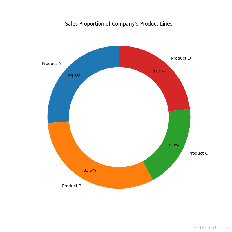
饼图(Pie Chart)
特点:将圆形划分为扇形,以扇形面积代表各部分在总体中的比例,方便直观比较各部分占比。
应用场景:常用于财务分析中展示企业各项费用在总费用中的占比,以及市场调研中呈现不同品牌产品的市场份额等。例如,一家化妆品公司通过饼图展示口红、眼影加粗样式、护肤品等不同产品销售额在总销售额中的占比。
matplotlib 代码实现:
import matplotlib.pyplot as plt

# 某公司四大产品线的销售额数据
products = ["Product A", "Product B", "Product C", "Product D"]
sales = [250000, 300000, 180000, 220000]

# 创建图形
plt.figure(figsize=(8, 8))

# 绘制饼图
plt.pie(sales, labels=products, autopct='%1.1f%%', startangle=90, pctdistance=0.85)

# 画一个白色的圆形,形成环形图效果
centre_circle = plt.Circle((0, 0), 0.70, fc='white')
fig = plt.gcf()
fig.gca().add_artist(centre_circle)

# 设置标题
plt.title('Sales Proportion of Company\'s Product Lines')

# 显示图形
plt.show()
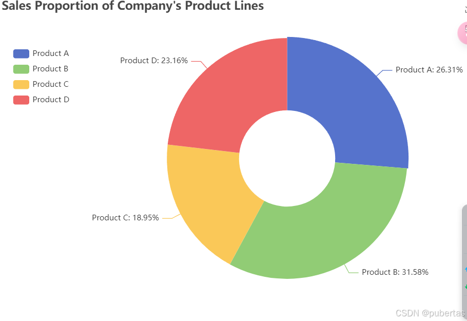
pyecharts 代码实现:
from pyecharts import options as opts
from pyecharts.charts import Pie

# 某公司四大产品线的销售额数据
products = ["Product A", "Product B", "Product C", "Product D"]
sales = [250000, 300000, 180000, 220000]

# 创建饼图对象
pie = (
    Pie()
    .add(
        "",
        [list(z) for z in zip(products, sales)],
        radius=["30%", "75%"],
        label_opts=opts.LabelOpts(formatter="{b}: {d}%"),
    )
    .set_global_opts(
        title_opts=opts.TitleOpts(title="Sales Proportion of Company's Product Lines"),
        legend_opts=opts.LegendOpts(orient="vertical", pos_top="15%", pos_left="2%"),
        toolbox_opts=opts.ToolboxOpts(is_show=True)
    )
)

# 渲染图表
pie.render("pie_chart.html")
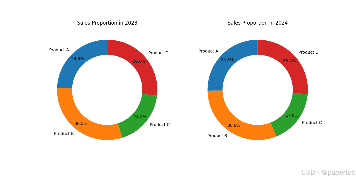
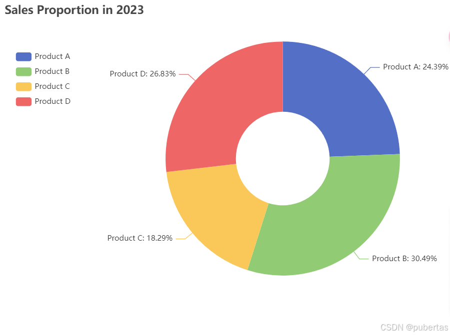
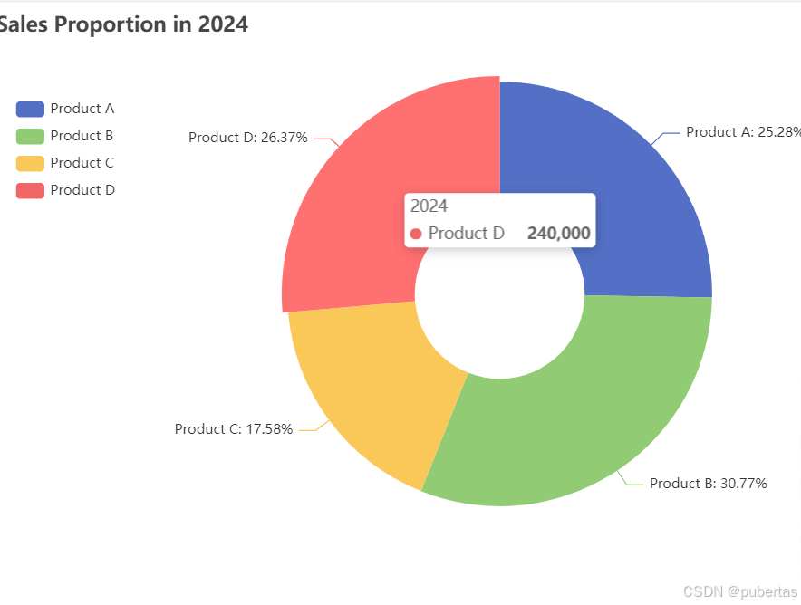
环形图(Donut Chart)
特点:是饼图的变体,中间有空洞,可同时展示多个数据系列的比例关系,便于对比多组数据。
应用场景:在企业业绩对比分析中,可对比不同时间段各产品销售额在总销售额中的占比变化。例如,电子产品公司对比 2023 年和 2024 年手机、电脑、平板等产品销售额在总销售额中的占比。
matplotlib 代码实现:
import matplotlib.pyplot as plt

# 某公司两个年度各产品线的销售额数据
products = ["Product A", "Product B", "Product C", "Product D"]
sales_2023 = [200000, 250000, 150000, 220000]
sales_2024 = [230000, 280000, 160000, 240000]

# 计算总销售额
total_sales_2023 = sum(sales_2023)
total_sales_2024 = sum(sales_2024)

# 计算各产品线的销售额占比
ratios_2023 = [s / total_sales_2023 for s in sales_2023]
ratios_2024 = [s / total_sales_2024 for s in sales_2024]

# 创建图形和子图
fig, axs = plt.subplots(1, 2, figsize=(12, 6))

# 绘制 2023 年的环形图
axs[0].pie(ratios_2023, labels=products, autopct='%1.1f%%', pctdistance=0.85, startangle=90)
centre_circle_2023 = plt.Circle((0, 0), 0.70, fc='white')
axs[0].add_artist(centre_circle_2023)
axs[0].set_title('Sales Proportion in 2023')

# 绘制 2024 年的环形图
axs[1].pie(ratios_2024, labels=products, autopct='%1.1f%%', pctdistance=0.85, startangle=90)
centre_circle_2024 = plt.Circle((0, 0), 0.70, fc='white')
axs[1].add_artist(centre_circle_2024)
axs[1].set_title('Sales Proportion in 2024')

# 显示图形
plt.show()
pyecharts 代码实现:
from pyecharts import options as opts
from pyecharts.charts import Pie

# 某公司两个年度各产品线的销售额数据
products = ["Product A", "Product B", "Product C", "Product D"]
sales_2023 = [200000, 250000, 150000, 220000]
sales_2024 = [230000, 280000, 160000, 240000]

# 创建饼图对象 2023 年
pie_2023 = (
    Pie()
    .add(
        "2023",
        [list(z) for z in zip(products, sales_2023)],
        radius=["30%", "75%"],
        label_opts=opts.LabelOpts(formatter="{b}: {d}%"),
    )
    .set_global_opts(
        title_opts=opts.TitleOpts(title="Sales Proportion in 2023"),
        legend_opts=opts.LegendOpts(orient="vertical", pos_top="15%", pos_left="2%"),
        toolbox_opts=opts.ToolboxOpts(is_show=True)
    )
)

# 创建饼图对象 2024 年
pie_2024 = (
    Pie()
    .add(
        "2024",
        [list(z) for z in zip(products, sales_2024)],
        radius=["30%", "75%"],
        label_opts=opts.LabelOpts(formatter="{b}: {d}%"),
    )
    .set_global_opts(
        title_opts=opts.TitleOpts(title="Sales Proportion in 2024"),
        legend_opts=opts.LegendOpts(orient="vertical", pos_top="15%", pos_left="2%"),
        toolbox_opts=opts.ToolboxOpts(is_show=True)
    )
)

# 渲染图表
pie_2023.render("donut_chart_2023.html")
pie_2024.render("donut_chart_2024.html")
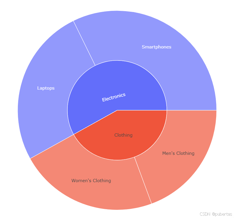
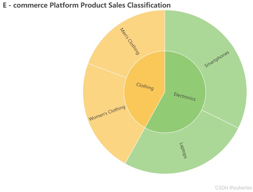
旭日图(Sunburst Chart)
特点:采用多层圆环展示数据的层次结构,从中心向外扩展,清晰反映数据的层级关联。
应用场景:可用于展示公司组织架构,从高层管理到具体岗位的层级关系;也可用于电商平台展示商品的分类结构。例如,电商平台用旭日图展示服装大类下的上衣、裤子、裙子等中类,以及上衣中的 T 恤、衬衫、毛衣等小类。
plotly 代码实现:
import plotly.express as px
import pandas as pd

# 某电商平台商品的分类销售数据
data = {
    'category': ['Electronics', 'Electronics', 'Clothing', 'Clothing'],
    'subcategory': ['Smartphones', 'Laptops', 'Men\'s Clothing', 'Women\'s Clothing'],
    'sales': [100000, 80000, 60000, 70000]
}
df = pd.DataFrame(data)

fig = px.sunburst(df, path=['category', 'subcategory'], values='sales')
fig.show()
pyecharts 代码实现:
from pyecharts import options as opts
from pyecharts.charts import Sunburst

data = [
    {
        "name": "Electronics",
        "children": [
            {
                "name": "Smartphones",
                "value": 100000
            },
            {
                "name": "Laptops",
                "value": 80000
            }
        ]
    },
    {
        "name": "Clothing",
        "children": [
            {
                "name": "Men's Clothing",
                "value": 60000
            },
            {
                "name": "Women's Clothing",
                "value": 70000
            }
        ]
    }
]

def custom_formatter(params):
    return f"{params['name']}: {params['percent']:.2f}%"

(
    Sunburst()
    .add(
        "",
        data_pair=data,
        radius=["0%", "90%"],
        label_opts=opts.LabelOpts(formatter=custom_formatter)
    )
    .set_global_opts(
        title_opts=opts.TitleOpts(title="E - commerce Platform Product Sales Classification"),
        toolbox_opts=opts.ToolboxOpts(is_show=True)
    )
    .render("sunburst_chart.html")
)
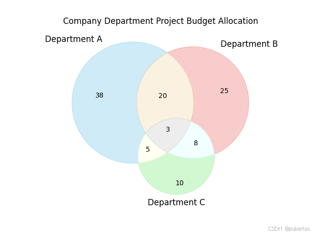
圆堆积图(Circle Packing Chart)
特点:用嵌套圆形表示数据的层次结构和相对大小,圆形面积对应数据大小,直观体现数据层次。
应用场景:在项目资源分配中,可展示各子项目的资源分配情况。例如,大型建筑项目中,展示基础建设、主体施工、装修装饰等子项目的资源分配。
matplotlib 代码实现:
import matplotlib.pyplot as plt
from matplotlib_venn import venn3

# 假设各部分预算数据,这里以数值代表预算量
set_a = 50
set_b = 40
set_c = 30
intersection_ab = 10
intersection_ac = 5
intersection_bc = 8
intersection_abc = 3

# 绘制三集合韦恩图
venn = venn3([(set_a - intersection_ab - intersection_ac + intersection_abc),
              (set_b - intersection_ab - intersection_bc + intersection_abc),
              (set_c - intersection_ac - intersection_bc + intersection_abc),
              intersection_ab,
              intersection_ac,
              intersection_bc,
              intersection_abc],
             ('Department A', 'Department B', 'Department C'))

# 设置图表标题
plt.title('Company Department Project Budget Allocation')

# 调整标签字体大小和样式(可按需调整)
for text in venn.set_labels:
    text.set_fontsize(12)
for text in venn.subset_labels:
    if text is not None:
        text.set_fontsize(10)

# 调整图形颜色(可按需设置颜色)
venn.get_patch_by_id('100').set_color('skyblue')
venn.get_patch_by_id('010').set_color('lightcoral')
venn.get_patch_by_id('001').set_color('lightgreen')
venn.get_patch_by_id('110').set_color('wheat')
venn.get_patch_by_id('101').set_color('lightyellow')
venn.get_patch_by_id('011').set_color('lightcyan')
venn.get_patch_by_id('111').set_color('lightgray')

# 显示图表
plt.show()
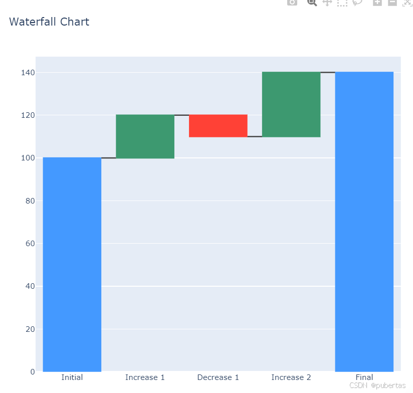
瀑布图(Waterfall Chart)
特点:通过一系列柱子展示数据的增减变化,从起始值开始,逐步累加或递减,最终得到结束值,清晰呈现数据的流动过程。
应用场景:常用于财务分析中展示企业利润的构成和变化,如收入、成本、费用等项目对利润的影响。例如,一家公司分析各季度收入、成本、税收等因素对年度净利润的影响。
plotly 代码实现:
import plotly.graph_objects as go

x = ['Initial', 'Increase 1', 'Decrease 1', 'Increase 2', 'Final']
y = [100, 20, -10, 30, 140]
fig = go.Figure(go.Waterfall(
    name="20", orientation="v",
    x=x,
    y=y,
    measure=["absolute", "relative", "relative", "relative", "total"]
))
fig.update_layout(title="Waterfall Chart")
fig.show()
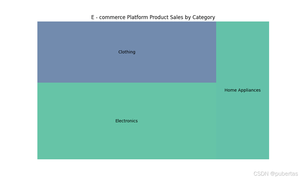
树形图(Tree Map)
特点:使用矩形嵌套来表示数据的层次结构,每个矩形的面积表示该部分数据的大小,颜色可用于区分不同类别。
应用场景:可用于展示计算机文件系统的目录结构和文件大小分布,也可用于市场份额分析,展示不同行业、不同企业在市场中的份额占比和层次关系。例如,展示某电商平台不同品类商品的销售金额占比及各品类下不同品牌的销售情况。
matplotlib 代码实现:
import matplotlib.pyplot as plt
import squarify

# 某电商平台不同品类商品销售金额数据
categories = ['Electronics', 'Clothing', 'Home Appliances']
sales = [150000, 120000, 80000]

# 创建图形
plt.figure(figsize=(10, 6))

# 绘制树形图
squarify.plot(sizes=sales, label=categories, alpha=0.7)

# 设置标题
plt.title('E - commerce Platform Product Sales by Category')

# 隐藏坐标轴
plt.axis('off')

# 显示图形
plt.show()
三、个人理解与总结
局部与整体类可视化图像在数据展示和分析中至关重要,不同图表适用于不同的数据特点和分析目的。matplotlib 是功能强大的基础绘图库,提供丰富绘图选项和定制功能,但对于一些复杂图表可能需要额外处理;pyecharts 侧重于交互式可视化,生成的图表可在网页展示,交互性和美观性好。在实际应用中,需根据数据性质、分析重点和受众需求选择合适的图表和绘图库。同时,要注重数据准确性和图表可读性,避免因设计不当导致误解。掌握这些图表和绘图工具,能有效提升数据处理和分析能力,为决策提供有力支持。


 17万+
17万+

 被折叠的 条评论
为什么被折叠?
被折叠的 条评论
为什么被折叠?
 到【灌水乐园】发言


