 Vue-treeselect:一个强大的多选组件


目录
Disable Item Selection(禁用项选择)
Introduction介绍
vue-treeselect is a multi-select component with nested options support for Vue.js.
treeselecte是一个具有嵌套选项的多选择组件,支持Vue.js。
- Single & multiple select with nested options support(支持嵌套选项的单个和多个选项)
- Fuzzy matching(模糊匹配)
- Async searching(异步搜索)
- Delayed loading (load data of deep level options only when needed)(支持嵌套选项的单个和多个选择)
- Keyboard support (navigate using Arrow Up & Arrow Down keys, select option using Enter key, etc.)(支持嵌套选项的单个和多个选择,使用回车键等)
- Rich options & highly customizable(丰富的选项和高度可定制的)
- Supports a wide range of browsers(支持多种浏览器)
Requires Vue 2.2+(必须vue2.2+)
Getting Started
It's recommended to install vue-treeselect via npm, and build your app using a bundler like webpack.
npm install --save @riophae/vue-treeselect
This example shows how to integrate vue-treeselect with your Vue SFCs.
<!-- Vue SFC -->
<template>
<div id="app">
<treeselect v-model="value" :multiple="true" :options="options" />
</div>
</template>
<script>
// import the component
import Treeselect from '@riophae/vue-treeselect'
// import the styles
import '@riophae/vue-treeselect/dist/vue-treeselect.css'
export default {
// register the component
components: { Treeselect },
data() {
return {
// define the default value
value: null,
// define options
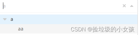
options: [ {
id: 'a',
label: 'a',
children: [ {
id: 'aa',
label: 'aa',
}, {
id: 'ab',
label: 'ab',
} ],
}, {
id: 'b',
label: 'b',
}, {
id: 'c',
label: 'c',
} ],
}
},
}
</script>
If you just don't want to use webpack or any other bundlers, you can simply include the standalone UMD build in your page. In this way, make sure Vue as a dependency is included before vue-treeselect.
<html>
  <head>
    <!-- include Vue 2.x -->
    <script src="https://cdn.jsdelivr.net/npm/vue@^2"></script>
    <!-- include vue-treeselect & its styles. you can change the version tag to better suit your needs. -->
    <script src="https://cdn.jsdelivr.net/npm/@riophae/vue-treeselect@^0.4.0/dist/vue-treeselect.umd.min.js"></script>
    <link rel="stylesheet" href="https://cdn.jsdelivr.net/npm/@riophae/vue-treeselect@^0.4.0/dist/vue-treeselect.min.css">
  </head>
  <body>
    <div id="app">
      <treeselect v-model="value" :multiple="true" :options="options" />
    </div>
  </body>
  <script>
    // register the component
    Vue.component('treeselect', VueTreeselect.Treeselect)

    new Vue({
      el: '#app',
      data: {
        // define the default value
        value: null,
        // define options
        options: [ {
          id: 'a',
          label: 'a',
          children: [ {
            id: 'aa',
            label: 'aa',
          }, {
            id: 'ab',
            label: 'ab',
          } ],
        }, {
          id: 'b',
          label: 'b',
        }, {
          id: 'c',
          label: 'c',
        } ],
      },
    })
  </script>
</html>
Guides
Basic Features
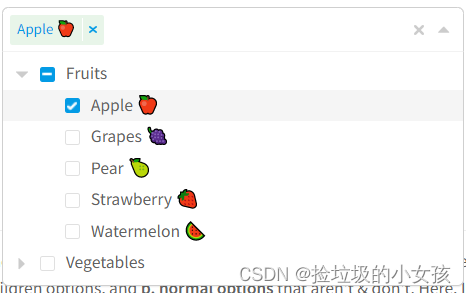
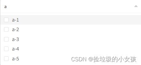
This example demonstrates the most commonly-used features of vue-treeselect. Try the fuzzy matching functionality by typing a few letters.
<div>
  <treeselect
    :multiple="true"
    :options="options"
    placeholder="Select your favourite(s)..."
    v-model="value"
    />
  <treeselect-value :value="value" />
</div>
export default {
  data: () => ({
    value: [],
    options: [ {
      id: 'fruits',
      label: 'Fruits',
      children: [ {
        id: 'apple',
        label: 'Apple 🍎',
        isNew: true,
      }, {
        id: 'grapes',
        label: 'Grapes 🍇',
      }, {
        id: 'pear',
        label: 'Pear 🍐',
      }, {
        id: 'strawberry',
        label: 'Strawberry 🍓',
      }, {
        id: 'watermelon',
        label: 'Watermelon 🍉',
      } ],
    }, {
      id: 'vegetables',
      label: 'Vegetables',
      children: [ {
        id: 'corn',
        label: 'Corn 🌽',
      }, {
        id: 'carrot',
        label: 'Carrot 🥕',
      }, {
        id: 'eggplant',
        label: 'Eggplant 🍆',
      }, {
        id: 'tomato',
        label: 'Tomato 🍅',
      } ],
    } ],
  }),
}
The first thing you need to learn is how to define options. There are two types of options: a. folder options that are foldable & may have children options, and b. normal options that aren't & don't. Here, I'd like to borrow the basic concepts from Computer Science and call the former as branch nodes & the latter as leaf nodes. These two kinds of nodes together compose the tree.
Defining leaf nodes is quite simple:
{
  id: '<id>', // used to identify the option within the tree so its value must be unique across all options
  label: '<label>', // used to display the option
}
Defining branch nodes only needs an extra children property:
{
  id: '<id>',
  label: '<label>',
  children: [
    {
      id: '<child id>',
      label: '<child label>',
    },
    ...
  ],
}
Then you can pass an array of these nodes as the options prop. Note that, even if you assign an empty array to the children property, it's still considered to be a branch node. This is likely different from what you've learnt from Computer Science, in which a node with no children is commonly known as a leaf node.
For information on all available properties in a node object, see below.
More Features
This demonstrates more features.
<div>
  <div :dir="rtl ? 'rtl' : 'ltr'">
    <treeselect
      name="demo"
      :multiple="multiple"
      :clearable="clearable"
      :searchable="searchable"
      :disabled="disabled"
      :open-on-click="openOnClick"
      :open-on-focus="openOnFocus"
      :clear-on-select="clearOnSelect"
      :close-on-select="closeOnSelect"
      :always-open="alwaysOpen"
      :append-to-body="appendToBody"
      :options="options"
      :limit="3"
      :max-height="200"
      v-model="value"
      />
  </div>
  <treeselect-value :value="value" />
  <p>
    <label><input type="checkbox" v-model="multiple">Multi-select</label>
    <label><input type="checkbox" v-model="clearable">Clearable</label>
    <label><input type="checkbox" v-model="searchable">Searchable</label>
    <label><input type="checkbox" v-model="disabled">Disabled</label>
  </p>
  <p>
    <label><input type="checkbox" v-model="openOnClick">Open on click</label>
    <label><input type="checkbox" v-model="openOnFocus">Open on focus</label>
  </p>
  <p>
    <label><input type="checkbox" v-model="clearOnSelect">Clear on select</label>
    <label><input type="checkbox" v-model="closeOnSelect">Close on select</label>
  </p>
  <p>
    <label><input type="checkbox" v-model="alwaysOpen">Always open</label>
    <label><input type="checkbox" v-model="appendToBody">Append to body</label>
    <label><input type="checkbox" v-model="rtl">RTL mode</label>
  </p>
</div>
import { generateOptions } from './utils'
export default {
data: () => ({
multiple: true,
clearable: true,
searchable: true,
disabled: false,
openOnClick: true,
openOnFocus: false,
clearOnSelect: true,
closeOnSelect: false,
alwaysOpen: false,
appendToBody: false,
rtl: false,
value: [ 'a' ],
options: generateOptions(2, 3),
}),
watch: {
multiple(newValue) {
if (newValue) {
this.value = this.value ? [ this.value ] : []
} else {
this.value = this.value[0]
}
},
},
}Delayed Loading
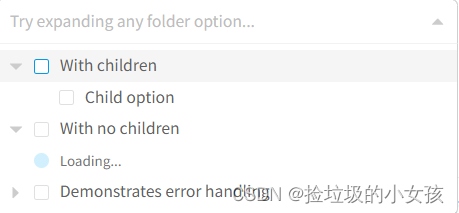
If you have a large number of deeply nested options, you might want to load options only of the most top levels on initial load, and load the rest only when needed. You can achieve that by following these steps:
- Declare an unloaded branch node by setting
children: null - Add
loadOptionsprop - Whenever an unloaded branch node gets expanded,
loadOptions({ action, parentNode, callback, instanceId })will be called, then you can perform the job requesting data from a remote server
<treeselect
  :multiple="true"
  :options="options"
  :load-options="loadOptions"
  placeholder="Try expanding any folder option..."
  v-model="value"
  />
import { LOAD_CHILDREN_OPTIONS } from '@riophae/vue-treeselect'
// We just use `setTimeout()` here to simulate an async operation
// instead of requesting a real API server for demo purpose.
const simulateAsyncOperation = fn => {
setTimeout(fn, 2000)
}
export default {
data: () => ({
value: null,
options: [ {
id: 'success',
label: 'With children',
// Declare an unloaded branch node.
children: null,
}, {
id: 'no-children',
label: 'With no children',
children: null,
}, {
id: 'failure',
label: 'Demonstrates error handling',
children: null,
} ],
}),
methods: {
loadOptions({ action, parentNode, callback }) {
// Typically, do the AJAX stuff here.
// Once the server has responded,
// assign children options to the parent node & call the callback.
if (action === LOAD_CHILDREN_OPTIONS) {
switch (parentNode.id) {
case 'success': {
simulateAsyncOperation(() => {
parentNode.children = [ {
id: 'child',
label: 'Child option',
} ]
callback()
})
break
}
case 'no-children': {
simulateAsyncOperation(() => {
parentNode.children = []
callback()
})
break
}
case 'failure': {
simulateAsyncOperation(() => {
callback(new Error('Failed to load options: network error.'))
})
break
}
default: /* empty */
}
}
},
},
}It's also possible to have root level options to be delayed loaded. If no options have been initially registered (options: null), vue-treeselect will attempt to load root options by calling loadOptions({ action, callback, instanceId }) after the component is mounted. In this example I have disabled the auto loading feature by setting autoLoadRootOptions: false, and the root options will be loaded when the menu is opened.

<treeselect
  :load-options="loadOptions"
  :options="options"
  :auto-load-root-options="false"
  :multiple="true"
  placeholder="Open the menu..."
  />
Async Searching
import { LOAD_ROOT_OPTIONS } from '@riophae/vue-treeselect'
const sleep = d => new Promise(r => setTimeout(r, d))
let called = false
export default {
data: () => ({
options: null,
}),
methods: {
// You can either use callback or return a Promise.
async loadOptions({ action/*, callback*/ }) {
if (action === LOAD_ROOT_OPTIONS) {
if (!called) {
// First try: simulate an exception.
await sleep(2000) // Simulate an async operation.
called = true
throw new Error('Failed to load options: test.')
} else {
// Second try: simulate a successful loading.
await sleep(2000)
this.options = [ 'a', 'b', 'c', 'd', 'e' ].map(id => ({
id,
label: `option-${id}`,
}))
}
}
},
},
}Async Searching
vue-treeselect supports dynamically loading & changing the entire options list as the user types. By default, vue-treeselect will cache the result of each AJAX request, thus the user could wait less.
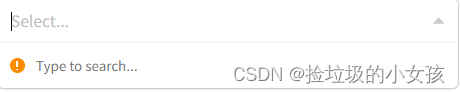
<treeselect
  :multiple="true"
  :async="true"
  :load-options="loadOptions"
  />
import { ASYNC_SEARCH } from '@riophae/vue-treeselect'
const simulateAsyncOperation = fn => {
setTimeout(fn, 2000)
}
export default {
methods: {
loadOptions({ action, searchQuery, callback }) {
if (action === ASYNC_SEARCH) {
simulateAsyncOperation(() => {
const options = [ 1, 2, 3, 4, 5 ].map(i => ({
id: `${searchQuery}-${i}`,
label: `${searchQuery}-${i}`,
}))
callback(null, options)
})
}
},
},
}Flat Mode & Sort Values
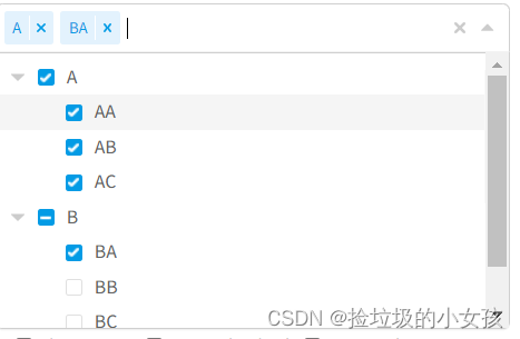
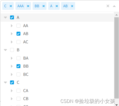
In all previous examples, we used the default non-flat mode of vue-treeselect, which means:
- Whenever a branch node gets checked, all its children will be checked too
- Whenever a branch node has all children checked, the branch node itself will be checked too
Sometimes we don't need that mechanism, and want branch nodes & leaf nodes don't affect each other. In this case, flat mode should be used, as demonstrated in the following.
If you want to control the order in which selected options to be displayed, use the sortValueBy prop. This prop has three options:
"ORDER_SELECTED"(default) - Order selected"LEVEL"- Level of option: C 🡒 BB 🡒 AAA"INDEX"- Index of option: AAA 🡒 BB 🡒 C
<div>
  <treeselect
    :multiple="true"
    :options="options"
    :flat="true"
    :sort-value-by="sortValueBy"
    :default-expand-level="1"
    placeholder="Try selecting some options."
    v-model="value"
    />
  <treeselect-value :value="value" />
  <p><strong>Sort value by:</strong></p>
  <p class="options">
    <label><input type="radio" value="ORDER_SELECTED" v-model="sortValueBy">Order selected</label>
    <label><input type="radio" value="LEVEL" v-model="sortValueBy">Level</label>
    <label><input type="radio" value="INDEX" v-model="sortValueBy">Index</label>
  </p>
</div>
import { generateOptions } from './utils'
export default {
data() {
return {
value: [ 'c', 'aaa', 'bb' ],
options: generateOptions(3),
sortValueBy: 'ORDER_SELECTED',
}
},
}Prevent Value Combining
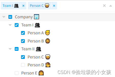
For non-flat & multi-select mode, if a branch node and its all descendants are checked, vue-treeselect will combine them into a single item in the value array, as demonstrated in the following example. By using valueConsistsOf prop you can change that behavior. This prop has four options:
"ALL"- Any node that is checked will be included in thevaluearray"BRANCH_PRIORITY"(default) - If a branch node is checked, all its descendants will be excluded in thevaluearray"LEAF_PRIORITY"- If a branch node is checked, this node itself and its branch descendants will be excluded from thevaluearray but its leaf descendants will be included"ALL_WITH_INDETERMINATE"- Any node that is checked will be included in thevaluearray, plus indeterminate nodes
<div>
  <treeselect
    :multiple="true"
    :options="options"
    :value-consists-of="valueConsistsOf"
    v-model="value"
    />
  <treeselect-value :value="value" />
  <p><strong>Value consists of:</strong></p>
  <p class="options">
    <label><input type="radio" value="ALL" v-model="valueConsistsOf">All</label><br>
    <label><input type="radio" value="BRANCH_PRIORITY" v-model="valueConsistsOf">Branch priority</label><br>
    <label><input type="radio" value="LEAF_PRIORITY" v-model="valueConsistsOf">Leaf priority</label><br>
    <label><input type="radio" value="ALL_WITH_INDETERMINATE" v-model="valueConsistsOf">All with indeterminate</label>
  </p>
</div>
export default {
data: () => ({
value: [ 'team-i' ],
valueConsistsOf: 'BRANCH_PRIORITY',
options: [ {
id: 'company',
label: 'Company 🏢',
children: [ {
id: 'team-i',
label: 'Team I 👥',
children: [ {
id: 'person-a',
label: 'Person A 👱',
}, {
id: 'person-b',
label: 'Person B 🧔',
} ],
}, {
id: 'team-ii',
label: 'Team II 👥',
children: [ {
id: 'person-c',
label: 'Person C 👳',
}, {
id: 'person-d',
label: 'Person D 👧',
} ],
}, {
id: 'person-e',
label: 'Person E 👩',
} ],
} ],
}),
}Disable Branch Nodes(只能选择子节点)
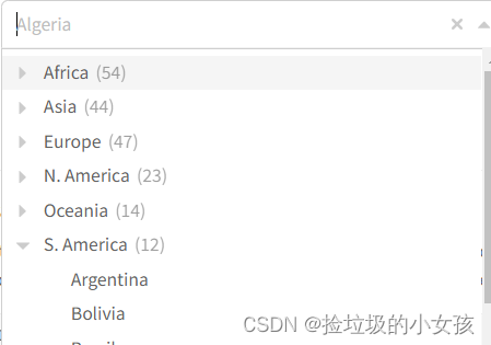
Set disableBranchNodes: true to make branch nodes uncheckable and treat them as collapsible folders only. You may also want to show a count next to the label of each branch node by setting showCount: true.
:disable-branch-nodes="true"
<treeselect
:options="options"
:disable-branch-nodes="true"
:show-count="true"
placeholder="Where are you from?"
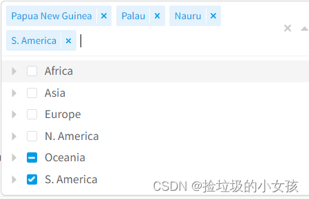
/>import countries from './data/countries-of-the-world'
export default {
data: () => ({
options: countries,
}),
}Flatten Search Results
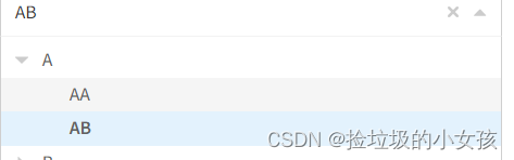
Set flattenSearchResults: true to flatten the tree when searching. With this option set to true, only the results that match will be shown. With this set to false (default), its ancestors will also be displayed, even if they would not individually be included in the results.
<treeselect
  :options="options"
  :multiple="true"
  :flatten-search-results="true"
  placeholder="Where are you from?"
  />
import countries from './data/countries-of-the-world'
export default {
data: () => ({
options: countries,
}),
}Disable Item Selection(禁用项选择)
You can disable item selection by setting isDisabled: true on any leaf node or branch node. For non-flat mode, setting on a branch node will disable all its descendants as well.(您可以通过在任何叶节点或分支节点上设置ISDI sable:true来禁用项选择。为非LAT模式,在分支节点上设置也将禁用它的所有子节点.---机翻勿喷,我自己翻译的还不如机翻)
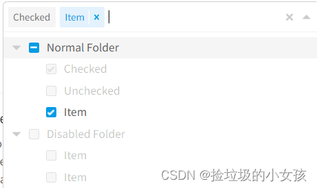
<treeselect
  :multiple="true"
  :options="options"
  :value="value"
  />
export default {
data: () => ({
options: [ {
id: 'folder',
label: 'Normal Folder',
children: [ {
id: 'disabled-checked',
label: 'Checked',
isDisabled: true,
}, {
id: 'disabled-unchecked',
label: 'Unchecked',
isDisabled: true,
}, {
id: 'item-1',
label: 'Item',
} ],
}, {
id: 'disabled-folder',
label: 'Disabled Folder',
isDisabled: true,
children: [ {
id: 'item-2',
label: 'Item',
}, {
id: 'item-3',
label: 'Item',
} ],
} ],
value: [ 'disabled-checked' ],
}),
}Nested Search
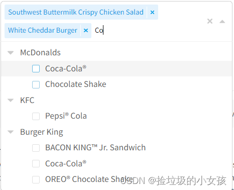
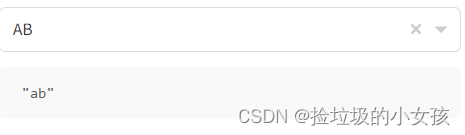
Sometimes we need the possibility to search options within a specific branch. For example your branches are different restaurants and the leafs are the foods they order. To search for the salad order of "McDonals" restaurant, just search for "mc salad". You can also try searching "salad" to feel the difference.
Concretely speaking, your search query gets split on spaces. If each splitted string is found within the path to the node, then we have a match.
<treeselect
  :multiple="true"
  :options="options"
  :disable-branch-nodes="true"
  v-model="value"
  search-nested
  />
export default {
data: () => ({
value: [],
options: [ {
id: 'm',
label: 'McDonalds',
children: [ {
id: 'm-fries',
label: 'French Fries',
}, {
id: 'm-cheeseburger',
label: 'Cheeseburger',
}, {
id: 'm-white-cheedar-burger',
label: 'White Cheddar Burger',
}, {
id: 'm-southwest-buttermilk-crispy-chicken-salad',
label: 'Southwest Buttermilk Crispy Chicken Salad',
}, {
id: 'm-cola',
label: 'Coca-Cola®',
}, {
id: 'm-chocolate-shake',
label: 'Chocolate Shake',
} ],
}, {
id: 'kfc',
label: 'KFC',
children: [ {
id: 'kfc-fries',
label: 'French Fries',
}, {
id: 'kfc-chicken-litties-sandwiches',
label: 'Chicken Litties Sandwiches',
}, {
id: 'kfc-grilled-chicken',
label: 'Grilled Chicken',
}, {
id: 'kfc-cola',
label: 'Pepsi® Cola',
} ],
}, {
id: 'bk',
label: 'Burger King',
children: [ {
id: 'bk-chicken-fries',
label: 'Chicken Fries',
}, {
id: 'bk-chicken-nuggets',
label: 'Chicken Nuggets',
}, {
id: 'bk-garden-side-salad',
label: 'Garden Side Salad',
}, {
id: 'bk-cheeseburger',
label: 'Cheeseburger',
}, {
id: 'bk-bacon-king-jr-sandwich',
label: 'BACON KING™ Jr. Sandwich',
}, {
id: 'bk-cola',
label: 'Coca-Cola®',
}, {
id: 'bk-oreo-chocolate-shake',
label: 'OREO® Chocolate Shake',
} ],
} ],
}),
}Fuzzy matching functionality is disabled for this mode to avoid mismatching. 此模式禁用模糊匹配功能,以避免错误匹配。
Customize Key Names
If your data of options is loaded via AJAX and have a different data structure than what vue-treeselect asks, e.g. your data has name property but vue-treeselect needs label, you may want to customize the key names. In this case, you can provide a function prop called normalizer which will be passed every node in the tree during data initialization. Use this function to create and return the transformed object.
<treeselect
  :options="options"
  :value="value"
  :normalizer="normalizer"
  />
export default {
data: () => ({
value: null,
options: [ {
key: 'a',
name: 'a',
subOptions: [ {
key: 'aa',
name: 'aa',
} ],
} ],
normalizer(node) {
return {
id: node.key,
label: node.name,
children: node.subOptions,
}
},
}),
}Customize Option Label
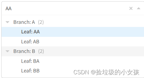
You can customize the label of each option. vue-treeselect utilizes Vue's scoped slot feature and provides some props you should use in your customized template:
node- a normalized node object (note that, this is differnt from what you return fromnormalizer()prop)count&shouldShowCount- the count number and a boolean indicates whether the count should be displayedlabelClassName&countClassName- CSS classnames for making the style correct
<treeselect
  :options="options"
  :value="value"
  :searchable="false"
  :show-count="true"
  :default-expand-level="1"
  >
  <label slot="option-label" slot-scope="{ node, shouldShowCount, count, labelClassName, countClassName }" :class="labelClassName">
    {{ node.isBranch ? 'Branch' : 'Leaf' }}: {{ node.label }}
    <span v-if="shouldShowCount" :class="countClassName">({{ count }})</span>
  </label>
</treeselect>
import { generateOptions } from './utils'
export default {
data: () => ({
value: null,
options: generateOptions(2),
}),
}Customize Value Label
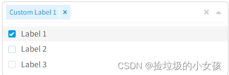
You can customize the label of value item (each item in case of multi-select). vue-treeselect utilizes Vue's scoped slot feature and provides some props you should use in your customized template:
node- a normalized node object (note that, this is differnt from what you return fromnormalizer()prop)
<div>
  <treeselect :options="options" :value="value" :multiple="multiple">
    <div slot="value-label" slot-scope="{ node }">{{ node.raw.customLabel }}</div>
  </treeselect>
  <p>
    <label><input type="checkbox" v-model="multiple">Multi-select</label>
  </p>
</div>
export default {
data: () => ({
multiple: true,
value: null,
options: [ 1, 2, 3 ].map(i => ({
id: i,
label: `Label ${i}`,
customLabel: `Custom Label ${i}`,
})),
}),
}Vuex Support
In all previous examples, we used v-model to sync value between application state and vue-treeselect, a.k.a two-way data binding. If you are using Vuex, we could make use of :value and @input, since v-model is just a syntax sugar for them in Vue 2.
Concretely speaking, we can bind getter to :value to make vue-treeselect reflect any changes in your Vuex state, and bind action or mutation to @input to update your Vuex state whenever the value changes.
<div>
  <treeselect
    :options="options"
    :value="value"
    :searchable="false"
    @input="updateValue"
    />
  <treeselect-value :value="value" />
</div>
import Vue from 'vue'
import Vuex, { mapState, mapMutations } from 'vuex'
import { generateOptions } from './utils'

Vue.use(Vuex)

const store = new Vuex.Store({
  state: {
    value: 'a',
  },
  mutations: {
    updateValue(state, value) {
      state.value = value
    },
  },
})

export default {
  store,

  data: () => ({
    options: generateOptions(2),
  }),

  computed: {
    ...mapState([ 'value' ]),
  },

  methods: {
    ...mapMutations([ 'updateValue' ]),
  },
}
API
Node
Available properties of a node object.
| Key | Type | Description |
|---|---|---|
| id (required) | Number | String | Used to identify the option within the tree. Its value must be unique across all options. |
| label (required) | String | Used to display the option. |
| children | node[] | null | Declares a branch node. You can: 1) Set to an array of children options consisting of a. leaf nodes, b. branch nodes, or c. a mixture of these two. or 2) Set to empty array for no children options. or 3) Set to null to declare an unloaded branch node for delayed loading. You can reassign an array (regardless of whether it's empty or not) later in loadOptions() to register these children options, and mark this branch node as loaded.If you want to declare a leaf node, set children: undefined or simply omit this property. |
| isDisabled | Boolean | Used for disabling item selection. See here for detailed information. |
| isNew | Boolean | Used for giving new nodes a different color. |
| isDefaultExpanded | Boolean | Whether this folder option should be expanded by default. |
The value of label, children or isDisabled can be reassigned anytime.
Add more properties than the listed ones IS okay. You can even use these extra properties in your custom template by accessing node.raw.xxx.
Props
| Name | Type / Default | Description |
|---|---|---|
| allowClearingDisabled | Type: Boolean Default: false | Whether to allow resetting value even if there are disabled selected nodes. |
| allowSelectingDisabledDescendants | Type: Boolean Default: false | When an ancestor node is selected/deselected, whether its disabled descendants should be selected/deselected. You may want to use this in conjunction with allowClearingDisabled prop. |
| alwaysOpen | Type: Boolean Default: false | Whether the menu should be always open. |
| appendToBody | Type: Boolean Default: false | Append the menu to <body />. |
| async | Type: Boolean Default: false | Whether to enable async search mode. |
| autoFocus | Type: Boolean Default: false | Automatically focus the component on mount. |
| autoLoadRootOptions | Type: Boolean Default: true | Automatically load root options on mount. When set to false, root options will be loaded when the menu is opened. |
| autoDeselectAncestors | Type: Boolean Default: false | When user deselects a node, automatically deselect its ancestors. Applies to flat mode only. |
| autoDeselectDescendants | Type: Boolean Default: false | When user deselects a node, automatically deselect its descendants. Applies to flat mode only. |
| autoSelectAncestors | Type: Boolean Default: false | When user selects a node, automatically select its ancestors. Applies to flat mode only. |
| autoSelectDescendants | Type: Boolean Default: false | When user selects a node, automatically select its descendants. Applies to flat mode only. |
| backspaceRemoves | Type: Boolean Default: true | Whether Backspace removes the last item if there is no text input. |
| beforeClearAll | Type: Fn() 🡒 (Boolean | Promise<Boolean>) Default: () => true | Function that processes before clearing all input fields. Return false to stop values being cleared. |
| branchNodesFirst | Type: Boolean Default: false | Show branch nodes before leaf nodes. |
| cacheOptions | Type: Boolean Default: true | Whether to cache results of each search request for async search mode. |
| clearable | Type: Boolean Default: true | Whether to show an "×" button that resets value. |
| clearAllText | Type: String Default: "Clear all" | Title for the "×" button when :multiple="true". |
| clearOnSelect | Type: Boolean Default: Defaults to false when :multiple="true"; always true otherwise. | Whether to clear the search input after selecting an option. Use only when :multiple="true". For single-select mode, it always clears the input after selecting regardless of the prop value. |
| clearValueText | Type: String Default: "Clear value" | Title for the "×" button. |
| closeOnSelect | Type: Boolean Default: true | Whether to close the menu after selecting an option. Use only when :multiple="true". |
| defaultExpandLevel | Type: Number Default: 0 | How many levels of branch nodes should be automatically expanded when loaded. Set Infinity to make all branch nodes expanded by default. |
| defaultOptions | Type: Boolean | node[]Default: false | The default set of options to show before the user starts searching. Used for async search mode. When set to true, the results for search query as a empty string will be autoloaded. |
| deleteRemoves | Type: Boolean Default: true | Whether Delete removes the last item if there is no text input. |
| delimiter | Type: String Default: "," | Delimiter to use to join multiple values for the hidden field value. |
| flattenSearchResults | Type: Boolean Default: false | Whether to flatten the tree when searching (sync search mode only). See here for example. |
| disableBranchNodes | Type: Boolean Default: false | Whether to prevent branch nodes from being selected. See here for example. |
| disabled | Type: Boolean Default: false | Whether to disable the control or not. |
| disableFuzzyMatching | Type: Boolean Default: false | Set to true to disable the fuzzy matching functionality, which is enabled by default. |
| flat | Type: Boolean Default: false | Whether to enable flat mode or not. See here for detailed information. |
| instanceId | Type: String | Number Default: "<auto-incrementing number>$$" | Will be passed with all events as the last param. Useful for identifying events origin. |
| joinValues | Type: Boolean Default: false | Joins multiple values into a single form field with the delimiter (legacy mode). |
| limit | Type: Number Default: Infinity | Limit the display of selected options. The rest will be hidden within the limitText string. |
| limitText | Type: Fn(count) 🡒 StringDefault: count => `and ${count} more` | Function that processes the message shown when selected elements pass the defined limit. |
| loadingText | Type: String Default: "Loading..." | Text displayed when loading options. |
| loadOptions | Type: Fn({action, callback, parentNode?, instanceId}) 🡒 (void | Promise)Default: – | Used for dynamically loading options. See here for detailed information. Possible values of action: "LOAD_ROOT_OPTIONS", "LOAD_CHILDREN_OPTIONS" or "ASYNC_SEARCH".callback - a function that accepts an optional error argumentparentNode - only presents when loading children optionssearchQuery - only presents when searching async optionsinstanceId - eqauls to the value of instanceId prop you passed to vue-treeselect |
| matchKeys | Type: String[] Default: [ "label" ] | Which keys of a node object to filter on. |
| maxHeight | Type: Number Default: 300 | Sets maxHeight style value of the menu. |
| multiple | Type: Boolean Default: false | Set true to allow selecting multiple options (a.k.a., multi-select mode). |
| name | Type: String Default: – | Generates a hidden <input /> tag with this field name for html forms. |
| noChildrenText | Type: String Default: "No sub-options." | Text displayed when a branch node has no children. |
| noOptionsText | Type: String Default: "No options available." | Text displayed when there are no available options. |
| noResultsText | Type: String Default: "No results found..." | Text displayed when there are no matching search results. |
| normalizer | Type: Fn(node, instanceId) 🡒 nodeDefault: node => node | Used for normalizing source data. See here for detailed information. |
| openDirection | Type: String Default: "auto" | By default ("auto"), the menu will open below the control. If there is not enough space, vue-treeselect will automatically flip the menu. You can use one of other four options to force the menu to be always opened to specified direction.Acceptable values: "auto", "below", "bottom", "above" or "top". |
| openOnClick | Type: Boolean Default: true | Whether to automatically open the menu when the control is clicked. |
| openOnFocus | Type: Boolean Default: false | Whether to automatically open the menu when the control is focused. |
| options | Type: node[]Default: – | Array of available options. See here to learn how to define them. |
| placeholder | Type: String Default: "Select..." | Field placeholder, displayed when there's no value. |
| required | Type: Boolean Default: false | Applies HTML5 required attribute when needed. |
| retryText | Type: String Default: "Retry?" | Text displayed asking user whether to retry loading children options. |
| retryTitle | Type: String Default: "Click to retry" | Title for the retry button. |
| searchable | Type: Boolean Default: true | Whether to enable searching feature or not. |
| searchNested | Type: Boolean Default: false | Set true if the search query should search in all ancestor nodes too. See here for example. |
| searchPromptText | Type: String Default: "Type to search..." | Text tip to prompt for async search. Used for async search mode. |
| showCount | Type: Boolean Default: false | Whether to show a children count next to the label of each branch node. See here for example. |
| showCountOf | Type: String Default: "ALL_CHILDREN" | Used in conjunction with showCount to specify which type of count number should be displayed.Acceptable values: "ALL_CHILDREN", "ALL_DESCENDANTS", "LEAF_CHILDREN" or "LEAF_DESCENDANTS". |
| showCountOnSearch | Type: Boolean Default: – | Whether to show children count when searching. Fallbacks to the value of showCount when not specified. |
| sortValueBy | Type: String Default: "ORDER_SELECTED" | In which order the selected options should be displayed in trigger & sorted in value array. Use only when :multiple="true". See here for example.Acceptable values: "ORDER_SELECTED", "LEVEL" or "INDEX". |
| tabIndex | Type: Number Default: 0 | Tab index of the control. |
| value | Type: id | node | id[] | node[]Default: – | The value of the control. Should be id or node object when :multiple="false", or an array of id or node object when :multiple="true". Its format depends on the valueFormat prop.For most cases, just use v-model instead. |
| valueConsistsOf | Type: String Default: "BRANCH_PRIORITY" | Which kind of nodes should be included in the value array in multi-select mode. See here for example.Acceptable values: "ALL", "BRANCH_PRIORITY", "LEAF_PRIORITY" or "ALL_WITH_INDETERMINATE". |
| valueFormat | Type: String Default: "id" | Format of value prop.Note that, when set to "object", only id & label properties are required in each node object in value.Acceptable values: "id" or "object". |
| zIndex | Type: Number | String Default: 999 | z-index of the menu. |
Events
| Name | Attributes | Description |
|---|---|---|
| open | (instanceId) | Emitted when the menu opens. |
| close | (value, instanceId) | Emitted when the menu closes. |
| input | (value, instanceId) | Emitted after value changes. |
| select | (node, instanceId) | Emitted after selecting an option. |
| deselect | (node, instanceId) | Emitted after deselecting an option. |
| search-change | (searchQuery, instanceId) | Emitted after the search query changes. |
Slots
| Name | Props | Description |
|---|---|---|
| option-label | {node, shouldShowCount, count, labelClassName, countClassName} | Slot for custom option label template. See here for detailed information. |
| value-label | {node} | Slot for custom value label template. See here for detailed information. |
| before-list | - | Slot showed before the menu list. |
| after-list | - | Slot showed after the menu list. |


 扫一扫
扫一扫


 1万+
1万+

 被折叠的 条评论
为什么被折叠?
被折叠的 条评论
为什么被折叠?
 到【灌水乐园】发言


