


flex-direction属性设置主轴的方向
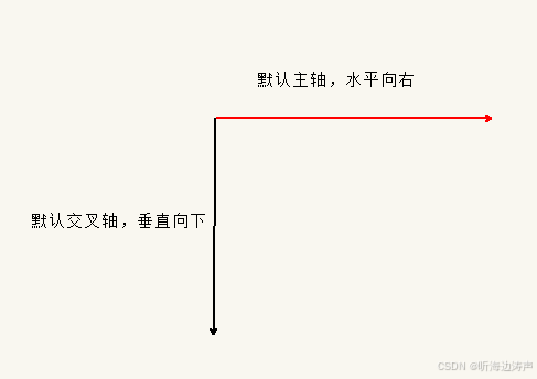
主轴和交叉轴
在flex布局中,有两个轴,分别称为主轴和交叉轴,它们是互相垂直的。同样的叫法: x轴和y轴、行和列。
- 默认主轴是x轴,水平向右
- 默认交叉轴是y轴,垂直向下
flex-direction属性值
flex-direction属性设置了主轴的方向,剩下的就是交叉轴。flex-direction属性值变化,主轴和交叉轴也跟着变化。而flex容器内的子元素是跟着主轴来排列的。
主轴由 flex-direction 定义,可以取 4 个值:
- row:是默认值,从左到右
- row-reverse: 从右到左
- column:从上到下
- column-reverse:从下到上
示例
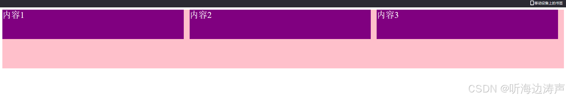
示例:使用默认的主轴
<!DOCTYPE html>
<html lang="en">

<head>
  <meta charset="UTF-8" />
  <meta name="viewport" content="width=device-width, initial-scale=1.0" />
  <title>Document</title>
  <style>
    div {
      display: flex;
      /* 如果采用默认主轴,写不写flex-direction: row;这句话效果是一样的 */
      flex-direction: row;
      width: 100%;
      height: 200px;
      background-color: pink;
      justify-content: space-between;
    }

    div span {
      height: 50%;
      background-color: purple;
      margin-right: 20px;
      flex: 1;
      color: white;
      font-size: 30px;
    }
  </style>
</head>

<body>
  <div>
    <span>内容1</span>
    <span>内容2</span>
    <span>内容3</span>
  </div>
</body>

</html>
展示效果:
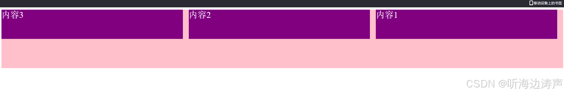
设置 flex-direction: row-reverse
<!DOCTYPE html>
<html lang="en">

<head>
  <meta charset="UTF-8" />
  <meta name="viewport" content="width=device-width, initial-scale=1.0" />
  <title>Document</title>
  <style>
    div {
      display: flex;
      flex-direction: row-reverse;
      width: 100%;
      height: 200px;
      background-color: pink;
      justify-content: space-between;
    }

    div span {
      height: 50%;
      background-color: purple;
      margin-right: 20px;
      flex: 1;
      color: white;
      font-size: 30px;
    }
  </style>
</head>

<body>
  <div>
    <span>内容1</span>
    <span>内容2</span>
    <span>内容3</span>
  </div>
</body>

</html>
展示效果:
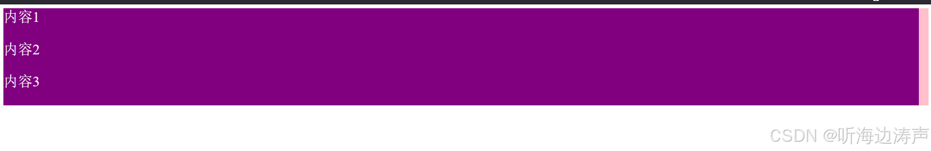
设置 flex-direction: column
<!DOCTYPE html>
<html lang="en">

<head>
  <meta charset="UTF-8" />
  <meta name="viewport" content="width=device-width, initial-scale=1.0" />
  <title>Document</title>
  <style>
    div {
      display: flex;
      flex-direction: column;
      width: 100%;
      height: 200px;
      background-color: pink;
      justify-content: space-between;
    }

    div span {
      height: 50%;
      background-color: purple;
      margin-right: 20px;
      flex: 1;
      color: white;
      font-size: 30px;
    }
  </style>
</head>

<body>
  <div>
    <span>内容1</span>
    <span>内容2</span>
    <span>内容3</span>
  </div>
</body>

</html>
展示效果:
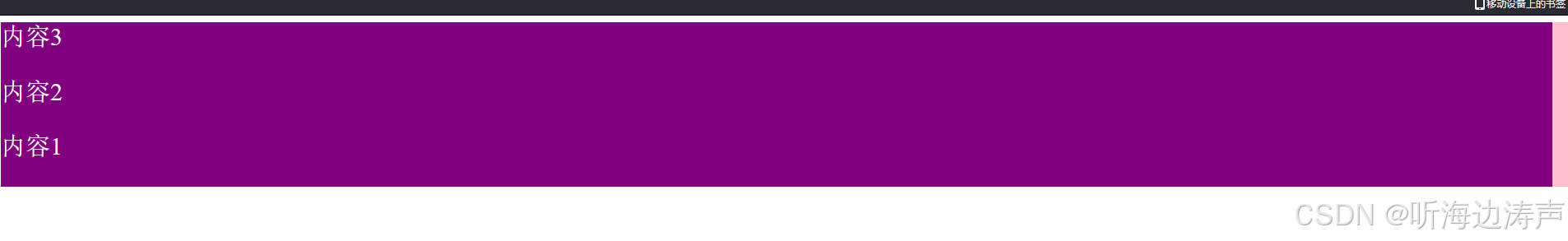
设置 flex-direction: column-reverse
<!DOCTYPE html>
<html lang="en">

<head>
  <meta charset="UTF-8" />
  <meta name="viewport" content="width=device-width, initial-scale=1.0" />
  <title>Document</title>
  <style>
    div {
      display: flex;
      flex-direction: column-reverse;
      width: 100%;
      height: 200px;
      background-color: pink;
      justify-content: space-between;
    }

    div span {
      height: 50%;
      background-color: purple;
      margin-right: 20px;
      flex: 1;
      color: white;
      font-size: 30px;
    }
  </style>
</head>

<body>
  <div>
    <span>内容1</span>
    <span>内容2</span>
    <span>内容3</span>
  </div>
</body>

</html>
展示效果:


 扫一扫
扫一扫


 2312
2312

 被折叠的 条评论
为什么被折叠?
被折叠的 条评论
为什么被折叠?
 到【灌水乐园】发言


