


0.1血版
<!DOCTYPE html>
<html lang="en">
<head>
<meta charset="UTF-8">
<meta name="viewport" content="width=device-width, initial-scale=1.0">
<title>Document</title>
</head>
<style>
/* 按钮的通用样式, 定义所有 button 元素的样式*/
/* 也可以添加class属性, 使用.class_btn
同样可以添加id属性, 使用#id_btn */
button {
position: fixed; /* 固定定位 */
bottom: 10px; /* 距离窗口底部 10 像素 */
right: 10px; /* 距离窗口右侧 10 像素 */
background-color: #007bff; /* 背景颜色为蓝色 */
padding: 15px 20px; /* 内边距,上下 15 像素,左右 20 像素 */
z-index: 666; /* 设置较高的层级,确保按钮在最上层显示 */
}
</style>
<body>
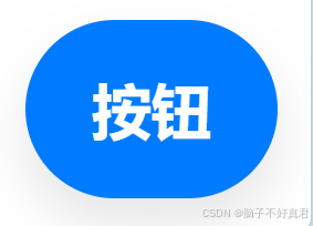
<button id="id_btn" class="class_btn">按钮</button>
</body>
</html>按钮效果:
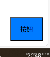
使用 button 对所有按钮进行通用样式设置。
使用 position: fixed 固定按钮位置,无论页面如何滚动,带有 position: fixed 的元素都会固定在指定位置,不会随页面滚动而改变位置。
使用了 position: fixed 之后,可以使用以下几个常用的定位属性来指定元素在视口中的位置:
top:距离视口顶部的距离
bottom:距离视口底部的距离
left:距离视口左侧的距离
right:距离视口右侧的距离
使用 padding: 15px 20px; 调整按钮大小,而不是使用width和height。
拥有以下优势:
按钮尺寸根据文本内容加上周围的填充进行动态调整。
不必担心内容溢出。
由于按钮随着文本长度或翻译的不同而增长或收缩,它也往往更快,更容易访问。
残血版
<!DOCTYPE html>
<html lang="en">
<head>
<meta charset="UTF-8">
<meta name="viewport" content="width=device-width, initial-scale=1.0">
<title>Document</title>
</head>
<style>
button {
position: fixed; /* 固定定位 */
bottom: 10px; /* 距离窗口底部 10 像素 */
right: 10px; /* 距离窗口右侧 10 像素 */
background-color: #007bff; /* 背景颜色为蓝色 */
padding: 15px 20px; /* 内边距,上下 15 像素,左右 20 像素 */
z-index: 666; /* 设置较高的层级,确保按钮在最上层显示 */
color: white; /* 文本颜色为白色 */
font-weight: bold; /* 文本加粗 */
font-size: 18px; /* 字体大小 18 像素 */
border-radius: 30px; /* 设置圆角半径为 30 像素 */
border: none; /* 去除边框 */
}
</style>
<body>
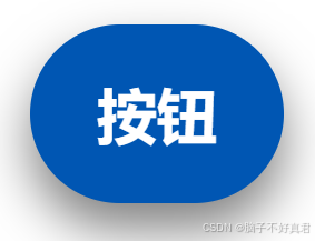
<button id="id_btn" class="class_btn">按钮</button>
</body>
</html>按钮效果:
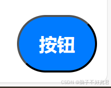
消除黑色边框只需简单的 border: none; /* 去除边框 */

鼠标悬停进阶版
<!DOCTYPE html>
<html lang="en">
<head>
<meta charset="UTF-8">
<meta name="viewport" content="width=device-width, initial-scale=1.0">
<title>Document</title>
</head>
<style>
/* 按钮样式 */
button {
position: fixed; /* 固定定位 */
bottom: 10px; /* 距离窗口底部 10 像素 */
right: 10px; /* 距离窗口右侧 10 像素 */
background-color: #007bff; /* 背景颜色为蓝色 */
padding: 15px 20px; /* 内边距,上下 15 像素,左右 20 像素 */
z-index: 666; /* 设置较高的层级,确保按钮在最上层显示 */
color: white; /* 文本颜色为白色 */
font-weight: bold; /* 文本加粗 */
font-size: 18px; /* 字体大小 18 像素 */
border-radius: 30px; /* 设置圆角半径为 30 像素 */
border: none; /* 去除边框 */
cursor: pointer; /* 鼠标悬停时显示手形指针 */
box-shadow: 0 8px 15px rgba(0, 0, 0, 0.1); /* 添加阴影效果 */
transition: all 0.3s ease; /* 所有属性变化添加 0.3s 平滑过渡 */
}
/* 当鼠标悬停在 button 上时的样式 */
button:hover { /* 定义悬停时的样式 */
background-color: #0056b3; /* 改变背景颜色为深蓝色 */
box-shadow: 0 15px 20px rgba(0, 0, 0, 0.2); /* 增加阴影效果,使按钮更突出 */
transform: translateY(-5px); /* 按钮向上移动 5 像素,产生浮动效果 */
box-shadow: 0 8px 15px rgba(0, 0, 0, 0.3); /* 加深阴影效果 */
}
</style>
<body>
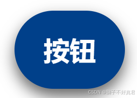
<button id="id_btn" class="class_btn">按钮</button>
</body>
</html>按钮效果
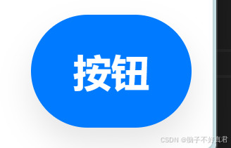
鼠标悬停效果
鼠标点击进阶版
<!DOCTYPE html>
<html lang="en">
<head>
<meta charset="UTF-8">
<meta name="viewport" content="width=device-width, initial-scale=1.0">
<title>Document</title>
</head>
<style>
/* 按钮样式 */
button {
position: fixed; /* 固定定位 */
bottom: 10px; /* 距离窗口底部 10 像素 */
right: 10px; /* 距离窗口右侧 10 像素 */
background-color: #007bff; /* 背景颜色为蓝色 */
padding: 15px 20px; /* 内边距,上下 15 像素,左右 20 像素 */
z-index: 666; /* 设置较高的层级,确保按钮在最上层显示 */
color: white; /* 文本颜色为白色 */
font-weight: bold; /* 文本加粗 */
font-size: 18px; /* 字体大小 18 像素 */
border-radius: 30px; /* 设置圆角半径为 30 像素 */
border: none; /* 去除边框 */
cursor: pointer; /* 鼠标悬停时显示手形指针 */
box-shadow: 0 8px 15px rgba(0, 0, 0, 0.1); /* 添加阴影效果 */
transition: all 0.3s ease; /* 所有属性变化添加 0.3s 平滑过渡 */
}
/* 当鼠标悬停在 button 上时的样式 */
button:hover { /* 定义悬停时的样式 */
background-color: #0056b3; /* 改变背景颜色为深蓝色 */
box-shadow: 0 15px 20px rgba(0, 0, 0, 0.2); /* 增加阴影效果,使按钮更突出 */
transform: translateY(-5px); /* 按钮向上移动 5 像素,产生浮动效果 */
box-shadow: 0 8px 15px rgba(0, 0, 0, 0.5); /* 加深阴影效果 */
}
/* 当鼠标点击 button 时的样式 */
button:active { /* 定义按钮被点击时的样式 */
background-color: #00408a; /* 改变背景颜色为更深蓝色 */
box-shadow: 0 5px 10px rgba(0, 0, 0, 0.6); /* 调整阴影效果,使按钮看起来按下 */
transform: translateY(0); /* 按钮恢复原位 */
}
</style>
<body>
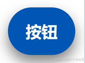
<button id="id_btn" class="class_btn">按钮</button>
</body>
</html>按钮效果
鼠标悬停效果
鼠标点击效果
完整版(再添加一个图标)
1)导入图标库
在cdnjs - The #1 free and open source CDN built to make life easier for developers中搜索 Font Awesome。


<link rel="stylesheet" href="https://cdnjs.cloudflare.com/ajax/libs/font-awesome/6.7.2/css/all.min.css" />2)寻找图标
在Find Icons with the Perfect Look & Feel | Font Awesome中寻找你心仪的图标。

我们需要使用沟通图标

使用这个吧!

复制使用即可

3)代码
<!DOCTYPE html>
<html lang="en">
<head>
    <meta charset="UTF-8">
    <meta name="viewport" content="width=device-width, initial-scale=1.0">
    <title>Document</title>
    <!-- 1. 引入 Font Awesome 样式 -->
    <link rel="stylesheet" href="https://cdnjs.cloudflare.com/ajax/libs/font-awesome/6.7.2/css/all.min.css" />
    <style>
        /* 按钮样式 */
        button {
            position: fixed;  /* 固定定位 */
            bottom: 10px; /* 距离窗口底部 10 像素 */
            right: 10px; /* 距离窗口右侧 10 像素 */
            background-color: #007bff; /* 背景颜色为蓝色 */
            padding: 20px 20px; /* 内边距,上下 20 像素,左右 20 像素 圆形*/
            z-index: 666; /* 设置较高的层级,确保按钮在最上层显示 */

            color: white; /* 文本颜色为白色 */
            font-weight: bold; /* 文本加粗 */
            font-size: 18px;  /* 字体大小 18 像素 */

            /* 也可以使用width和height, 需要注释掉padding
            width: 60px;
            height: 60px;  */
            border-radius: 50%; /* 按钮的宽度和高度相等,再加上 border-radius: 50%,按钮就会变成真正的圆形。 */

            border: none;  /* 去除边框 */
            cursor: pointer;  /* 鼠标悬停时显示手形指针 */
            box-shadow: 0 8px 15px rgba(0, 0, 0, 0.1);  /* 添加阴影效果 */
            transition: all 0.3s ease;  /* 所有属性变化添加 0.3s 平滑过渡 */
        }

        /* 当鼠标悬停在 button 上时的样式 */
        button:hover {
            background-color: #0056b3;  /* 改变背景颜色为深蓝色 */
            box-shadow: 0 15px 20px rgba(0, 0, 0, 0.2);
            transform: translateY(-5px);
            box-shadow: 0 8px 15px rgba(0, 0, 0, 0.5);  /* 加深阴影效果 */
        }

        /* 当鼠标点击 button 时的样式 */
        button:active {
            background-color: #00408a;  /* 改变背景颜色为更深蓝色 */
            box-shadow: 0 5px 10px rgba(0, 0, 0, 0.6);  /* 调整阴影效果,使按钮看起来按下 */
            transform: translateY(0);  /* 按钮恢复原位 */
        }

        /* 调整按钮图标大小 */
        .icon-size {
            font-size: 28px;
        }
    </style>
</head>
<body>
    <!-- 2. 在按钮内部加入评论图标,文字可随意修改 -->
    <button id="id_btn" class="class_btn">
        <i class="fa-solid fa-comments icon-size"></i>
    </button>
</body>
</html>
导入 <link rel="stylesheet" href="https://cdnjs.cloudflare.com/ajax/libs/font-awesome/6.7.2/css/all.min.css" /> 库,再使用 图标样式<i class="fa-solid fa-comments icon-size"></i>


 扫一扫
扫一扫


 1456
1456

 被折叠的 条评论
为什么被折叠?
被折叠的 条评论
为什么被折叠?
 到【灌水乐园】发言


