


 本文详细介绍CSS动画的基础概念,包括animation-name、duration、timing-function等属性的使用,通过实例讲解关键帧动画的创建过程,演示如何实现平滑移动效果。
先基础的了解一下,可能不是很全
animation-name 绑定到选择器关键帧的名称
ainmation-duration动画需要多少秒完成
animation-timing-function设置动画将多长时间完成一个周期 ,常用的有
linear匀速
ease以低速开始,然后加快,结束前变慢 默认的
ease-in 以低速开始
ease-out以低速结束
ease-in-out开始和结束低速
animation-delay 动画在启动前的延时间隔
animation-iteration-count定义播放的次数 infinite 无限
animation-play-state(pause running)指定正在运行或已暂停
关键帧 如
@keyframes cloud1-move {

	from {
		right: -300px;
	}
	to{
		right: 100%;
	}
}
from是开始的位置 to是结束的位置 跟英语的from to意思差不多
我在做的过程中遇到的一个问题就是 在from里使用right(定位了之后用的right)或者left之后
如果你在to里面用left则不会出现逐渐变化的过程,而是一瞬间的
还有一种是
@keyframes move {
    0% {left:0;}
    50% {left:100px;}
    100% { left:100%}
}
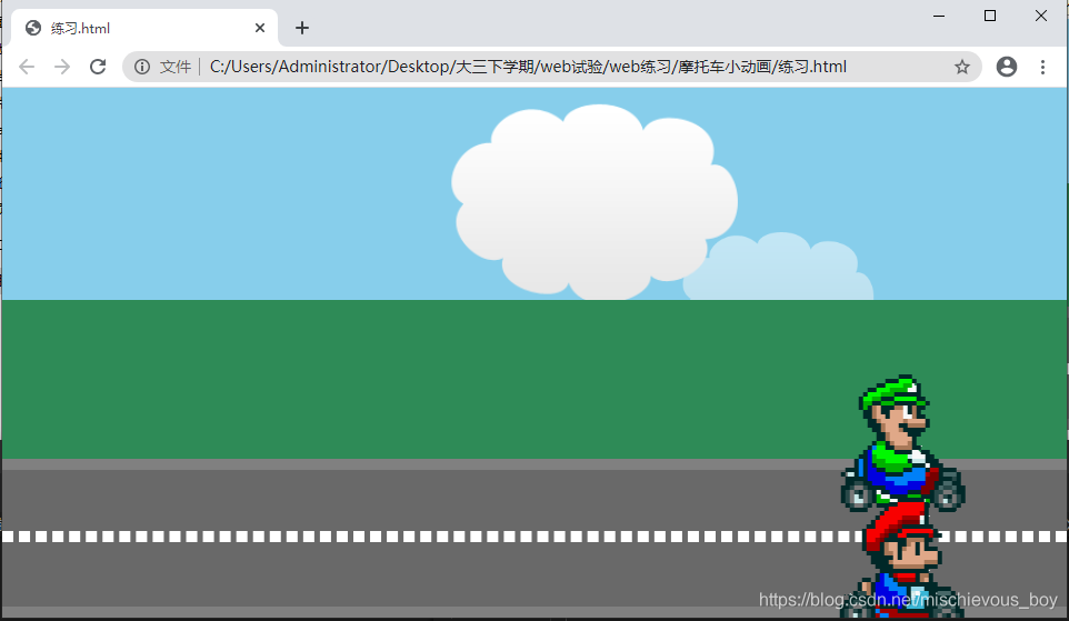
练习(网上找的模拟的)
<!DOCTYPE html>
<html lang="en">
<head>
	<meta charset="UTF-8">
	<meta name="viewport" content="width=device-width, initial-scale=1.0">
	<title>Document</title>
	<link rel="stylesheet" href="练习.css">
</head>
<body>
	<div class="container">
		<div class="sky">
			<img src="http://lc-jOYHMCEn.cn-n1.lcfile.com/8ba2d4cc06e96162cbba.png" alt="" class="cloud1">
			<img src="http://lc-jOYHMCEn.cn-n1.lcfile.com/8ba2d4cc06e96162cbba.png" alt="" class="cloud2">
		</div>
		<div class="grass"></div>
		<div class="road">
			<div class="line"></div>
			<img src="http://lc-jOYHMCEn.cn-n1.lcfile.com/a1aa3ebfc1d96b954025.png" alt="" class="player1">
			<img src="http://lc-jOYHMCEn.cn-n1.lcfile.com/a1aa3ebfc1d96b954025.png" alt="" class="player2">
		</div>
	</div>
</body>
</html>
* {
	margin: 0;
	padding: 0;
}
.container {
	width: 100%;
	height:700px;
	background-color: #000;
	overflow: hidden;

}
.container .sky {
	position: relative;
	height: 200px;
	background-color: #87ceeb;
	overflow: hidden;
}
.container .sky .cloud1 , .container .sky .cloud2{
	width: 200px;
	height: 150px;

	position: absolute;
	animation-name: cloud1-move;
	animation-timing-function: linear;
	animation-fill-mode: both;
	animation-iteration-count: infinite;
}
.container .sky .cloud1 {
	animation-duration: 15s;
	z-index: 1;
}
.container .sky .cloud2 {
	top: 100px;
	opacity: 0.5;
	animation-duration: 20s;
}

.container .grass {
	height: 200px;
	background-color: #2e8b57;
}
@keyframes cloud1-move {

	from {
		right: -300px;
	}
	to{
		right: 100%;
	}
}
.road {
	position: relative;
	height: 200px;
	background-color: #696969;
	border-top: 10px solid #808080;
	border-bottom: 10px solid #808080;
	box-sizing: border-box;
}
.road .line {
	width: 100%;
	border: 5px dashed white;
	position: absolute;
	top:90px;
}
.road .player1 , .road .player2 {
	width: 80px;
	height:80px;
	animation-name: player-move;
	animation-duration: 15s;
	animation-timing-function: ease-in-out;
	animation-iteration-count: infinite;
	animation-play-state: ;
	/*  */
}
.road .player1 {
	position: absolute;
	top:0px;
}
.road .player2 {
	position: absolute;
	top: 95px;
}

@keyframes player-move{
	from {left: 0;}
	to {left: 100%;}
}


 扫一扫
扫一扫


 2520
2520

 被折叠的 条评论
为什么被折叠?
被折叠的 条评论
为什么被折叠?
 到【灌水乐园】发言


