


 本文介绍了如何使用matplotlib创建堆积柱状图,包括处理两组数据的简单方法和扩展到三组及以上数据的计算技巧。通过`bottom`参数,展示了如何有效地展示不同数据集之间的对比关系。
matplotlib创建堆积柱状图比较简单,通过pyplot.bar()函数中bottom参数可以便捷实现。
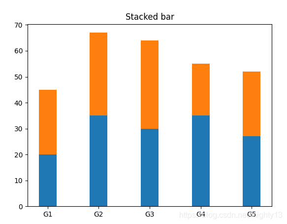
两组数据
两组数据的堆积柱状图非常简单,直接使用bottom参数即可。
import matplotlib.pyplot as plt

labels = ['G1', 'G2', 'G3', 'G4', 'G5']
men_means = [20, 35, 30, 35, 27]
women_means = [25, 32, 34, 20, 25]
width = 0.35
plt.bar(labels, men_means, width)
# 关键在bottom参数
plt.bar(labels, women_means, width, bottom=men_means)
plt.title('Stacked bar')
plt.show()
两组以上数据
三组数据以上需要计算每组柱子bottom参数值。使用numpy计算可能稍微简单点。由于例子比较简单,就不再使用numpy计算。
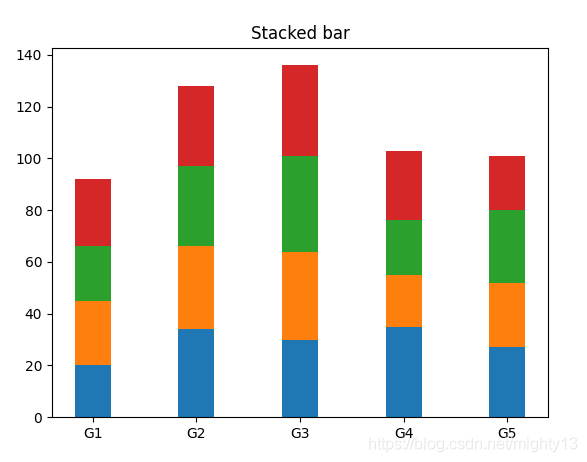
import matplotlib.pyplot as plt

labels = ['G1', 'G2', 'G3', 'G4', 'G5']
first = [20, 34, 30, 35, 27]
second = [25, 32, 34, 20, 25]
third = [21, 31, 37, 21, 28]
fourth = [26, 31, 35, 27, 21]
data = [first, second, third, fourth]

x = range(len(labels))
width = 0.35
# 将bottom_y元素都初始化为0
bottom_y = [0] * len(labels)
for y in data:
    plt.bar(x, y, width, bottom=bottom_y)
    # 累加数据计算新的bottom_y
    bottom_y = [a+b for a, b in zip(y, bottom_y)]
plt.xticks(x, labels)
plt.title('Stacked bar')
plt.show()


 1769
1769

 被折叠的 条评论
为什么被折叠?
被折叠的 条评论
为什么被折叠?
 到【灌水乐园】发言


