


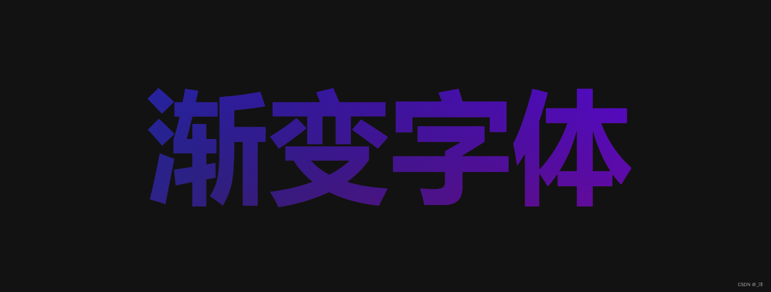
实现字体渐变
实现字体渐变的思路是:
- 容器内编写字体
- 字体颜色设置成透明色
transparent - 编写渐变的背景
- 使用
background-clip: text;设置背景
<!DOCTYPE html>
<html lang="en">
  <head>
    <meta charset="UTF-8" />
    <meta name="viewport" content="width=device-width, initial-scale=1.0" />
    <title>Document</title>
  </head>
  <body>
    <div class="text-container">
      <h1>渐变字体</h1>
    </div>
    <style>
      .text-container {
        h1 {
          line-height: 300px;
          font-size: 200px;
          text-align: center;
          font-weight: 900;
          background: linear-gradient(
              217deg,
              #5100ff,
              rgba(0, 0, 0, 0.2) 70.71%
            ),
            linear-gradient(127deg, #003cff, rgba(0, 0, 0, 0.2) 80.71%),
            linear-gradient(336deg, #ff0084, rgba(0, 0, 0, 0.2) 80.71%);
          background-clip: text;
          color: transparent;
        }
      }
    </style>
  </body>
</html>
效果是:
字体渐变加阴影
想要给上述渐变字体添加阴影是没有用的,会有如下效果:
h1{
	text-shadow: 2px 2px 5px white;
}
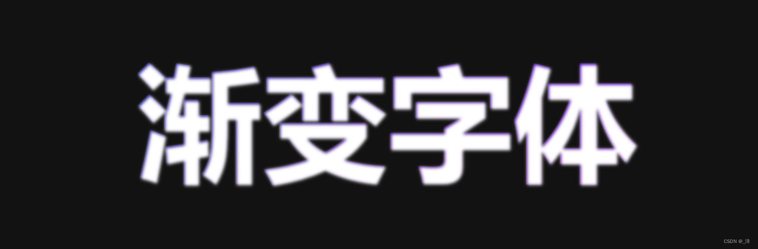
会发现字体的颜色完全被阴影覆盖。这是因为我们将字体的颜色设置为了透明色,字体阴影是在字体的下层,背景的上层展示的,所以字体阴影将遮盖背景展示出来。
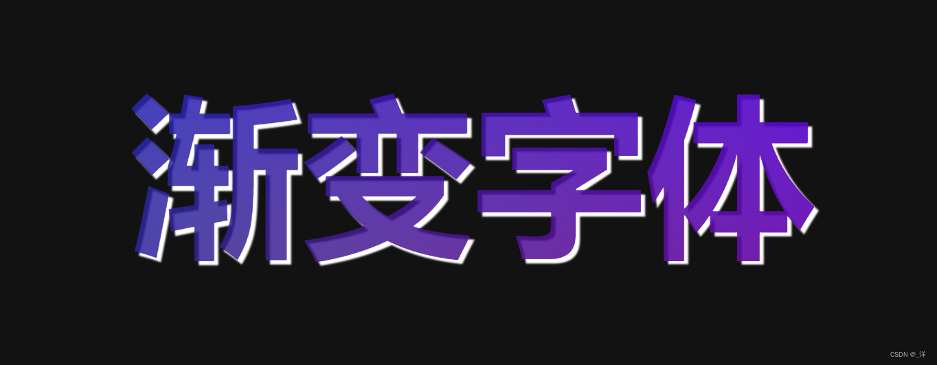
为了将字体阴影作为背景的阴影能够渲染,需要通过伪类(::before, ::after)实现:
<!DOCTYPE html>
<html lang="en">
  <head>
    <meta charset="UTF-8" />
    <meta name="viewport" content="width=device-width, initial-scale=1.0" />
    <title>Document</title>
  </head>
  <body>
    <div class="text-container">
      <h1>渐变字体</h1>
    </div>
    <style>
      .text-container {
        h1 {
          line-height: 300px;
          font-size: 200px;
          text-align: center;
          font-weight: 900;
          background: linear-gradient(
              217deg,
              #5100ff,
              rgba(0, 0, 0, 0.2) 70.71%
            ),
            linear-gradient(127deg, #003cff, rgba(0, 0, 0, 0.2) 80.71%),
            linear-gradient(336deg, #ff0084, rgba(0, 0, 0, 0.2) 80.71%);
          background-clip: text;
          color: transparent;
        }
        h1::before {
          content: "渐变字体";
          position: absolute;
          text-shadow: 5px 5px 2px white;
          z-index: -1;
        }
      }
    </style>
  </body>
</html>
效果是:
炫酷的渐变字体
实现如下效果:
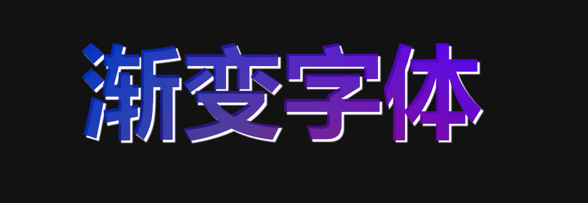
代码:
<!DOCTYPE html>
<html lang="en">
  <head>
    <meta charset="UTF-8" />
    <meta name="viewport" content="width=device-width, initial-scale=1.0" />
    <title>Document</title>
  </head>
  <body>
    <div class="text-container">
      <h1>渐变字体</h1>
    </div>
    <style>
      .text-container {
        display: flex;
        align-items: center;
        justify-content: center;

        h1 {
          font-size: 200px;
          font-weight: 900;
          background: linear-gradient(
              217deg,
              #5100ff,
              rgba(0, 0, 0, 0.2) 70.71%
            ),
            linear-gradient(127deg, #003cff, rgba(0, 0, 0, 0.2) 80.71%),
            linear-gradient(336deg, #ff0084, rgba(0, 0, 0, 0.2) 80.71%);
          background-clip: text;
          -webkit-background-clip: text;
          color: transparent;
          position: relative;
        }
        h1::before {
          content: "渐变字体";
          position: absolute;
          text-shadow: 5px 5px 2px white;
          z-index: -1;
          display: block;
        }
        h1::after {
          content: "渐变字体";
          position: absolute;
          background: url("./white-bar.png") no-repeat;
          color: transparent;
          display: block;
          z-index: 1;
          top: 0;
          left: 0;
          background-clip: text;
          animation: leftToRight 2s ease-in infinite;
          filter: blur(10px);
        }
      }

      @keyframes leftToRight {
        0% {
          background-position: -50% 0;
        }
        100% {
          background-position: 150% 0;
        }
      }
    </style>
  </body>
</html>
需要借助图片资源如下:
white-bar.png


 扫一扫
扫一扫


 被折叠的 条评论
为什么被折叠?
被折叠的 条评论
为什么被折叠?
 到【灌水乐园】发言


