


文章目录
问题
今天发现,如果在h中嵌套行内元素,h1不是被行内元素撑开,中间是有一段距离的。
eg:

代码,如下:
<!DOCTYPE html>
<html lang="en">
  <head>
    <meta charset="UTF-8" />
    <style>
      *{
        margin: 0;
        padding: 0;
      }
      .outer{
          background-color: rgb(236, 187, 197);
          font-size: 50px;
      }
       h1 {
        background-color: slategray;
      }
      .font {
          background-color: cornflowerblue;
      }
      a {
        /* display: block; */
        /* vertical-align: top; */
        color: #242526;
        background-color: tomato;
        font-size: 16px;
      }
      p{
        font-size: 16px;
        background-color: darkseagreen;
      }
      h2{
        background-color: darksalmon;
      }
      .h1-div{
        background-color: darkslateblue;
        font-size: 16px;
      }
      i{
        display: block;
        background-color: darkturquoise;
        font-size: 16px;
      }
    </style>
  </head>
  <body>
    <div class="outer">
    <h1><a href="#">我是h1中的a</a></h1>
    <div class="font"><a href="#">我是div中的a</a></div>
    <h2><a href="#">我是h2中的a</a></h2>
    <h1><p>我是h1中的p</p></h1>
    <h1><div class="h1-div">我是h1中的div</div></h1>
    <h1>我是h1</h1>
    <div class="font"><i>我是div中的i</i></div>
     <h1><i>我是h1中的i</i></h1>
    </div>
  </body>
</html>
如果把a设置为块级元素,或者设置外层容器的font-size=0,就不会出现该现象

解决
一开始很疑惑,后面发现该距离的大小和font-size有关,后来又发现font-size的大小又能影响行高(line-heigth),所以就推测该距离是行高撑起来的。那为什么设置font-size=0就可以解决并且只对行内元素其作用呢,下面就来说说行高。
行高line-heigth的定义
(1)行高是指文本行基线间的垂直距离。
(2)行距是上一行的底线和下一行的顶线之间的距离。
行距的一半就是半行距。上间距等于下间距。

字体大小font-size的定义
字体大小是同一行的顶线和底线之间的距离
vertical-align
vertical-align的属性中有top、middle、baseline、bottom,就是和图中的四条线一一对应。
行高的特性
- 行高不能是负值
- 取值和继承性
| 设置方式 | 描述 | (例子)line-heigth | 计算后的line-height | 子元素(font-size: 30px)继承的line-height |
|---|---|---|---|---|
| normal(默认值) | 默认。设置合理的行间距 | 不同浏览器,不同字体都会有所区别 | 大约是1.2*font-size | 大约是1.2*font-size |
| number | 设置数字,此数字会与当前的字体尺寸相乘来设置行间距。 | line-height:1.2 | 自身 font-size(16px) * 1.2 = 19.2px | 继承1.2,line-height = 自身font-size(30px)*1.2=36px |
| % | 基于当前字体尺寸的百分比行间距。 | line-height:120% | 自身 font-size(16px) * 120% = 19.2px | 继承120%,行高=父元素字体大小*行高百分比=19.2px |
| length | 设置固定的行间距。 | line-height: 20px | 不用计算 | line-height: 20px |
| inherit | 规定应该从父元素继承 line-height 属性的值。 | 父元素的line-height | 不用计算 | 父元素的line-height值 |
normal大概等于fontsize*1.2
- 问题所在
这就是问题的所在,不同的标签会有不同的默认行高,该行高就是为其子元素设置的高度大小。如果其子元素的高度超过父元素为其设置的行高大小,就会直接超过行高,在其父元素中显示;如果小于父元素为其设置的行高大小,就会在行高中直接显示,但是父元素为其设置的行高未占满,所以就会有空隙
即:


其实这里的说法就不对:
(子元素”撑开“父元素,就是说我们子元素可见部分撑开父元素,子元素可见部分是font-size的大小,这样转换过来就是说font-size”撑开“父元素,但是实际上是由line-height撑开父元素的。(下面有演示))
所以我们平常说子元素撑开父元素,应该理解为子元素的行高撑开父元素。但是这样说也不严谨,因为当子元素行高>父元素行高时父元素才会被子元素撑开,当子元素行高<父元素行高,父元素由自己的行高撑开。
行高撑开元素,而不是font-size
eg:
<!DOCTYPE html>
<html lang="en">
<head>
    <meta charset="UTF-8">
    <meta http-equiv="X-UA-Compatible" content="IE=edge">
    <meta name="viewport" content="width=div, initial-scale=1.0">
    <title>Document</title>
    <style>
        .box1{
            background-color: coral;
            line-height: 30px;
        }
        h1{
            background-color: darkcyan;
            font-size: 16px;
            line-height: 0;
        }
    </style>
</head>
<body>
    <div class="box1">1
    </div>
    <h1>
           2
    </h1>
</body>
</html>

2没有背景,因为他所在容器行高为0,不会显示。
解释font-size=0为什么可以使行高消失
font-size: 0 的作用
- 设置字体大小是0px——font-size=0使行高消失
设置外层容器的字体大小为0,那么该容器的行高就不进行设置了, 由于继承性所以h1标签的行高也不设置了,
内容直接由子元素撑开,不会因为自己的行高,而使容器看起来有空隙。
即:
<!DOCTYPE html>
<html lang="en">
  <head>
    <meta charset="UTF-8" />
    <style>
      *{
        margin: 0;
        padding: 0;
      }
      .outer{
          background-color: rgb(236, 187, 197);
          font-size: 0px;
          /* line-height: 0; */
      }
       h1 {
        background-color: slategray;
      }
      .font {
          background-color: cornflowerblue;
      }
      a {
        /* display: block; */
        color: #242526;
        background-color: tomato;
        font-size: 16px;
      }
      p{
        font-size: 16px;
        background-color: darkseagreen;
      }
      h2{
        background-color: darksalmon;
      }
      .h1-div{
        background-color: darkslateblue;
        font-size: 16px;
      }
      i{
        display: block;
        background-color: darkturquoise;
        font-size: 32px;
      }
      .font{
        font-size: 16px;
      }

    </style>
  </head>
  <body>
    <div class="outer">
    <h1><a href="#">我是h1中的a</a></h1>
    <div class="font"><a href="#">我是div中的a</a></div>
    <h2><a href="#">我是h2中的a</a></h2>
    <h1><p>我是h1中的p</p></h1>
    <h1><div class="h1-div">我是h1中的div</div></h1>
    <h1>我是h1</h1>
    <div><i>我是div中的i</i></div>
     <h1><i>我是h1中的i</i></h1>
    </div>
  </body>
</html>
解释:

注意:行高就不进行设置了不等于line-heigth=0,
如下是line-heigth=0的效果:

可以解决行内元素的空隙
浏览器会将换行解析成空格,就会再两个容器之间留一条缝,除非你不换行
<!DOCTYPE html>
<html lang="en">
<head>
    <meta charset="UTF-8">
    <meta http-equiv="X-UA-Compatible" content="IE=edge">
    <meta name="viewport" content="width=div, initial-scale=1.0">
    <title>Document</title>
    <style>
        li{
            display: inline-block;
            width: 100px;
            height: 100px;
            background-color: darkorange;
        }

    </style>
</head>
<body>
    <ul>
        <li></li><li></li><li></li>
        <li></li>
    </ul>
</body>
</html>

设置父元素font-size: 0,该缝隙就会消失。
        ul{
             font-size: 0;
        }

diaplay:block可以使行高消失
父元素设置的行高对块级子元素无效,但是对行内元素、行内块元素有效。
所以如果你的元素设置为块级元素,父元素就不会特意为你设置行高等着你填了。
eg:

总结
总结下来,一切都是父元素的行高搞的鬼。
我觉得可以这样理解:
1.“inline、block和行高”: 由于行内元素无法设置heigth,父元素为了他不受欺负,所以设置的行高对行内元素起作用,而块元素可以通过heigth设置高度,不用担心会受欺负,所以设置的行高就不会对他起作用了。
(注意这里说的起不起作用都是父元素设置的行高对子元素是否起作用,不是说如果一个块级元素或行内元素设置行高不起作用,元素设置行高都是有作用的)
2.“font-size=0”:如果说上面是父元素保护行内元素而“区别”对待,那父元素设置“font-size=0”,就是对子元素公平对待,子元素有多大能耐就显示多大,不管是inline还是block。
检验
还有一个例子
<head>
    <meta charset="UTF-8">
    <meta name="viewport" content="width=device-width, initial-scale=1.0">
    <title>Document</title>
    <style>
        *{
            padding: 0;
            margin: 0;
        }
        li{
            float: left;
            list-style: none;
            width: 8px;
            height: 8px;
            margin: 2px;
            background-color: red;
            text-align: center;
            /* font-size: 0px; */
        }
        a{
            /* display: block; */
            vertical-align:baseline;
            display: inline-block;
            width: 8px;
            height: 8px;
            background-color: blue;
        }
    </style>
</head>
<body>
        <ul>
            <li><a  href="https://www.baidu.com/" target=_blank></a></li>
            <li><a  href="https://www.baidu.com/" target=_blank></a></li>
            <li><a  href="https://www.baidu.com/" target=_blank></a></li>
            <li><a  href="https://www.baidu.com/" target=_blank></a></li>
        </ul>
</body>
</html>

说说为什么蓝点没有覆盖红点。
还是行高的问题,li是a的父元素,li 的line-heigth大概是16*1.2 =19 px,看见子元素是行内元素a,就会为它设置行高。即使它非常小还是会为子元素保留行高。
父元素高度小,可是行高比较大,子元素在父元素设置的行高上,垂直方向默认和基线对齐,行高背景又是透明的,就会导致上面的现象。

所以按照上面的讲解我们可以通过消除行高来改变,
1、设置父元素font-size = 0:
li{
 font-size: 0px;
 }
或者
        ul{
            font-size: 0;
        }
设置ul是利用了font-size的继承性
2.设置a为block
a{
diaplay:block;
}
效果:

通过设置vertical-align来修改
这个题目的目的是蓝点盖住红点,所以我们可以不消除行高,而通过设置子元素垂直方向的位置来改变。
vertical-align取值
vertical-align属性定义行内元素的基线相对于该元素所在行的基线的垂直对齐。允许指定负长度值和百分比值。
(注意这里:vertical-align是给子元素自己的对齐方式设置的)

| 属性值 | 含义 |
|---|---|
| baseline默认 | 元素放置在父元素的基线上。 |
| sub | 垂直对齐文本的下标。 |
| super | 垂直对齐文本的上标 |
| top | 把元素的顶端与行中最高元素的顶端对齐 |
| text-top | 把元素的顶端与父元素字体的顶端对齐 |
| middle | 把此元素中部放置在父元素的中部。 |
| bottom | 把元素的底端与行中最低的元素的顶端对齐 |
| text-bottom | 把元素的底端与父元素字体的底端对齐。 |
| % | 使用 “line-height” 属性的百分比值来排列此元素。允许使用负值。 |
| inherit | 规定应该从父元素继承 vertical-align 属性的值。 |
所以我们可以设置a的vertical-align:top;来使蓝点覆盖红点。
 a{
            vertical-align:top;
  }

eg:vertical-align例子
<!DOCTYPE html>
<html lang="en">
<head>
    <meta charset="UTF-8">
</head>
<style>
    p{
        font-size: 100px;
        border: orangered 1px solid;
    }

    a{
        font-size: 30px;
        text-decoration: none;
    }
    .test{
        font-size: 20px;
        vertical-align: bottom;
    }

</style>
<body>
    <div><p>
        我是p
        <a href="#">你好呀小姐姐</a>
        <a href="#" class="test">abc
        </a>
    </p>

    </div>

</body>
</html>

行高和文字大小的位置关系
行高 = 上半行间距 + 字体的高度 + 下半行间距 (行间距可以为负值)
即字体永远位于行高的中间位置,所以才会有如下结论:
- 当行高等于容器的高度的时候文字垂直居中
- 当行高等于汉字大小的时候,文字的顶线和基线就是分界线
<!DOCTYPE html>
<html lang="en">
<head>
<meta charset="UTF-8" />
<style>
.outer {
background: lightpink;
/* 设置为0,取消外部行高的影响 */
font-size: 0px;
}
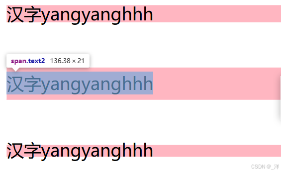
.text1 {
font-size: 16px;
line-height: 16px;
}
.text2 {
font-size: 16px;
line-height: 30px;
}
.text3 {
font-size: 16px;
line-height: 10px;
}
</style>
</head>
<body>
<div class="outer"><span class="text1">汉字yangyanghhh</span></div>
<br />
<br />
<div class="outer"><span class="text2">汉字yangyanghhh</span></div>
<br />
<br />
<div class="outer"><span class="text3">汉字yangyanghhh</span></div>
</body>
</html>
行高和高度的优先级
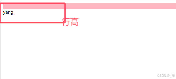
当同时给一个元素设置行高和高度,高度的优先级绝对是大于行高的。
行高可以理解为对其子元素起作用,当没有设置高度的时候,子元素根据其设置的行高撑开容器,当具体设置高度还是以高度为准:
<!DOCTYPE html>
<html lang="en">
  <head>
    <meta charset="UTF-8" />
    <style>
      .outer {
       background: lightpink;
        line-height: 60px;
        font-size: 14px;
        height: 20px;
      }
    </style>
  </head>
  <body>
    <div class="outer">yang</div>
  </body>
</html>


 扫一扫
扫一扫


 7275
7275

 被折叠的 条评论
为什么被折叠?
被折叠的 条评论
为什么被折叠?
 到【灌水乐园】发言


