


在这篇博客中,我将向大家展示如何使用 pyecharts 库来可视化数据。pyecharts 是一个非常强大的 Python 数据可视化库,能够生成各种漂亮的图表。
准备工作
在开始之前,我们需要确保已经安装了 pyecharts 库。可以通过以下命令安装:
pip install pyecharts
代码解释
-
导入库: 我们首先导入
pyecharts.charts中的Line类和pyecharts中的options模块。 -
数据准备: 我们将数据存储在一个字符串中,并使用
split方法将其解析为多个列表。 -
创建折线图: 使用
Line类创建折线图对象,并使用add_xaxis和add_yaxis方法添加数据。我们为每个数据集设置不同的颜色和样式。 -
设置全局配置项: 使用
set_global_opts方法设置图表的全局配置项,包括标题、图例位置和 tooltip 样式。 -
渲染图表: 使用
render方法将图表渲染为 HTML 文件。
数据准备
我们将使用以下数据进行可视化:
日期	阅读量	评论数	粉丝数	收藏数
2024年07月10日	110	6	11	4
2024年07月11日	180	9	14	7
2024年07月12日	150	7	12	5
2024年07月13日	220	10	16	8
2024年07月14日	270	13	18	10
2024年07月15日	310	15	20	12
2024年07月16日	280	14	19	11
2024年07月17日	350	17	23	14
2024年07月18日	400	20	25	16
2024年07月19日	370	18	24	15
2024年07月20日	450	22	28	18
代码实现
以下是完整的代码示例:
from pyecharts.charts import Line
from pyecharts import options as opts

# 数据
data = """日期	阅读量	评论数	粉丝数	收藏数
2024年07月10日	110	6	11	4
2024年07月11日	180	9	14	7
2024年07月12日	150	7	12	5
2024年07月13日	220	10	16	8
2024年07月14日	270	13	18	10
2024年07月15日	310	15	20	12
2024年07月16日	280	14	19	11
2024年07月17日	350	17	23	14
2024年07月18日	400	20	25	16
2024年07月19日	370	18	24	15
2024年07月20日	450	22	28	18
"""


# 解析数据
lines = data.split('\n')
dates = []
read_counts = []
comment_counts = []
fan_counts = []
collect_counts = []

for line in lines[1:]:  # 跳过标题行
    if line.strip():  # 跳过空行
        parts = line.split('\t')
        dates.append(parts[0])
        read_counts.append(int(parts[1]))
        comment_counts.append(int(parts[2]))
        fan_counts.append(int(parts[3]))
        collect_counts.append(int(parts[4]))

# 创建折线图
line = Line()
line.add_xaxis(dates)
line.add_yaxis(
    "阅读量",
    read_counts,
    is_smooth=True,  # 添加圆滑线条
    linestyle_opts=opts.LineStyleOpts(color="red", width=2),  # 修改线条样式
    itemstyle_opts=opts.ItemStyleOpts(color="red"),  # 修改数据点样式
    label_opts=opts.LabelOpts(is_show=False),  # 不显示数据标签
)
line.add_yaxis(
    "评论数",
    comment_counts,
    is_smooth=True,
    linestyle_opts=opts.LineStyleOpts(color="blue", width=2),
    itemstyle_opts=opts.ItemStyleOpts(color="blue"),
    label_opts=opts.LabelOpts(is_show=False),
)
line.add_yaxis(
    "粉丝数",
    fan_counts,
    is_smooth=True,
    linestyle_opts=opts.LineStyleOpts(color="green", width=2),
    itemstyle_opts=opts.ItemStyleOpts(color="green"),
    label_opts=opts.LabelOpts(is_show=False),
)
line.add_yaxis(
    "收藏数",
    collect_counts,
    is_smooth=True,
    linestyle_opts=opts.LineStyleOpts(color="purple", width=2),
    itemstyle_opts=opts.ItemStyleOpts(color="purple"),
    label_opts=opts.LabelOpts(is_show=False),
)

# 设置全局配置项
line.set_global_opts(
    title_opts=opts.TitleOpts(title="数据折线图"),
    legend_opts=opts.LegendOpts(pos_bottom="bottom"),  # 将图例位置设置在下面
    tooltip_opts=opts.TooltipOpts(
        background_color="black",  # 修改tooltip背景颜色
        border_width=2,  # 修改tooltip边框宽度
        border_color="black",  # 修改tooltip边框颜色
        textstyle_opts=opts.TextStyleOpts(color="white", font_size=14),  # 修改tooltip文字样式
    ),  # 修改tooltip样式
)

# 渲染图表
line.render("line_chart.html")
可视化图表: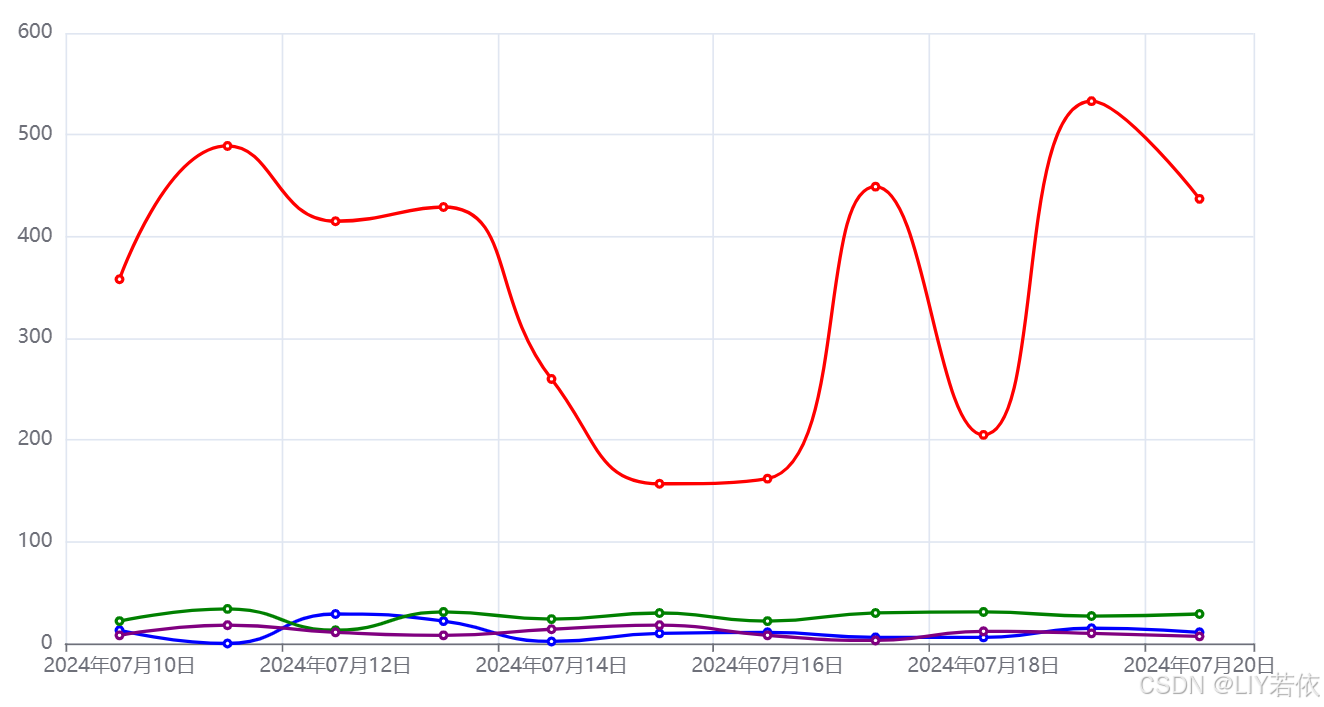

说明
在这篇博客中,我们使用 pyecharts 库生成了一个折线图。我们首先准备了数据,然后解析数据并将其添加到图表中。接着,我们设置了图表的样式和全局配置项,最后渲染并生成了图表。
总结
通过这篇博客,我们学习了如何使用 pyecharts 库来可视化数据。pyecharts 提供了丰富的图表类型和配置选项,使得数据可视化变得非常简单和灵活。
扩展
除了折线图,pyecharts 还支持其他类型的图表,如柱状图、饼图、散点图等。你可以根据自己的需求,选择合适的图表类型进行数据可视化。
相关类型扩展
以下是一些常见的图表类型及其使用示例:
- 柱状图:用于显示不同类别的数据比较。
- 饼图:用于显示数据的组成部分。
- 散点图:用于显示数据的分布和关系。
爬虫项目推荐
- 使用 Python 指定内容 爬取百度引擎搜索结果-优快云博客
- 使用Python和Selenium爬取QQ新闻热榜-优快云博客
- 使用Selenium 和 Python 抓取快手网页大量评论-优快云博客
- 使用 Python 和 Selenium 爬取快手视频 附源码-优快云博客
- 如何使用Python、Selenium 爬取酷狗音乐网站的歌曲信息-优快云博客
- 使用Python 和 Selenium 抓取 酷狗 音乐专辑 附源码-优快云博客
其他项目推荐
- 使用 TensorFlow 和 CIFAR-10 数据集进行图像分类-优快云博客
- 在 Python 中编写一个简单的文件搜索工具-优快云博客
- 使用Python从.exe文件中提取图标_提取文件图标-优快云博客
- Python 文件搜索程序详解与实现-优快云博客
- 使用Python 进行文本情感分析-优快云博客
- 使用 Python和PyQt5 打造 你的专属文件查询工具! 附源码-优快云博客
- 用Python和PyQt5打造你的专属音乐播放器!轻松创建带封面的音乐列表-优快云博客
结论
我们可以根据自己的需求,进一步扩展和修改代码,生成更多类型的图表。pyecharts 是一个非常强大的工具,适用于各种数据可视化需求。
欢迎在评论区留言。继续探索和学习,祝你在深度学习的旅程中取得更多的成果!🚀
希望这个博客对你有所帮助!如果你有任何问题需要进一步的指导,请随时提问。继续加油! 🚀


 被折叠的 条评论
为什么被折叠?
被折叠的 条评论
为什么被折叠?
 到【灌水乐园】发言


