


 本文介绍如何使用Highcharts创建区间柱形图,并提供了一个详细的实例代码,展示了温度数据的变化范围。通过配置chart.type为'columnrange'实现区间柱状图的绘制。
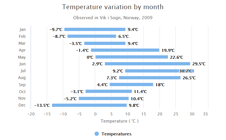
Highcharts 区间柱形图
以下实例演示了区间柱形图。
我们在前面的章节已经了解了 Highcharts 基本配置语法。接下来让我们来看下其他的配置。

chart 配置
配置 chart 的 type 为 'columnrange' 。chart.type 描述了图表类型。默认值为 "line"。
var chart = {
   type: 'columnrange',
   inverted: true
};
实例
文件名:highcharts_column_range.htm
var series= [{
name: 'Temperatures',
data: [
[-9.7, 9.4],
[-8.7, 6.5],
[-3.5, 9.4],
[-1.4, 19.9],
[0.0, 22.6],
[2.9, 29.5],
[9.2, 30.7],
[7.3, 26.5],
[4.4, 18.0],
[-3.1, 11.4],
[-5.2, 10.4],
[-13.5, 9.8]
]
}];
var json = {};
json.chart = chart;
json.title = title;
json.subtitle = subtitle;
json.tooltip = tooltip;
json.xAxis = xAxis;
json.yAxis = yAxis;
json.series = series;
json.plotOptions = plotOptions;
json.credits = credits;
$('#container').highcharts(json);
});
</script>
</body>
</html>
以上实例输出结果为:


 被折叠的 条评论
为什么被折叠?
被折叠的 条评论
为什么被折叠?
 到【灌水乐园】发言


