


弹性盒子是CSS3的一种新的布局模式
CSS3弹性盒子(Flexible Box 或flexbox),是一种当页面需要适应不同的屏幕大小以及设备类型时确保元素拥有恰当的行为的布局方式。
引入弹性盒子布局模型的目的是提供一种更加有效的方式来对一个容器中的子元素进行排列、对齐和分配空白空间。
CSS3 弹性盒子内容
弹性盒子由弹性容器和弹性子元素组成。
弹性容器通过设置display属性的值为flex或inline-flex将其定义为弹性容器。
弹性容器内包含了一个或多个弹性子元素。
注意:弹性容器外及弹性子元素内是正常渲染的。弹性盒子只定义了弹性子元素如何在弹性容器内布局。
弹性子元素通常在弹性盒子内一行显示。默认情况每个容器只有一行。
示例:
<!DOCTYPE html>
<html lang="en">
<head>
  <meta charset="UTF-8">
  <meta name="viewport" content="width=device-width, initial-scale=1.0">
  <title>flex画色子</title>
  <style>

    .box{
      display: flex; /* flex布局 */
      width: 250px;
      height: 250px;
      border: 2px solid #ccc;
      border-radius: 10px;
      padding: 20px;

    }
    .item{
      /*背景色、大小、边框等*/
      display: block;
      width: 40px;
      height: 40px;
      border-radius: 50%;
      background-color: #666;
      margin:10px;
      text-align: center;
      line-height: 40px;
    }
  </style>
</head>
<body>
  <div class="box">
    <span class="item">1</span>
    <span class="item">2</span>
    <span class="item">3</span>
    <span class="item">4</span>
  </div>
</body>
</html>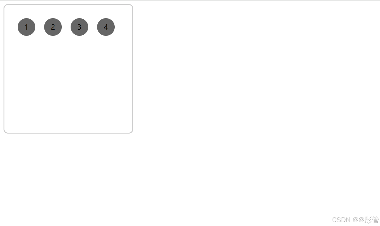
flex-direction修改排列方式
flex-direction 属性指定了弹性子元素在父容器中的位置
| 属性值 | 描述 |
| row | 行,水平(默认) |
| row-reverse | 行,从右向左 |
| column | 列,垂直 |
| column-reverse | 列,从下向上 |
示例():
row-reverse
<!DOCTYPE html>
<html lang="en">
<head>
  <meta charset="UTF-8">
  <meta name="viewport" content="width=device-width, initial-scale=1.0">
  <title>flex画色子</title>
  <style>

    .box{
      display: flex; /* flex布局 */
      flex-direction: row-reverse; /*修改排列方式*/
      width: 250px;
      height: 250px;
      border: 2px solid #ccc;
      border-radius: 10px;
      padding: 20px;

    }
    .item{
      /*背景色、大小、边框等*/
      display: block;
      width: 40px;
      height: 40px;
      border-radius: 50%;
      background-color: #666;
      margin:10px;
      text-align: center;
      line-height: 40px;
    }
  </style>
</head>
<body>
  <div class="box">
    <span class="item">1</span>
    <span class="item">2</span>
    <span class="item">3</span>
    <span class="item">4</span>
  </div>
</body>
</html>
column-reverse
<!DOCTYPE html>
<html lang="en">
<head>
  <meta charset="UTF-8">
  <meta name="viewport" content="width=device-width, initial-scale=1.0">
  <title>flex画色子</title>
  <style>

    .box{
      display: flex; /* flex布局 */
      flex-direction: column-reverse; /*修改排列方式*/
      width: 250px;
      height: 250px;
      border: 2px solid #ccc;
      border-radius: 10px;
      padding: 20px;

    }
    .item{
      /*背景色、大小、边框等*/
      display: block;
      width: 40px;
      height: 40px;
      border-radius: 50%;
      background-color: #666;
      margin:10px;
      text-align: center;
      line-height: 40px;
    }
  </style>
</head>
<body>
  <div class="box">
    <span class="item">1</span>
    <span class="item">2</span>
    <span class="item">3</span>
    <span class="item">4</span>
  </div>
</body>
</html>
justify-content属性
内容对齐(justify-content)属性应用在弹性容器上,把弹性项沿着弹性容器的主轴线(main axis)对齐。
| 属性值 | 描述 |
| flex-start | 弹性子元素向行头紧挨着填充。这个是默认值。第一个弹性子元素的main-start外边距边线被放置在该行的main-start边线,而后续弹性元素依次平齐摆放 |
| flex-end | 弹性子元素向行尾紧挨着填充。第一个弹性子元素的main-end外边距边线被放置在该行的main-end边线,而后续弹性元素依次平齐摆放 |
| center | 弹性子元素居中紧挨着填充。(如果剩余的自由空间是负的,则弹性子元素将在两个方向上同时溢出) |
| space-between | 弹性子元素平均分布在该行上。如果剩余空间为负或者只有一个弹性元素,则该值等同于flex-start。否则,第1个弹性元素的外边距和行的main-start边线对齐,而最后1个弹性项的外边距和行的main-end边线对齐,然后剩余的弹性项分布在该行上,相邻项目的间隔相等 |
| space-around | 弹性子元素平均分布在该行上,两边留有一半的间隔空间。如果剩余空间为负或者只有一个弹性元素,则该值等同于center。否则,弹性项目沿该行分布,且彼此间隔相等(比如是20px),同时首尾两边和弹性容器之间留有一半的间隔(1/2*20px=10px) |
<!DOCTYPE html>
<html lang="en">
<head>
  <meta charset="UTF-8">
  <meta name="viewport" content="width=device-width, initial-scale=1.0">
  <title>justify-content</title>
  <style>

    div{
      display: flex;
      width: 100%;
      height: 70px;
      background-color: #CCC;
    }
    span{
     display: block;
     width: 50px;
     height: 50px;
     margin: 10px;
     background: grey ;
    }
    .box1{
      justify-content: flex-start;
    }

    .box2{
      justify-content: flex-end;
    }

    .box3{
      justify-content: center;
    }

    .box4{
      justify-content: space-between;
    }

    .box5{
      justify-content: space-around;
    }

  </style>
</head>
<body>
  <p>flex-start:</p>
  <div class="box1">
    <span class="item1">1</span>
    <span class="item1">2</span>
    <span class="item1">3</span>
    <span class="item1">4</span>
  </div>
  <p>flex-end:</p>
  <div class="box2">
    <span class="item2">1</span>
    <span class="item2">2</span>
    <span class="item2">3</span>
    <span class="item2">4</span>
  </div>
  <p>center:</p>
  <div class="box3">
    <span class="item3">1</span>
    <span class="item3">2</span>
    <span class="item3">3</span>
    <span class="item3">4</span>
  </div>
  <p>space-between:</p>
  <div class="box5">
    <span class="item4">1</span>
    <span class="item4">2</span>
    <span class="item4">3</span>
    <span class="item4">4</span>
  </div>
  <p>space-around:</p>
  <div class="box5">
    <span class="item5">1</span>
    <span class="item5">2</span>
    <span class="item5">3</span>
    <span class="item5">4</span>
  </div>
</body>
</html>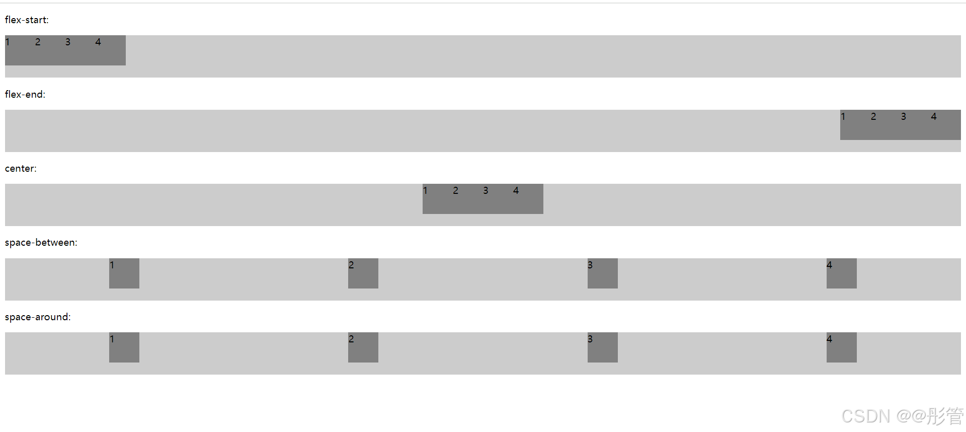
align-items属性
aligin-items设置或检索弹性盒子子元素在侧轴(纵轴)方向上的对齐方式。
| 属性值 | 描述 |
| flex-start | |
| flex-end | |
| center | |
| baseline | |
| stretch |
<!DOCTYPE html>
<html lang="en">
<head>
  <meta charset="UTF-8">
  <meta name="viewport" content="width=device-width, initial-scale=1.0">
  <title>justify-content</title>
  <style>

    div{
      display: flex;
      width: 100%;
      height: 100px;
      background-color: #CCC;
    }
    span{
     display: block;
     width: 50px;
     height: 50px;
     margin: 5px;
     background: grey ;
    }
    .box1{
      align-items: flex-start;
    }

    .box2{
      align-items: flex-end;
    }

    .box3{
      align-items: center;
    }

    .box4{
      align-items: baseline;
    }

    .box5{
      align-items: stretch;
    }

  </style>
</head>
<body>
  <p>flex-start:</p>
  <div class="box1">
    <span class="item1">1</span>
    <span class="item1">2</span>
    <span class="item1">3</span>
    <span class="item1">4</span>
  </div>
  <p>flex-end:</p>
  <div class="box2">
    <span class="item2">1</span>
    <span class="item2">2</span>
    <span class="item2">3</span>
    <span class="item2">4</span>
  </div>
  <p>center:</p>
  <div class="box3">
    <span class="item3">1</span>
    <span class="item3">2</span>
    <span class="item3">3</span>
    <span class="item3">4</span>
  </div>
  <p>baseline:</p>
  <div class="box5">
    <span class="item4">1</span>
    <span class="item4">2</span>
    <span class="item4">3</span>
    <span class="item4">4</span>
  </div>
  <p>stretch:</p>
  <div class="box5">
    <span class="item5">1</span>
    <span class="item5">2</span>
    <span class="item5">3</span>
    <span class="item5">4</span>
  </div>
</body>
</html>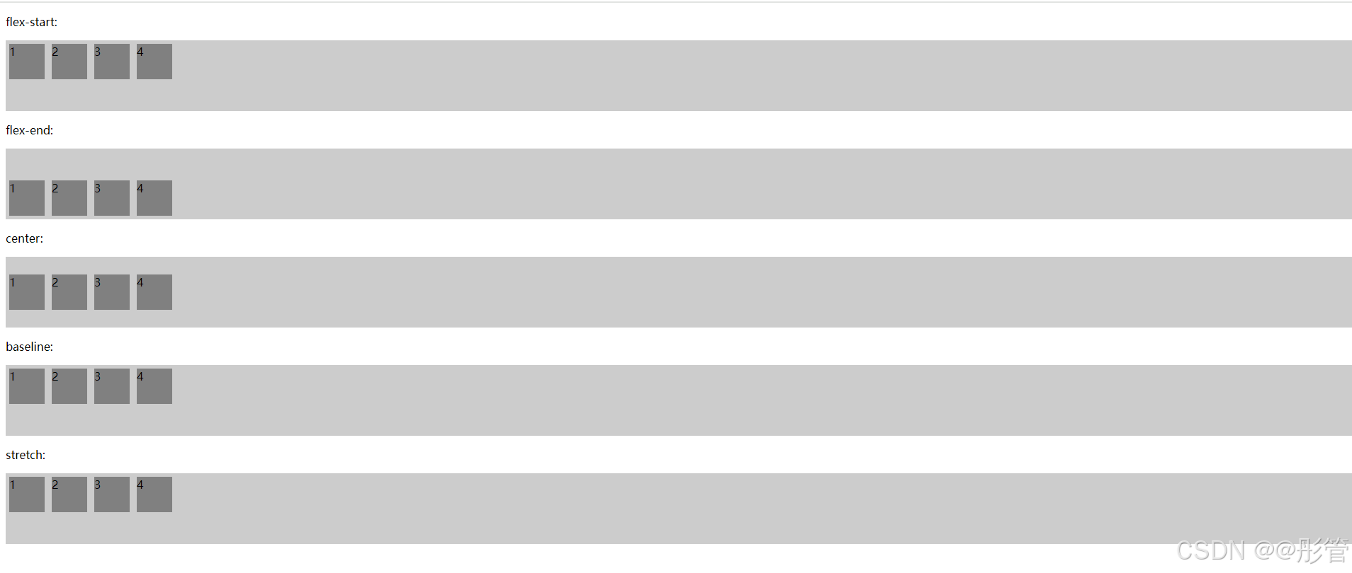
flex-wrap属性
align-content属性
弹性子元素属性
order
align-self
flex设置弹性盒子的子元素如何分配空间。


 扫一扫
扫一扫


 1069
1069

 被折叠的 条评论
为什么被折叠?
被折叠的 条评论
为什么被折叠?
 到【灌水乐园】发言


