


 本文介绍了一个基于uView框架自定义的Confirm组件实现过程。该组件提供了弹窗确认功能,支持自定义标题、内容及按钮文字等属性,并通过实例演示了如何在父组件中调用此组件。
如题需要使用一个confirm但是uView 1.x没有,只能自己封装一个了。
confirm 组件
<template>
	<view class="Confirm">
		<!-- 弹出层提示框 -->
		<u-popup :mask-close-able="false" :width="width" v-model="isShow" :mode="mode" border-radius="30">
			<view class="pop-box">
				<view class="title">
					{{title}}
				</view>
				<view class="content">
					{{content}}
				</view>
				<view class="bottom-Bnts">
					<button v-if="showClose" @click="ClickEvent('cancle')" hover-class="_active-hover" :plain="true"
						class="close-btn btns-item  ">
						{{closeText}}
					</button>
					<button v-if="showSumbit" @click="ClickEvent('sumbit')" hover-class="_active-hover" :plain="true"
						class="sumbit-btn btns-item">
						{{sumbitText}}
					</button>
				</view>
			</view>
		</u-popup>
	</view>
</template>

<script>
	export default {
		props: {
			//是否显示弹出层
			width: {
				type: String, //宽度大小rpx
				default: '600'
			},
			mode: {
				type: String,
				default: 'center', //默认中间弹出
			},
			borderRadius: {
				type: Number || String,
				default: 16, //默认16圆角边框
			},
			sumbitText: {
				type: String,
				default: '确定'
			},
			closeText: {
				type: String,
				default: '取消'
			},
			showClose:{
				type:Boolean,
				default:true
			}, //是否显示取消按钮
			showSumbit:{
				type:Boolean,
				default:true,
				//是否显示确认按钮
			}
		},
		data() {
			return {
				data: '', //数据
				isShow: false, //是否显示弹出层
				content: '', //内容
				title: '', //标题
			}
		},
		methods: {
			ClickEvent(type) {
				this.isShow = false;
				this.data.callback(type);
			},
			open(data) {
				this.title = data.title || '标题';
				this.content = data.content || '内容';
				this.data = data;
				this.isShow = true;
			},
		}
	}
</script>

<style lang="scss">
	.Confirm {

		//pop弹出层
		.pop-box {
			.title {
				padding: 20rpx;
				font-size: 34rpx;
				font-weight: bold;
				width: 100%;
				display: flex;
				justify-content: center;
				align-items: center;
			}

			.content {
				display: flex;
				flex-wrap: wrap;
				font-size: 26rpx;
				justify-content: center;
				align-items: center;
				padding: 50rpx;
				padding-top: 20rpx;
				padding-bottom: 20rpx;
				color: #666666;
				font-weight: 400;
				text-align: center;
				letter-spacing: 3rpx;
			}

			.line-block {
				width: 100%;
				height: 1rpx;
				background-color: #eee;
				margin: 30rpx 0;
			}

			.close-btn {
				border: 0;
				font-size: 28rpx;
				padding-bottom: 20rpx;
				color: #000;
				font-weight: 500;
				line-height: 1;
			}

			.sumbit-btn {
				border: 0;
				font-size: 28rpx;
				padding-bottom: 20rpx;
				color: red;
				font-weight: 500;
				line-height: 1;
				border-left: 1px solid #fff;
				border-radius: 0;
			}

			.bottom-Bnts {
				display: flex;
				margin-top: 20rpx;
				border-top: 1rpx solid #eee;
				width: 100%;
				background-color: #Fff;
				justify-content: space-around;
				align-items: center;

				.btns-item {
					width: 50%;
					padding: 30rpx;
					border-radius: 0;
					font-size: 30rpx;
					font-weight: 500;
				}

				.one-btn-click {
					border: 0;
					font-size: 28rpx;
					padding-bottom: 20rpx;
					font-weight: 500;
					line-height: 1;
					color: #2585FD;
				}

				.sumbit-btn {
					border-left: 1rpx solid #eee;
				}
			}
		}

	}
</style>
父组件
import Confirm from '../Common/PoP/Confirm.vue'
<!-- 确认框 -->
<Confirm ref="Confirm"></Confirm>
components: {
Confirm
},
使用 - >
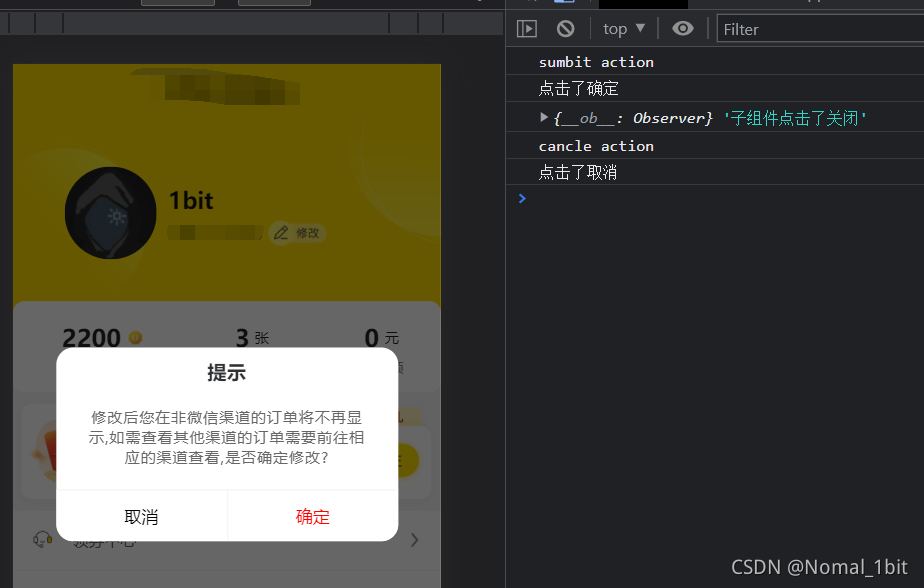
this.$refs["Confirm"].open({
title: "提示",
content: "修改后您在非微信渠道的订单将不再显示,如需查看其他渠道的订单需要前往相应的渠道查看,是否确定修改?",
callback: (action) => {
console.log(action, 'action');
if (action == 'sumbit') {
console.log('点击了确定');
this.ShowBindPhone = true;
} else {
console.log('点击了取消')
}
}
});


 扫一扫
扫一扫


 3577
3577

 被折叠的 条评论
为什么被折叠?
被折叠的 条评论
为什么被折叠?
 到【灌水乐园】发言


