


 文章展示了如何在Vue.js中创建一个自定义表格组件,包括数据绑定、多级表头、行选择、分页功能以及各种事件监听器(如行点击、多选变化等)。组件接受props来配置表格样式和行为,并能处理复杂的数据结构。
表格源文件
index.vue
<template>
  <div class="my-table">
    <el-table ref="multilevelTable" :data="rows" :row-class-name="rowClassName" :row-style="rowStyle" border stripe
      :height="height" :max-height="tableHeight" @selection-change="onSelectionChange" @row-click="onRowClick"
      @row-dblclick="onRowDblclick" @current-change="onCurrentChange">
      <el-table-column type="selection" v-if="selectionShow" width="50" align="center" fixed="left" />
      <el-table-column type="index" v-if="indexShow" :width="indexWidth" align="center" fixed="left" label="序号" />
      <table-column v-for="(item, index) in headerTitle" :key="index" :headerTitle="item"></table-column>
    </el-table>
    <pagination v-if="paginationShow" :total="totalPage" :page.sync="filter.pageNum" :limit.sync="filter.pageSize"
      @pagination="onPagination" />
  </div>
</template>

<script>
  import TableColumn from "./tableColumn";
  export default {
    components: {
      TableColumn,
    },
    props: {
      headerTitle: {
        type: Array | Object,
        default () {
          return [];
        }
      },
      data: {
        type: Object,
        default () {
          return {};
        }
      },
      indexWidth: {
        type: Number,
        default: 50
      },
      height: [String, Number],
      filter: { // 过滤条件
        type: Object,
        default () {
          return {};
        }
      },
      paginationShow: { // 分页器展示
        type: Boolean,
        default: true,
      },
      selectionShow: { // 复选框展示
        type: Boolean,
        default: true,
      },
      indexShow: { // 序号列展示
        type: Boolean,
        default: true,
      },
      rowClassName: [String, Function],
      rowStyle: [Object, Function],
    },
    computed: {
      rows() {
        if (!this.data) {
          return [];
        }
        return this.data.rows || [];
      },
      totalPage() {
        if (!this.data) {
          return 0;
        }
        return this.data.total || 0;
      },
      tableHeight() {
        let recordNum = 10; // 分页大小
        if (this.maxHeight) {
          return this.maxHeight;
        }
        if (this.headerFixed && this.data && this.data.rows && this.data.rows.length > recordNum) {
          let scrollBarHeight = 18;
          let ivuTableSmallThHeight = 40; // small size 下的table表头单元格高度
          let ivuTableSmallTdHeight = 40; // small size 下的table表体单元格高度
          return ivuTableSmallThHeight + ivuTableSmallTdHeight * recordNum + scrollBarHeight;
        }
        return null;
      }
    },
    methods: {
      /**
       * 表格行多选事件
       * @param selection
       */
      onSelectionChange(selection) {
        this.$emit("selection-change", selection);
      },

      /**
       * 当某一行被点击时会触发该事件
       * @param row
       * @param column
       * @param event
       */
      onRowClick(row, column, event) {
        if (this.showRadio) {
          //赋值给radio
          this.stdGroupRadio = this.rows.indexOf(row);
        }
        if (this.showCheck) {
          //赋值给checked
          this.getTableRef().toggleRowSelection(row);
        }
        this.$emit("row-click", row, column, event);
      },

      /**
       * 当某一行被点击时会触发该事件
       * @param row
       * @param column
       * @param event
       */
      onRowDblclick(row, column, event) {
        this.$emit("row-dblclick", row, column, event);
      },

      /**
       * 当表格的当前行发生变化的时候会触发该事件,如果要高亮当前行,请打开表格的 highlight-current-row 属性
       * @param currentRow
       * @param oldCurrentRow
       */
      onCurrentChange(currentRow, oldCurrentRow) {
        this.$emit("current-change", currentRow, oldCurrentRow);
      },

      /**
       * 分页参数变更事件
       */
      onPagination() {
        this.$emit('pagination', arguments);
      },
    },
  };

</script>
单行源文件
<template>
  <el-table-column :prop="headerTitle.prop" :label="headerTitle.label" :fixed="headerTitle.fixed"
    :width="headerTitle.width" align="center">
    <template v-if="headerTitle.children">
      <table-column v-for="(item, index) in headerTitle.children" :key="index" :headerTitle="item">
      </table-column>
    </template>
  </el-table-column>
</template>

<script>
  export default {
    name: "TableColumn",
    props: {
      headerTitle: {
        type: Array | Object,
      },
    },
  };

</script>
<style scoped>
</style>
使用时
先引用
import MultilevelTable from "@/components/multilevelTable";
再注册
components: { MultilevelTable }
就可以用啦
<multilevel-table
    :headerTitle="planStartDetailHeader"
    :data="planStartDetailData"
    :filter="planStartConPO"
    @selection-change="planStartSelectionChange"
    @pagination="pagePlanStartDetail">
</multilevel-table>
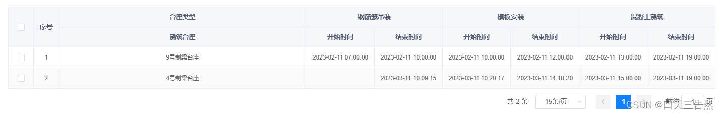
表头格式如下
[
    {
        "children": [
            {
                "prop": "toolPedestalType0",
                "fixed": "left",
                "label": "浇筑台座"
            }
        ],
        "label": "台座类型"
    },
    {
        "children": [
            {
                "prop": "startDate0",
                "width": "135",
                "label": "开始时间"
            },
            {
                "prop": "endDate0",
                "width": "135",
                "label": "结束时间"
            }
        ],
        "label": "钢筋笼吊装"
    },
    {
        "children": [
            {
                "prop": "startDate1",
                "width": "135",
                "label": "开始时间"
            },
            {
                "prop": "endDate1",
                "width": "135",
                "label": "结束时间"
            }
        ],
        "label": "模板安装"
    },
    {
        "children": [
            {
                "prop": "startDate2",
                "width": "135",
                "label": "开始时间"
            },
            {
                "prop": "endDate2",
                "width": "135",
                "label": "结束时间"
            }
        ],
        "label": "混凝土浇筑"
    }
]
表格内容如下
{
    "total": 2,
    "rows": [
        {
            "tempComponentId": "100",
            "componentId": "1630395483321143372",
            "endDate0": "2023-02-11 10:00:00",
            "startDate2": "2023-02-11 13:00:00",
            "startDate0": "2023-02-11 07:00:00",
            "toolPedestalType0": "9号制梁台座",
            "startDate1": "2023-02-11 10:00:00",
            "endDate1": "2023-02-11 12:00:00",
            "endDate2": "2023-02-11 19:00:00"
        },
        {
            "tempComponentId": "102",
            "componentId": "1630395483312754688",
            "endDate0": "2023-03-11 10:09:15",
            "startDate2": "2023-03-11 15:00:00",
            "toolPedestalType0": "4号制梁台座",
            "startDate1": "2023-03-11 10:20:17",
            "endDate1": "2023-03-11 14:18:20",
            "endDate2": "2023-03-11 19:00:00"
        }
    ],
    "code": 200,
    "msg": "查询成功"
}
表格内容data为一个对象,自动定位到rows,可自行修改
字段名一一对应,就可以了
效果如图


 扫一扫
扫一扫


 660
660


 到【灌水乐园】发言


