


HTML小案例-CSS3实现旋转太极图
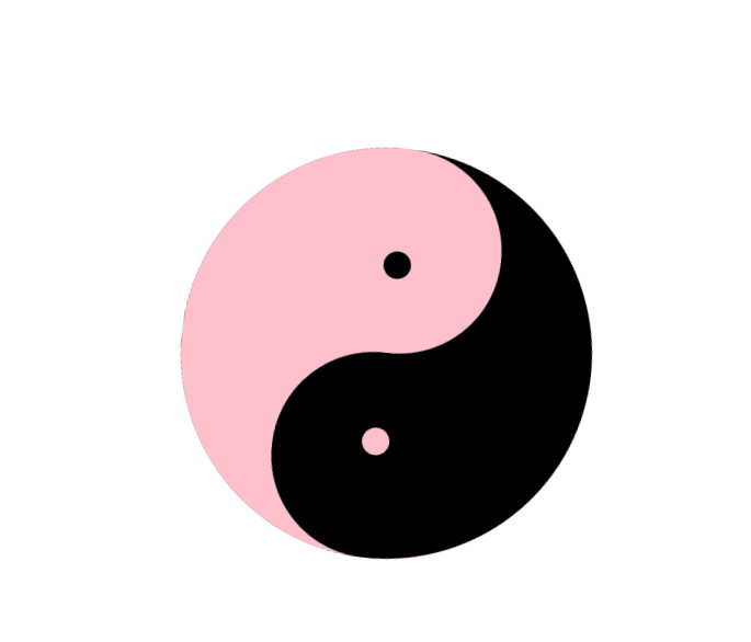
话不多说,先看效果
** 以下为源代码 **
<!doctype html>
<html lang="zh-cn">
<head>
  <meta charset="UTF-8">
  <meta name="viewport"
        content="width=device-width, user-scalable=no, initial-scale=1.0, maximum-scale=1.0, minimum-scale=1.0">
  <meta http-equiv="X-UA-Compatible" content="ie=edge">
  <title>CSS3实现旋转太极图</title>
  <style type="text/css">
    * {margin: 0; padding: 0}
    .circlebox {
      width: 300px;
      height: 300px;
      margin: 200px auto;
      position:relative;
      /* 动画设置为匀速 无限循环*/
      animation: move 3s linear infinite;
    }
    .circleblack {
      width: 300px;
      height: 300px;
      background: black;
      border-radius: 50%;
    }
    .circlewhite {
      width: 150px;
      height: 300px;
      background: pink;
      /* 将此矩形的右上角和右下角去掉 */
      border-top-right-radius: 150px;
      border-bottom-right-radius: 150px;
      position: absolute;
      top: 0;
      right: 0;
    }
    .circlebb {
      width: 150px;
      height: 150px;
      background: black;
      border-radius: 50%;
      position: absolute;
      top: 0;
      left: 75px;
    }
    .circleww {
      width: 150px;
      height: 150px;
      background: pink;
      border-radius: 50%;
      position: absolute;
      bottom: 0;
      right: 75px;
    }
    .circlebbl {
      width: 20px;
      height: 20px;
      background: black;
      border-radius: 50%;
      position: absolute;
      bottom: 75px;
      left: 140px;
    }
    .circlewwl {
      width: 20px;
      height: 20px;
      background: pink;
      border-radius: 50%;
      position: absolute;
      top: 75px;
      right: 140px;
    }
    @keyframes move {
      from {
        transform: rotate(0deg);
      }
      to {
        transform: rotate(360deg);
      }
    }
  </style>
</head>
<body>
<div class="circlebox">
  <!--    黑色大圆-->
  <div class="circleblack"></div>
  <!--    粉色半圆-->
  <div class="circlewhite"></div>
  <!--    黑色小圆-->
  <div class="circlebb"></div>
  <!--    粉色小圆-->
  <div class="circleww"></div>
  <!--    黑色小小圆-->
  <div class="circlebbl"></div>
  <!--    粉色小小圆-->
  <div class="circlewwl"></div>
</div>
</body>
</html>


 扫一扫
扫一扫


 199
199

 被折叠的 条评论
为什么被折叠?
被折叠的 条评论
为什么被折叠?
 到【灌水乐园】发言


