


一、简介:
1.CSS作用:
用于html文档中的元素样式的定义,美化页面。
2.CSS语法:
css规则由两个主要的部分构成:选择器,以及一条或多条声明(样式)
例子: h1{color:blue;font-size:12px;}
h1为选择器,color,font-size为属性,blue,12px为值
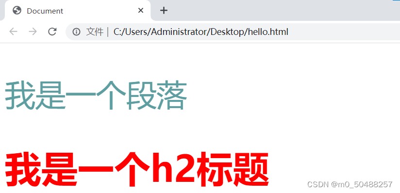
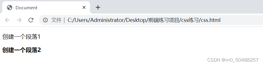
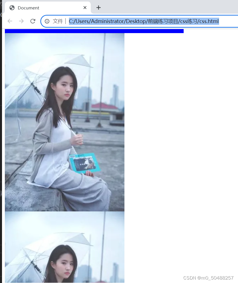
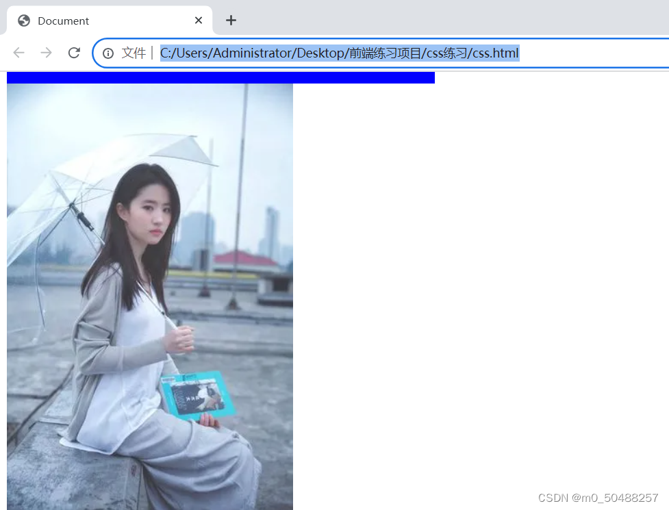
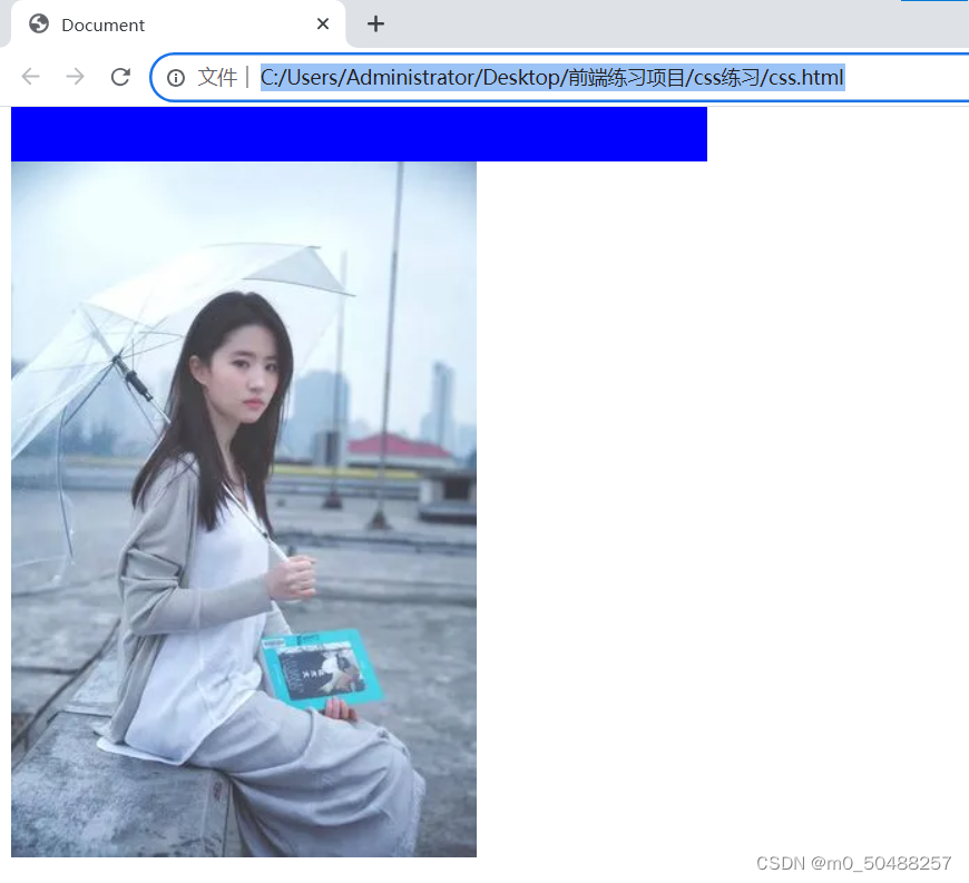
3.练习
</head>
<style>
p{color: cadetblue;
font-size: 50px;}
h2{color: red;
font-size: 60px;}
</style>
<body>
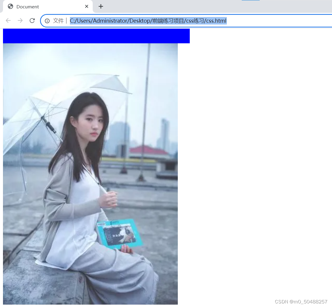
<p>我是一个段落</p>
<h2>我是一个h2标题</h2>
</body>样式展示
二、CSS引入方式
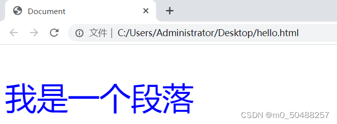
1.内联样式(在标签中加入style属性)
代码展示
<p style="color: blue ;font-size: 50px;">我是一个段落</p>样式展示
2.内部样式
修改整个文档的相同标签
</head>
<style>
  p{color: cadetblue;
  font-size: 50px;}

  h2{color: red;
  font-size: 60px;}
</style>
<body>

<p>我是一个段落</p>

<h2>我是一个h2标题</h2>
</body>
样式展示
3.外部样式
当样式需要应用于很多页面时,选用外部时最方便的选择,在使用外部样式的情况下,可以通过改变一个文件来改变整个站点的外观,每个页面使用<link>标签连接到样式表,<link>标签放在放荡的头部。
练习:
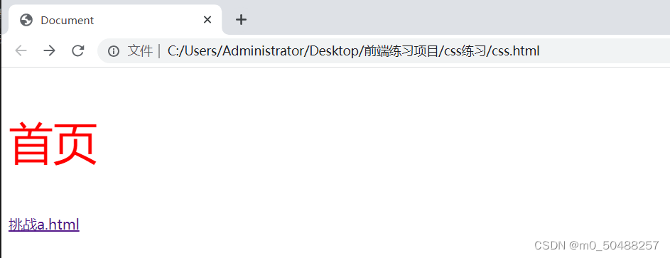
创建三个文件,css.htm、a.html、public.css文件,在css.html文件中创建一个p标签和a标签,跳转到a.html文档中,a.html文档中存在一个p便签,在public.css中写入p便签的样式,在a.html和css.html中使用<link rel="stylesheet" href="./public.css">,查看是否样式为css文档的样式。
css.html
<!DOCTYPE html>
<html lang="en">
<head>
    <meta charset="UTF-8">
    <meta http-equiv="X-UA-Compatible" content="IE=edge">
    <meta name="viewport" content="width=device-width, initial-scale=1.0">
    <title>Document</title>
    <link rel="stylesheet" href="./public.css">
</head>
<body>
    <p>首页</p>
    <a href="./a.html">挑战a.html</a>

</body>
</html>
a.html
<!DOCTYPE html>
<html lang="en">
<head>
    <meta charset="UTF-8">
    <meta http-equiv="X-UA-Compatible" content="IE=edge">
    <meta name="viewport" content="width=device-width, initial-scale=1.0">
    <title>Document</title>
    <link rel="stylesheet" href="./public.css">
</head>
<body>
    <p>hello  world</p>

</body>
</html>
public.css
p{color: red;font-size: 50px;}样式展示
跳转后
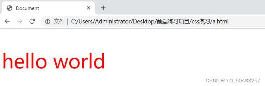
发现所有使用link标签的元素全部修改了样式。
三、选择器
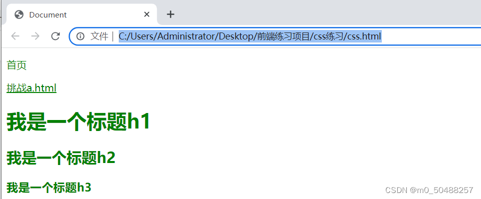
1.通配符(*)选择全部的元素
<!DOCTYPE html>
<html lang="en">
<head>
    <meta charset="UTF-8">
    <meta http-equiv="X-UA-Compatible" content="IE=edge">
    <meta name="viewport" content="width=device-width, initial-scale=1.0">
    <title>Document</title>
    <style>
        *{color: green;
        }
    </style>
</head>
<body>
    <p>首页</p>
    <a href="./a.html">挑战a.html</a>
    <h1>我是一个标题h1</h1>
    <h2>我是一个标题h2</h2>
    <h3>我是一个标题h3</h3>
</body>
</html>
样式展示
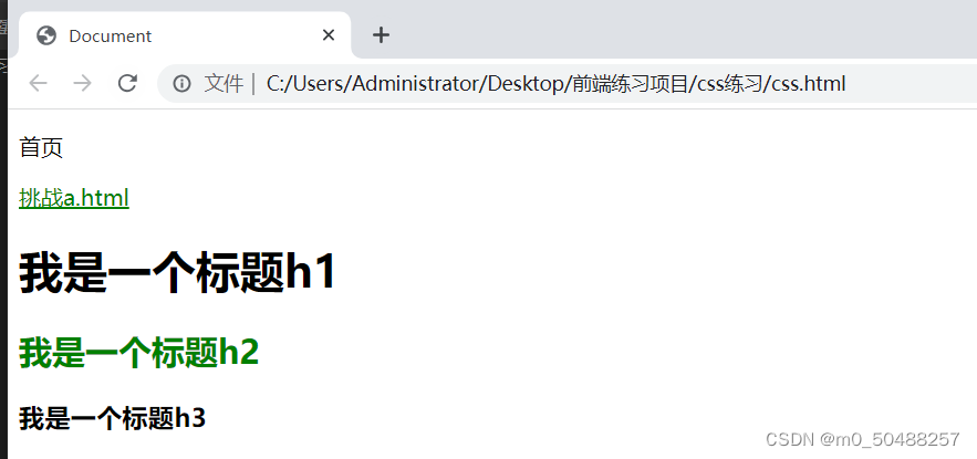
2.类选择器
给html元素添加class属性,创建一个.属性值一致的css样式。
代码展示:
创建了一个.p1的css样式,把a,h2标签添加p1属性。
<!DOCTYPE html>
<html lang="en">
<head>
    <meta charset="UTF-8">
    <meta http-equiv="X-UA-Compatible" content="IE=edge">
    <meta name="viewport" content="width=device-width, initial-scale=1.0">
    <title>Document</title>
    <style>
        .p1{color: green;
        }
    </style>
</head>
<body>
    <p>首页</p>
    <a href="./a.html" class="p1">挑战a.html</a>
    <h1>我是一个标题h1</h1>
    <h2 class="p1">我是一个标题h2</h2>
    <h3>我是一个标题h3</h3>
</body>
</html>
样式展示:
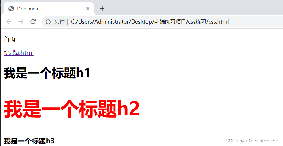
3.ID选择器
只能使用一次,id值不能重复,id不能以数字开头
以#开头
<!DOCTYPE html>
<html lang="en">
<head>
    <meta charset="UTF-8">
    <meta http-equiv="X-UA-Compatible" content="IE=edge">
    <meta name="viewport" content="width=device-width, initial-scale=1.0">
    <title>Document</title>
    <style>
        #hello{color: red;font-size: 50px;}
    </style>
</head>
<body>
    <p>首页</p>
    <a href="./a.html">挑战a.html</a>
    <h1>我是一个标题h1</h1>
    <h2 id="hello">我是一个标题h2</h2>
    <h3 >我是一个标题h3</h3>
</body>
</html>
样式展示:
4.选择器的优先级
css中,权重用数字衡量
元素选择器的权重为:1
class选择器的权重为:10
id选择器的权重为:100
内联样式的权重为:1000
优先级从高到低:行内样式>ID选择器>类选择器>元素选择器
四、字体属性
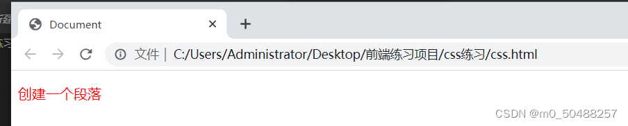
1.css字体颜色属性
十六进制
<!DOCTYPE html>
<html lang="en">
<head>
<meta charset="UTF-8">
<meta http-equiv="X-UA-Compatible" content="IE=edge">
<meta name="viewport" content="width=device-width, initial-scale=1.0">
<title>Document</title>
<style>
p{color: #ff0000; ;}
</style>
</head>
<body>
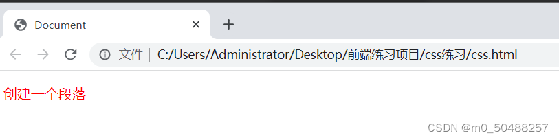
<p>创建一个段落</p>
</body>
</html>样式展示
rgb() #三原色
p{color:rgb(255,0,0);}样式展示
rgba() #比rgb多加了一个透明度
这里不做展示了
2.字体属性设置
font-size 用来设置字体大小
font-size: 15px; font-size:大小像素
bold定义粗体字符
font-weight: bold;
样式展示
bolder定义更粗的字符,比bold更粗一点
font-weight: bolder;
样式展示
lighter定义更细的字符
font-weight: lighter;
样式展示
100-900定义有细到粗,400为默认,700等于bold
font-weight: 700;
样式展示:
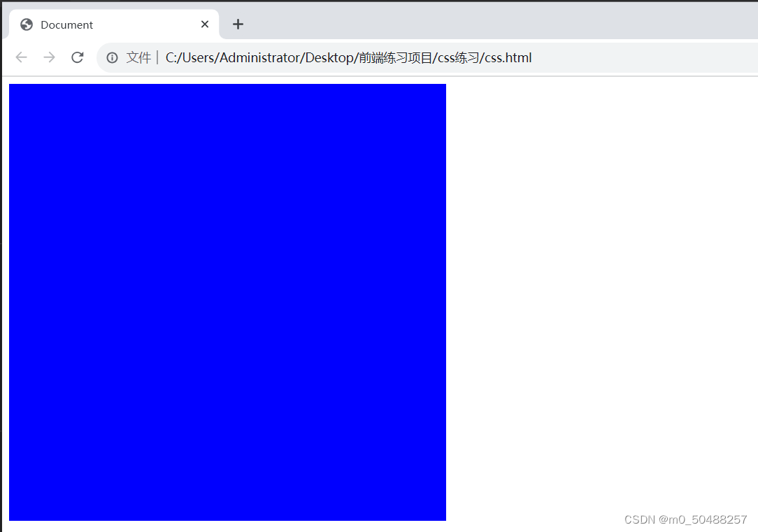
五、背景属性
1.背景颜色 background-color
代码展示
    <style>
        .div1{
            width: 500px;
            height: 500px;
            background-color: blue;
        }

    </style>
</head>
<body>
    <div class="div1"></div>
样式展示:
2.背景图片 background-image
代码展示
   <style>
        .div1{
            width: 500px;
            height: 500px;
            background-color: blue;
        }
        .box1{width: 700px;
        height: 500px;
    background-image: url(1.jpeg);
    }

    </style>
</head>
<body>
    <div class="div1"></div>
    <div class="box1"></div>
样式展示
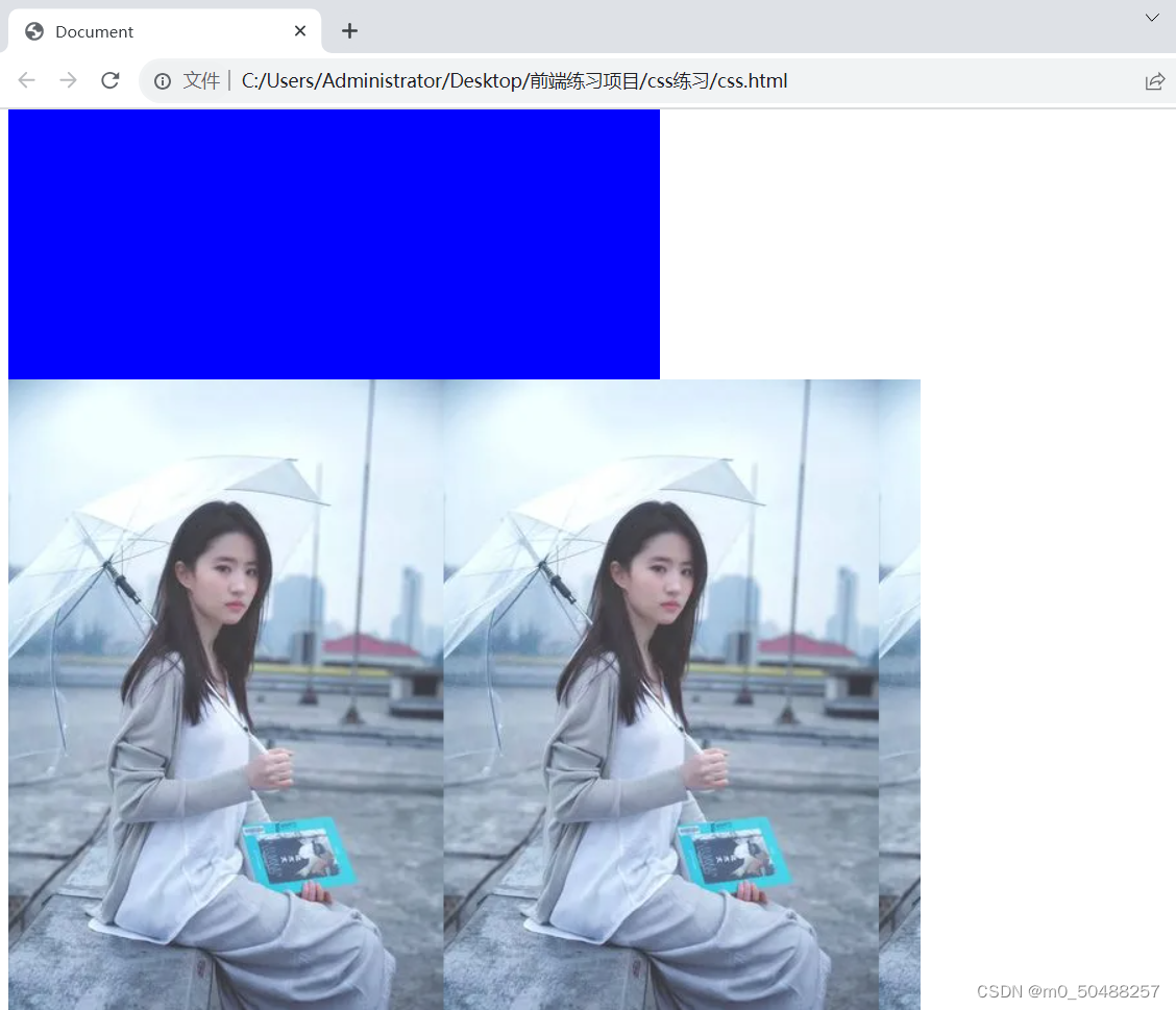
设置的div大小有多余的,图片会重复显示
3.设置平铺方式 background-repeat
平铺方式有三种,repeat-x、repeat-y、no-repeat
代码展示:
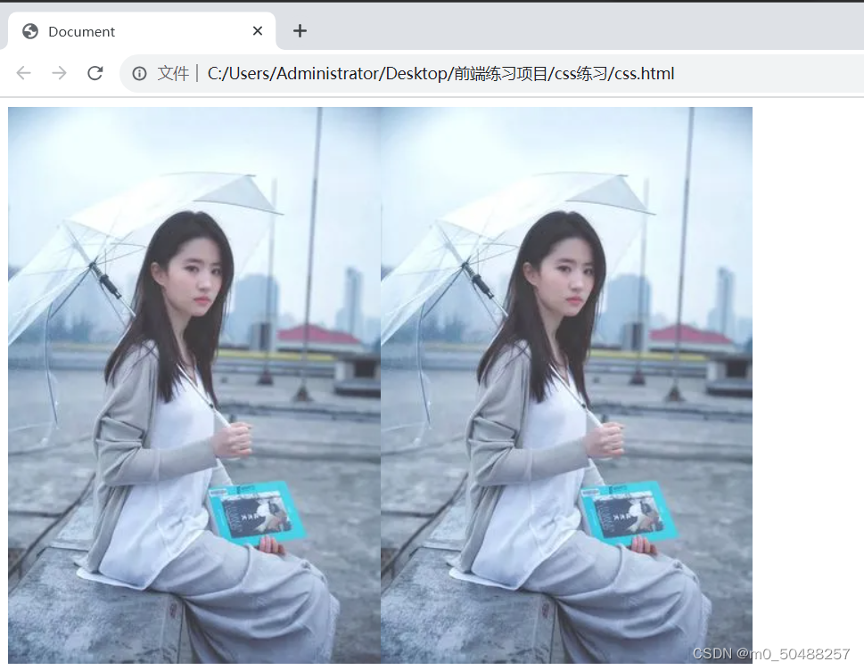
<style>
        .div1{
            width: 500px;
            height: 500px;
            background-color: blue;
        }
        .box1{width: 700px;
        height: 500px;
        background-image: url(1.jpeg);
        background-repeat: no-repeat;
    }

    </style>
</head>
<body>
    <div class="div1"></div>
    <div class="box1"></div>
样式展示
repeat-x 横向平铺
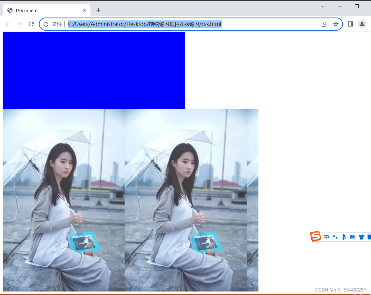
repeat-y 竖向平铺
no-repeat 不平铺,只显示一张图
4.设置图像大小 background-size
设置图片大小常用的方式,auto ,contain,cover 最常用cover
代码展示
    <style>
        .div1{
            width: 500px;
            height: 500px;
            background-color: blue;
        }
        .box1{width: 700px;
        height: 700px;
        background-image: url(1.jpeg);
        background-repeat: no-repeat;
        background-size: auto;
    }

    </style>
</head>
<body>
    <div class="div1"></div>
    <div class="box1"></div>
样式展示
auto
cover 保持纵横比将提箱缩放成完全覆盖背景区域大小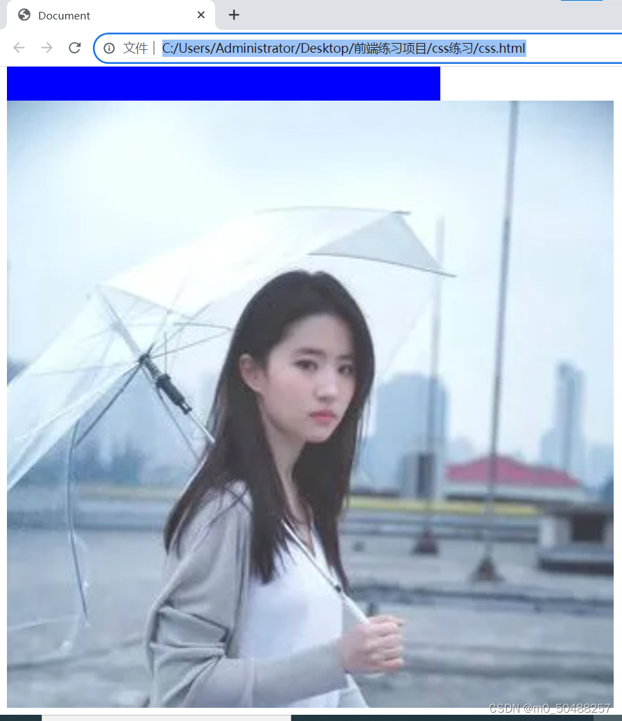
contain 保持纵横比,进图像放在合适的定位区域的最大大小
5.设置图片的位置调整 background-position
top: 背景图片的初始位置为元素顶部
center: 背景图片的起始位置为元素中部
left: 背景图片的起始位置为元素左侧
right: 背景图片的起始位置为元素右侧
bottom: 背景图片的起始位置为元素底部
代码展示
    <style>
        .div1{
            width: 500px;
            height: 500px;
            background-color: blue;
        }
        .box1{width: 700px;
        height: 700px;
        background-image: url(1.jpeg);
        background-repeat: no-repeat;
        background-size:auto;
        background-position: left;
    }

    </style>
</head>
<body>
    <div class="div1"></div>
    <div class="box1"></div>
样式展示
left

center
bottom
六、文本属性
1.文本对齐方式 text-align
常用属性:left 、right,center
代码展示
<style>
.h1{text-align: center;}
</style>
</head>
<body>
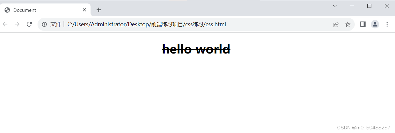
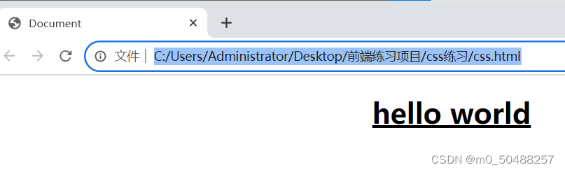
<h1 class="h1">hello world</h1>2.文本修试 text-decoration
常用值:underline 下滑线,overline 上划线,line-through 删除线
代码展示
    <style>
    .h1{text-align: center;
        text-decoration: line-through;}

    </style>
</head>
<body>
    <h1 class="h1">hello world</h1>
样式展示
line-through
underline
overline
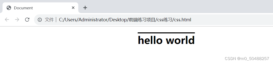
3.控制文本大小写 text-transform
常用的值:capitalize 开头大写、lowercas 小写,lowercas大写
代码展示:
    <style>
    .h1{text-align: center;
        text-decoration: overline;
        text-transform: uppercase;
       }

    </style>
</head>
<body>
    <h1 class="h1">hello world</h1>
样式展示

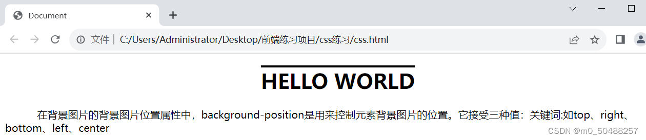
4.首行缩进 text-indent
代码展示:
    <style>
    .h1{text-align: center;
        text-decoration: overline;
        text-transform: uppercase;
       }
    .p1{text-align: left;
    text-indent: 50px;
    }

    </style>
</head>
<body>
    <h1 class="h1">hello world</h1>
    <p class="p1">在背景图片的背景图片位置属性中,background-position是用来控制元素背景图片的位置。它接受三种值:关键词:如top、right、bottom、left、center</p>
</body>
样式展示
七、表格属性
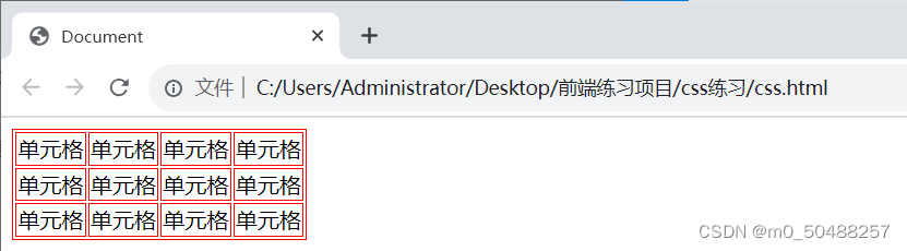
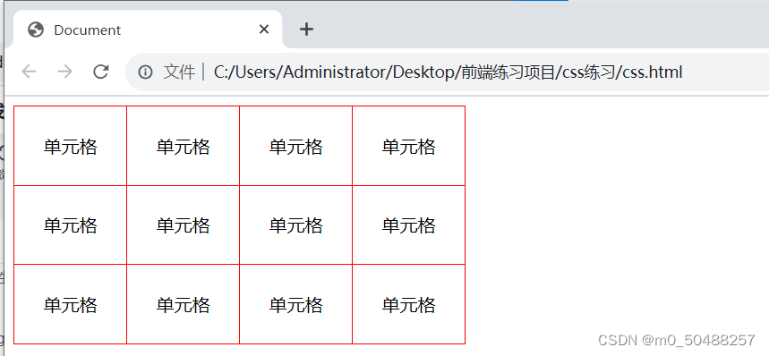
1.外边框 border
值:1.px 边框粗细,solid外边框样式(实线) red 颜色
代码展示
把表外边框和每个单元格添加上外边框
 <style>
    .tab1,td{border: 1px solid red;
    }


    </style>
</head>
<body>

    <table class="tab1">
        <tr>
            <td>单元格</td>
            <td>单元格</td>
            <td>单元格</td>
            <td>单元格</td>
        </tr>
        <tr>
            <td>单元格</td>
            <td>单元格</td>
            <td>单元格</td>
            <td>单元格</td>
        </tr>
        <tr>
            <td>单元格</td>
            <td>单元格</td>
            <td>单元格</td>
            <td>单元格</td>
        </tr>
    </table>

</body>
样式展示
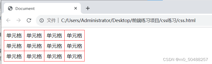
2.折叠边框 border-collapse
值: collapse
可以使用width,height,text-align 来调整单元格大小,字体对齐方式等
代码展示
    <style>
    .tab1,td{border: 1px solid red;
        border-collapse: collapse;
    }
    td{width: 60px;
    height: 30px;
    text-align: center;

}


    </style>
</head>
<body>

    <table class="tab1">
        <tr>
            <td>单元格</td>
            <td>单元格</td>
            <td>单元格</td>
            <td>单元格</td>
        </tr>
        <tr>
            <td>单元格</td>
            <td>单元格</td>
            <td>单元格</td>
            <td>单元格</td>
        </tr>
        <tr>
            <td>单元格</td>
            <td>单元格</td>
            <td>单元格</td>
            <td>单元格</td>
        </tr>
    </table>
样式展示
padding 设置字体到四条边的距离
代码展示
    td{width: 60px;
    height: 30px;
    text-align: center;
    padding: 20px;

}
样式展示
八、关系选择器
1.后代选择器
格式:E F {}
选择所有被E元素包含的F元素,中间用空格隔开
代码展示
    <style>
    ul li{
        color: red;
    }

    </style>
</head>
<body>
<ul>
    <li>列表1</li>
    <li>列表2</li>
    <li>列表3</li>
    <li>列表4</li>
    <div>
        <ol>
            <p>段落1</p>
            <li>列表5</li>
            <li>列表6</li>
        </ol>
    </div>

</ul>
样式展示
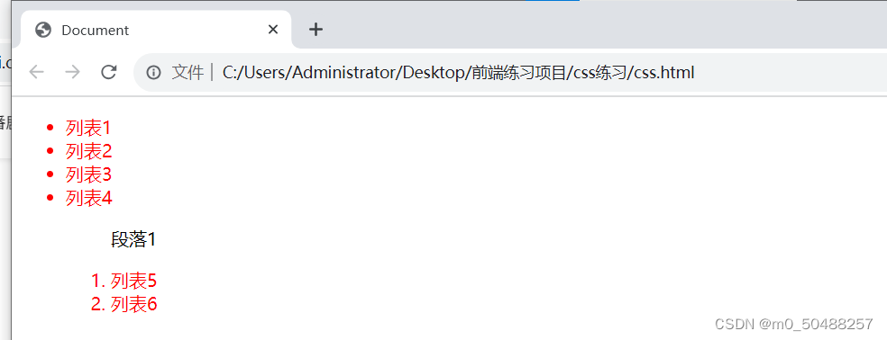
只要是ul 标签后面的li标签都生效
2.子代选择器
使用方法:E>F{}
代码展示
    <style>
    ul>li{
        color: red;
    }

    </style>
</head>
<body>
<ul>
    <li>列表1</li>
    <li>列表2</li>
    <li>列表3</li>
    <li>列表4</li>
    <div>
        <ol>
            <p>段落1</p>
            <li>列表5</li>
            <li>列表6</li>
        </ol>
    </div>

</ul>
样式展示
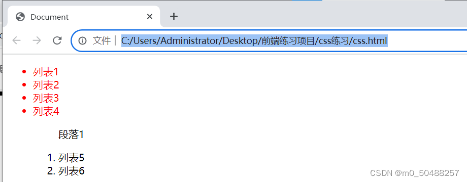
只有ul标签下为li标签css才生效
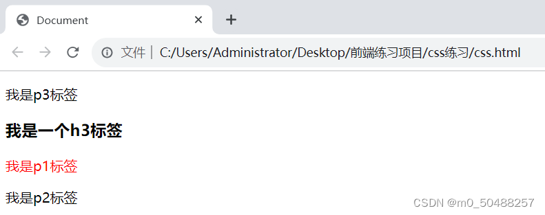
3.相邻兄弟选择器
使用方法:E+F{} 只能向下选择,只选择一个
代码展示
    <style>
    h3+p{color:red;}

    </style>
</head>
<body>

<p>我是p3标签</p>
<h3>我是一个h3标签</h3>
<p>我是p1标签</p>
<p>我是p2标签</p>
样式展示
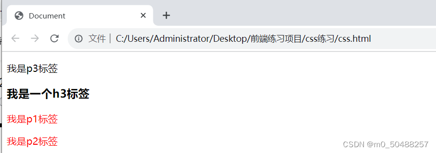
4.通用兄弟选择器
使用方法:E~P{} 向下选择,作用于多个对象
代码展示
    <style>
    h3~p{color:red;}

    </style>
</head>
<body>

<p>我是p3标签</p>
<h3>我是一个h3标签</h3>
<p>我是p1标签</p>
<p>我是p2标签</p>
样式展示
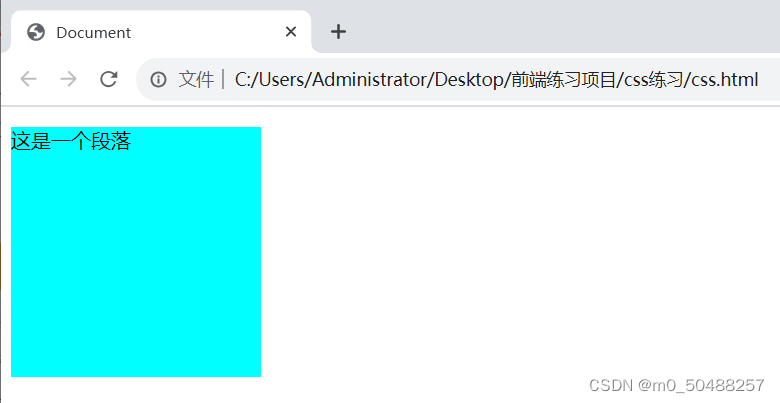
九、CSS盒子模型
页面上的所有元素,包括文本、图像、超级链接、div等,都可以被看作盒子
网页页面布局的过程可以看作在页面空间中摆放盒子的过程。通过调整盒子的边框、边界等参数控制各个盒子,实现对整个网页的布局。
盒模型由内到外依次分为内容(content)、填充(padding)、边框(border)和边界(margin)4部分。
大致如下:

代码展示:
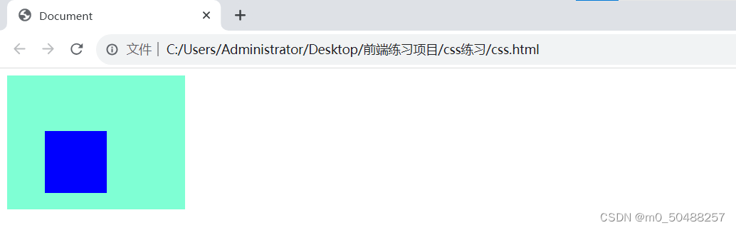
1.内容 content
内容部分写一个div标签,中间包含一个p标签,
    <style>
    div{background-color: aqua;
        width: 200px;
        height: 200px;
    }
    </style>
</head>
<body>

<div>
    <p>这是一个段落</p>

</div>
样式展示
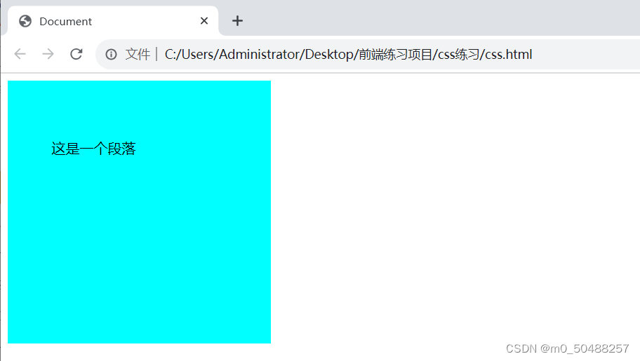
2.内边距 padding
给内容加上内边距,元素内容与其最近一层束缚框的距离,
padding可以指定不同侧边,padding-top、padding-bottom、padding-right、padding-left
代码
    <style>
    div{background-color: aqua;
        padding: 50px;
        width: 200px;
        height: 200px;
    }
    </style>
</head>
<body>

<div>
    <p>这是一个段落</p>

</div>
样式展示
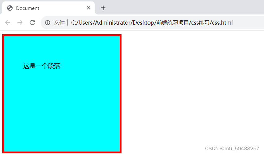
3. 边框 border
外边框的样式,在前面代码上上border属性,5px,实线,红色
dotted 定义点线边框、dashed 定义一个虚线边框、solid 定义一个实线边框,double定义两个边框
代码展示:
    <style>
    div{background-color: aqua;
        padding: 50px;
        border: 5px solid red;
        width: 200px;
        height: 200px;
    }
    </style>
</head>
<body>

<div>
    <p>这是一个段落</p>

</div>
样式展示
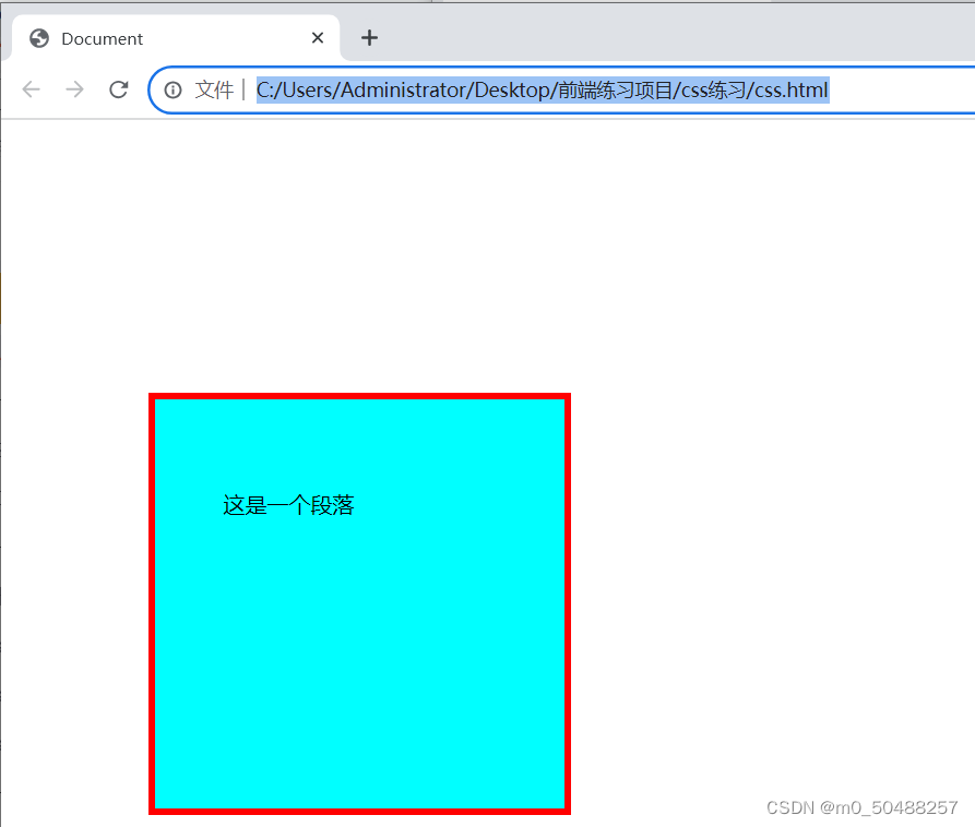
4. margin 边缘部分
margin的作用就是是盒子之间的保持间隙
margin-top、margin-left 、margin-right、margin-bottom
代码展示
    <style>
    div{background-color: aqua;
        padding: 50px;
        border: 5px solid red;
        margin-top: 200px;
        margin-left: 100px;
        width: 200px;
        height: 200px;
    }
    </style>
</head>
<body>

<div>
    <p>这是一个段落</p>

</div>
样式展示
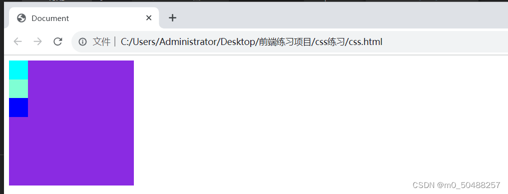
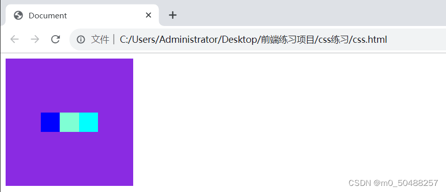
5.弹性盒子模型
css3弹性盒子是一种当页面需要适应不同屏幕大小及设备类型需要确保元素拥有恰当的行为布局方式。
(1).用法:display: flex;
display: flex 开启弹性盒子,属性设置后默认为水平排列
代码展示
    <style>
        .box_max{background-color: blueviolet;
        display: flex;
        width: 200px;
        height: 200px;
        }
        .box_1{background-color: aqua;
        height: 30px;
        width: 30px;}
        .box_2{background-color: aquamarine;
        height: 30px;
        width: 30px;}
        .box_3{background-color: blue;
        width: 30px;
        height: 30px;}
    </style>

</head>
<body>
    <div class="box_max">
        <div class="box_1"></div>
        <div class="box_2"></div>
        <div class="box_3"></div>
    </div>
样式展示
常规
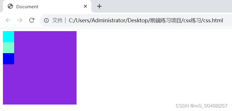
弹性盒子 display: flex
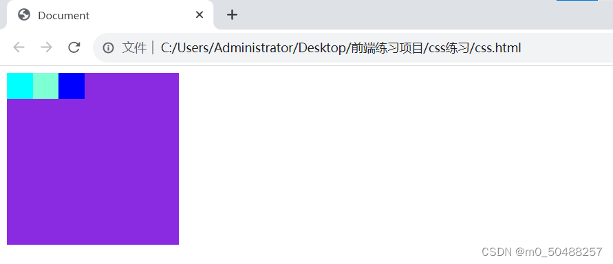 (2).设置排列方式 flex-direction
值:column 竖直排列、column-reverse 竖直排序反,row横向排列,row-reverse横向反过来
column 竖直排列
column-reverse 竖直排序反过来
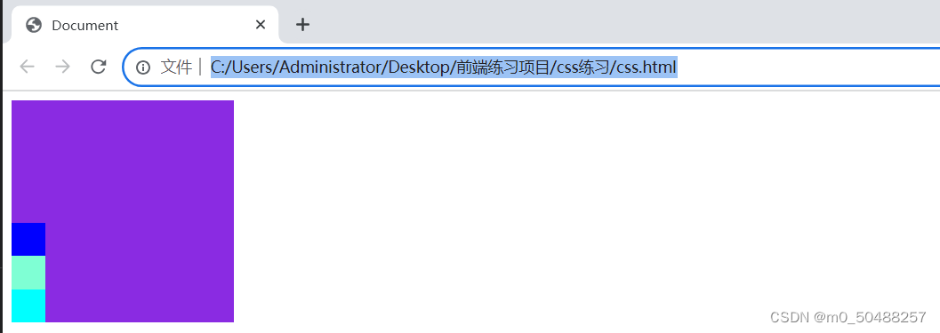
row-reverse横向反过来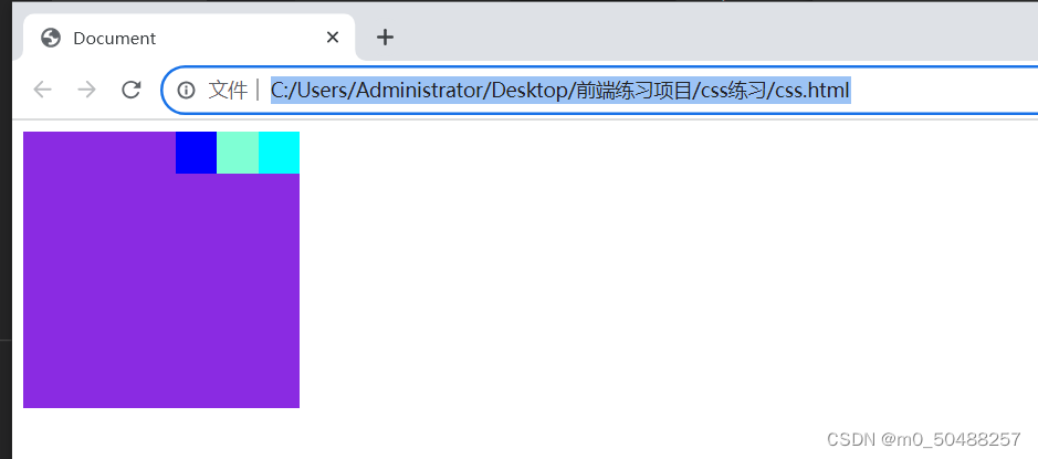
沿容器的主轴线对齐
代码展示:
<style>
        .box_max{background-color: blueviolet;
        display: flex;
        flex-direction: row-reverse;
        justify-content: center;
        width: 200px;
        height: 200px;
        }
        .box_1{background-color: aqua;
        height: 30px;
        width: 30px;}
        .box_2{background-color: aquamarine;
        height: 30px;
        width: 30px;}
        .box_3{background-color: blue;
        width: 30px;
        height: 30px;}
    </style>

</head>
<body>
    <div class="box_max">
        <div class="box_1"></div>
        <div class="box_2"></div>
        <div class="box_3"></div>
    </div>
样式展示
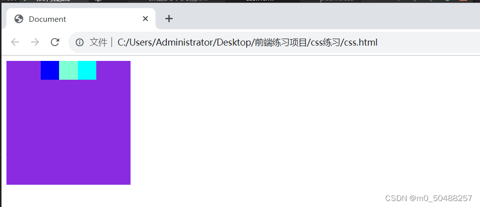
(3).设置或检索弹道盒子元素在侧轴(纵轴)方向上的对齐方式 align-items
值:flex-end 在侧轴(纵轴)的最远处,flex-star 在侧轴(纵轴)的最近一条变,center中间对齐
代码展示
    <style>
        .box_max{background-color: blueviolet;
        display: flex;
        flex-direction: row-reverse;
        justify-content: center;
        align-items: center;
        width: 200px;
        height: 200px;
        }
        .box_1{background-color: aqua;
        height: 30px;
        width: 30px;}
        .box_2{background-color: aquamarine;
        height: 30px;
        width: 30px;}
        .box_3{background-color: blue;
        width: 30px;
        height: 30px;}
    </style>

</head>
<body>
    <div class="box_max">
        <div class="box_1"></div>
        <div class="box_2"></div>
        <div class="box_3"></div>
    </div>
样式展示
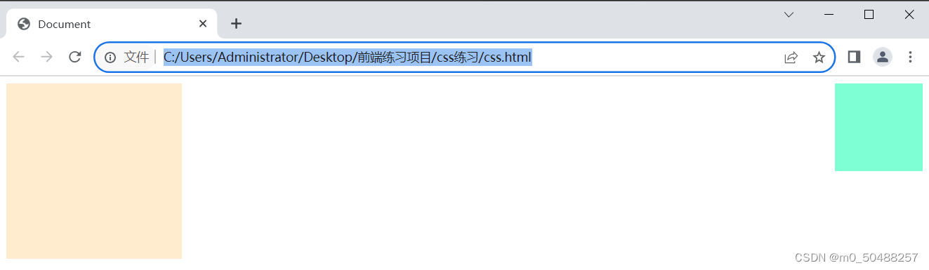
十、文档流
文档流是文档中可显示对象在排列时所占用的位置/空间
脱离文档流:
1.浮动
浮动以后是元素脱离文档流
浮动只有左右浮动没有上下浮动
float属性定义元素在那个方向浮动,任何元素都可以浮动。
left 元素向左浮动
right 元素向右浮动
正常代码
 <style>
    .box1{
        width: 100px;
        height: 100px;
        background-color: aquamarine;
    }
    .box2{
        width: 200px;
        height: 200px;
        background-color: blanchedalmond;
    }
   </style>

</head>
<body>
    <div class="box1"></div>
    <div class="box2"></div>
样式展示
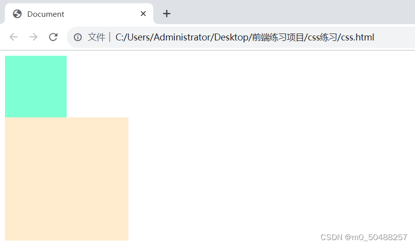
加上float: left
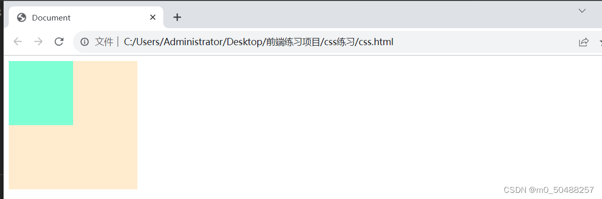
加上float: right
两张图片放置在一起会有空隙,可以使用float,来删除空隙
   <style>
    img{float: left;}
   </style>

</head>
<body>
    <div>
        <img src="1.jpeg" alt="">
        <img src="1.jpeg" alt="">
    </div>
样式展示
正常 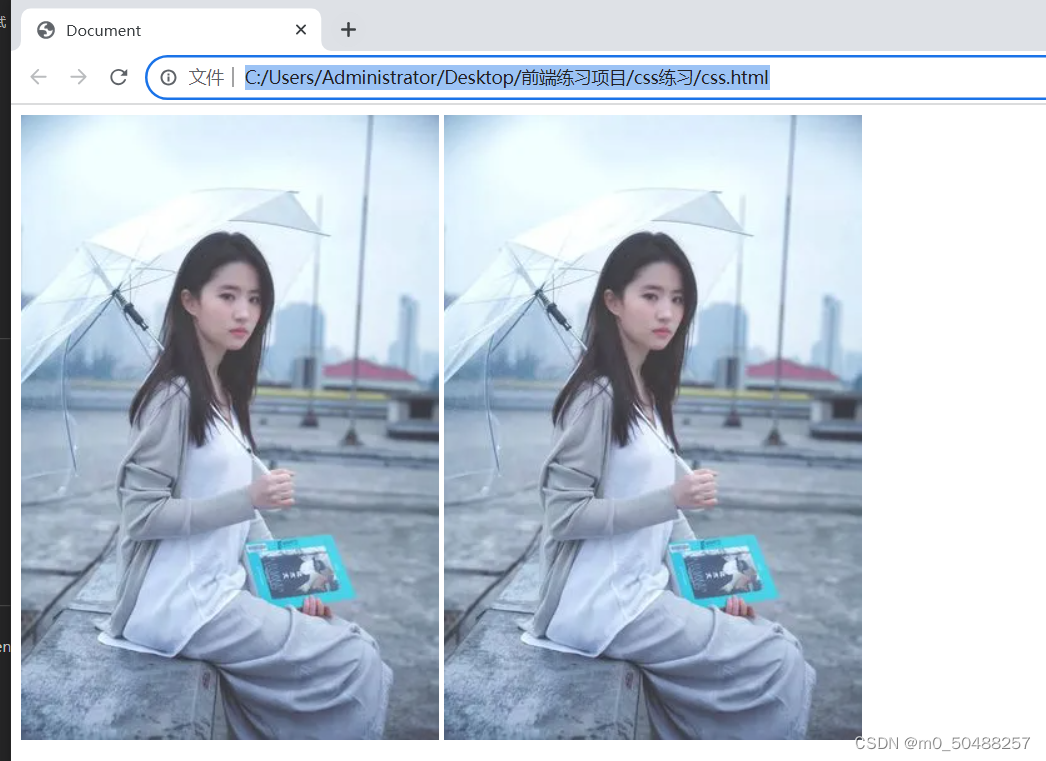
加上浮动属性
2.清除浮动
浮动的原理是让图片脱离文档流,直接浮在画面上。我们一般布局都是只设置宽度不设置高度,让内容来填充高度。但利用浮动后会让原本填充的高度消失,父元素高度为0,后续添加内容布局机会混乱。这时候就可以利用清除浮动来解决父元素高度塌陷的问题。
(1).父元素设置高度
(2).收影响的元素增加clear属性
clear: both;
(3).overflow清除浮动
overflow: hidden;
(3).伪对象方式
3.定位 position
值:relative 相对定位、absolute 绝对定位 、fixed 固定定位 、 static 静态定位
(1).elative 相对定位
相对定位的偏移元素参考的是元素本身,不会使元素脱离文档流,元素的初始位置占据的空间会被保留
代码展示:
    <style>
    .p_box{background-color: aquamarine;
        width: 200px;
        height: 150px;
        }
    .box{background-color: blue;
        width: 70px;
        height: 70px;
        position: relative;
        left: 150px;
        top: 150px;
        }
    </style>
</head>
<body>
    <div class="p_box">
        <div class="box"></div>
    </div>
    <div class="box"></div>
(2).absolute 绝对定位
相对定位的偏移元素参考的是元素本身,不会使元素脱离文档流,元素的初始位置占据的空间会被保留
代码展示
    <style>
    .p_box{background-color: aquamarine;
        width: 200px;
        height: 150px;
        }
    .box{background-color: blue;
        width: 70px;
        height: 70px;
        position: absolute;
        left: 50px;
        top: 70px;
        }
    </style>
</head>
<body>
    <div class="p_box">
        <div class="box"></div>
    </div>
样式展示
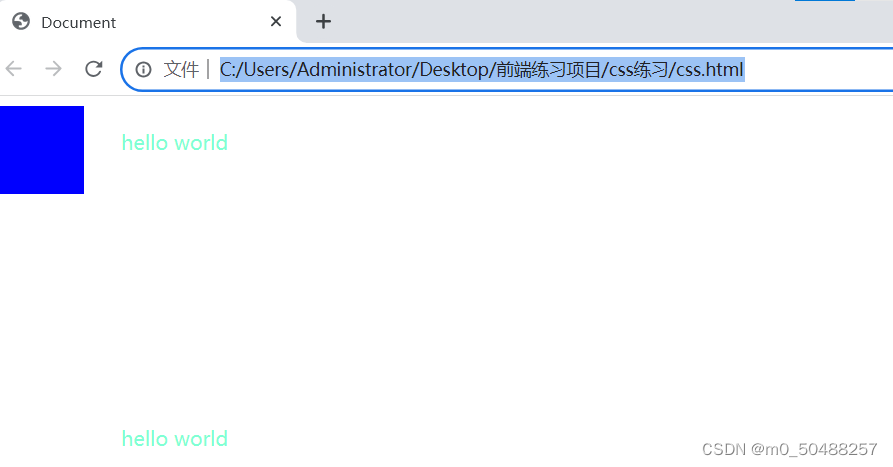
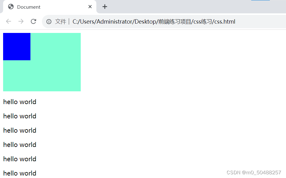
(3).固定定位
固定定位相对于浏览器窗口,脱离文档流,使用fixed的元素不会随窗口的滚动而滚动
代码展示
    <style>
    .p_box{background-color: aquamarine;
        width: 200px;
        height: 150px;
        }
    .box{background-color: blue;
        width: 70px;
        height: 70px;
        position: fixed;
        }

    p{color: aquamarine;
    padding: 100px;
    }
    </style>
</head>
<body>
    <div class="p_box">
        <div class="box"></div>
    </div>
    <div class="box2"> </div>

    <p>hello world</p>
    <p>hello world</p>
    <p>hello world</p>
    <p>hello world</p>
    <p>hello world</p>
    <p>hello world</p>
样式展示
鼠标滑动,蓝色模块不变
(4).静态定位
没有特别的设定,不脱离文档流,遵循基本的定位规定,不能通过z-index进行层次分级
代码展示
    <style>
    .p_box{background-color: aquamarine;
        width: 200px;
        height: 150px;
        }
    .box{background-color: blue;
        width: 70px;
        height: 70px;
        position: static;
        }
    </style>
</head>
<body>
    <div class="p_box">
        <div class="box"></div>
    </div>
样式展示
十一、CSS3新特性
1.圆角 border-radius
(1).一个值四个角相等
(2).第一个值为左上角和右下角,第二个值为右上角和左下角
(3).第一个值为左上角,第二个值为右下角和左下角,第三个值为右下角
(4).第一个值为左上角,第二个值为右上角,第三个值为右下角,第四个值为左下角
正常的div便签显示四边形
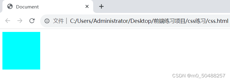
代码展示
    <style>
    div{background-color: aqua;
    width: 100px;
    height: 100px;
    border-radius: 20px;
    }
    </style>
</head>
<body>
    <div></div>
样式展示
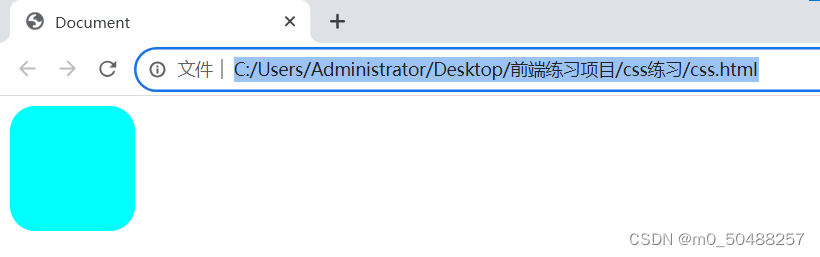
如果想变为圆 border-radius: 100%;
2.阴影效果 jbox-shadow
jbox-shadow: h-shadow v-shadow blur spread color inset;
h-shadow 阴影部分水平偏移。正数向右偏移,负数向左偏移,必须,单位px
v-shadow:阴影的垂直偏移量。正数向下偏移,负数向上偏移。 必需 单位: px
blur:阴影模糊度,不能取负数。 可选 单位: px
spread:阴影大小。正数阴影扩大(阴影大小大于盒子大小),负数阴影缩小(阴影大小小于盒子大小),0阴影与盒子同等大小。 可选 单位: px
color : 表示阴影颜色, 可选,默认为黑色
inset:表示添加内阴影,默认为外阴影。可选


 扫一扫
扫一扫


 538
538

 被折叠的 条评论
为什么被折叠?
被折叠的 条评论
为什么被折叠?
 到【灌水乐园】发言


