


 这篇博客探讨了如何利用SCSS创建一个无缝衔接的背景动画,重点在于解决首尾动画过渡的问题。通过设置`::before`伪元素和`@keyframes`动画,实现了背景颜色的循环滚动效果。文章详细解释了代码实现过程,并提供了关键代码片段,帮助读者理解如何在实际项目中应用此类动画技巧。
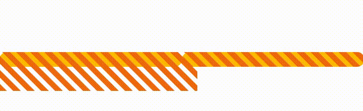
核心难点在于动画的首尾如何衔接上,需要自己尝试计算。
<div class="bar"></div>
<div class="bar overflow"></div>
scss
html,
body {
    width: 100%;
    height: 100%;
    display: flex;
}

.bar {
    position: relative;
    width: 400px;
    height: 30px;
    margin: auto;
    border-radius:20px;
    // border: 1px solid #000;
    background: #ffba01;

    &::before {
        position: absolute;
        content: "";
        top: 0;
        left: 0;
        width: 400px;
        height: 85px;
        background: repeating-linear-gradient(45deg, #f06a0e, #f06a0e
10px, transparent 11px, transparent 19px, #f06a0e 20px);
        background-position: 0 0;
        background-repeat: no-repeat;
        animation: move 1s linear infinite;
    }

}

.overflow {
    overflow: hidden;
}

@keyframes move {
    from { background-position: 0 0; }
    to { background-position: 0 -56px; }
}


 扫一扫
扫一扫


 被折叠的 条评论
为什么被折叠?
被折叠的 条评论
为什么被折叠?
 到【灌水乐园】发言


