


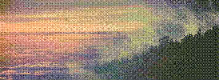
- 主要借助了 mask-image,一张图片上应用 mask-image: linear-gradient(0, rgba(0, 0, 0,1) 40%, transparent 60%);,透明的部分则会凸显出另外一张图。
- 再利用动画,让 mask-image: linear-gradient 的角度旋转起来。
<div class="a"></div>
<div class="b"></div>
scss
$img2: '图片地址';

$img1: '图片地址';

$count: 360;

div {
    position: absolute;
    top:0;
    left: 0;
    width: 100vw;
    height: 100vh;

}

.a {
    background: url($img1);
    background-size: 100% auto;
}

.b {
    background: url($img2);
    background-size: 100% auto;
    mask-image: linear-gradient(0, rgba(0, 0, 0, 1) 40%, transparent 60%);
    mask-image-position: 50% 50%;
    animation: move 10s infinite;
}

@keyframes move {

    @for $i from 0 through $count {
        #{$i / $count * 100}% {
            mask-image: linear-gradient($i / $count * 360deg, rgba(0, 0, 0, 1) 40%, transparent 60%);
        }
    }
}


 扫一扫
扫一扫


 6916
6916

 被折叠的 条评论
为什么被折叠?
被折叠的 条评论
为什么被折叠?
 到【灌水乐园】发言


