


 本文介绍了在Flutter中使用Dart实现富文本、加载本地和网络图片的方法,探讨了布局组件如Container、Align、GridView和ListView的用法,以及如何创建带有分隔线的ListView。
关于widget的生命周期的相关知识这里就不做介绍,和很多语言类似;
1. 富文本实例
Dart中使用richtext,示例如下:
const Text.rich(
    textAlign:TextAlign.center,
    TextSpan(
      text: '生于忧患,死于安乐\n',
      style: TextStyle(color: Colors.red, fontSize: 18),
      children: [
        TextSpan(
          text: '孟子及其弟子〔先秦〕',
          style: TextStyle(color: Colors.blueGrey,fontSize: 10),
        ),
        WidgetSpan(child:Icon(Icons.face,color: Colors.red)),
        TextSpan(
            text: """
            \n    舜发于畎亩之中,傅说举于版筑之间,胶鬲举于鱼盐之中,管夷吾举于士,孙叔敖举于海,百里奚举于市。故天将降大任于是人也,必先苦其心志,劳其筋骨,饿其体肤,空乏其身,行拂乱其所为,所以动心忍性,曾益其所不能。\n(是人 一作:斯人)
            \n    人恒过,然后能改;困于心,衡于虑,而后作;征于色,发于声,而后喻。入则无法家拂士,出则无敌国外患者,国恒亡。然后知生于忧患而死于安乐也。
            """,
          style: TextStyle(color: Colors.black,fontSize: 13)
        )
      ],
    ),
  )
效果如下:

2. Image
图片类主要用的有两种一种是加载本地的图片,一种是网络的。其他的图片类如下:
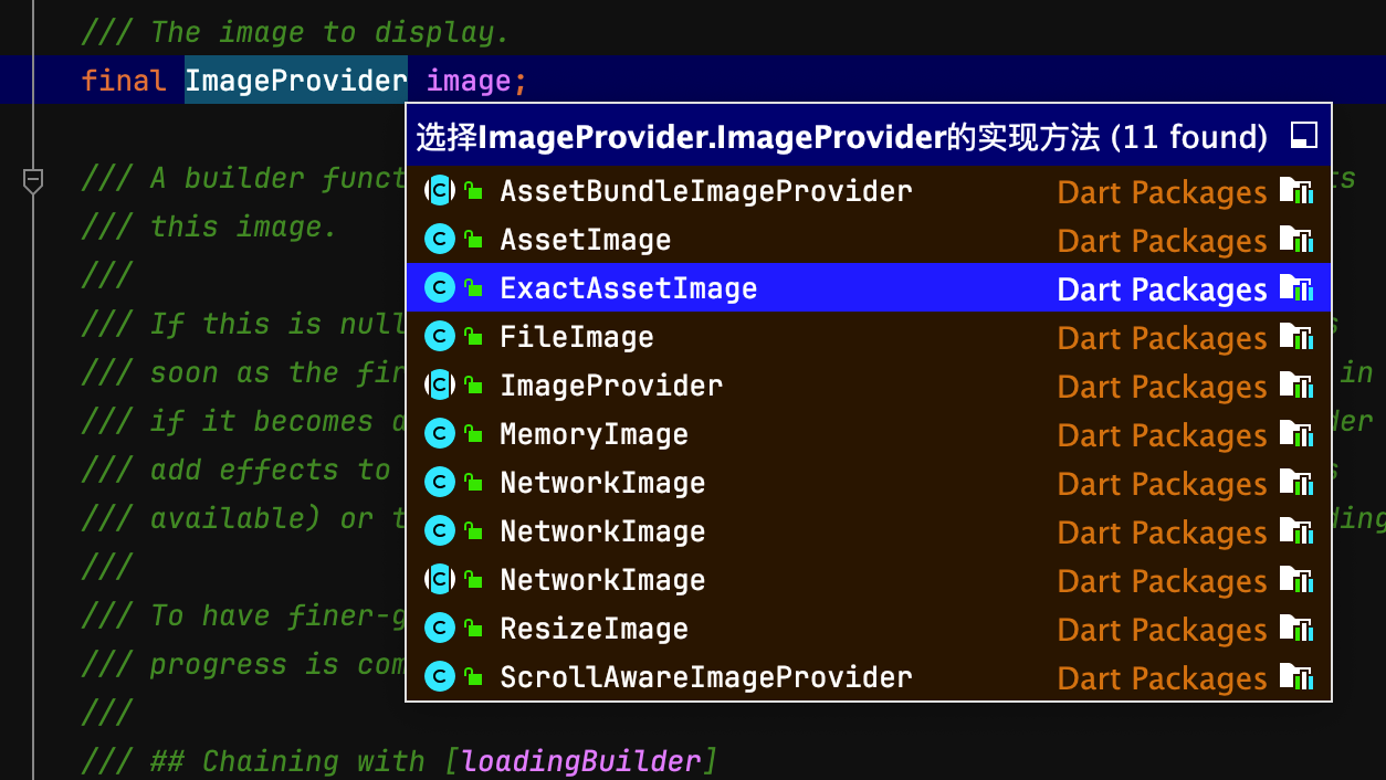
上图是在类中点击后:command + B或option + command + B,就会出现所有的子类实现;
2.1 本地图片
本地的图片加载比较复杂:
- 需要新建文件夹assets/images目录,
- 然后修改pubspec.yaml文件:找到flutter:配置项目新增:
flutter:

  # The following line ensures that the Material Icons font is
  # included with your application, so that you can use the icons in
  # the material Icons class.
  uses-material-design: true
  assets:
    - assets/images/*
- 最后执行flutter pub get
- 图片加载如下:
  const Image(
          image: AssetImage("assets/images/desktop.jpg"),
        width: 200,
        fit: BoxFit.cover,
      )
2.2 网络图片
网络图片的使用比较简单:Image(image: NetworkImage("https://uri"));
笔记
记录一个快捷键,比如下面的代码:
class MyHomePage extends StatelessWidget {
  @override
  Widget build(BuildContext context) {
    return Scaffold(
      appBar: AppBar(
        backgroundColor: Theme.of(context).colorScheme.inversePrimary,
        // Here we take the value from the MyHomePage object that was created by
        // the App.build method, and use it to set our appbar title.
        title: Text("计数器"),
      ),
      body: _MyHomeContent(),
    );
  }
}
我们想在AppBar外面加一个Center的wedge;mac上选中AppBar后按option(alt)+enter就会出现如下图的选项:
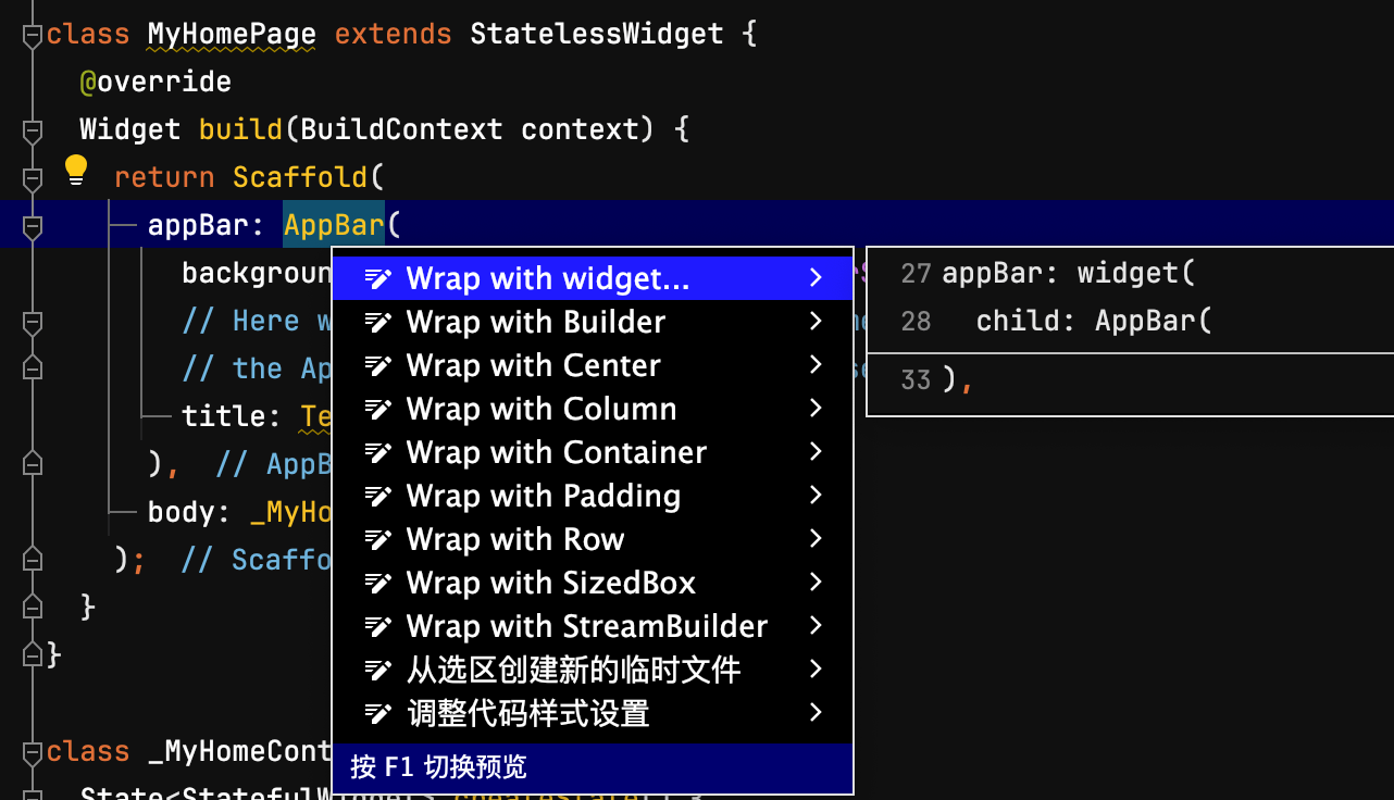
选中任意一个就会自动添加;
3. 布局
Dart中使用最多就是Container,Align,edge设置内边距;
- container使用如下:
class _MyHomeContentState extends State<_MyHomeContent> {
int _counter = 0;
Widget build(BuildContext context) {
return Container(
width: 200,
height: 200,
alignment: Alignment(0.5,0.5),
padding: EdgeInsets.all(50),
margin: EdgeInsets.all(10),
decoration: BoxDecoration(
color: Colors.blue,
borderRadius: BorderRadius.circular(10),
),
child: const Column(
children: [
Icon(
Icons.people,
color: Colors.orange,
),
],
),
);
}
}
- align如下:
class _MyHomeContentState extends State<_MyHomeContent> {
int _counter = 0;
Widget build(BuildContext context) {
return const Align(
alignment: Alignment(0.5, 0.5),
child: Icon(
Icons.people,
color: Colors.orange,
),
);
}
}
Row 和 Column 布局这里不做分析;
补充Positioned和Stack使用:示例如下:
class _MyHomeContentState extends State<_MyHomeContent> {
int _counter = 0;
Widget build(BuildContext context) {
return Stack(
children: <Widget>[
Image.asset("assets/images/desktop.jpg", width: 300),
Positioned(
left: 0,
right: 0,
bottom: 0,
child: Container(
padding: const EdgeInsets.all(10),
color: const Color.fromARGB(160, 0, 0, 0),
child: Row(
// 控件平分剩余空间
mainAxisAlignment: MainAxisAlignment.spaceBetween,
children: [
const Text(
"这个图片很合适",
style: TextStyle(fontSize: 20, color: Colors.white),
),
IconButton(
onPressed: () {
print("俺就点击了。。。。。。");
},
icon: const Icon(
Icons.favorite_border,
color: Colors.white,
))
],
),
))
],
);
}
}
效果如下图:
4. 滑动相关view
4.1 GridView类似九宫格view
使用如下:
class _MyHomeContentState extends State<_MyHomeContent> {
bool _isFavorite = false;
Widget build(BuildContext context) {
return GridView(
gridDelegate: SliverGridDelegateWithFixedCrossAxisCount(
crossAxisCount: 3,
crossAxisSpacing: 10,
mainAxisSpacing: 10,
),
children:List.generate(9, (index) {
return Container(
width: 40,
height: 40,
child: Image.asset(index%2==0?"assets/images/img1.png":"assets/images/img2.png"),
);
}
)
);
}
}
效果:
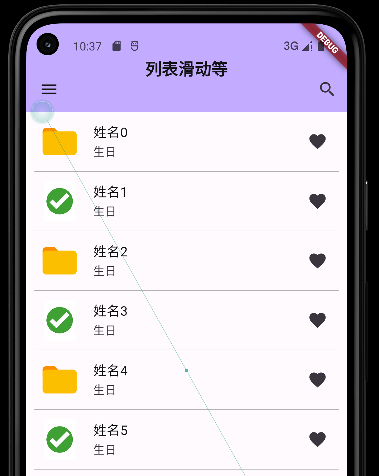
4.2 ListView
这里主要介绍有分隔线的使用:
class _MyHomeContentState_list2 extends State<_MyHomeContent> {
bool _isFavorite = false;
Widget build(BuildContext context) {
return ListView.separated(
itemCount: 100,
itemBuilder: (context, index) {
return ListTile(
leading: Container(
width: 50,
height: 50,
// decoration: BoxDecoration(
// shape: BoxShape.circle,
// color: Colors.blue,
// ),
child: Image.asset(index%2==0?"assets/images/img1.png":"assets/images/img2.png"),
),
title: Text("姓名${index}"),
subtitle: Text("生日"),
trailing: Icon(Icons.favorite),
onTap: (){
setState(() {
_isFavorite = !_isFavorite;
});
},
);
},
separatorBuilder: (context, index) {
return const Divider(
thickness:0.5,
indent:10,
endIndent: 10,
height: 1,
color: Colors.grey,
);
}
);
}
}
效果:


 扫一扫
扫一扫


 940
940

 被折叠的 条评论
为什么被折叠?
被折叠的 条评论
为什么被折叠?
 到【灌水乐园】发言


