


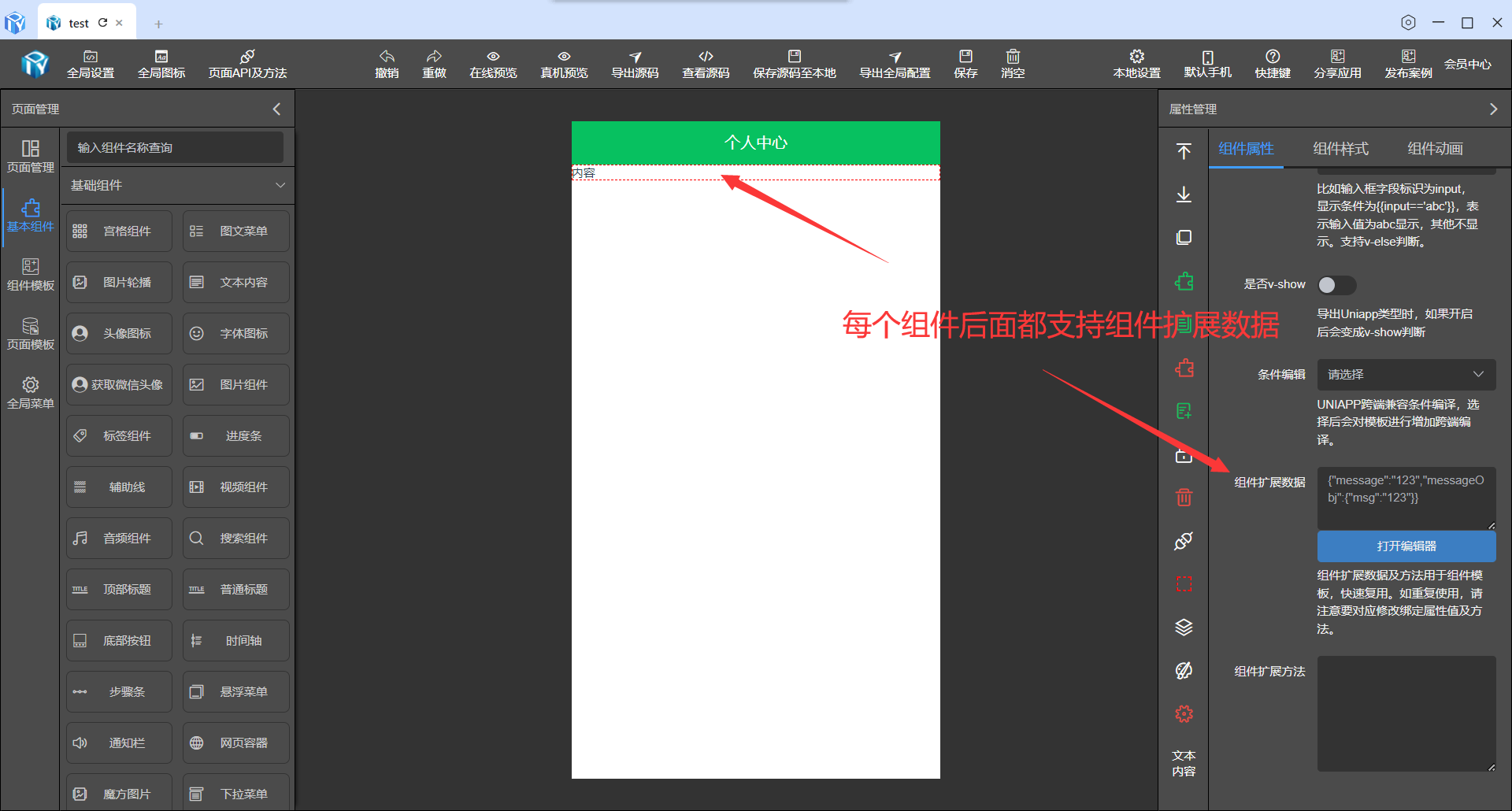
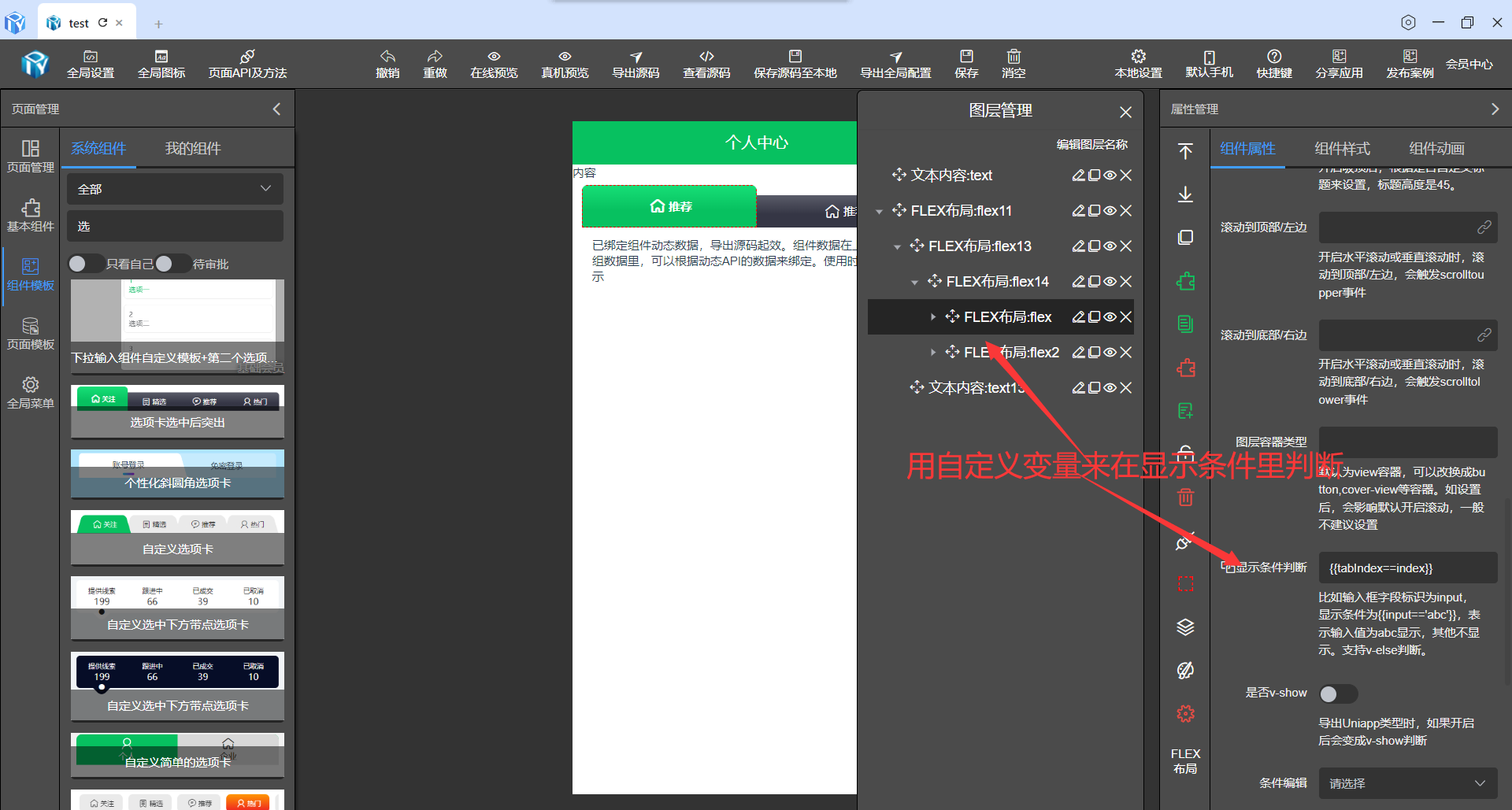
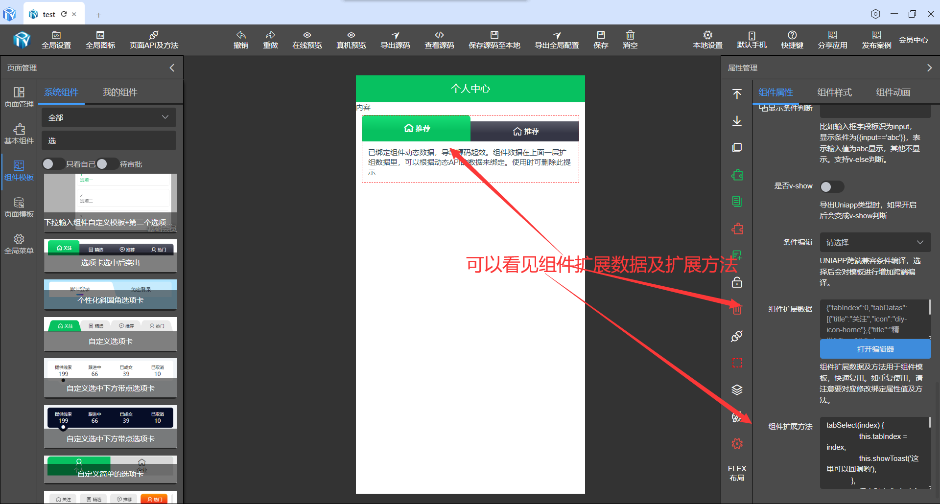
自定义变量由于默认组件库没有生成自己想要的变量,由于特殊场景下需要些其他变量,但此变量又没有生成,我们可采用扩展变量的方式。
自定义扩展变量
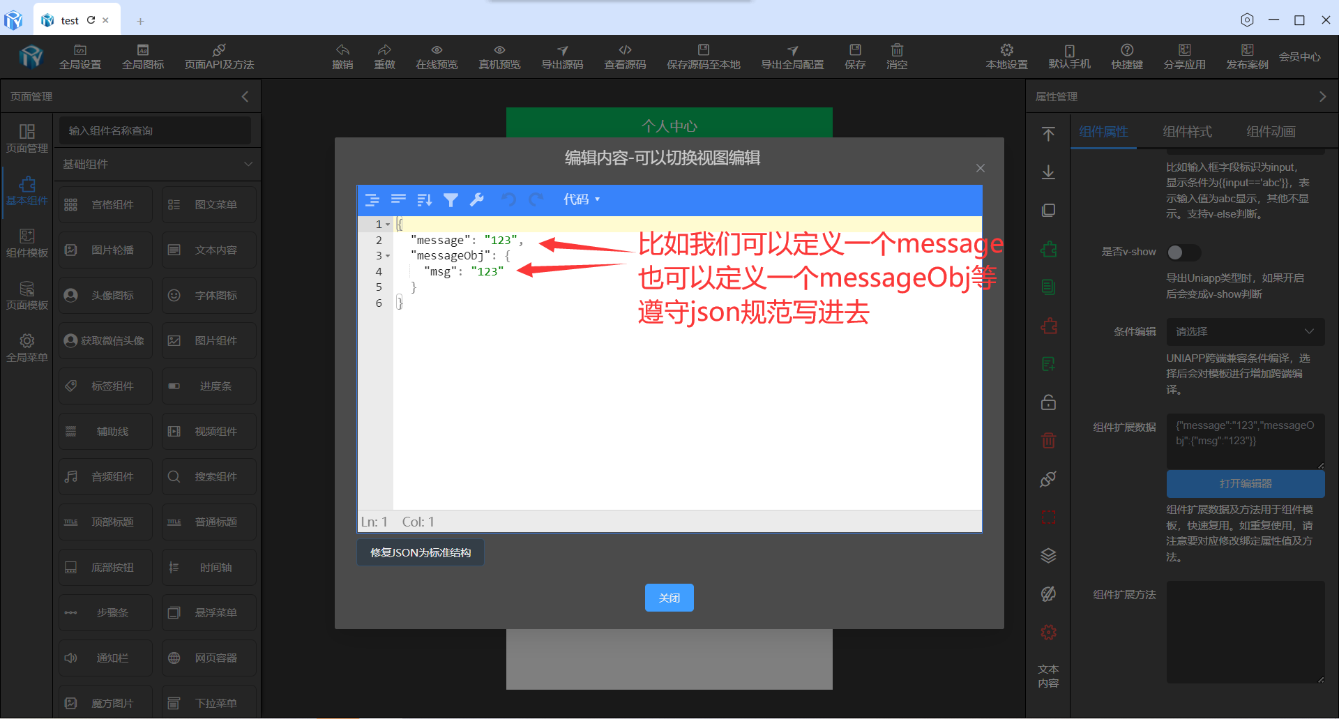
属性里找到组件扩展数据,这里可以定义自己想要的变量。
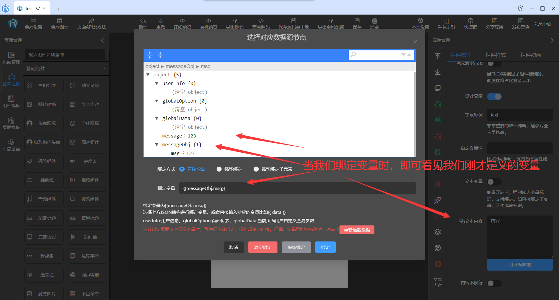
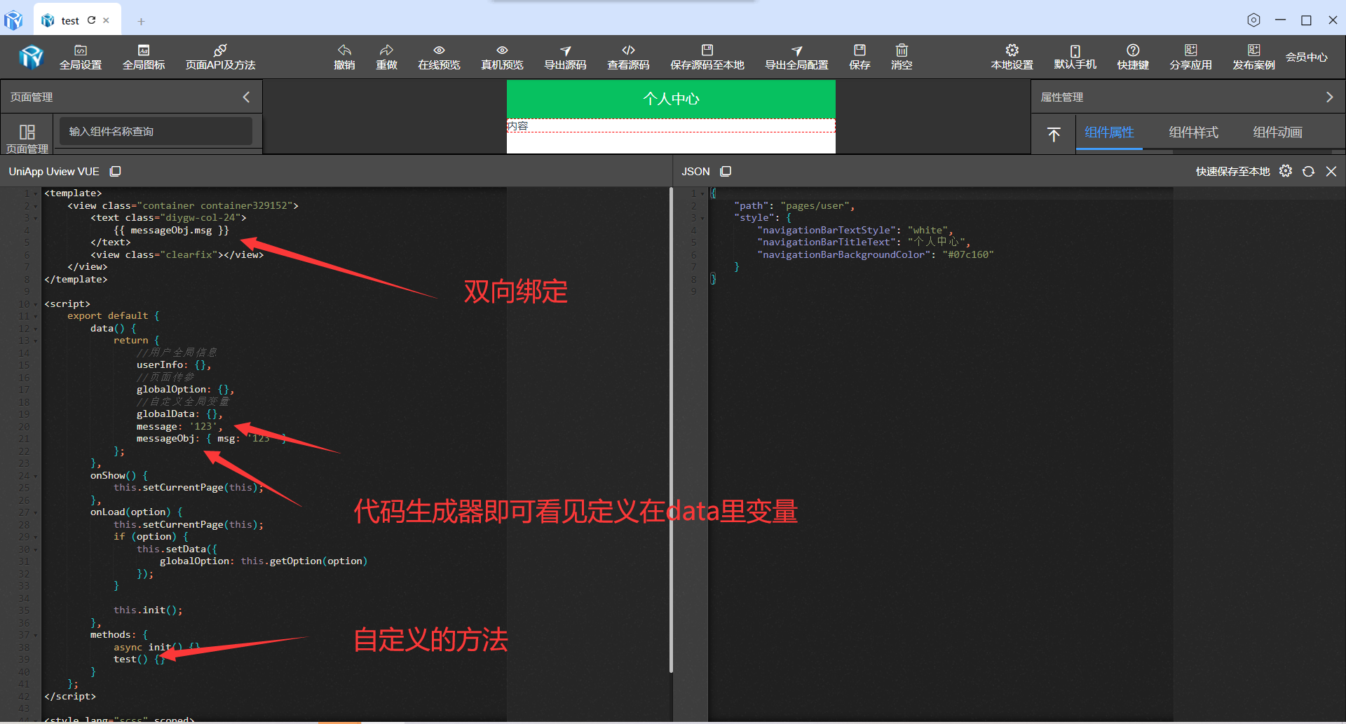
双向绑定变量
定义变量后就可以需要绑定地方进行绑定此变量。
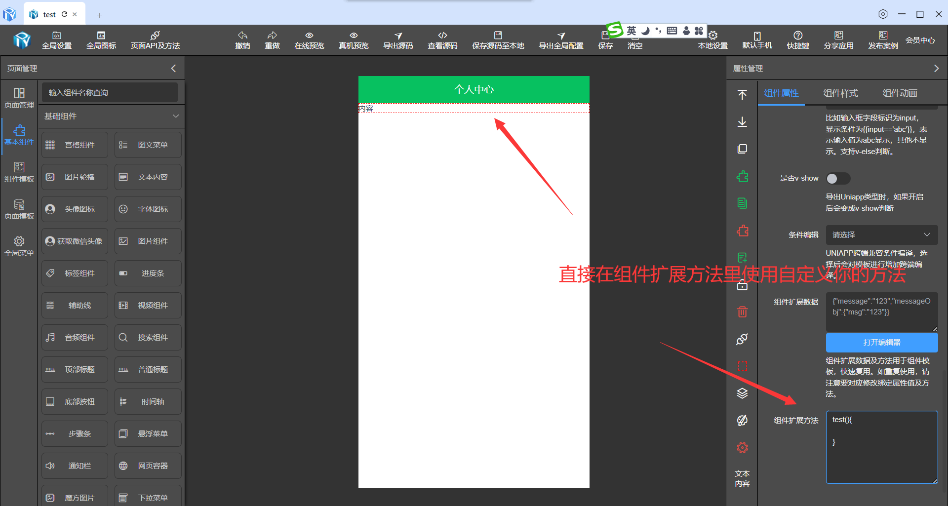
自定义方法
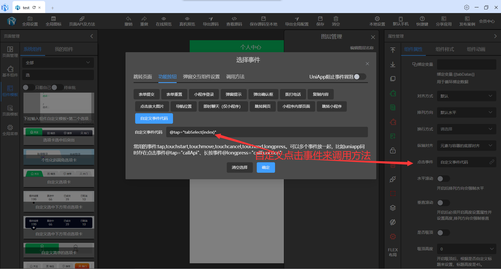
页面级的API及方法我们已经提供了,如果我们想要在该组件上扩展下自己的方法。
生成源码
自定义组件及扩展方法使用例子
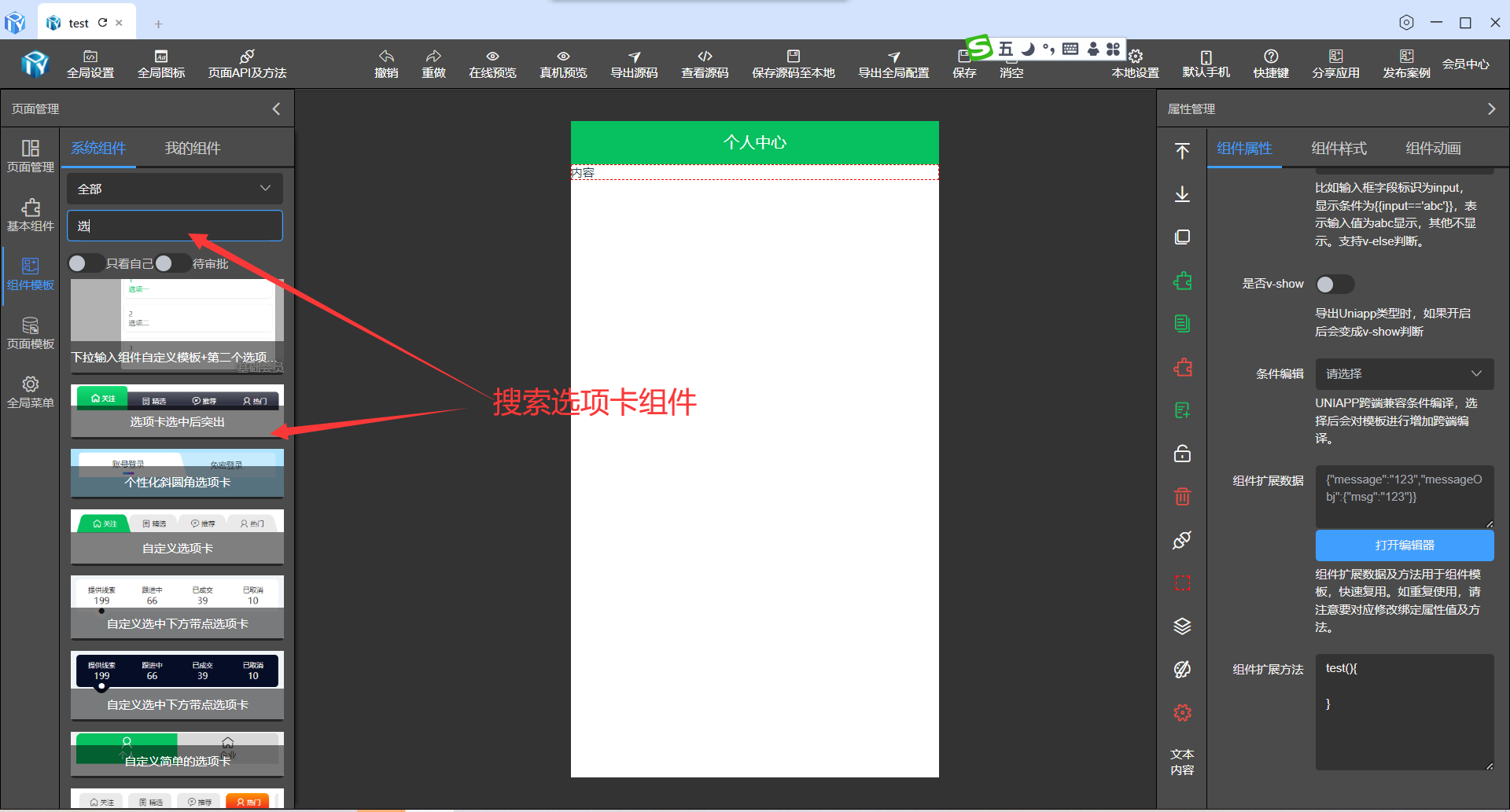
在组件模板里搜索选项卡,找到例子指示的组件。
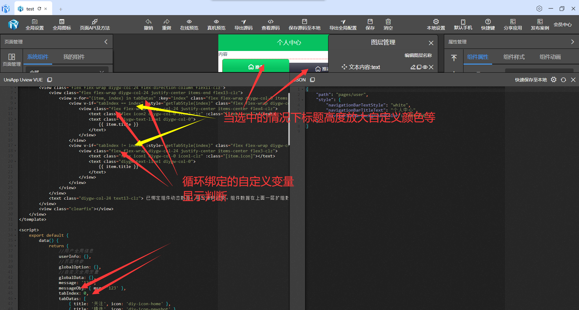
<template>
	<view class="container container329152">
		<text class="diygw-col-24">
			{

  { messageObj.msg }}
		</text>
		<view class="flex flex-wrap diygw-col-24 flex-direction-column flex11-clz">
			<view class="flex flex-wrap diygw-col-24 justify-center items-end flex13-clz">
				<view v-for="(item, index) in tabDatas" :key="index" class="flex flex-wrap diygw-col-0 items-end flex14-clz" @tap="tabSelect(index)">
					<view v-if="tabIndex == index" :style="getTabStyle(index)" class="flex flex-wrap diygw-col-0 items-stretch flex-clz">
						<view class="flex flex-wrap diygw-col-24 justify-center items-center flex4-clz">
							<text class="flex icon2 diygw-col-0 icon2-clz" :class="[item.icon]"></text>
							<text class="diygw-text-line1 diygw-col-0">
								{

  { item.title }}
							</text>
						</view>
					</view>
					<view v-if="tabIndex != index" :style="getTabStyle(index)" class="flex flex-wrap diygw-col-0 items-stretch flex2-clz">
						<view class="flex flex-wrap diygw-col-24 justify-center items-center flex3-clz">
							<text class="flex icon1 diygw-col-0 icon1-clz" :class="[item.icon]"></text>
							<text class="diygw-text-line1 diygw-col-0">
								{

  { item.title }}
							</text>
						</view>
					</view>
				</view>
			</view>
			<text class="diygw-col-24 text13-clz"> 已绑定组件动态数据,导出源码起效。组件数据在上面一层扩组数据里,可以根据动态API的数据来绑定。使用时可删除此提示 </text>
		</view>
		<view class="clearfix"></view>
	</view>
</template>

<script>
	export default {
		data() {
			return {
				//用户全局信息
				userInfo: {},
				//页面传参
				globalOption: {},
				//自定义全局变量
				globalData: {},
				message: '123',
				messageObj: { msg: '123' },
				tabIndex: 0,
				tabDatas: [
					{ title: '关注', icon: 'diy-icon-home' },
					{ title: '精选', icon: 'diy-icon-newshot' },
					{ title: '推荐', icon: 'diy-icon-message' },
					{ title: '热门', icon: 'diy-icon-my' }
				]
			};
		},
		onShow() {
			this.setCurrentPage(this);
		},
		onLoad(option) {
			this.setCurrentPage(this);
			if (option) {
				this.setData({
					globalOption: this.getOption(option)
				});
			}

			this.init();
		},
		methods: {
			async init() {},
			test() {},
			tabSelect(index) {
				this.tabIndex = index;
				this.showToast('这里可以回调哟');
			},
			getTabStyle(index) {
				let style = {};
				if (index == 0) {
					if (this.tabIndex == index) {
						style = {
							borderTopLeftRadius: '6px',
							borderTopRightRadius: '6px'
						};
					} else {
						style = {
							borderTopLeftRadius: '6px'
						};
					}
				} else if (index == this.tabDatas.length - 1) {
					if (this.tabIndex == index) {
						style = {
							borderTopLeftRadius: '6px',
							borderTopRightRadius: '6px'
						};
					} else {
						style = {
							borderTopRightRadius: '6px'
						};
					}
				}
				return style;
			}
		}
	};
</script>

<style lang="scss" scoped>
	.flex11-clz {
		margin-left: 20rpx;
		width: calc(100% - 20rpx - 20rpx) !important;
		margin-top: 10rpx;
		margin-bottom: 10rpx;
		margin-right: 20rpx;
	}
	.flex13-clz {
		border-bottom-left-radius: 0rpx;
		overflow: hidden;
		border-top-left-radius: 12rpx;
		border-top-right-radius: 12rpx;
		border-bottom-right-radius: 0rpx;
	}
	.flex14-clz {
		border-bottom-left-radius: 0rpx;
		overflow: visible;
		flex: 1;
		border-top-left-radius: 12rpx;
		border-top-right-radius: 12rpx;
		border-bottom-right-radius: 0rpx;
	}
	.flex-clz {
		border-bottom-left-radius: 0rpx;
		z-index: 1;
		overflow: hidden;
		color: #ffffff;
		flex: 1;
		border-top-left-radius: 12rpx;
		border-top-right-radius: 12rpx;
		border-bottom-right-radius: 0rpx;
		background-image: linear-gradient(180deg, rgba(23, 223, 119, 1) 0%, rgba(7, 193, 96, 1) 59%);
	}
	.flex4-clz {
		padding-top: 20rpx;
		font-weight: bold;
		padding-left: 10rpx;
		padding-bottom: 20rpx;
		padding-right: 10rpx;
	}
	.icon2-clz {
		margin-left: 6rpx;
		margin-top: 6rpx;
		margin-bottom: 6rpx;
		margin-right: 6rpx;
	}
	.icon2 {
		font-size: 32rpx;
	}
	.flex2-clz {
		color: #ffffff;
		flex: 1;
		background-image: linear-gradient(180deg, rgba(90, 92, 105, 1) 0%, rgba(53, 54, 69, 1) 59%);
	}
	.flex3-clz {
		padding-top: 10rpx;
		padding-left: 10rpx;
		padding-bottom: 10rpx;
		padding-right: 10rpx;
	}
	.icon1-clz {
		margin-left: 6rpx;
		margin-top: 6rpx;
		margin-bottom: 6rpx;
		margin-right: 6rpx;
	}
	.icon1 {
		font-size: 32rpx;
	}
	.text13-clz {
		margin-left: 10rpx;
		padding-top: 10rpx;
		padding-left: 10rpx;
		width: calc(100% - 10rpx - 10rpx) !important;
		padding-bottom: 10rpx;
		margin-top: 10rpx;
		margin-bottom: 10rpx;
		margin-right: 10rpx;
		padding-right: 10rpx;
	}
	.container329152 {
	}
</style>


 扫一扫
扫一扫


 2917
2917

 被折叠的 条评论
为什么被折叠?
被折叠的 条评论
为什么被折叠?
 到【灌水乐园】发言


