<div class="shake"></div>
.shake {
  width: 100px;
  aspect-ratio: 1;
  color: #ce0800;
  border: 14px solid;
  border-radius: 50%;
  position: relative;
  background:
    radial-gradient(circle 6px, #000 90%,#0000),
    linear-gradient(180deg,#000 50%,#0000 0) center/5px 70%,
    linear-gradient(90deg ,#000 50%,#0000 0) center/50% 5px;
  background-repeat: no-repeat;
  animation: shake 1s infinite;
}
.shake:before,
.shake:after {
  content: "";
  position: absolute;
  border-radius: 40px 40px 0 0;
  inset: -40px calc(50% - 20px);
  transform: rotate(40deg


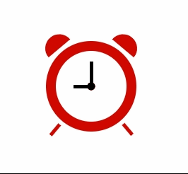
 本文介绍了如何使用CSS创建一个动态变化的闹钟效果,详细讲解了CSS在前端设计中的应用,通过实例展示了如何结合HTML和JavaScript实现时间的实时更新和动画效果。

 订阅专栏 解锁全文


 扫一扫
扫一扫


 被折叠的 条评论
为什么被折叠?
被折叠的 条评论
为什么被折叠?
 到【灌水乐园】发言


