


手把手教你实现一个Flutter登录页面
嗨,各位Flutter爱好者!今天我要和大家分享一个超级实用的功能——用Flutter构建一个功能完整的登录界面。说实话,第一次接触Flutter时,看着那些组件列表也是一头雾水,但当真正动手做出第一个登录页面后,才发现原来一切都这么有趣!
登录界面就像餐厅的门面,直接影响用户的第一印象。今天,我们就一起来打造一个既美观又实用的"门面"!
我们要实现什么?
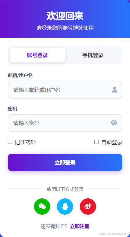
先来看看我们的目标——一个支持多种登录方式的登录界面:
含以下功能点:
- 双登录方式:账号密码 + 手机验证码
- 实时表单验证
- 记住密码和自动登录
- 验证码倒计时
- 第三方登录(微信&QQ&微博)
- 交互动画
是不是已经迫不及待了?别急,工欲善其事,必先利其器!!!
在开始搭建之前,我们先来熟悉一下Flutter的基础组件,这些组件就像乐高积木,每个都有独特的用途,组合起来就能创造奇迹!
一、Flutter基础组件
1.1 Text组件:不只是显示文字
Text组件就像聊天时的文字消息,不同的样式能传达不同的情感。让我给你展示几个实用的例子:
// 基础文本 - 就像普通的聊天消息
Text('你好,Flutter!')

// 带样式的文本 - 像加了特效的消息
Text(
  '欢迎回来!',
  style: TextStyle(
    fontSize: 24.0,              // 字体大小
    fontWeight: FontWeight.bold, // 字体粗细
    color: Colors.blue[800],     // 字体颜色
    letterSpacing: 1.2,          // 字母间距
  ),
)

// 富文本 - 像一条消息中有不同样式的部分
Text.rich(
  TextSpan(
    children: [
      TextSpan(
        text: '已有账号?',
        style: TextStyle(color: Colors.grey[600]),
      ),
      TextSpan(
        text: '立即登录',
        style: TextStyle(
          color: Colors.blue,
          fontWeight: FontWeight.bold,
        ),
      ),
    ],
  ),
)
实用技巧:
- 文字超出时显示省略号:
overflow: TextOverflow.ellipsis - 限制最多显示行数:
maxLines: 2 - 文字居中显示:
textAlign: TextAlign.center
1.2 TextField组件:用户输入
TextField就像餐厅的点菜单,用户在上面写下需求,我们负责处理。来看看如何打造一个贴心的输入体验:
// 基础输入框
TextField(
  decoration: InputDecoration(
    labelText: '用户名',             // 标签文字
    hintText: '请输入用户名',        // 提示文字
    prefixIcon: Icon(Icons.person), // 前缀图标
  ),
)

// 密码输入框 - 带显示/隐藏切换
TextField(
  obscureText: true,  // 隐藏输入内容
  decoration: InputDecoration(
    labelText: '密码',
    prefixIcon: Icon(Icons.lock),
    suffixIcon: IconButton(    // 后缀图标按钮
      icon: Icon(Icons.visibility),
      onPressed: () {
        // 切换密码显示/隐藏
      },
    ),
  ),
)

// 带验证的输入框
TextFormField(
  validator: (value) {
    if (value == null || value.isEmpty) {
      return '请输入内容';  // 验证失败时的提示
    }
    return null;  // 验证成功
  },
)
TextField的核心技能:
controller:管理输入内容focusNode:跟踪输入焦点keyboardType:为不同场景准备合适的键盘onChanged:实时监听用户的每个输入
1.3 按钮组件:触发事件的开关
按钮就像电梯的按键,按下它就会带你到达想去的楼层。Flutter提供了多种类型按钮,每种都有其独有的特性:
// 1. ElevatedButton - 主要操作按钮(有立体感)
ElevatedButton(
  onPressed: () {
    print('按钮被点击了!');
  },
  style: ElevatedButton.styleFrom(
    backgroundColor: Colors.blue,      // 背景色
    foregroundColor: Colors.white,     // 文字颜色
    padding: EdgeInsets.all(16),       // 内边距
    shape: RoundedRectangleBorder(     // 形状
      borderRadius: BorderRadius.circular(12),
    ),
  ),
  child: Text('登录'),
)

// 2. TextButton - 次要操作按钮
TextButton(
  onPressed: () {
    print('忘记密码');
  },
  child: Text('忘记密码?'),
)

// 3. OutlinedButton - 边框按钮
OutlinedButton(
  onPressed: () {},
  child: Text('取消'),
  style: OutlinedButton.styleFrom(
    side: BorderSide(color: Colors.grey),
  ),
)

// 4. IconButton - 图标按钮
IconButton(
  onPressed: () {},
  icon: Icon(Icons.close),
  color: Colors.grey,
)
按钮状态管理很重要:
- 加载时禁用按钮,防止重复提交
- 根据表单验证结果控制按钮可用性
- 提供视觉反馈,让用户知道操作已被接收
1.4 布局组件
布局组件就像房子的承重墙,它们决定了界面元素的排列方式。掌握它们,你就能轻松构建各种复杂布局:
// Container - 万能的容器
Container(
  width: 200,
  height: 100,
  margin: EdgeInsets.all(16),    // 外边距
  padding: EdgeInsets.all(20),   // 内边距
  decoration: BoxDecoration(
    color: Colors.white,
    borderRadius: BorderRadius.circular(16),
    boxShadow: [                 // 阴影效果
      BoxShadow(
        color: Colors.black12,
        blurRadius: 10,
      ),
    ],
  ),
  child: Text('内容'),
)

// Row - 水平排列
Row(
  mainAxisAlignment: MainAxisAlignment.spaceBetween,
  children: [
    Text('左边'),
    Text('右边'),
  ],
)

// Column - 垂直排列
Column(
  children: [
    Text('第一行'),
    SizedBox(height: 16),  // 间距组件
    Text('第二行'),
  ],
)
现在我们已经熟悉了基础组件,是时候开始真正的功能实战了!
二、功能实战:构建多功能登录页面
2.1 项目目录结构
在开始编码前,我们先规划好项目结构,就像建房子前先画好房体图纸一样:
lib/
├── main.dart                    # 应用入口
├── models/                      # 数据模型
│   ├── user_model.dart          # 用户模型
│   └── login_type.dart          # 登录类型
├── pages/                       # 页面文件
│   ├── login_page.dart          # 登录页面
│   ├── home_page.dart           # 首页
│   └── register_page.dart       # 注册页面
├── widgets/                     # 自定义组件
│   ├── login_tab_bar.dart       # 登录选项卡
│   ├── auth_text_field.dart     # 认证输入框
│   └── third_party_login.dart   # 第三方登录
├── services/                    # 服务层
│   └── auth_service.dart        # 认证服务
├── utils/                       # 工具类
│   └── validators.dart          # 表单验证
└── theme/                       # 主题配置
    └── app_theme.dart           # 应用主题
2.2 数据模型定义
我们先定义需要用到的数据模型:
// 登录类型枚举
enum LoginType {
  account,  // 账号密码登录
  phone,    // 手机验证码登录
}

// 用户数据模型
class User {
  final String id;
  final String name;
  final String email;
  final String phone;

  User({
    required this.id,
    required this.name,
    required this.email,
    required this.phone,
  });
}
2.3 实现登录页面
下面我将会带你一步步构建登录页面。
第一步:状态管理
首先,我们需要管理页面的各种状态,就像我们平时开车时要关注各项指标:
class _LoginPageState extends State<LoginPage> {
// 登录方式状态
LoginType _loginType = LoginType.account;
// 文本控制器
final TextEditingController _accountController = TextEditingController();
final TextEditingController _passwordController = TextEditingController();
final TextEditingController _phoneController = TextEditingController();
final TextEditingController _smsController = TextEditingController();
// 焦点管理
final FocusNode _accountFocus = FocusNode();
final FocusNode _passwordFocus = FocusNode();
final FocusNode _phoneFocus = FocusNode();
final FocusNode _smsFocus = FocusNode();
// 状态变量
bool _isLoading = false;
bool _rememberPassword = true;
bool _autoLogin = false;
bool _isPasswordVisible = false;
bool _isSmsLoading = false;
int _smsCountdown = 0;
// 错误信息
String? _accountError;
String? _passwordError;
String? _phoneError;
String? _smsError;
// 表单Key
final GlobalKey<FormState> _formKey = GlobalKey<FormState>();
void initState() {
super.initState();
_loadSavedData();
}
void _loadSavedData() {
// 从本地存储加载保存的账号
if (_rememberPassword) {
_accountController.text = 'user@example.com';
}
}
}
第二步:构建页面
接下来,我们构建页面的整体结构:
Widget build(BuildContext context) {
return Scaffold(
backgroundColor: Colors.grey[50],
body: SafeArea(
child: SingleChildScrollView(
physics: BouncingScrollPhysics(),
child: Container(
padding: EdgeInsets.all(24),
child: Form(
key: _formKey,
child: Column(
crossAxisAlignment: CrossAxisAlignment.start,
children: [
_buildBackButton(), // 返回按钮
SizedBox(height: 20),
_buildHeader(), // 页面标题
SizedBox(height: 40),
_buildLoginTypeTab(), // 登录方式切换
SizedBox(height: 32),
_buildDynamicForm(), // 动态表单
SizedBox(height: 24),
_buildRememberSection(), // 记住密码选项
SizedBox(height: 32),
_buildLoginButton(), // 登录按钮
SizedBox(height: 40),
_buildThirdPartyLogin(), // 第三方登录
SizedBox(height: 24),
_buildRegisterPrompt(), // 注册提示
],
),
),
),
),
),
);
}
第三步:构建各个组件
现在我们来逐一实现每个功能组件:
登录方式切换选项卡:
Widget _buildLoginTypeTab() {
  return Container(
    height: 48,
    decoration: BoxDecoration(
      color: Colors.grey[100],
      borderRadius: BorderRadius.circular(12),
    ),
    child: Row(
      children: [
        // 账号登录选项卡
        _buildTabItem(
          title: '账号登录',
          isSelected: _loginType == LoginType.account,
          onTap: () {
            setState(() {
              _loginType = LoginType.account;
            });
          },
        ),
        // 手机登录选项卡
        _buildTabItem(
          title: '手机登录',
          isSelected: _loginType == LoginType.phone,
          onTap: () {
            setState(() {
              _loginType = LoginType.phone;
            });
          },
        ),
      ],
    ),
  );
}
动态表单区域:
Widget _buildDynamicForm() {
  return AnimatedSwitcher(
    duration: Duration(milliseconds: 300),
    child: _loginType == LoginType.account
        ? _buildAccountForm()   // 账号登录表单
        : _buildPhoneForm(),    // 手机登录表单
  );
}
账号输入框组件:
Widget _buildAccountField() {
  return Column(
    crossAxisAlignment: CrossAxisAlignment.start,
    children: [
      Text('邮箱/用户名'),
      SizedBox(height: 8),
      TextFormField(
        controller: _accountController,
        focusNode: _accountFocus,
        decoration: InputDecoration(
          hintText: '请输入邮箱或用户名',
          prefixIcon: Icon(Icons.person_outline),
          border: OutlineInputBorder(
            borderRadius: BorderRadius.circular(12),
          ),
          errorText: _accountError,
        ),
        onChanged: (value) {
          setState(() {
            _accountError = _validateAccount(value);
          });
        },
      ),
    ],
  );
}
登录按钮组件:
Widget _buildLoginButton() {
  bool isFormValid = _loginType == LoginType.account
      ? _accountError == null && _passwordError == null
      : _phoneError == null && _smsError == null;

  return SizedBox(
    width: double.infinity,
    height: 52,
    child: ElevatedButton(
      onPressed: isFormValid && !_isLoading ? _handleLogin : null,
      child: _isLoading
          ? CircularProgressIndicator()
          : Text('立即登录'),
    ),
  );
}
第四步:实现业务逻辑
表单验证:
String? _validateAccount(String? value) {
  if (value == null || value.isEmpty) {
    return '请输入账号';
  }
  final emailRegex = RegExp(r'^[a-zA-Z0-9._%+-]+@[a-zA-Z0-9.-]+\.[a-zA-Z]{2,}$');
  if (!emailRegex.hasMatch(value)) {
    return '请输入有效的邮箱';
  }
  return null;
}
登录逻辑:
Future<void> _handleLogin() async {
  if (_isLoading) return;

  if (_formKey.currentState!.validate()) {
    setState(() {
      _isLoading = true;
    });

    try {
      User user;
      if (_loginType == LoginType.account) {
        user = await AuthService.loginWithAccount(
          account: _accountController.text,
          password: _passwordController.text,
        );
      } else {
        user = await AuthService.loginWithPhone(
          phone: _phoneController.text,
          smsCode: _smsController.text,
        );
      }
      await _handleLoginSuccess(user);
    } catch (error) {
      _handleLoginError(error);
    } finally {
      setState(() {
        _isLoading = false;
      });
    }
  }
}
效果展示与总结

至此我们终于完成了一个功能完整的登录页面!让我们总结一下实现的功能:
实现功能点
- 双登录方式:用户可以在账号密码和手机验证码之间无缝切换
- 智能验证:实时表单验证,即时错误提示
- 用户体验:加载状态、错误提示、流畅动画
- 第三方登录:支持微信、QQ、微博登录
- 状态记忆:记住密码和自动登录选项
学到了什么?
通过这个项目,我们掌握了:
- 组件使用:Text、TextField、Button等基础组件的深度使用
- 状态管理:使用setState管理复杂的页面状态
- 表单处理:实时验证和用户交互
- 布局技巧:创建响应式和美观的界面布局
- 业务逻辑:处理用户输入和API调用
最后的话
看到这里,你已经成功构建了一个完整的登录界面!这个登录页面只是开始,期待你能创造出更多更好的应用!
有什么问题或想法?欢迎在评论区留言讨论~, Happy Coding!✨


 扫一扫
扫一扫


 6109
6109

 被折叠的 条评论
为什么被折叠?
被折叠的 条评论
为什么被折叠?
 到【灌水乐园】发言


