


前言
大家好,今天我们聊一个看似简单、实则至关重要的技术话题——如何获取和利用设备信息。在移动应用开发中,许多令人头疼的适配问题,其根源往往就在设备信息的处理上。今天,我们就来一起聊聊这个话题。
一、系统信息
1.1 同步vs异步
很多人都知道用uni.getSystemInfo(),但其实这里有个性能坑:
// 不推荐:每次都调异步API
async function getDeviceInfo() {


  const info = await uni.getSystemInfo()
  return info
}

// 推荐:同步获取+缓存
let cachedInfo = null

function getSystemInfo() {


  if (!cachedInfo) {


    // 首次使用同步API,避免Promise开销
    cachedInfo = uni.getSystemInfoSync()
  }
  return cachedInfo
}
为什么同步更好?
- 无Promise开销,避免微任务队列调度
- 不用await
- 应用启动时就应该获取
但同步API有个坑:在极少数情况下可能会阻塞UI。建议:
- 应用启动时用同步
- 运行时变化用异步监听
1.2 专业术语解释
const systemInfo = uni.getSystemInfoSync()

// 一下6个字段比较重要:
const essentialFields = {


  // 1. 设备识别
  platform: systemInfo.platform,    // "android" | "ios" | "web"
  model: systemInfo.model,          // 具体型号,如"iPhone 13 Pro"

  // 2. 屏幕信息
  pixelRatio: systemInfo.pixelRatio,   // 设备像素比
  screenWidth: systemInfo.screenWidth, // 物理像素宽度
  windowWidth: systemInfo.windowWidth, // 可用宽度

  // 3. 刘海屏-安全区域
  safeArea: systemInfo.safeArea,              // 安全区域坐标
  statusBarHeight: systemInfo.statusBarHeight // 状态栏高度
}
特别说明一下pixelRatio这个字段,很多新手会忽略它:
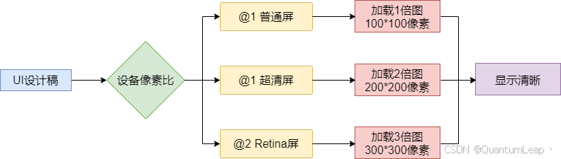
像素比的意义:
// 根据像素比加载合适图片
function getImageUrl(baseUrl, pixelRatio) {


  if (pixelRatio >= 3) return `${

     baseUrl}@3x.png`
  if (pixelRatio >= 2) return `${

     baseUrl}@2x.png`
  return `${

     baseUrl}.png`
}

// 计算Canvas绘制尺寸
function getCanvasSize(designSize, pixelRatio) {


  return {


    width: designSize.width * pixelRatio,
    height: designSize.height * pixelRatio,
    styleWidth: designSize.width,
    styleHeight: designSize.height
  }
}
1.3 平台差异处理
uni-app号称"一套代码,多端运行",但现实是不同平台确实存在差异:
// Platform适配工具类
class PlatformAdapter {


  static getStatusBarHeight() {


    const info = uni.getSystemInfoSync()

    // iOS和Android的状态栏高度
    if (info.platform === 'ios') {


      // iOS:iPhone X以上有刘海
      const isNotchScreen = this.isNotchScreen(info)
      return isNotchScreen ? 44 : 20
    } else if (info.platform === 'android') {


      // Android:通常比iOS高,且版本差异大
      const version = parseFloat(info.system.split(' ')[1]) || 0
      return version >= 10 ? 28 : 25
    }

    return 20 // Web端默认
  }

  static isNotchScreen(info) {


    // 判断是否为刘海屏
    const notchModels = [
      'iPhone X', 'iPhone 11', 'iPhone 12', 'iPhone 13',
      'iPhone 14', 'iPhone 15'
    ]
    return notchModels.some(model => info.model.includes(model))
  }
}
二、屏幕适配
2.1 rpx单位
rpx是uni-app的核心创新,让我们深入了解一下rpx吧。
// rpx转换原理
function rpx2px(rpx, windowWidth = 375) {


  // 1rpx = windowWidth / 750
  return (rpx * windowWidth) / 750
}

// 注意事项
const designWidth = 750
const deviceWidth = uni.getSystemInfoSync().windowWidth

// 按钮宽度是200rpx
const buttonDesignWidth = 200

// 在任何设备上,实际宽度都是:
const actualWidth = (buttonDesignWidth / designWidth) * deviceWidth
rpx的好处在于:
- 750rpx对应设计稿750px
- 所有元素按屏幕宽度等比缩放
- 框架自动处理转换
rpx局限性:
- 不适合需要固定尺寸的场景(如1px边框)
- 在大屏设备上可能过度拉伸
- 图片使用rpx需要配合
mode="widthFix"
2.2 适配安全区域
随着全面屏普及,安全区域适配成了必修课:
 最低0.47元/天 解锁文章


 扫一扫
扫一扫


 807
807

 被折叠的 条评论
为什么被折叠?
被折叠的 条评论
为什么被折叠?
 到【灌水乐园】发言


