


 本文介绍了一款由微软Research出品的免费在线图表工具Charticulator,支持复杂图表制作,可与PowerBI无缝集成。通过教程快速上手,提供多种导出格式,包括SVG,适合数据分析。特别强调了其易用性和模板功能,以及如何利用其插件深入PowerBI学习。
来源:pythonic生物人

本次分享一款免费商业可视化工具Charticulator:
微软研究院Microsoft Research出品
可直接免费在线使用,轻松制作复杂图表
可与PowerBI联用
使用教程完整,部分图包含详细视频教程
可导出SVG矢量图,以便于后续分析
Charticulator案例展示


Charticulator上手简单
Charticulator界面简洁

Dataset Panel: listing the columns in your dataset. Click the “…” button to view the actual data values.
Toolbar: widgets for specifying Marks, Links, Guides, Plot Segments, and Scaffolds.
Chart Canvas: a canvas for specifying the chart design.
Glyph Editor: a canvas for specifying the glyph design.
Layers Panel: listing the contents of the chart and glyph designs.
Attributes Panel: widgets for specifying the attributes and data bindings for each layer.
Scales Panel: listing the scales used in the chart.
可结合视频教程快速上手

可使用Charticulator模版快速上手

可导出多种格式

Charticulator模版直接导入PowerBI

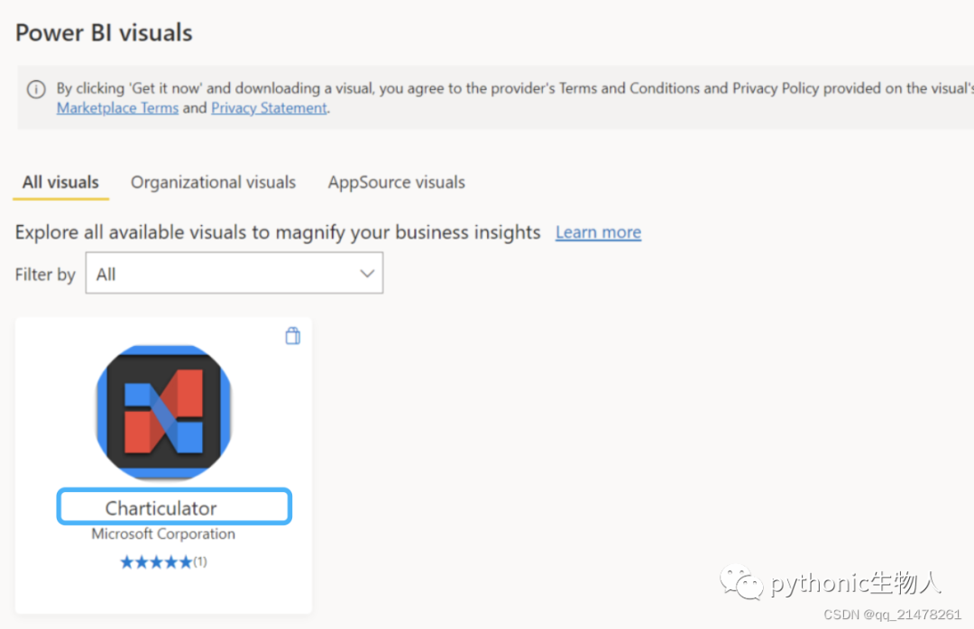
PowerBI中直接使用Charticulator插件
 进一步学习:https://charticulator.com/index.html


 9
9

 被折叠的 条评论
为什么被折叠?
被折叠的 条评论
为什么被折叠?
 到【灌水乐园】发言


