


 文章解答了如何在Plotly中将y轴刻度标签文字设置为靠左对齐的问题。作者探讨了Plotly的标准参数限制,并提供了一种通过设置x轴范围和y轴分布的不完美解决办法。此外,还展示了在甘特图和水平柱状图中应用此方法的示例。
01写在前面
大家好,我是 阳哥 。
前几天,我再次分享了 《Plotly Express 可视化指南》这个内容。
有同学问了一个问题,这个问题有点冷门,但也有特定的用处,姑且称之为“奇奇怪怪”的问题吧。

我再进一步阐述下这个问题要表达的意思:如下面图片中,y轴的刻度标签文字是靠右对齐的,如何设置为靠左对齐?

02初步实践
对于这个问题,我刚开始觉得 Plotly 应该提供了标准的参数来控制位置分布。
于是回复这位同学:“标题通过 plotly 来控制的”。幸亏这位同学进一步提问,我才开始自己去测验。
但实际上,我自己去实践了下,发现好像不行。
实践的途径如下:
plotly 本身是提供了 ticklabelposition 这个参数的。大家可以通过下面的链接了解更多的情况:
https://plotly.com/python/reference/layout/yaxis/#layout-yaxis
ticklabelposition 参数只能从以下值中进行选择:
Type: enumerated , one of ( "outside" | "inside" | "outside top" | "inside top" | "outside left" | "inside left" | "outside right" | "inside right" | "outside bottom" | "inside bottom" )
在 ticklabelposition 这个参数中,有一段说明文字,如下:
Determines where tick labels are drawn with respect to the axis Please note that top or bottom has no effect on x axes or when
ticklabelmodeis set to "period". Similarly left or right has no effect on y axes or whenticklabelmodeis set to "period". Has no effect on "multicategory" axes or whenticksonis set to "boundaries". When used on axes linked bymatchesorscaleanchor, no extra padding for inside labels would be added by autorange, so that the scales could match.
Similarly left or right has no effect on y axes or when ticklabelmode is set to "period".
这段话说明 设置 左 或 右 对于y轴中的 ticklabelposition 这个参数是没有效果的。
既然 plotly 中没有标准参数来控制,那咱们就只有想其他办法了。
03解决方案
在介绍解决办法之前,还是先描述下项目代码相关的背景。
先引入相关Python库:
import plotly.express as px
import plotly.io as pio
import plotly.graph_objects as go
import pandas as pd
import plotly

print(f'Plotly version:{plotly.__version__}')
print(f'Pandas version:{pd.__version__}')

# Plotly version:5.1.0
# Pandas version:1.4.1
甘特图案例
首先还是以这位同学提问的甘特图为案例来阐述。
该案例的初始代码如下:
def plot_timeline_1():
df = pd.DataFrame([
dict(Task="项目1", Start='2021-02-01', Finish='2021-03-25',Manager='Lemon',Completion_pct=90),
dict(Task="项目2", Start='2021-03-05', Finish='2021-04-15',Manager='Lee',Completion_pct=60),
dict(Task="项目3", Start='2021-02-20', Finish='2021-05-30',Manager='Zhang',Completion_pct=70),
dict(Task="项目4", Start='2021-04-20', Finish='2021-09-30',Manager='Lemon',Completion_pct=20),
])
fig = px.timeline(df, x_start="Start", x_end="Finish", y="Task")
fig.update_yaxes(autorange="reversed")
return fig
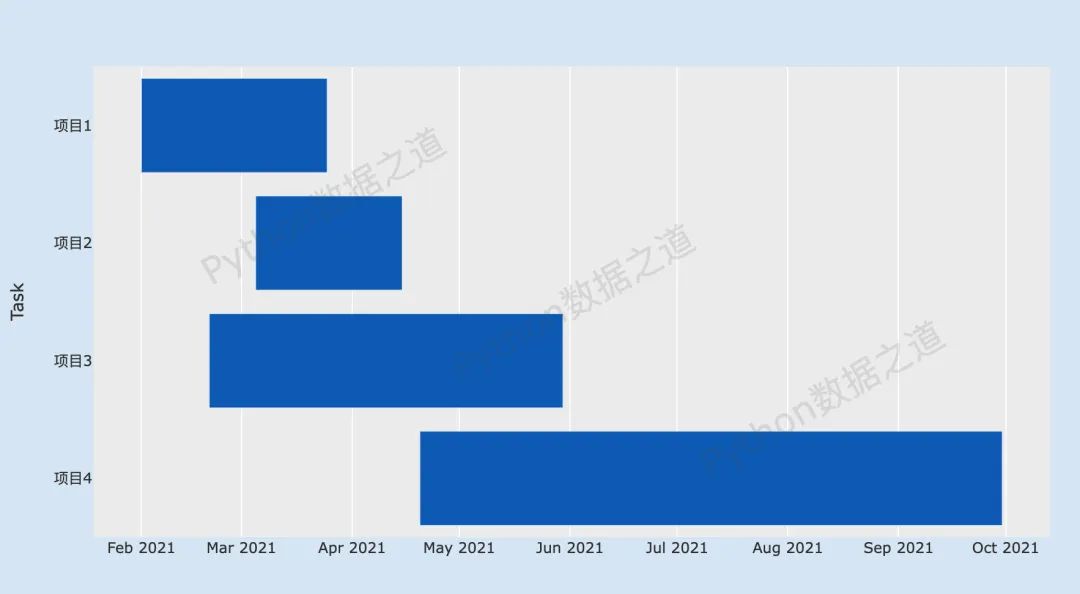
fig = plot_timeline_1()
# fig.write_image('./images/px/16-timeline-1.png')
fig.show()上述代码的结果图示如下:
从上面这个图中,还看不出差异。于是,我将其中一个项目的文字名称加长了,再来看效果,代码如下:
def plot_timeline_1_1():
    df = pd.DataFrame([
        dict(Task="项目1:如何建设好一个项目", Start='2021-02-01', Finish='2021-03-25',Manager='Lemon',Completion_pct=90),
        dict(Task="项目2", Start='2021-03-05', Finish='2021-04-15',Manager='Lee',Completion_pct=60),
        dict(Task="项目3", Start='2021-02-20', Finish='2021-05-30',Manager='Zhang',Completion_pct=70),
        dict(Task="项目4", Start='2021-04-20', Finish='2021-09-30',Manager='Lemon',Completion_pct=20),
    ])

    fig = px.timeline(df, x_start="Start", x_end="Finish", y="Task")
    fig.update_yaxes(autorange="reversed")
    return fig

fig = plot_timeline_1_1()
# fig.write_image('./images/px/16-timeline-1.png')
fig.show()
上述代码的结果图示如下:
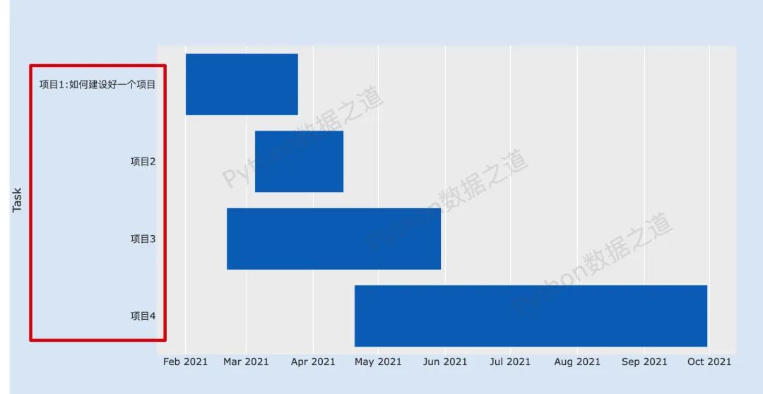
于是,就产生了上面这位同学所提出的问题:
请问,甘特图的左边标题默认是右对齐的,怎么左对齐啊?
这里要说明下,这个“左边标题”应该是指的 ticklabel,翻译过来应该是 刻度标签,而y轴的标题是 “Task”,还是有些差异的。
通过一番研究与翻阅资料,还是找到了一个不怎么完美的解决办法,主要是通过x轴范围以及y轴分布来设置。
代码如下:
def plot_timeline_2():
df = pd.DataFrame([
dict(Task="项目1:如何建设好一个项目", Start='2021-02-01', Finish='2021-03-25',Manager='Lemon',Completion_pct=90),
dict(Task="项目2", Start='2021-03-05', Finish='2021-04-15',Manager='Lee',Completion_pct=60),
dict(Task="项目3", Start='2021-02-20', Finish='2021-05-30',Manager='Zhang',Completion_pct=70),
dict(Task="项目4", Start='2021-04-20', Finish='2021-09-30',Manager='Lemon',Completion_pct=20),
])
fig = px.timeline(df, x_start="Start", x_end="Finish", y="Task")
fig.update_layout(
xaxis=dict(domain=[0.2, 0.99]),
yaxis=dict(
anchor='free',
position=0.01,
side='right',
autorange="reversed",
title=dict(text='')
)
)
return fig
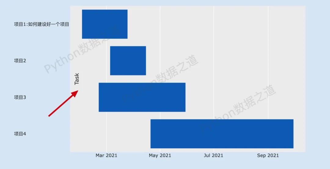
fig = plot_timeline_2()
# fig.write_image('./images/px/16-timeline-1.png')
fig.show()这里说明下:
设置x轴的范围(
xaxis=dict(domain=[0.2, 0.99]))为 0.2 到 0.99,表示为x轴的 20% 到99% 的范围;y(
yaxis)轴中,side='right'则会使刻度标签呈现为文字左边对齐,这个是有点奇怪的,我也没想好怎么解释,囧~~ ;position可以控制文字整体左右移动的位置,大家可以自己测试下;这里需要注意下,要将title即 y轴标题设置为空值,如果不将标题设置为空值,则会出现下面的状况:
到这里,如果某位读者倔强的想既要刻度标签文字左边对齐,又要正常显示y轴标题,有没有办法呢?
答案是有的,难得我煞费苦心哈。
y轴标题可以通过单独的文本设置来实现,关于 plotly 中文本介绍的详细内容,可以通过下面的链接来了解:
具体来说,阳哥是通过利用 annotations 类型的文本来实现 y轴标题的正常显示的。
代码如下:
def plot_timeline_3():
    df = pd.DataFrame([
        dict(Task="项目1:如何建设好一个项目", Start='2021-02-01', Finish='2021-03-25',Manager='Lemon',Completion_pct=90),
        dict(Task="项目2", Start='2021-03-05', Finish='2021-04-15',Manager='Lee',Completion_pct=60),
        dict(Task="项目3", Start='2021-02-20', Finish='2021-05-30',Manager='Zhang',Completion_pct=70),
        dict(Task="项目4", Start='2021-04-20', Finish='2021-09-30',Manager='Lemon',Completion_pct=20),
    ])

    fig = px.timeline(df, x_start="Start", x_end="Finish", y="Task")

    # 设置文字注释内容
    annotation = [dict(x=-0.05,
                       xref='paper',  #使用相对坐标
                       y=0.5,
                       yref='paper',
                       text='Task',
                       font=dict(color='red',size=20),
                       showarrow=False,  # 不显示箭头
                       textangle=-90,
                       ),
                 ]

    fig.update_layout(
        xaxis=dict(domain=[0.2, 0.99]),
        yaxis=dict(
            anchor='free',
            position=0.01,
            side='right',
            autorange="reversed",
            title=dict(text='')
        ),
        annotations= annotation
    )
    return fig

fig = plot_timeline_3()
# fig.write_image('./images/px/16-timeline-1.png')
fig.show()这里要注意下,annotation 中 x 的值为负数,才会使 y轴标题出现在最左边,大家可以设置其他值,看看演示情况。
上述代码的结果图示如下:
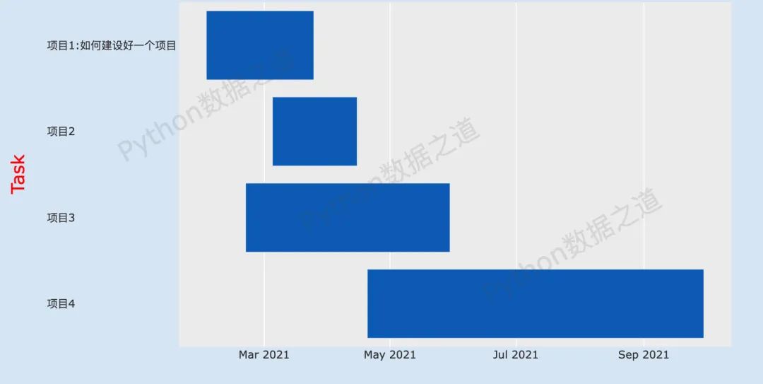
至此,虽然过程有点曲折,也还是实现了想要的效果。
柱状图案例
上面这个是甘特图(时间线)的案例,再来看看,在 plotly 的其他图表中,是否同样可以实现,以水平柱状图为例,来看看结果。
先构造数据,如下:
通常情况下的水平柱状图代码如下:
fig = px.bar(df,y='name',x='amount',orientation='h')
fig.show()
结果如下:
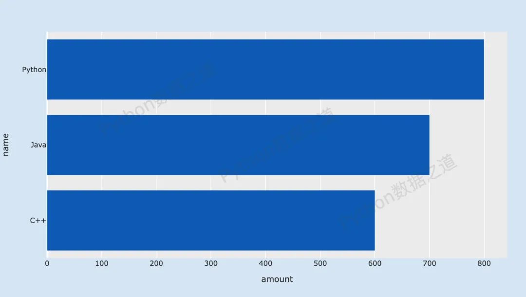
上面的这个,y轴刻度标签文字是靠右对齐的。
再来看看调整后的效果,y轴刻度标签文字是靠左对齐,代码如下:
fig = px.bar(df,y='name',x='amount',orientation='h')

fig.update_layout(
    xaxis=dict(domain=[0.07, 0.99]),
    yaxis=dict(
        anchor='free',
        position=0.01,
        side='right',
        title=dict(text='')
    )
)
fig.show()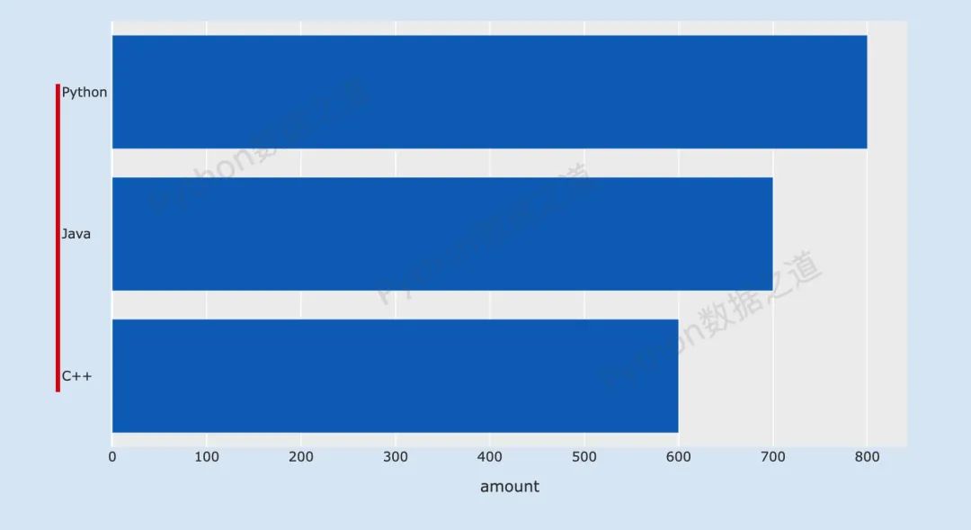
同样的,这里也实现了咱们想要的效果。
所以,这个解决方案,应该还是可以的,大家也来试试吧。
为方便大家,这里提供了本文对应的源代码,大家可以在公众号「Python数据之道」后台回复 code 来获取。
如果有其他解决的方案,欢迎来留言告诉大家~~
延伸阅读


大家读完顺手点下右下角的 “在看” ,就是最大的鼓励和支持了。


 被折叠的 条评论
为什么被折叠?
被折叠的 条评论
为什么被折叠?
 到【灌水乐园】发言


