


 本文详细介绍了如何使用Python和Sklearn库绘制混淆矩阵,通过一个具体的例子展示了混淆矩阵的生成过程及其在机器学习结果分析中的作用。文章还提供了绘制混淆矩阵热图的代码,并对生成的图像进行了深入分析。
在机器学习中经常会用到混淆矩阵(confusion matrix),不了解的同学请参考这篇博文:
ML01 机器学习后利用混淆矩阵Confusion matrix 进行结果分析
本文参考:使用python绘制混淆矩阵(confusion_matrix)
首先import一些必要的库:
from sklearn.metrics import confusion_matrix    # 生成混淆矩阵函数
import matplotlib.pyplot as plt    # 绘图库
import numpy as np
import tensorflow as tf
然后定义绘制混淆矩阵函数:
def plot_confusion_matrix(cm, labels_name, title):
    cm = cm.astype('float') / cm.sum(axis=1)[:, np.newaxis]    # 归一化
    plt.imshow(cm, interpolation='nearest')    # 在特定的窗口上显示图像
    plt.title(title)    # 图像标题
    plt.colorbar()
    num_local = np.array(range(len(labels_name)))
    plt.xticks(num_local, labels_name, rotation=90)    # 将标签印在x轴坐标上
    plt.yticks(num_local, labels_name)    # 将标签印在y轴坐标上
    plt.ylabel('True label')
    plt.xlabel('Predicted label')
生成混淆矩阵:
其中pred_y为预测值,y_为网络输出预测值,test_x为测试输入值,test_y为测试真实值。
(本程序中标签为one-hot形式,故使用tf.argmax(y_, 1)和tf.argmax(test_y, 1),若标签为普通列表形式,请直接使用y_和test_y)
pred_y = session.run(tf.argmax(y_, 1), feed_dict={X: test_x})
cm = confusion_matrix(np.argmax(test_y, 1), pred_y,)
print(cm)
# [[100   1   0   1   6   0   0]
#  [  2 111   3   0   2   1  24]
#  [  0   2  68   5   4   3   2]
#  [  2   0   1 120   7  26   0]
#  [  2   5   3   2 120  11  14]
#  [  2   0   2  12   8 115   1]
#  [  2  25   0   1  14   4 302]]
绘制混淆矩阵热图并显示:
plot_confusion_matrix(cm, labels_name, "HAR Confusion Matrix")
# plt.savefig('/HAR_cm.png', format='png')
plt.show()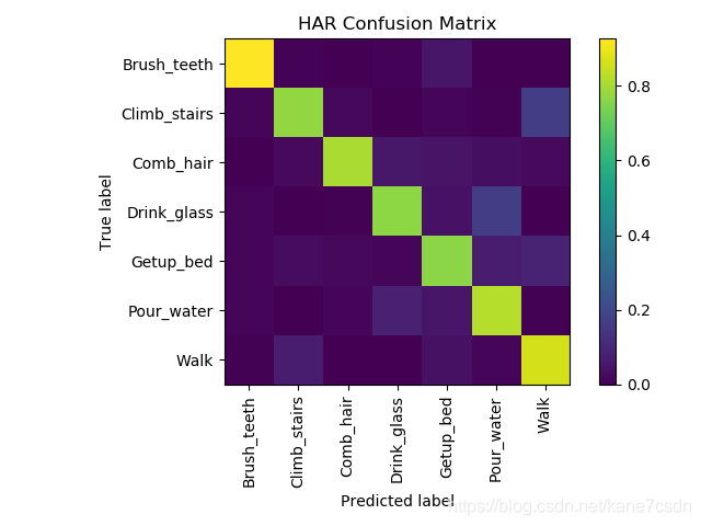
结合生成的图像对混淆矩阵进行分析:
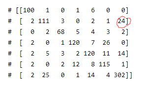
24代表:有24个Climb_stairs动作被神经网络认为成了Walk。


 4万+
4万+


 到【灌水乐园】发言


