


弹性布局概要
弹性布局(Flex)提供更加有效的方式对容器中的子元素进行排列、对齐和分配剩余空间。通常用于页面头部导航栏的均匀分布、页面框架的搭建、多行数据的排列等。
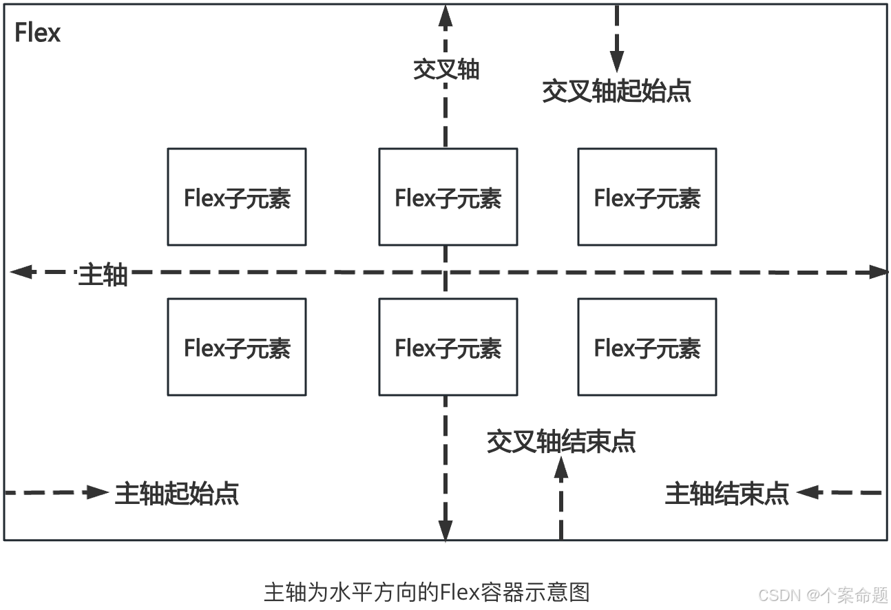
容器默认存在主轴与交叉轴,子元素默认沿主轴排列,子元素在主轴方向的尺寸称为主轴尺寸,在交叉轴方向的尺寸称为交叉轴尺寸。
基本概念
-
主轴:Flex组件布局方向的轴线,子元素默认沿着主轴排列。主轴开始的位置称为主轴起始点,结束位置称为主轴结束点。
-
交叉轴:垂直于主轴方向的轴线。交叉轴开始的位置称为交叉轴起始点,结束位置称为交叉轴结束点。
布局方向
在弹性布局中,容器的子元素可以按照任意方向排列。通过设置参数direction,可以决定主轴的方向,从而控制子元素的排列方向。
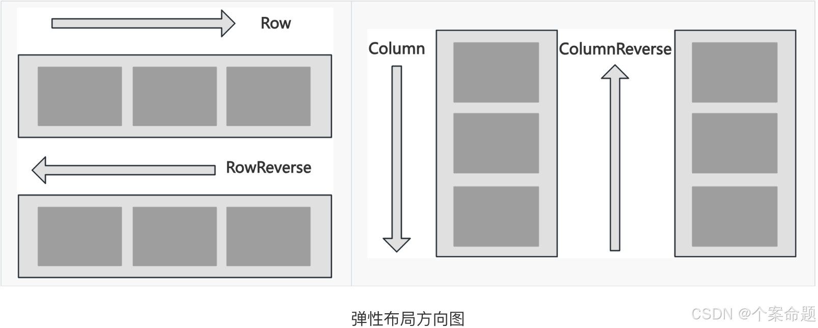
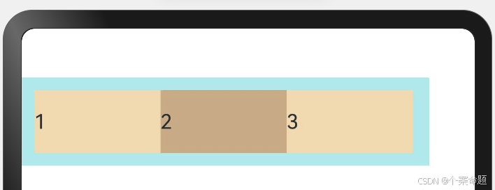
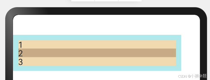
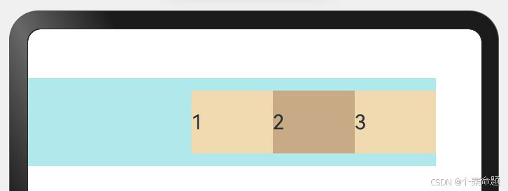
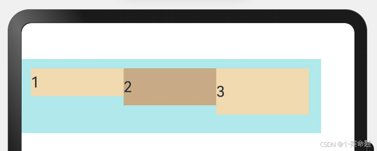
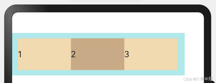
1. FlexDirection.Row(默认值):主轴为水平方向,子元素从起始端沿着水平方向开始排布。
@Entry
@Component
struct FlexSample {
  build() {
    // 弹性布局组件,设置布局方向为水平方向
    Flex({ direction: FlexDirection.Row }) {
      // 设置宽度为父容器宽度的1/3
      Text('1').width('33%').height(50).backgroundColor(0xF5DEB3)
      // 设置宽度为父容器宽度的1/3
      Text('2').width('33%').height(50).backgroundColor(0xD2B48C)
      // 设置宽度为父容器宽度的1/3
      Text('3').width('33%').height(50).backgroundColor(0xF5DEB3)
    }.height(70).width('90%')
    // 设置内填充边距为10vp
    .padding(10).backgroundColor(0xAFEEEE)
  }
}
显示的效果如下图所示:
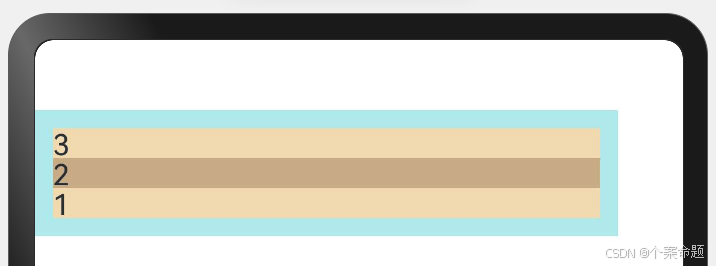
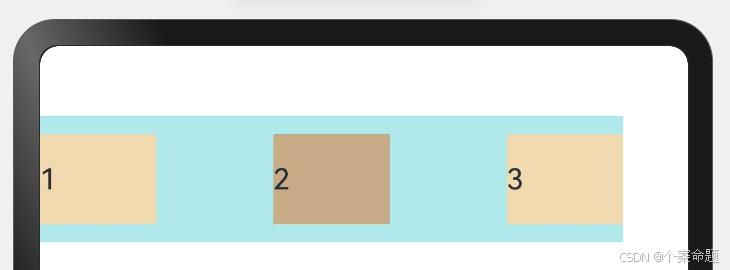
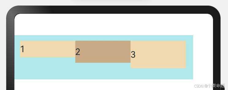
2. FlexDirection.RowReverse:主轴为水平方向,子元素从终点端沿着FlexDirection. Row相反的方向开始排布。
@Entry
@Component
struct FlexSample {
  build() {
    // 设置子组件排列放方向为行的反向,即从右向左
    Flex({ direction: FlexDirection.RowReverse }) {
      Text('1').width('33%').height(50).backgroundColor(0xF5DEB3)
      Text('2').width('33%').height(50).backgroundColor(0xD2B48C)
      Text('3').width('33%').height(50).backgroundColor(0xF5DEB3)
    }.height(70).width('90%').padding(10).backgroundColor(0xAFEEEE)
  }
}
显示的效果如下图所示:
3. FlexDirection.Column:主轴为垂直方向,子元素从起始端沿着垂直方向开始排布。
@Entry
@Component
struct FlexSample {
  build() {
    // 弹性布局组件,设置子组件排列方向为从上向下的列方向
    Flex({ direction: FlexDirection.Column }) {
      Text('1').width('100%').height(50).backgroundColor(0xF5DEB3)
      Text('2').width('100%').height(50).backgroundColor(0xD2B48C)
      Text('3').width('100%').height(50).backgroundColor(0xF5DEB3)
    }.height(70).width('90%').padding(10).backgroundColor(0xAFEEEE)
  }
}
显示的效果如下图所示:
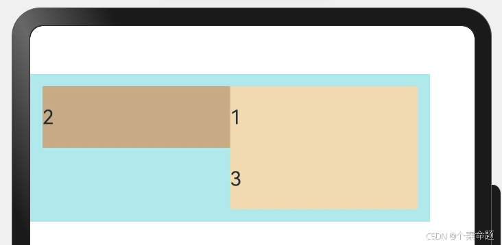
4. FlexDirection.ColumnReverse:主轴为垂直方向,子元素从终点端沿着FlexDirection. Column相反的方向开始排布。
@Entry
@Component
struct FlexSample {
  build() {
    // 弹性布局组件,排列方向为从下向上
    Flex({ direction: FlexDirection.ColumnReverse }) {
      Text('1').width('100%').height(50).backgroundColor(0xF5DEB3)
      Text('2').width('100%').height(50).backgroundColor(0xD2B48C)
      Text('3').width('100%').height(50).backgroundColor(0xF5DEB3)
    }.height(70).width('90%').padding(10).backgroundColor(0xAFEEEE)
  }
}
显示效果如下图所示:
布局换行
弹性布局分为单行布局和多行布局。默认情况下,Flex容器中的子元素都排在一条线(又称“轴线”)上。wrap属性控制当子元素主轴尺寸之和大于容器主轴尺寸时,Flex是单行布局还是多行布局。在多行布局时,通过交叉轴方向,确认新行排列方向。
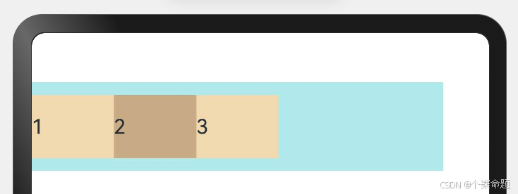
1. FlexWrap. NoWrap(默认值):不换行。如果子元素的宽度总和大于父元素的宽度,则子元素会被压缩宽度。
@Entry
@Component
struct FlexSample {
  build() {
    // 弹性布局组件,设置不换航
    Flex({ wrap: FlexWrap.NoWrap }) {
      // 下列三个组件的宽度超过了弹性布局组件的宽度,但是不换行,最终变为均匀分配宽度。
      // 子组件宽度设置为父容器组件的50%
      Text('1').width('50%').height(50).backgroundColor(0xF5DEB3)
      // 子组件宽度设置为父容器组件的50%
      Text('2').width('50%').height(50).backgroundColor(0xD2B48C)
      // 子组件宽度设置为父容器组件的50%
      Text('3').width('50%').height(50).backgroundColor(0xF5DEB3)
    }.width('90%').padding(10).backgroundColor(0xAFEEEE)
  }
}
显示的效果如下图所示:
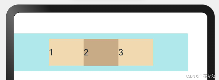
2. FlexWrap. Wrap:换行,每一行子元素按照主轴方向排列。
@Entry
@Component
struct FlexSample {
  build() {
    // 弹性布局组件,设置换行,子组件按照弹性布局组件的主轴方向排列
    Flex({ wrap: FlexWrap.Wrap }) {
      // 宽度设置为父容器组件宽度的50%
      Text('1').width('50%').height(50).backgroundColor(0xF5DEB3)
      // 宽度设置为父容器组件宽度的50%
      Text('2').width('50%').height(50).backgroundColor(0xD2B48C)
      // 宽度设置为父容器组件宽度的50%
      Text('3').width('50%').height(50).backgroundColor(0xD2B48C)
    }.width('90%').padding(10).backgroundColor(0xAFEEEE)
  }
}
显示效果如下图所示:
3. FlexWrap. WrapReverse:换行,每一行子元素按照主轴反方向排列。
@Entry
@Component
struct FlexSample {
  build() {
    // 弹性布局组件,设置反向排列子组件,如果换行,反向换行
    Flex({ wrap: FlexWrap.WrapReverse }) {
      Text('1').width('50%').height(50).backgroundColor(0xF5DEB3)
      Text('2').width('50%').height(50).backgroundColor(0xD2B48C)
      Text('3').width('50%').height(50).backgroundColor(0xF5DEB3)
    }.width('90%').padding(10).backgroundColor(0xAFEEEE)
  }
}
显示效果如下图所示:
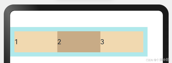
主轴对齐方式
通过justifyContent参数设置子元素在主轴方向的对齐方式。
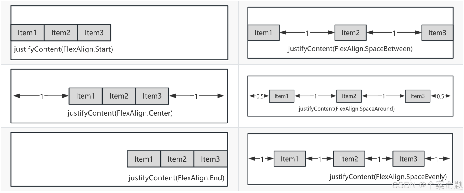
1. FlexAlign.Start(默认值):子元素在主轴方向起始端对齐, 第一个子元素与父元素边沿对齐,其他元素与前一个元素对齐。
// 通过Record设置布局参数
let PTopBottom: Record<string, number> = { 'top': 10, 'bottom': 10 }
@Entry
@Component
struct FlexSample {
  build() {
    // 子元素在主轴方向起始端对齐, 第一个子元素与父元素边沿对齐,其他元素与前一个元素对齐。
    Flex({ justifyContent: FlexAlign.Start }) {
      Text('1').width('20%').height(50).backgroundColor(0xF5DEB3)
      Text('2').width('20%').height(50).backgroundColor(0xD2B48C)
      Text('3').width('20%').height(50).backgroundColor(0xF5DEB3)
    }.width('90%')
    // 通过Record类型数据设置内填充边距
    .padding(PTopBottom)
    .backgroundColor(0xAFEEEE)
  }
}
显示效果如下图所示:
2. FlexAlign.Center:子元素在主轴方向居中对齐。
// 通过Record设置布局参数
let PTopBottom: Record<string, number> = { 'top': 10, 'bottom': 10 }
@Entry
@Component
struct FlexSample {
  build() {
    // 弹性布局,子组件在水平方向居中对齐
    Flex({ justifyContent: FlexAlign.Center }) {
      Text('1').width('20%').height(50).backgroundColor(0xF5DEB3)
      Text('2').width('20%').height(50).backgroundColor(0xD2B48C)
      Text('3').width('20%').height(50).backgroundColor(0xF5DEB3)
    }.width('90%')
    // 使用Record类型数据设置内填充边距
    .padding(PTopBottom)
    .backgroundColor(0xAFEEEE)
  }
}
显示效果如下图所示:
3. FlexAlign.End:子元素在主轴方向终点端对齐, 最后一个子元素与父元素边沿对齐,其他元素与后一个元素对齐。
// 通过Record设置布局参数
let PTopBottom: Record<string, number> = { 'top': 10, 'bottom': 10 }
@Entry
@Component
struct FlexSample {
  build() {
    // 弹性布局组件,设置子组件在水平方向右对齐
    Flex({ justifyContent: FlexAlign.End }) {
      Text('1').width('20%').height(50).backgroundColor(0xF5DEB3)
      Text('2').width('20%').height(50).backgroundColor(0xD2B48C)
      Text('3').width('20%').height(50).backgroundColor(0xF5DEB3)
    }.width('90%')
    // 使用Record类型参数设置内填充边距
    .padding(PTopBottom)
    .backgroundColor(0xAFEEEE)
  }
}
显示效果如下图所示:
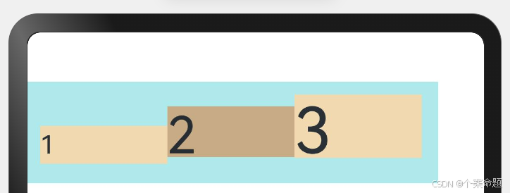
4. FlexAlign.SpaceBetween:Flex主轴方向均匀分配弹性元素,相邻子元素之间距离相同。第一个子元素和最后一个子元素与父元素边沿对齐。
// 使用Record类型数据设置布局参数
let PTopBottom1: Record<string, number> = { 'top': 10, 'bottom': 10 }
@Entry
@Component
struct FlexSample {
  build() {
    // 弹性布局,设置子组件在水平方向对齐方式为:
    // 第一个子组件与父组件起始对齐,最后一个子组件与父组件结束位置对齐
    // 子组件之间等间距布局
    Flex({ justifyContent: FlexAlign.SpaceBetween }) {
      Text('1').width('20%').height(50).backgroundColor(0xF5DEB3)
      Text('2').width('20%').height(50).backgroundColor(0xD2B48C)
      Text('3').width('20%').height(50).backgroundColor(0xF5DEB3)
    }.width('90%')
    // 使用Record类型数据设置内填充边距
    .padding(PTopBottom1)
    .backgroundColor(0xAFEEEE)
  }
}
显示效果如下图所示:
5. FlexAlign.SpaceAround:Flex主轴方向均匀分配弹性元素,相邻子元素之间距离相同。第一个子元素到主轴起始端的距离和最后一个子元素到主轴终点端的距离是相邻元素之间距离的一半。
// 使用Record类型数据设置布局参数
let PTopBottom: Record<string, number> = { 'top': 10, 'bottom': 10 }
@Entry
@Component
struct FlexSample {
  build() {
    // 弹性布局组件,设置子组件在水平方向对齐方式为:
    // 子组件之间等距布局,第一个子组件到父组件开始的距离是子组件之间距离的1/2
    // 最后一个子组件与父组件结束位置的距离是子组件之间距离的1/2
    Flex({ justifyContent: FlexAlign.SpaceAround }) {
      Text('1').width('20%').height(50).backgroundColor(0xF5DEB3)
      Text('2').width('20%').height(50).backgroundColor(0xD2B48C)
      Text('3').width('20%').height(50).backgroundColor(0xF5DEB3)
    }.width('90%')
    // 使用Record类型数据设置内填充边距
    .padding(PTopBottom)
    .backgroundColor(0xAFEEEE)
  }
}
显示效果如下图所示:
6. FlexAlign.SpaceEvenly:Flex主轴方向元素等间距布局,相邻子元素之间的间距、第一个子元素与主轴起始端的间距、最后一个子元素到主轴终点端的间距均相等。
// 使用Record类型数据设置布局参数
let PTopBottom: Record<string, number> = { 'top': 10, 'bottom': 10 }
@Entry
@Component
struct FlexSample {
  build() {
    // 弹性布局组件,设置子组件的布局方式为:
    // 子组件之间等距排列,第一个子元素到父组件起始位置的距离与最后一个子组件到
    // 父组件结束位置的距离与子组件之间的间距相同
    Flex({ justifyContent: FlexAlign.SpaceEvenly }) {
      Text('1').width('20%').height(50).backgroundColor(0xF5DEB3)
      Text('2').width('20%').height(50).backgroundColor(0xD2B48C)
      Text('3').width('20%').height(50).backgroundColor(0xF5DEB3)
    }.width('90%')
    // 使用Record类型数据设置内填充边距
    .padding(PTopBottom)
    .backgroundColor(0xAFEEEE)
  }
}
显示效果如下图所示:
交叉轴对齐方式
容器和子元素都可以设置交叉轴对齐方式,且子元素设置的对齐方式优先级较高。
容器组件设置交叉轴对齐
可以通过Flex组件的alignItems参数设置子元素在交叉轴的对齐方式。
1. ItemAlign.Auto:使用Flex容器中默认配置。
// 使用Record类型数据设置布局参数
let SWh: Record<string, number | string> = { 'width': '90%', 'height': 80 }
@Entry
@Component
struct FlexSample {
  build() {
    // 弹性布局组件,设置子组件在交叉轴方向的对齐方式为默认设置,
    // 即顶部对齐
    Flex({ alignItems: ItemAlign.Auto }) {
      Text('1').width('33%').height(30).backgroundColor(0xF5DEB3)
      Text('2').width('33%').height(40).backgroundColor(0xD2B48C)
      Text('3').width('33%').height(50).backgroundColor(0xF5DEB3)
    }
    // 使用Record类型数据设置布局参数,此处设置了组件的宽度和高度
    .size(SWh)
    .padding(10).backgroundColor(0xAFEEEE)
  }
}
显示效果如下图所示:
2. ItemAlign.Start:交叉轴方向首部对齐。
// 使用Record类型数据设置布局参数
let SWh: Record<string, number | string> = { 'width': '90%', 'height': 80 }
@Entry
@Component
struct FlexSample {
  build() {
    // 弹性布局组件,设置子组件在交叉轴方向的对齐方式为起始对齐,即
    // 子组件在交叉轴方向顶部对齐,为默认方式
    Flex({ alignItems: ItemAlign.Start }) {
      Text('1').width('33%').height(30).backgroundColor(0xF5DEB3)
      Text('2').width('33%').height(40).backgroundColor(0xD2B48C)
      Text('3').width('33%').height(50).backgroundColor(0xF5DEB3)
    }
    // 使用Record类型数据设置布局参数,此处设置了Flex组件的宽度和高度
    .size(SWh)
    .padding(10).backgroundColor(0xAFEEEE)
  }
}
显示效果如下图所示:
3. ItemAlign.Center:交叉轴方向居中对齐。
// 使用Record类型数据设置组件的布局参数
let SWh: Record<string, number | string> = { 'width': '90%', 'height': 80 }
@Entry
@Component
struct FlexSample {
  build() {
    // 弹性布局组件,设置子组件在交叉轴方向对齐方式为:居中对齐,即水平居中对齐
    Flex({ alignItems: ItemAlign.Center }) {
      Text('1').width('33%').height(30).backgroundColor(0xF5DEB3)
      Text('2').width('33%').height(40).backgroundColor(0xD2B48C)
      Text('3').width('33%').height(50).backgroundColor(0xF5DEB3)
    }
    // 使用Record类型数据设置组件的宽度和高度
    .size(SWh)
    .padding(10).backgroundColor(0xAFEEEE)
  }
}
显示效果如下图所示:
4. ItemAlign.End:交叉轴方向底部对齐。
// 使用Record类型数据设置组件的布局参数
let SWh: Record<string, number | string> = { 'width': '90%', 'height': 80 }
@Entry
@Component
struct FlexSample {
  build() {
    // 弹性布局组件,设置子组件在交叉轴方向的对齐方式为:尾部对齐,即底部对齐
    Flex({ alignItems: ItemAlign.End }) {
      Text('1').width('33%').height(30).backgroundColor(0xF5DEB3)
      Text('2').width('33%').height(40).backgroundColor(0xD2B48C)
      Text('3').width('33%').height(50).backgroundColor(0xF5DEB3)
    }
    // 使用Record类型数据设置组件的宽度和高度
    .size(SWh)
    .padding(10).backgroundColor(0xAFEEEE)
  }
}
显示效果如下图所示:
5. ItemAlign.Stretch:交叉轴方向拉伸填充,在未设置尺寸时,拉伸到容器尺寸。
// 使用Record类型数据设置组件的布局参数
let SWh: Record<string, number | string> = { 'width': '90%', 'height': 80 }
@Entry
@Component
struct FlexSample {
  build() {
    // 弹性布局,设置子组件在交叉轴方向的对齐方式:在交叉轴方向拉伸填充,
    // 在未设置尺寸时,拉伸到容器尺寸。
    Flex({ alignItems: ItemAlign.Stretch }) {
      Text('1').width('33%').backgroundColor(0xF5DEB3)
      Text('2').width('33%').backgroundColor(0xD2B48C)
      Text('3').width('33%').backgroundColor(0xF5DEB3)
    }
    // 使用Record类型数据设置组件的宽度和高度
    .size(SWh)
    .padding(10).backgroundColor(0xAFEEEE)
  }
}
显示效果如下图所示:
6. ItemAlign. Baseline:交叉轴方向文本基线对齐。
// 使用Record类型数据设置组件的布局参数
let SWh: Record<string, number | string> = { 'width': '90%', 'height': 80 }
@Entry
@Component
struct FlexSample {
  build() {
    // 弹性布局组件,设置子组件在交叉轴方向的对齐方式:文本基线对齐
    Flex({ alignItems: ItemAlign.Baseline }) {
      Text('1').width('33%').height(30).fontSize(20).backgroundColor(0xF5DEB3)
      Text('2').width('33%').height(40).fontSize(40).backgroundColor(0xD2B48C)
      Text('3').width('33%').height(50).fontSize(50).backgroundColor(0xF5DEB3)
    }
    // 使用Record类型数据设置组件的宽度和高度
    .size(SWh)
    .padding(10).backgroundColor(0xAFEEEE)
  }
}
显示效果如下图所示:
子元素设置交叉轴对齐
子元素的alignSelf属性也可以设置子元素在父容器交叉轴的对齐方式,且会覆盖Flex布局容器中alignItems配置。
如下代码所示:
@Entry
@Component
struct FlexSample {
  build() {
    // 弹性布局组件,设置子元素布局方向为水平方向,子组件在交叉轴方向对齐方式为居中对齐,即垂直居中对齐
    Flex({ direction: FlexDirection.Row, alignItems: ItemAlign.Center }) {
      // 容器组件设置子元素居中
      Text('alignSelf Start').width('25%').height(80)
        // 通过alignSelf设置自己在父组件交叉轴方向的对齐方式为:顶部对齐
        .alignSelf(ItemAlign.Start)
        .backgroundColor(0xF5DEB3)
      Text('alignSelf Baseline')
        // 通过alignSelf设置自己在父组件交叉轴方向的对齐方式:文本基线对齐
        .alignSelf(ItemAlign.Baseline)
        .width('25%')
        .height(80)
        .backgroundColor(0xD2B48C)
      Text('alignSelf Baseline').width('25%').height(100)
        .backgroundColor(0xF5DEB3)
        // 通过alignSelf设置自己在父组件交叉轴方向的对齐方式:文本基线对齐
        .alignSelf(ItemAlign.Baseline)
      // 该组件在父组件交叉轴方向的对齐方式使用父组件的设置:垂直居中对齐
      Text('no alignSelf').width('25%').height(100)
        .backgroundColor(0xD2B48C)
      // 该组件在父组件交叉轴方向的对齐方式使用父组件的设置:垂直居中对齐
      Text('no alignSelf').width('25%').height(80)
        .backgroundColor(0xF5DEB3)
    }.width('90%').height(220).backgroundColor(0xAFEEEE)
  }
}
显示效果如下图所示:
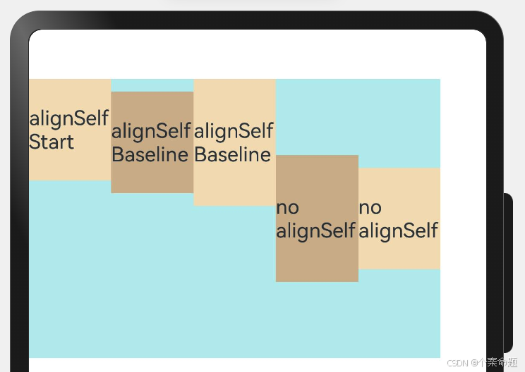
上例中,Flex容器中alignItems设置交叉轴子元素的对齐方式为居中,子元素自身设置了alignSelf属性的情况,覆盖父组件的alignItems值,表现为alignSelf的定义。
内容对齐
可以通过alignContent参数设置子元素各行在交叉轴剩余空间内的对齐方式,只在多行的Flex布局中生效。可选值有:
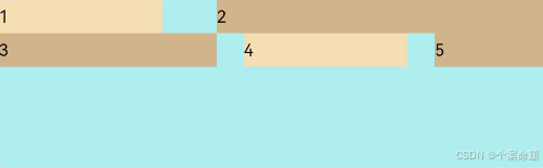
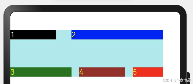
1. FlexAlign.Start:子元素各行与交叉轴起点对齐。
Flex({
  justifyContent: FlexAlign.SpaceBetween,
  wrap: FlexWrap.Wrap,
  alignContent: FlexAlign.Start
}) {
  Text('1').width('30%').height(20).backgroundColor(0xF5DEB3)
  Text('2').width('60%').height(20).backgroundColor(0xD2B48C)
  Text('3').width('40%').height(20).backgroundColor(0xD2B48C)
  Text('4').width('30%').height(20).backgroundColor(0xF5DEB3)
  Text('5').width('20%').height(20).backgroundColor(0xD2B48C)
}.width('90%').height(100).backgroundColor(0xAFEEEE)
显示效果如下图所示:
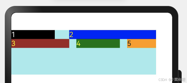
2. FlexAlign.Center:子元素各行在交叉轴方向居中对齐。
@Entry
@Component
struct FlexSample {
  build() {
    // 弹性布局组件
    Flex({
      // 设置子组件在主轴方向的对齐方式:第一个子组件与容器组件的起始对齐
      // 最后一个子组件与容器组件的结束为止对齐
      // 子组件之间等间距排列
      justifyContent: FlexAlign.SpaceBetween,
      // 设置换行
      wrap: FlexWrap.Wrap,
      // 设置子组件在交叉轴方向的对齐方式:垂直顶部对齐,留出下面的空间
      // 即在交叉轴方向还有剩余空间,此时子组件如何排列
      alignContent: FlexAlign.Start
    }) {
      Text('1').width('30%').height(20).backgroundColor(Color.Black).fontColor(Color.White)
      Text('2').width('60%').height(20).backgroundColor(Color.Blue).fontColor(Color.Yellow)
      Text('3').width('40%').height(20).backgroundColor(Color.Brown).fontColor(Color.Yellow)
      Text('4').width('30%').height(20).backgroundColor(Color.Green).fontColor(Color.Yellow)
      Text('5').width('20%').height(20).backgroundColor(Color.Orange)
    }.width('90%').height(100).backgroundColor(0xAFEEEE)
  }
}
显示效果如下图所示:
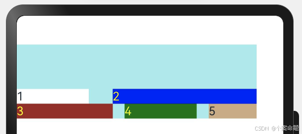
3. FlexAlign.End:子元素各行与交叉轴终点对齐。
@Entry
@Component
struct FlexSample {
  build() {
    Flex({
      // 在主轴方向子组件排列方式。
      // 子组件之间等距排列,第一个子组件与父组件开始对齐,最后一个子组件与父组件结束对齐
      justifyContent: FlexAlign.SpaceBetween,
      // 如果主轴方向空间不够则换行
      wrap: FlexWrap.Wrap,
      // 在交叉轴方向,如果父组件空间有剩余,则子组件在交叉轴方向的对齐方式为:与交叉轴方向底端对齐
      alignContent: FlexAlign.End
    }) {
      Text('1').width('30%').height(20).backgroundColor(Color.White)
      Text('2').width('60%').height(20).backgroundColor(Color.Blue).fontColor(Color.Yellow)
      Text('3').width('40%').height(20).backgroundColor(Color.Brown).fontColor(Color.Yellow)
      Text('4').width('30%').height(20).backgroundColor(Color.Green).fontColor(Color.Yellow)
      Text('5').width('20%').height(20).backgroundColor(0xD2B48C)
    }.width('90%').height(100).backgroundColor(0xAFEEEE)
  }
}
显示效果如下图所示:
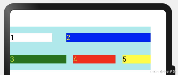
4. FlexAlign.SpaceBetween:子元素各行与交叉轴两端对齐,各行间垂直间距平均分布。
@Entry
@Component
struct FlexSample {
  build() {
    Flex({
      // 子组件在主轴方向对齐方式:
      // 子组件之间等间距,第一个子组件与主轴开始对齐,最后一个子组件与主轴方向结束对齐
      justifyContent: FlexAlign.SpaceBetween,
      // 如果主轴方向空间不够,则换行
      wrap: FlexWrap.Wrap,
      // 在交叉轴方向如果有剩余空间,则子组件的对齐方式为:
      // 行之间等距排列,第一行与交叉轴开始对齐,最后一行与交叉轴结束对齐
      alignContent: FlexAlign.SpaceBetween
    }) {
      Text('1').width('30%').height(20).backgroundColor(Color.Black)
        .fontColor(Color.White)
      Text('2').width('60%').height(20).backgroundColor(Color.Blue)
        .fontColor(Color.Yellow)
      Text('3').width('40%').height(20).backgroundColor(Color.Green)
        .fontColor(Color.Yellow)
      Text('4').width('30%').height(20).backgroundColor(Color.Brown)
        .fontColor(Color.Yellow)
      Text('5').width('20%').height(20).backgroundColor(Color.Red)
        .fontColor(Color.Yellow)
    }.width('90%').height(100).backgroundColor(0xAFEEEE)
  }
}
显示效果如下图所示:
5. FlexAlign.SpaceAround:子元素各行间距相等,是元素首尾行与交叉轴两端距离的两倍。
@Entry
@Component
struct FlexSample {
  build() {
    Flex({
      // 子组件在主轴方向排列方式:首尾子组件与主轴方向开始和结束对齐
      // 子组件之间等距排列
      justifyContent: FlexAlign.SpaceBetween,
      // 如果主轴方向空间不够则换行
      wrap: FlexWrap.Wrap,
      // 在交叉轴方向如果有剩余空间则子组件的对齐方式:
      // 行之间等距排列,第一行和最后一行到交叉轴开始和结束的距离为行之间距离的一半
      alignContent: FlexAlign.SpaceAround
    }) {
      Text('1').width('30%').height(20).backgroundColor(Color.White)
        .fontColor(Color.Black)
      Text('2').width('60%').height(20).backgroundColor(Color.Blue)
        .fontColor(Color.Yellow)
      Text('3').width('40%').height(20).backgroundColor(Color.Green)
        .fontColor(Color.Yellow)
      Text('4').width('30%').height(20).backgroundColor(Color.Red)
        .fontColor(Color.Yellow)
      Text('5').width('20%').height(20).backgroundColor(Color.Yellow)
        .fontColor(Color.Black)
    }.width('90%').height(100).backgroundColor(0xAFEEEE)
  }
}
显示效果如下图所示:
6. FlexAlign.SpaceEvenly: 子元素各行间距,子元素首尾行与交叉轴两端距离都相等。
@Entry
@Component
struct FlexSample {
  build() {
    Flex({
      // 子组件在主轴方向对齐方式:首尾子组件与父组件主轴起始和结束位置对齐
      // 子组件之间等距排列
      justifyContent: FlexAlign.SpaceBetween,
      // 在主轴方向如果空间不够,则换行显示子组件
      wrap: FlexWrap.Wrap,
      // 在交叉轴方向如果有剩余空间,则子组件的排列方式:
      // 行之间等距排列,第一行和最后一行到交叉轴方向的开始和结束为值的间距与行间距相同
      alignContent: FlexAlign.SpaceEvenly
    }) {
      Text('1').width('30%').height(20).backgroundColor(Color.Black)
        .fontColor(Color.White)
      Text('2').width('60%').height(20).backgroundColor(Color.Blue)
        .fontColor(Color.Yellow)
      Text('3').width('40%').height(20).backgroundColor(Color.Green)
        .fontColor(Color.Yellow)
      Text('4').width('30%').height(20).backgroundColor(Color.Yellow)
      Text('5').width('20%').height(20).backgroundColor(Color.Red)
        .fontColor(Color.Yellow)
    }.width('90%').height(100).backgroundColor(0xAFEEEE)
  }
}
显示效果如下图所示:
自适应拉伸
在弹性布局父组件尺寸过小时,通过子元素的以下属性设置其在父容器的占比,达到自适应布局。
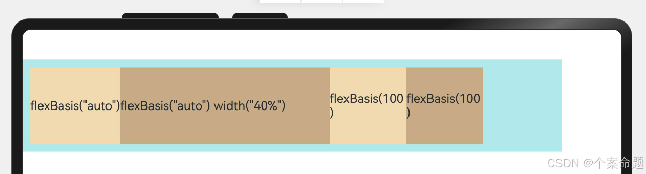
1. flexBasis:设置子元素在父容器主轴方向上的基准尺寸。如果设置了该属性,则子项占用的空间为该属性所设置的值;如果没设置该属性,那子项的空间为width/height的值。
@Entry
@Component
struct FlexSample {
  build() {
    Flex() {
      Text('flexBasis("auto")')
        // 未设置width以及flexBasis值为auto,组件的宽度容纳自身内容
        .flexBasis('auto')
        .height(100)
        .backgroundColor(0xF5DEB3)
      Text('flexBasis("auto")' + ' width("40%")')
          //设置width以及flexBasis值auto,使用width的值
        .flexBasis('auto')
        .width('40%')
        .height(100)
        .backgroundColor(0xD2B48C)

      Text('flexBasis(100)')
        // 未设置width以及flexBasis值为100,宽度为100vp
        .flexBasis(100)
        .height(100)
        .backgroundColor(0xF5DEB3)

      Text('flexBasis(100)')
        // flexBasis值为100,覆盖width的设置值,宽度为100vp
        .flexBasis(100)
        .width(200)
        .height(100)
        .backgroundColor(0xD2B48C)
    }.width('90%').height(120).padding(10).backgroundColor(0xAFEEEE)
  }
}
显示的效果如下图所示:
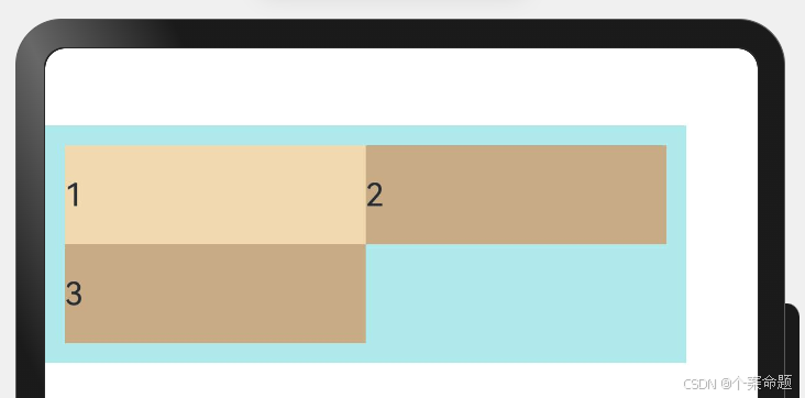
2. flexGrow:设置父容器的剩余空间分配给此属性所在组件的比例。用于分配父组件的剩余空间。
@Entry
@Component
struct FlexSample {
  build() {
    Column() {
      Flex() {
        // flexGrow为2,则分配父组件剩余空间的权重为2,此处为2/5
        Text('flexGrow(2)')
          .flexGrow(2)
          .width(100)
          .height(100)
          .backgroundColor(0xF5DEB3)
        // flexGrow为3,则分配父组件剩余空间的权重为3,此处为3/5
        Text('flexGrow(3)')
          .flexGrow(3)
          .width(100)
          .height(100)
          .backgroundColor(0xD2B48C)
        // 如果没有设置flexGrow的值,则容纳自身的宽度
        // 此处设置为100vp,则宽度就是100vp,不会分配父组件的剩余空间
        Text('no flexGrow')
          .width(100)
          .height(100)
          .backgroundColor(0xF5DEB3)
      }.width(420).height(120).padding(10).backgroundColor(0xAFEEEE)
      Flex() {
        Text('no flexGrow')
          .width(100)
          .height(100)
          .backgroundColor(0xF5DEB3)
        Text('no flexGrow')
          .width(100)
          .height(100)
          .backgroundColor(0xD2B48C)
        Text('no flexGrow')
          .width(100)
          .height(100)
          .backgroundColor(0xF5DEB3)
      }.width(420).height(120).padding(10).backgroundColor(0xAFEEEE)
    }.height('100%').width('100%')
  }
}
显示的效果如下图所示:
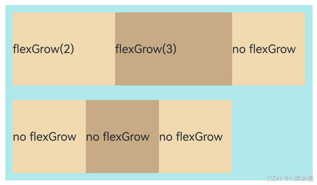
父容器宽度420vp,三个子元素原始宽度为100vp,左右padding为20vp,总和320vp,剩余空间100vp根据flexGrow值的占比分配给子元素,未设置flexGrow的子元素不参与“瓜分”。
第一个元素以及第二个元素以2:3分配剩下的100vp。第一个元素为100vp+100vp * 2/5=140vp,第二个元素为100vp+100vp * 3/5=160vp。
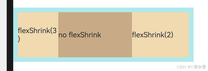
3. flexShrink: 当父容器空间不足时,子元素的压缩比例。
@Entry
@Component
struct FlexSample {
  build() {
    Flex({ direction: FlexDirection.Row }) {
      Text('flexShrink(3)')
        // 设置了收缩比例,当父组件宽度不够时的收缩权重为3,此处为3/5
        // 父组件宽度为400,不收缩的占据了200,剩余的200中的3/5即120由该组件让出来
        // 最终该组件的宽度为80vp
        .flexShrink(3)
        .width(200)
        .height(100)
        .backgroundColor(0xF5DEB3)
        .onClick(() => {
        })
      // 没有设置收缩比例,因此不收缩
      Text('no flexShrink')
        .width(200)
        .height(100)
        .backgroundColor(0xD2B48C)

      // 设置了收缩比例为2,即当父组件宽度不够时的收缩权重为2,此处为2/5
      // 父组件宽度为400,不收缩的占据了200,不足的200中的2/5即80由该组件让出来
      // 最终该组件的宽度为120vp
      Text('flexShrink(2)')
        .flexShrink(2)
        .width(200)
        .height(100)
        .backgroundColor(0xF5DEB3)
    }.width(400).height(120).padding(10).backgroundColor(0xAFEEEE)
  }
}
显示效果如下图所示:
场景示例
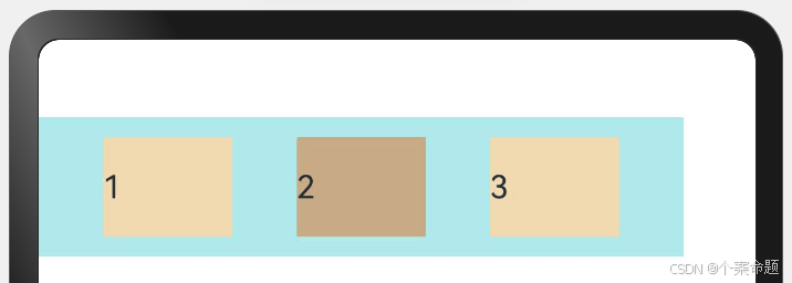
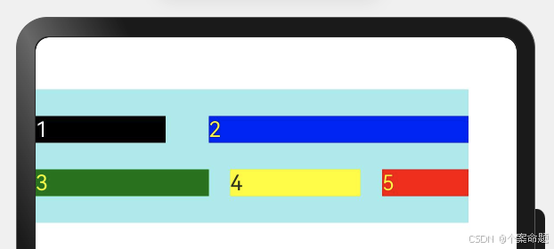
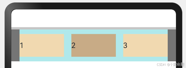
使用弹性布局,可以实现子元素沿水平方向排列,两端对齐,子元素间距平分,垂直方向上子元素居中的效果。
@Entry
@Component
struct FlexExample {
  build() {
    Column() {
      Column({ space: 5 }) {
        Flex({
          // 子组件排列方向为行,从左向右
          direction: FlexDirection.Row,
          // 当宽度不够的时候,子组件不换行
          wrap: FlexWrap.NoWrap,
          // 子组件在主轴方向对齐方式:第一个子组件与最后一个子组件与父组件首尾对齐
          // 子组件之间等距排列
          justifyContent: FlexAlign.SpaceBetween,
          // 子组件在交叉轴方向对齐方式为:居中对齐
          alignItems: ItemAlign.Center
        }) {
          Text('1').width('30%').height(50).backgroundColor(0xF5DEB3)
          Text('2').width('30%').height(50).backgroundColor(0xD2B48C)
          Text('3').width('30%').height(50).backgroundColor(0xF5DEB3)
        }
        .height(70)
        .width('90%')
        .backgroundColor(0xAFEEEE)
      }.width('100%').margin({ top: 5 }).backgroundColor(Color.Gray)
    }.width('100%').backgroundColor('#cccccc')
  }
}
显示效果如下图所示:


 扫一扫
扫一扫


 2022
2022

 被折叠的 条评论
为什么被折叠?
被折叠的 条评论
为什么被折叠?
 到【灌水乐园】发言


