


 本文介绍了一个基于vue3和typescript实现的配置化table表格组件,旨在减少重复代码,提高代码维护性。组件内封装了分页组件和分页参数管理,支持多种UI框架,提供配置JSON实例,通过接口定义简化数据获取和列渲染。同时,解决了props传对象时默认值被覆盖的问题。
背景
同form,table编写会出现大量的table-column组件,并且没有另外处理分页组件及分页参数,出现大量的重复代码影响美观及代码维护,另外,大量的使用table+分页组件,会出现大量的重复逻辑,容易出现遗漏细节性的低级bug,各个页面分页管理其实基本一致,这里将分页组件及分页参数也封装在此组件内部,调用组件不在需要管理分页参数
此组件在element-ui、ant-design-vue项目中均可直接使用,实现原理 vue3+ts组件库同时兼容多种ui框架
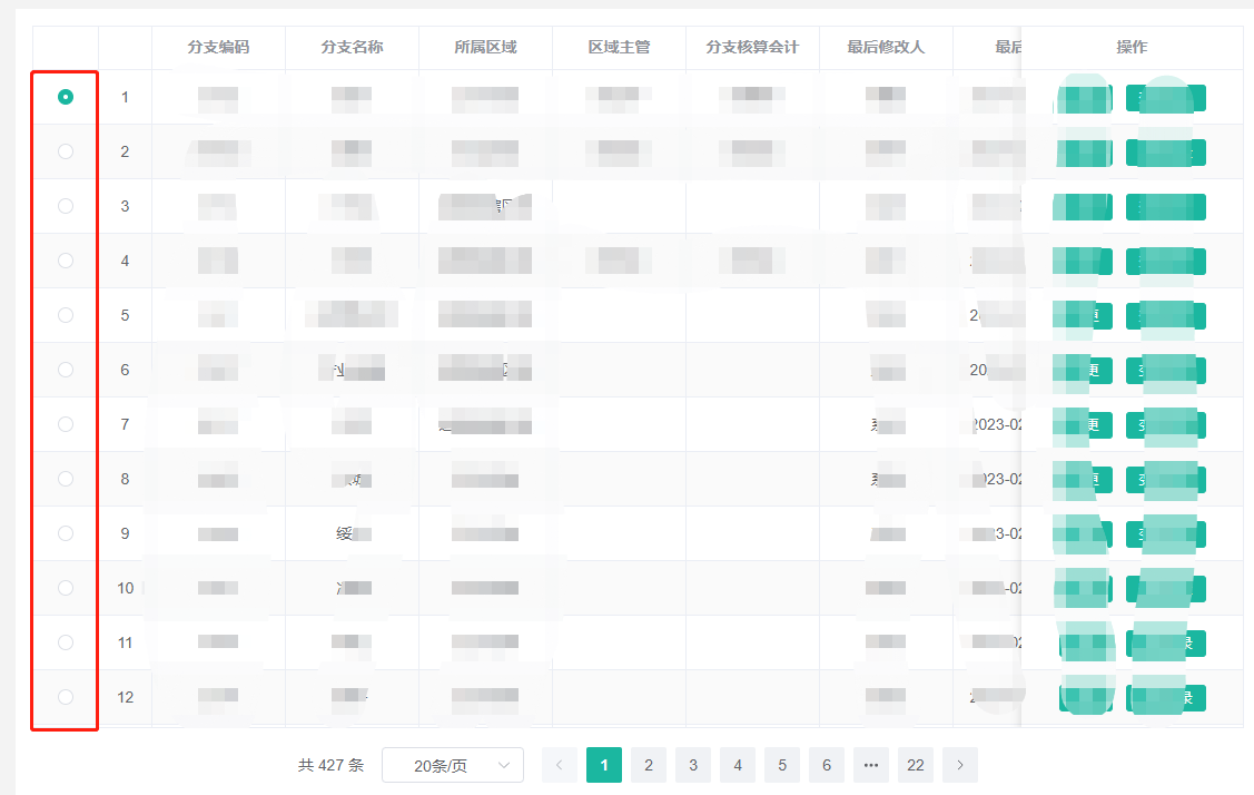
效果图
最终实现的效果是这样滴!!!

概要实现逻辑
组件目录

"食用"例子
我们先看下上述效果图的配置化JOSN实例,最终我们将实现所有table表格+分页都能通过这样一些简单的JSON实现渲染,最后通过一个简单的调用即可渲染一个form表单,具体组件的入参如下:
- tableConfig:table相关配置,主要是支持element-ui、ant-design-vue table组件所有原生属性(eg:stripe、border等)以及自定义的一些table相关属性具体参看tableConfigFace接口定义,常用字段均有默认值,无特殊指定可以不传
- pagingConfig:分页相关配置,主要是支持element-ui、ant-design-vue pagination组件所有原生属性(eg:background、layout等)以及自定义的一些分页相关属性具体参看pagingConfigFace接口定义,常用字段均有默认值,无特殊指定可以不传
- thead:table列JSON对象配置,具体参考theadConfigFace,必传
- loadData:table数据获取函数配置,此函数必须返回一个promise且次promise必须返回一个满足resultInt接口定义的数据格式的对象,有数据渲染时,必传
调用
<BaseTable
  :thead="thead"
  :load-data="loadData2"
/>
<script lang="tsx" setup>
  // table列配置
  const thead = ref<theadConfigFace>([
    { type: 'index', fixed: 'left' },
    { prop: 'id', label: 'id', width: 100, align: 'left', fixed: 'left' },
    { prop: 'createTime', label: '创建时间', width: 100 },
    { prop: 'loanCount', label: '笔数', width: 80 },
    { prop: 'effectiveDays', label: '下载有效期(天)' },
    { prop: 'statusDesc', label: '状态' },
    {
      prop: 'infoData1',
      label: '数目1',
      width: 160,
      nativeProps:{
        'show-overflow-tooltip': true,
      }
    },
    {
      prop: 'info', label: '统计', children: [
        {
          prop: 'infoData22',
          label: '统计数目22',
          width: 160,
          children: [
            {
              prop: 'infoData221',
              label: '统计数目221',
              width: 160,
            },
            {
              prop: 'infoData222',
              label: '统计数目212',
              width: 160,
            },
          ],
        },
        {
          prop: 'infoData21',
          label: '统计数目21',
          width: 160,
          children: [
            {
              prop: 'infoData211',
              label: '统计数目211',
              width: 160,
            },
            {
              prop: 'infoData212',
              label: '统计数目212',
              width: 160,
              render: (scope: any) => (
                <div>
                  {scope.row.infoData211} render测试
                </div>
              ),
            },
          ],
        },
      ],
    },
  ])
  // 加载函数配置
  const loadData2:loadDataFace = async({ pageIndex, pageSize }: { pageIndex: number, pageSize: number }) => {
    return new Promise<resultInt>((resolve) => {
      setTimeout(() => {
        resolve({
          success: true,
          list: pageIndex === 1 ? [
            { id: 1, createTime: '2021-01', loanCount: 5, effectiveDays: 5, statusDesc: '成功', infoData1: 1, infoData21: 21, infoData22: 22, infoData211: 211, infoData212: 212, infoData221: 221, infoData222: 222 },
            { id: 2, createTime: '2021-02', loanCount: 5, effectiveDays: 5, statusDesc: '成功', infoData1: 1, infoData21: 21, infoData22: 22, infoData211: 211, infoData212: 212, infoData221: 221, infoData222: 222 },
            { id: 3, createTime: '2021-03', loanCount: 5, effectiveDays: 5, statusDesc: '成功', infoData1: 1, infoData21: 21, infoData22: 22, infoData211: 211, infoData212: 212, infoData221: 221, infoData222: 222 },
            { id: 4, createTime: '2021-04', loanCount: 5, effectiveDays: 5, statusDesc: '成功', infoData1: 1, infoData21: 21, infoData22: 22, infoData211: 211, infoData212: 212, infoData221: 221, infoData222: 222 },
            { id: 5, createTime: '2021-05', loanCount: 5, effectiveDays: 5, statusDesc: '成功', infoData1: 1, infoData21: 21, infoData22: 22, infoData211: 211, infoData212: 212, infoData221: 221, infoData222: 222 },
            { id: 6, createTime: '2021-06', loanCount: 5, effectiveDays: 5, statusDesc: '成功', infoData1: 1, infoData21: 21, infoData22: 22, infoData211: 211, infoData212: 212, infoData221: 221, infoData222: 222 },
            { id: 7, createTime: '2021-07', loanCount: 5, effectiveDays: 5, statusDesc: '成功', infoData1: 1, infoData21: 21, infoData22: 22, infoData211: 211, infoData212: 212, infoData221: 221, infoData222: 222 },
            { id: 8, createTime: '2021-08', loanCount: 5, effectiveDays: 5, statusDesc: '成功', infoData1: 1, infoData21: 21, infoData22: 22, infoData211: 211, infoData212: 212, infoData221: 221, infoData222: 222 },
            { id: 9, createTime: '2021-09', loanCount: 5, effectiveDays: 5, statusDesc: '成功', infoData1: 1, infoData21: 21, infoData22: 22, infoData211: 211, infoData212: 212, infoData221: 221, infoData222: 222 },
            { id: 10, createTime: '2021-10', loanCount: 5, effectiveDays: 5, statusDesc: '成功', infoData1: 1, infoData21: 21, infoData22: 22, infoData211: 211, infoData212: 212, infoData221: 221, infoData222: 222 },
          ] : [
            { id: 11, createTime: '2021-11', loanCount: 5, effectiveDays: 5, statusDesc: '成功', infoData1: 1, infoData21: 21, infoData22: 22, infoData211: 211, infoData212: 212, infoData221: 221, infoData222: 222 },
            { id: 12, createTime: '2021-12', loanCount: 5, effectiveDays: 5, statusDesc: '成功', infoData1: 1, infoData21: 21, infoData22: 22, infoData211: 211, infoData212: 212, infoData221: 221, infoData222: 222 },
          ],
          total: 12,
        })
      }, 1500)
    })
  }
</script>
接口定义
先看配置JSON对象ts接口定义
/*
 * @Author: 陈宇环
 * @Date: 2023-01-03 10:56:12
 * @LastEditTime: 2023-04-25 14:13:53
 * @LastEditors: 陈宇环
 * @Description:
 */

// table配置参数
export interface tableConfigFace {
  border?: boolean,  // 是否需要边框
  stripe?: boolean, // 是否斑马纹
  ifInitLoadData?: boolean, // 是否初始调用getList方法
  rowSelection?: rowSelectionFace // 选择行配置
  rowKey?: string, // 行对应key值,选择行功能开启时必传

  // ant

  nativeProps?: {   // ui框架原生属性
    [key: string]: any
  }
}

// 分页配置参数
export interface pagingConfigFace {
  open?: boolean,  // 是否需要分页
  pageIndex?: number,  // 默认pageIndex
  pageSize?: number,   // 默认pageSize
  total?: number, // 默认total
  showTotal?: any, // ant 属性
  showSizeChanger?: boolean, // ant 属性
  layout?: string,
  pageIndexChange?: (val: number) => any
  pageSizeChange?: (val: number) => any
  nativeProps?: {   // ui框架原生属性
    [key: string]: any
  }
}

// table列配置
export type theadConfigFace = theadItemConfig[]

// table列配置项item
export interface theadItemConfig {
  prop?: string,  // key
  label?: string, // 中文名称
  type?: 'selection' | 'index' | 'expand'  // 类型
  width?: string | number, // 宽度
  minWidth?: string | number, // 最小宽度
  align?: 'left' | 'center' | 'right', // 列align布局
  fixed?: 'left' | 'right' | true, // 列是否固定在左侧或者右侧,true 表示固定在左侧
  render?: (scope: any) => any,  // 自定义渲染函数
  children?: theadItemConfig[],  // 多级头定义
  nativeProps?: {   // ui框架原生属性
    [key: string]: any
  }
}

// table多选配置项
export type rowSelectionFace = {
  type: 'checkout' | 'radio', // 多选或者单选
  onChange:(selection?: any[]) => any,  // 选择变化勾选变化事件
  selectable?: (row:any, index:number) => boolean // 当前行勾选是否禁用
}

// table数据获取函数返回值校验
export interface resultInt {
  success: boolean, // 接口返回状态
  list: any[], // table数据列表
  total: number // table数据总数
}

// table数据获取函数接口
export type loadDataFace = ({ pageIndex, pageSize }: { pageIndex: number, pageSize: number }) => Promise<resultInt>
数据获取及分页参数管理
本组件将分页参数也全部封装到了组件内部,组件调用不需要处理分页相关参数,只需要传入数据获取函数loadData既可,需要刷新列表或者手动获取某页参数时可以通过BaseTableRef.value.getList({pageIndex: 1,pageSize:20})的方式进行操作,具体实现部分代码如下:
// @/components/BaseTable/index

const pageInfo = reactive({
  pageIndex: clonePagingConfig.pageIndex,
  pageSize: clonePagingConfig.pageSize,
  total: clonePagingConfig.total,
})
const list = ref([])
// 获取数据函数
const getList = async({ pageIndex = pageInfo.pageIndex, pageSize = pageInfo.pageSize } : { pageIndex?: number, pageSize?: number } = {}) => {
  try {
    loading.value = true
    // 使用内部的分页参数来调用外部传入loadData函数,来获取数据
    const result = await loadData.value({
      pageIndex,
      pageSize,
    })
    loading.value = false
    if (result.success) {
      list.value = result.list
      pageInfo.total = result.total
    }
    pageInfo.pageIndex = pageIndex
    pageInfo.pageSize = pageSize
  } catch (error) {
    console.log(error)
  }
}
// 暴露getList方法给父组件
expose({
  getList,
})
onMounted(function() {
  // 如果需要默认调用getList
  if (cloneTableConfig.ifInitLoadData) {
    getList()
  }
})
// 分页size变化
const handleSizeChange = (val: number) => {
  console.log(`${val} items per page`)
  pageInfo.pageIndex = 1
  pageInfo.pageSize = val
  clonePagingConfig.pageSizeChange && clonePagingConfig.pageSizeChange(val)
  getList()
}
// 当前页变化
const handleCurrentChange = (val: number) => {
  console.log(`current page: ${val}`)
  pageInfo.pageIndex = val
  clonePagingConfig.pageIndexChange && clonePagingConfig.pageIndexChange(val)
  getList()
}
配置化实现及多级头处理
不在需要复制粘贴table-column组件,通过如下配置既可生成table列
const thead = ref<theadConfigFace>([
  { type: 'index', fixed: 'left' },
  { prop: 'branchCode', label: '分支编码', minWidth: 120 },
  { prop: 'branchName', label: '分支名称', minWidth: 120 },
  {
    label: '所属区域',
  	children: [
    	{ prop: 'regionName', label: '所属区域名称', minWidth: 120 },
      { prop: 'regionCode', label: '所属区域编码', minWidth: 120 },
  	]
  },
  { prop: 'regionSupervisorName', label: '区域主管', minWidth: 120 },
  { prop: 'accountantName', label: '分支核算会计', minWidth: 120 },
  { prop: 'updateUserName', label: '最后修改人', minWidth: 120 },
  { prop: 'updateTime', label: '最后修改时间', minWidth: 160 },
  {
    label: '操作',
    width: 200,
    fixed: 'right',
    render(scope: any) {
      return <div>
        <el-button type="primary" size="small" onClick={() => {
          opFn('edit', scope)
        }}>变更</el-button>
        <el-button type="primary" size="small" onClick={() => {
          opFn('changeRecord', scope)
        }}>变更记录</el-button>
      </div>
    },
  },
])
多级头这里我们采用递归的方式,遍历递归thead数组及children属性递归建立table组件,部分代码如下:
// @/components/BaseTable/index

/*遍历thead生成table列*/
{thead.value.map((item: theadItemConfig, index: any) => {
  return (
    <BaseTableItem
      key={item.prop ? item.prop : '' + index}
      item-data={item}
      />
  )
})}
// @/components/BaseTable/BaseTableItem

// 导入组件本身
import BaseTableItem from './BaseTableItem'

// 多级头处理
const childrenDom = itemData.value.children && itemData.value.children.length > 0
  ? itemData.value.children.map((item:any, index:any) => (
    <BaseTableItem
      key={item.prop ? item.prop : '' + index}
      item-data={item}
    ></BaseTableItem>
  ))
  : null

return () => {
  return (
    <dynamicTableColumn
      prop={itemData.value.prop}
      label={itemData.value.label}
      width={itemData.value.width}
      min-width={itemData.value.minWidth}
      align={itemData.value.align ? itemData.value.align : 'center'}
      fixed={itemData.value.fixed ? itemData.value.fixed : false}
      {...itemData.value.nativeProps}
      v-slots={{
        default: (scope: any) => {
          return <>
            {
              itemData.value.render ?
                (typeof itemData.value.render === 'function' ? itemData.value.render(scope) : itemData.value.render) :
                scope.row[itemData.value.prop]
            }
            {/* 多级头部 */}
            {childrenDom}
          </>
        },
      }}
    ></cTableColumn>
  )
}
上述代码中childrenDom用来处理多级头部,如果配置thead中存在children则代表存在多级头部,递归children既可
兼容原生ui属性及方法
tableConfig、pagingConfig已经thead的每一项分别兼容element原生el-table、pagination、el-table-column组件所有属性实现方式
实现方式也很简单,在tsx中通过扩展符展开既可
<dynamicTable
  v-loading={loading.value}
  height="100%"
  ref={tableDom}
  class={[styles.table]}
  data={list.value}
  columns={columns.value}
  data-source={list.value}
  style={{ maxWidth: '100%' }}
  row-key={cloneTableConfig.rowKey}

  pagination={false} // ant 特有属性,关闭table自带分页

  {...cloneTableConfig.nativeProps}
  onSelectionChange={(val: any) => handleSelectionChange(val)}
</dynamicTable>
支持行首单选
此功能只有选用element-ui时才支持
element-ui 原生单选是点击行选择然后高亮,个人觉得不是很友好
行单选?如下图:
实现
<div class={[styles.BaseTable]}>
  <dynamicTable
    v-loading={loading.value}
    height="100%"
    ref={tableDom}
    class={[styles.table]}
    data={list.value}
    columns={columns.value}
    data-source={list.value}
    style={{ maxWidth: '100%' }}
    row-key={cloneTableConfig.rowKey}

    pagination={false} // ant 特有属性,关闭table自带分页

    {...cloneTableConfig.nativeProps}
    onSelectionChange={(val: any) => handleSelectionChange(val)}
  >
    {/* 只有el-ui走这段渲染逻辑,ant-Design-vue是通过columns直接生成的 */}
    {CustomDynamicComponent.language === CustomDynamicComponent.eleLanguage ? <>
      {/* 需要多选行选择按钮 */}
      {cloneTableConfig.rowSelection && cloneTableConfig.rowSelection.type === 'checkout' ? (
        <dynamicTableColumn type="selection" align="center" selectable={(row: any, index: number) => {
          return cloneTableConfig.rowSelection?.selectable ? cloneTableConfig.rowSelection?.selectable(row, index) : true
        }} />
      ) : null}
      {/* 需要单选行选择按钮 */}
      {cloneTableConfig.rowSelection && cloneTableConfig.rowSelection.type === 'radio' ? (
        <dynamicTableColumn
          label=""
          align="center"
          width="60"
          fixed
          v-slots={{
            default: (scope: any, column: any, index: number) => {
              return (
                <div style={{ textAlign: 'center' }}>
                  <dynamicRadio
                    disabled={cloneTableConfig.rowSelection?.selectable ? !cloneTableConfig.rowSelection?.selectable(scope.row, index) : false}
                    class={[styles.rowRadio]}
                    v-model={radio.value}
                    label={scope.row[cloneTableConfig.rowKey ? cloneTableConfig.rowKey : 'id']}
                    onChange={(val: any) => handleSelectionChange(val)}
                  ></dynamicRadio>
                </div>
              )
            },
          }}
        ></dynamicTableColumn>
      ) : null}
      {columns.value.map((item: theadItemConfig, index: any) => {
        return (
          // 递归组件
          <BaseTableItem
            key={item.prop ? item.prop : '' + index}
            item-data={item}
          ></BaseTableItem>
        )
      })}</> : null}
  </cTable>
  {
    clonePagingConfig.open && <div
      style={{
        display: 'flex',
        justifyContent: 'center',
        padding: '15px 0',
      }}
    >
      <dynamicPagination
        current-page={pageInfo.pageIndex}
        page-size={pageInfo.pageSize}
        layout={defaultPagingConfig.layout}
        total={pageInfo.total}
        background
        {...clonePagingConfig.nativeProps}
        onSizeChange={(val: any) => handleSizeChange(val)}
        onCurrentChange={(val: any) => handleCurrentChange(val)}

        // ant-ui相关属性
        current={pageInfo.pageIndex}
        onShowSizeChange={(current: number, size: number) => handleSizeChange(size)}
        onChange={(page:number) => handleCurrentChange(page)}
      />
    </div>
  }
</div>
多选:沿用ui框架原生 type="selection"属性来实现
单选通过:自定义radio组件来实现
坑点
props 传对象时,默认值会被整体覆盖问题
举例
props: {
  tableConfig: {
    type: Object as PropType<tableConfigFace>,
    default() {
      return {
        border: true,
        stripe: true,
        ifInitLoadData: true,
        rowKey: 'id',
      }
    },
  },
},
默认参数如上,当传参如下时:
<BaseTable
  ref="BaseTableRef"
  :thead="thead"
  :load-data="loadData2"
  :table-config="{
    ifInitLoadData: false
  }"
/>
此时:组件内部props拿到的tableConfig会被整体替换成{ifInitLoadData: false},tableConfig默认值对象里的其他字段全部为空了
解决方式
props: {
  tableConfig: {
    type: Object as PropType<tableConfigFace>,
    default() {
      return {
        border: true,
        stripe: true,
        ifInitLoadData: true,
        rowKey: 'id',
      }
    },
  },
},

...

const defaultTableConfig: tableConfigFace = {
  border: true,
  stripe: true,
  ifInitLoadData: true,
  rowKey: 'id',
  rowSelection: {
    type: 'checkout',
    onChange: (selection: any) => {
      console.log(selection)
    },
  },
}
const cloneTableConfig: tableConfigFace = reactive<tableConfigFace>({
  ...defaultTableConfig,
  ...props.tableConfig,
})
watch(
  () => props.tableConfig,
  () => {
    Object.assign(cloneTableConfig, defaultTableConfig, props.tableConfig)
  },
  { immediate: true, deep: true },
)
源码及实现浅析
https://blog.youkuaiyun.com/junner443/article/details/131302051
作者:快落的小海疼


 扫一扫
扫一扫


 被折叠的 条评论
为什么被折叠?
被折叠的 条评论
为什么被折叠?
 到【灌水乐园】发言


