


 本文介绍了Flutter中的SliverAppBar控件,它是AppBar的增强版,可以实现页面头部展开、合并效果。文章详细讲解了SliverAppBar的使用方法,包括添加leading、actions、滑动标题上移、背景图片沉浸式显示以及TabBar的集成,并通过不同滑动效果的演示帮助理解其工作原理。
Flutter SliverAppbar 控件介绍
flutter SliverAppbar 控件介绍
一、使用方法
-
与CustomScrollView、NestedScrollView集成的材质设计应用栏。应用栏由工具栏和其他小部件组成,例如 TabBar和FlexibleSpaceBar。应用栏通常会使用IconButton公开一个或多个常见操作,后者可选地后跟 PopupMenuButton以进行不太常见的操作
-
属性值 描述 leading this.leading, //在标题左侧显示的一个控件,在首页通常显示应用的 logo;在其他界面通常显示为返回按钮 automaticallyImplyLeading = true,//? 控制是否应该尝试暗示前导小部件为null title 当前界面的标题文字 actions 一个 Widget 列表,代表 Toolbar 中所显示的菜单,对于常用的菜单,通常使用 IconButton 来表示;对于不常用的菜单通常使用 PopupMenuButton 来显示为三个点,点击后弹出二级菜单 flexibleSpace 一个显示在 AppBar 下方的控件,高度和 AppBar 高度一样, // 可以实现一些特殊的效果,该属性通常在 SliverAppBar 中使用 bottom 一个 AppBarBottomWidget 对象,通常是 TabBar。用来在 Toolbar 标题下面显示一个 Tab 导航栏 elevation 阴影 forceElevated = false backgroundColor APP bar 的颜色,默认值为 ThemeData.primaryColor。改值通常和下面的三个属性一起使用 brightness App bar 的亮度,有白色和黑色两种主题,默认值为 ThemeData.primaryColorBrightness iconTheme App bar 上图标的颜色、透明度、和尺寸信息。默认值为 ThemeData().primaryIconTheme textTheme App bar 上的文字主题。默认值为 ThemeData().primaryTextTheme primary = true 此应用栏是否显示在屏幕顶部 centerTitle 标题是否居中显示,默认值根据不同的操作系统,显示方式不一样,true居中 false居左 titleSpacing = NavigationToolbar.kMiddleSpacing 横轴上标题内容 周围的间距 expandedHeight 展开高度 floating = false 是否随着滑动隐藏标题 pinned = false 是否固定在顶部 snap = false 与floating结合使用
先来简单看下部分效果图:
-
什么是SliverAppBar
SliverAppBar 类似于Android中的CollapsingToolbarLayout,可以轻松实现页面头部展开、合并的效果。
与AppBar大部分的属性重合,相当于AppBar的加强版。
先从最基本的效果开始,一步一步做到全效果

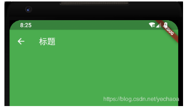
return Scaffold(
      body: new CustomScrollView(
        slivers: <Widget>[
          new SliverAppBar(
            title: Text("标题"),
            expandedHeight: 230.0,
            floating: false,
            pinned: true,
            snap: false,
          ),
          new SliverFixedExtentList(
            itemExtent: 50.0,
            delegate: new SliverChildBuilderDelegate(
              (context, index) => new ListTile(
                    title: new Text("Item $index"),
                  ),
              childCount: 30,
            ),
          ),
        ],
      ),
    );
这是最最最基本的效果了,但是也简陋的不行,下面开始一步一步改造。
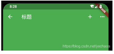
添加leading
 leading: new IconButton(
              icon: Icon(Icons.arrow_back),
              onPressed: () {},
            ),
添加actions
 actions: <Widget>[
              new IconButton(
                icon: Icon(Icons.add),
                onPressed: () {
                  print("添加");
                },
              ),
              new IconButton(
                icon: Icon(Icons.more_horiz),
                onPressed: () {
                  print("更多");
                },
              ),
            ],
滑动标题上移效果
去掉title,添加flexibleSpace
flexibleSpace: new FlexibleSpaceBar(
              title: new Text("标题标题标题"),
              centerTitle: true,
              collapseMode: CollapseMode.pin,
            ),

背景图片沉浸式
项目根目录下新建images文件夹,存放图片,随便选一张即可。
要加载本地图片,还需要在pubspec.yaml 文件中配置一下
assets:
    - images/a.jpg
修改flexibleSpace
flexibleSpace: new FlexibleSpaceBar(
              background: Image.asset("images/a.jpg", fit: BoxFit.fill),
            ),

各种滑动效果演示
- floating: false, pinned: true, snap: false:

loating: true, pinned: true, snap: true:

floating: false, pinned: false, snap: false:

总结:仔细观察,区别主要在于:
- 标题栏是否跟着一起滑动
- 上滑的时候,SliverAppBar是直接滑上去还是先合并然后再滑上去。
- 下拉的时候,SliverAppBar是直接拉下来还是先拉下来再展开。
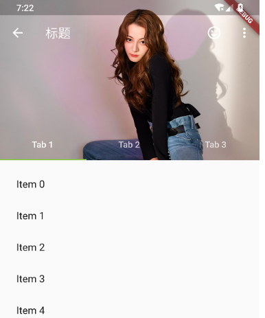
添加TabBar
在SliverAppBar的bottom属性中添加TabBar,直接改造源码中的例子
var _tabs = <String>[];
    _tabs = <String>[
      "Tab 1",
      "Tab 2",
      "Tab 3",
    ];
 /// 加TabBar
      DefaultTabController(
        length: _tabs.length, // This is the number of tabs.
        child: NestedScrollView(
          headerSliverBuilder: (BuildContext context, bool innerBoxIsScrolled) {
            // These are the slivers that show up in the "outer" scroll view.
            return <Widget>[
              SliverOverlapAbsorber(
                handle:
                    NestedScrollView.sliverOverlapAbsorberHandleFor(context),
                child: SliverAppBar(
                  leading: new IconButton(
                    icon: Icon(Icons.arrow_back),
                    onPressed: () {},
                  ),
                  title: const Text('标题'),
                  centerTitle: false,
                  pinned: true,
                  floating: false,
                  snap: false,
                  primary: true,
                  expandedHeight: 230.0,

                  elevation: 10,
                  //是否显示阴影,直接取值innerBoxIsScrolled,展开不显示阴影,合并后会显示
                  forceElevated: innerBoxIsScrolled,

                  actions: <Widget>[
                    new IconButton(
                      icon: Icon(Icons.more_horiz),
                      onPressed: () {
                        print("更多");
                      },
                    ),
                  ],

                  flexibleSpace: new FlexibleSpaceBar(
                    background: Image.asset("images/a.jpg", fit: BoxFit.fill),
                  ),

                  bottom: TabBar(
                    tabs: _tabs.map((String name) => Tab(text: name)).toList(),
                  ),
                ),
              ),
            ];
          },
          body: TabBarView(
            // These are the contents of the tab views, below the tabs.
            children: _tabs.map((String name) {
              //SafeArea 适配刘海屏的一个widget
              return SafeArea(
                top: false,
                bottom: false,
                child: Builder(
                  builder: (BuildContext context) {
                    return CustomScrollView(
                      key: PageStorageKey<String>(name),
                      slivers: <Widget>[
                        SliverOverlapInjector(
                          handle:
                              NestedScrollView.sliverOverlapAbsorberHandleFor(
                                  context),
                        ),
                        SliverPadding(
                          padding: const EdgeInsets.all(10.0),
                          sliver: SliverFixedExtentList(
                            itemExtent: 50.0, //item高度或宽度,取决于滑动方向
                            delegate: SliverChildBuilderDelegate(
                              (BuildContext context, int index) {
                                return ListTile(
                                  title: Text('Item $index'),
                                );
                              },
                              childCount: 30,
                            ),
                          ),
                        ),
                      ],
                    );
                  },
                ),
              );
            }).toList(),
          ),
        ),
      ),


 扫一扫
扫一扫


 5万+
5万+

 被折叠的 条评论
为什么被折叠?
被折叠的 条评论
为什么被折叠?
 到【灌水乐园】发言


