


一、Animation动画:
Animation即动画,我们能够通过创建Animation动画取代动画图片、Flash动画以及JavaScript。使用CSS3 Animation动画,只需要定义几个关键帧,就可以生成连续的动画。
1.定义关键帧:
在CSS中,当需要创建动画时,首先要了解@keyframes属性。
@keyframes属性规定了动画的关键帧,关键帧定义了元素在各个时间点的样式。
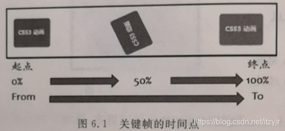
使用百分比表示时间点,0是动画开始的时间,100%是动画完成的时间,中间的过渡点可以选取25%、50%、80%等,也可以用"from"表示开始时间,用"to"表示结束时间。
例如:
@keyframes myfirst{
    from {background: red;}
    to {background: yellow;}
}
这段语句的作用是定义关键帧。使用@keyframes属性定义关键帧,动画名称为myfirst,第一帧背景为红色,第二帧背景为黄色。
例如:
@keyframes mymove {
    %0 {background: red;}
    25% {background: yellow;}
    50% {background: blue;}
    100% {background: green;}
}
在本例中,定义动画名称为mymove,开始时背景色为红色,当时间为25%时,背景为黄色,时间为50%时背景过渡为蓝色,当动画100%完成时,背景变化为绿色。
可以写出更多的属性变化:
@keyframes myfirst {
    0% {background:red; left:0px; top:0px;}
    25% {background:yellow; left:200px; top:0px;}
    50% {background:blue; left:200px; top:200px;}
    75% {background:green; left:0px; top:200px;}
    100% {background:red; left:0px; top:0px;}
}
2.绑定动画:
在@keyframes中创建动画后,必须把它捆绑到某个元素或者选择器上,否则不会产生动画效果。
使用Animation对动画进行捆绑,同时需要规定以下两项动画属性:动画名称、动画时长。
例如,页面上有一个div元素,可以把myfirst动画绑定到该元素上,并且定义动画时长为5秒。如:
<style>
    @keyframes myfirst {
    0% {background:red; left:0px; top:0px;}
    25% {background:yellow; left:200px; top:0px;}
    50% {background:blue; left:200px; top:200px;}
    75% {background:green; left:0px; top:200px;}
    100% {background:red; left:0px; top:0px;}
    }
    div {
        width:150px;
        height:50px;
        position:absolute;
        animation:myfirst 5s;
    }
</style>
CSS3所有与动画相关的属性:
| 属性 | 描述 |
| @keyframes | 规定动画 |
| animation | 所有动画属性的简写属性,除了animation-play-state属性 |
| animation-name | 规定@keyframes动画的名称 |
| animation-duration | 规定动画完成一个周期所花费的秒或毫秒,默认是0 |
| animation-timing-function | 规定动画的速度曲线,默认是ease |
| animation-delay | 规定动画何时开始,默认为0 |
| animation-iteration-count | 规定动画被播放的次数,默认是1 |
| animation-direction | 规定动画是否在下一周期逆向播放,默认是normal |
| animation-play-state | 规定动画是否正在运行或暂停,默认是running |
| animation-fill-mode | 规定对象动画时间之外的状态 |
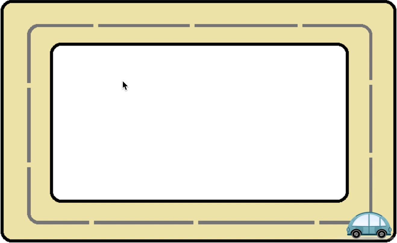
项目实战:跑动的汽车
<!DOCTYPE html>
<html>
<head>
<meta charset="utf-8">
<style>
body{background:url(path.png)no-repeat;}

.div1{
    width:150px;
    height:140px;
    position:relative;
    animation:mymove 5s infinite;
    -moz-animation:mymove 5s infinite; /* Firefox */
    -webkit-animation:mymove 5s infinite; /* Safari and Chrome */
    -o-animation:mymove 5s infinite; /* Opera */
}

@keyframes mymove{
    0%   {left:30px; top:0px;}
    25%  {left:600px; top:0px;}
    50%  {left:600px; top:330px;}
    75%  {left:30px; top:330px;}
    100% {left:30px; top:0px;}
}

@-webkit-keyframes mymove{
    0%   {left:30px; top:0px;}
    25%  {left:600px; top:0px;}
    50%  {left:600px; top:330px;}
    75%  {left:30px; top:330px;}
    100% {left:30px; top:0px;}
}
</style>
</head>
<body>
    <img src="car.png" class="div1">
</div>
</body>
</html>
二、Transition动画:
Transition是一种过渡,它控制元素从一种样式转变为另一种样式的效果。为了实现这一点,必须规定两项内容。
(1)哪个CSS属性发生变化。
(2)规定效果的时长。
如:
div{
    width:100px;
    height:100px;
    background:red;
    transition:width 2s;/*div宽度由100变为300,这个变化在2秒内完成,可以看到过渡动画效果*/
}
div:hover{
    width:300px;
}
当需要同时设置多个属性时,各个属性之间由逗号隔开,代码如下:
div{
    width:100px;
    height:100px;
    background:red;
    transition:width 2s,height 2s;
}
div:hover{
    width:300px;
    height:300px;
}
可以用all代表所有变化的属性,即“transition:width 2s,height 2s;"可改写为"transition:all 2s;"。
注意浏览器的兼容性。
项目实战:页面切换效果
<!DOCTYPE html>
	<head>
		<meta charset="UTF-8" />
		<title>css3页面切换效果</title>
		<style>
/*实现内容块的布局*/
.content{
    width: 73%;
    height: 98%;
    box-shadow: 4px -4px 4px rgba(0,0,0,0.5);
	background-color: #b1e583;
    position: absolute;
	left: 280px;
	top: 20px;
}
/*导航栏位置*/
#header{
	position:absolute;
    top:50px;
    z-index:2000;/*z-index仅能在定位元素上奏效(如 position:absolute;)*/
    width:235px;
    height:500px;
	background-color:pink;
	}

/*页面切换动画*/
.panel{
	width: 100%;
    height: 100%;
    background-color: white;
	position: absolute;
	margin-left: -102%;
    z-index:2;
	transition: all .6s ease-in-out;/*慢进快出*/
}

.panel:target{
	margin-left: 0%;
}
		</style>
	</head>
	<body>
		<div id="home" class="content">
			<h2>作者简介</h2>
		</div>
		<div id="portfolio" class="panel">
			<div class="content">
				<h2>作品展示</h2>
			</div>
		</div>
		<div id="about" class="panel">
			<div class="content">
				<h2>作者生平</h2>
			</div>
		</div>
		<div id="contact" class="panel">
			<div class="content">
				<h2>联系我们</h2>
			</div>
		</div>
		<div id="header">
			<h1>导航栏</h1>
			<ul id="navigation">
				<li><a id="link-home" href="#home">作者简介</a></li>
				<li><a id="link-portfolio" href="#portfolio">作品展示</a></li>
				<li><a id="link-about" href="#about">作者生平</a></li>
				<li><a id="link-contact" href="#contact">联系我们</a></li>
			</ul>
		</div>
	</body>
</html>
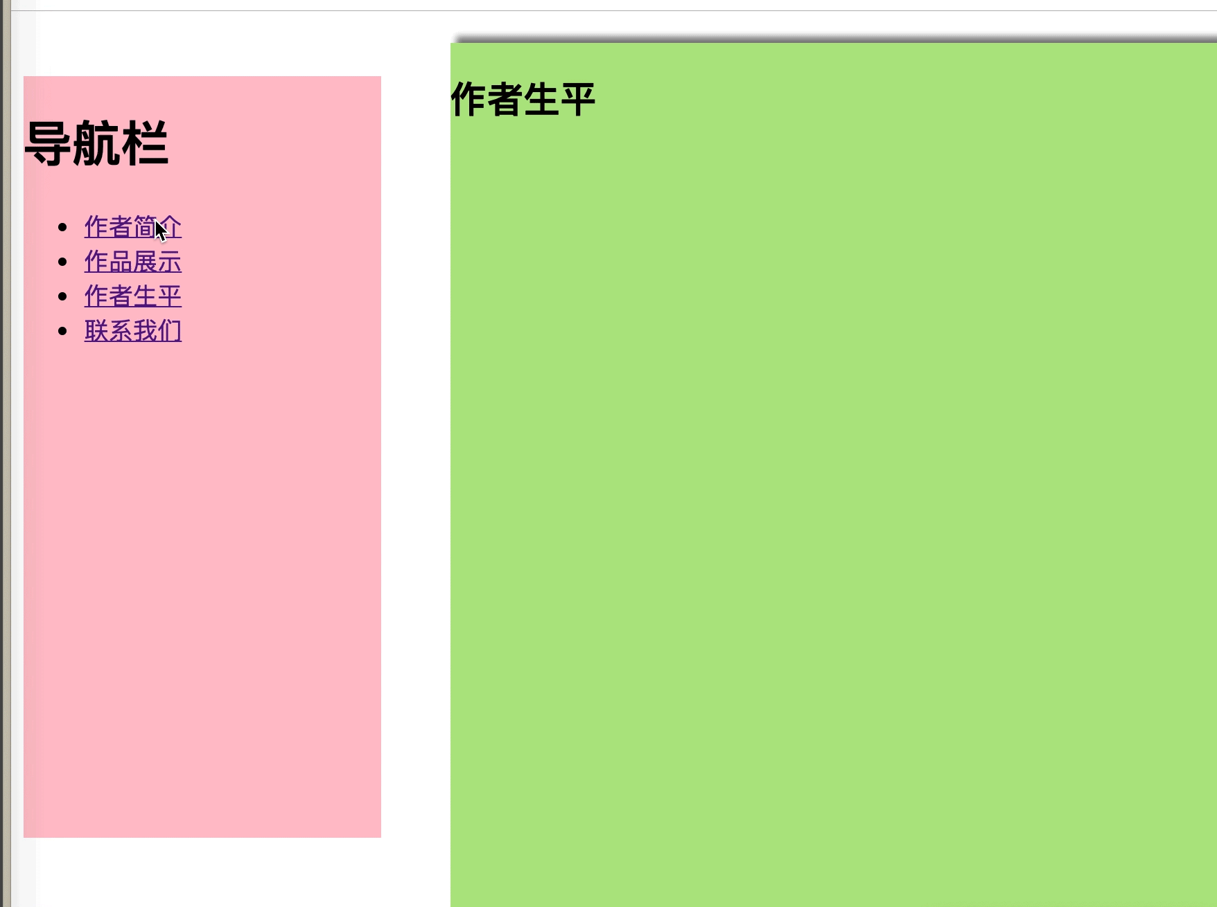
以上项目的设计:
(1)首先要明确“作者简介”版块是始终不动的,其他3个版块由左侧进入并覆盖其上。一共有3个活动的版块,开始时它们隐藏于页面的左外侧,通过margin-left:-102%设置。
(2)给3个活动版块统一添加class="panel",给4个版块的内部统一添加class="content"。
(3)这个项目的关键是实现过渡效果的动画,动画的触发事件是由单击导航栏上的超链接,而超链接指向的目标由伪元素选择符:target表示,:target选择符可用于选取当前活动的目标元素。
(4)当单击导航栏中的超链接时,被命中的版块margin-left属性发生变化,由margin-left:-102%变为margin-left:0%,从而使版块进入页面。利用transition属性定义变化发生的时长,使变化逐渐完成,产生从左向右的过渡动画。 未被选中的版块自动退回到左外侧,通过margin-left:-102%设置实现。


 扫一扫
扫一扫


 被折叠的 条评论
为什么被折叠?
被折叠的 条评论
为什么被折叠?
 到【灌水乐园】发言


