<!DOCTYPE html>
<html lang="en">
<head>
    <meta charset="UTF-8">
    <meta http-equiv="X-UA-Compatible" content="IE=edge">
    <meta name="viewport" content="width=device-width, initial-scale=1.0">
    <title>caihong</title>
    <style>


        .container{
            width: 170px;
            height: 170px;
            position: relative;
            margin: 250px auto;
        }


        .rainbow{
            width: 70px;
            height: 70px;
            position: absolute;
            top: 70px;
            left: 80px;
            margin-left: -40px;
            border-radius: 170px 0 0 0;
            box-shadow: #fb323c -2px -2px 0 1px,
                #f99716 -4px -4px 0 3px,
                #fee124 -6px -6px 0 5px,
                #afde2e -8px -8px 0 7px,
                #6ad7f8 -10px -10px 0 9px,
                #60b1f5 -12px -12px 0 11px,
                #a3459b -14px -14px 0 13px;
            animation: rainbow 5s ease-in-out infinite;
            transform: rotate(40deg);
        }

        @keyframes rainbow{
            50%{
                transform: rotate(50deg);
            }
        }


        .rainbow::after{
            content: '';
            width: 120px;
            height: 15px;
            position: absolute;
            bottom: -23px;
            left: 17px;
            background: #000;
            border-radius: 50%;
            opacity: 0.2;
            animation: rainbow_shadow 5s ease-in-out infinite;
            transform: rotate(-40deg);
            transform-origin: 50% 50%;
        }

        @keyframes rainbow_shadow{
            50%{
                transform: rotate(-50deg) translate(10px) scale(0.7);
                opacity: 0.05;
            }
        }


    </style>
</head>
<body>
    <div class="container">
        <div class="rainbow"></div>
    </div>
</body>
</html>


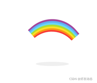
 本文介绍了一个使用HTML和CSS实现的彩虹动画效果。通过设置特定的样式属性和关键帧动画,可以在网页上呈现出动态旋转的彩虹图案及其阴影效果。


 扫一扫
扫一扫


 1万+
1万+

 被折叠的 条评论
为什么被折叠?
被折叠的 条评论
为什么被折叠?
 到【灌水乐园】发言


