直方图
- 题目:

输出:
代码:
import numpy as np
import matplotlib.pyplot as plt
print(plt.style.available)
plt.style.use('seaborn-talk')
fig, ax = plt.subplots()
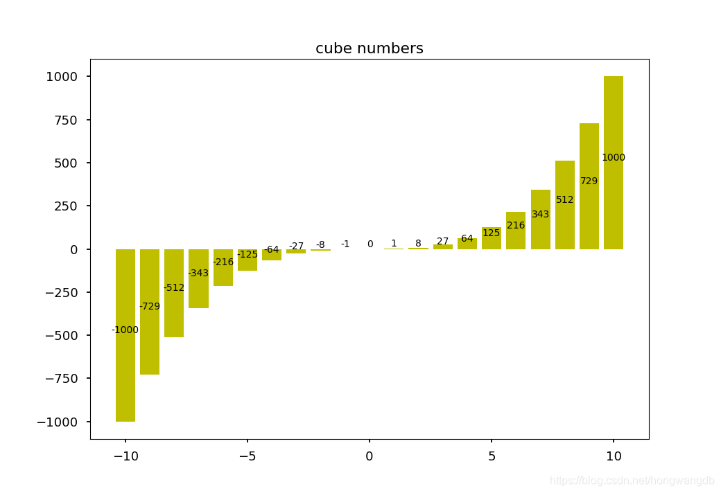
ax.set_title('cube numbers')
x = np.array([-10, -9, -8, -7, -6, -5, -4, -3, -2, -1, 0, 1, 2, 3, 4, 5, 6, 7, 8, 9, 10])
y = x*x*x
plt.bar(x, y, color='y')
for a, b in zip(x, y):
plt.text(a, b/2, '%d'%b, ha='center', va='bottom', fontsize=10)
plt.show()
- 题目:

输出:
代码:
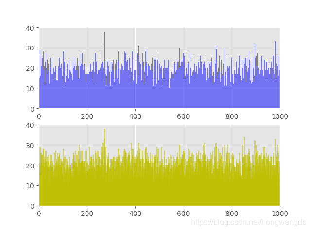
import matplotlib.pyplot as plt
import random
plt.style.use('ggplot')
fig, ax = plt.subplots(ncols=1, nrows=2)
ax1, ax2 = ax.ravel()
L = []
for i in range(20001):
L.append(random.randint(0, 1000))
D1, D2 = {
}, {
}
for i in L:
D1[i] = D1.get(i, 0) + 1
D2[i/5*5] = D2.get(i/5*5, 0) + 1
ax1.axis([0, 1000, 0, 40])
ax1.bar(D1.keys(), D1.values(), 1, alpha=0.5, color='b')
ax2.axis([0, 1000, 0, 40])
ax2.bar(D2.keys(), D2.values(), 5, alpha=0.5, color='y')
plt.show()
- 题目:

输出:
代码:
import numpy as np
import matplotlib.pyplot as plt
fig, ax = plt.subplots()
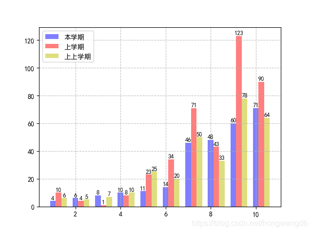
plt.rcParams['font.sans-serif'] = ['SimHei']
S1 = [4, 6, 8, 10, 11, 14, 46, 48, 60, 71]
S2 = [10, 4, 1, 8, 23, 34, 71, 43, 123, 90]
S3 = [6, 5, 7, 10, 25, 20, 50, 33, 78, 64]
x = np.arange(1, 11)
plt.bar(x, S1, 0.25, alpha=0.5, color='b')
plt.bar(x+0.25, S2, 0.25, alpha=0.5, color='r')
plt.bar(x+0.5, S3, 0.25, alpha=0.5, color='y')
for a, b in zip(x, S1):
plt.text(a, b+0.2, '%d'%b, ha='center', va='bottom', fontsize=9)
for a, b in zip(x, S2):
plt.text(a+0.25, b+0.2, '%d'%b, ha='center', va='bottom', fontsize=9)
for a, b in zip(x, S3):
plt.text(a+0.5, b+0.2, '%d'%b, ha='center', va='bottom', fontsize=9)
plt.legend(['本学期', '上学期', '上上学期'], loc='upper left')
plt.grid(True, linestyle='--', alpha=0.8)
plt.show()
线形图
- 题目:

输出:
代码:
import numpy as np
import matplotlib.pyplot as plt
fig, ax = plt.subplots()
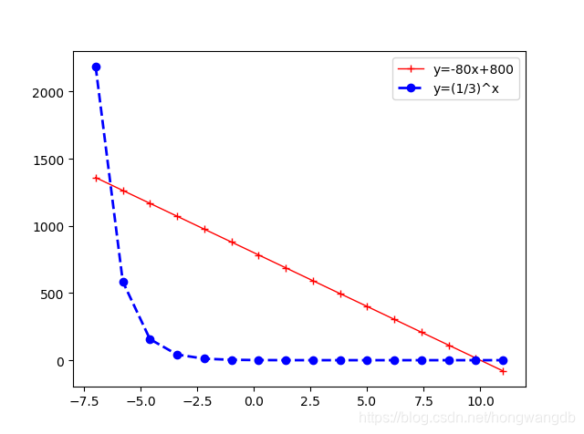
x = np.linspace(-7, 11, 16)
y1 = -80*x + 800
y2 = (1/3)**x
plt.plot(x, y1, 'r+', color='red', linewidth=1.0, linestyle='-', label='line1')
plt.plot(x, y2, 'bo', color='blue', linewidth=2.0, linestyle='--', label='line2')
plt.xlim(-8, 12)
ax.legend(['y=-80x+800', 'y=(1/3)^x'], loc='upper right')
plt.show()
- 题目:
输出:
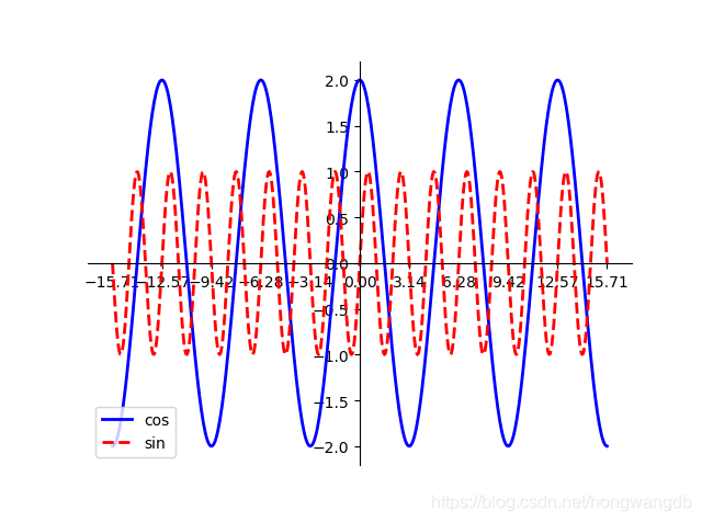
代码:
import numpy as np
import matplotlib.pyplot as plt
fig, ax = plt.subplots()
x = np.linspace(-5*np.pi, 5*np.pi, 512)
cos, sin = 2*np.cos(x), np.sin(3*x)
ax.set_xticks([-5*np.pi, -4*np.pi, -3*np.pi, -2*np.pi, -1*np.pi, 0, np.pi, 2*np.pi, 3*np.pi, 4*np.pi, 5*np.pi])
plt.plot(x, cos, color='blue', linewidth=2.0, linestyle='-', label='cos')
plt.plot(x, sin, color='red', linewidth=2.0, linestyle='--', label='sin')
ax.spines['right'].set_visible(False)
ax.spines['top'].set_visible(False)
ax.spines['left'].set_position(('data', 0))
ax.yaxis.set_ticks_position('left')
ax.spines['bottom'].set_position(('data', 0))
ax


 最低0.47元/天 解锁文章


 被折叠的 条评论
为什么被折叠?
被折叠的 条评论
为什么被折叠?
 到【灌水乐园】发言


