


 本文介绍了如何利用Python的matplotlib.pyplot模块(plt.hist)和seaborn库(sns.displot)来绘制直方图,展示统计区间内的样本数量。通过这两种方法,可以清晰地呈现数据分布,并且sns.displot还能自动拟合概率密度函数曲线。
统计区间内的样本数画直方图
一、使用plt.hist
import numpy as np
import matplotlib.mlab as mlab
import matplotlib.pyplot as plt
from scipy.stats import norm
# 产生数据
mu = 100 # mean of distribution
sigma = 15 # standard deviation of distribution
x = mu + sigma * np.random.randn(10000)
num_bins = 50 # 区间个数
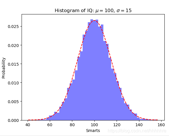
n, bins, patches = plt.hist(x, num_bins, density=1, facecolor='blue', alpha=0.5) # alpha 透明度
y = norm.pdf(bins, mu, sigma) # 拟合高斯分布的曲线
plt.plot(bins, y, 'r--')
plt.xlabel('Smarts')
plt.ylabel('Probability')
plt.title(r'Histogram of IQ: $\mu=100$, $\sigma=15$')
plt.show()
结果如下图
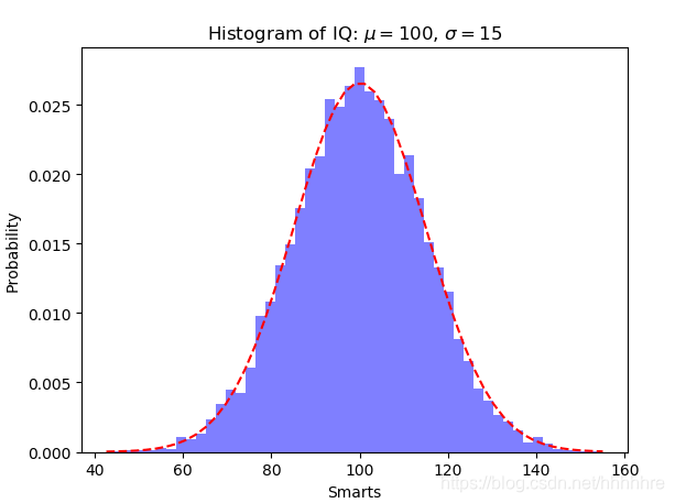
也可以使用这种方法拟合y
y = ((1 / (np.sqrt(2 * np.pi) * sigma)) *
     np.exp(-0.5 * (1 / sigma * (bins - mu)) ** 2))
结果:
二、使用sns.displot
这里可以自动拟合概率密度函数曲线
plt.figure()
sns.distplot(x,bins=50, kde_kws={"color":"red", "lw":2 }, hist_kws={ "color": "blue" },label='LGG4')
plt.xlabel('Smarts')
plt.ylabel('Probability')
plt.title('Histogram')
plt.legend()
plt.show()


 1万+
1万+

 被折叠的 条评论
为什么被折叠?
被折叠的 条评论
为什么被折叠?
 到【灌水乐园】发言


