


 本博客详细介绍了数据可视化的多种技术和实践案例,从基础的折线图、柱状图到高级的地理信息可视化,涵盖Matplotlib、Seaborn、Pandas及PyEcharts等工具的使用技巧,帮助读者掌握数据展示和分析的精髓。
项目一
绘制两个相对的纵坐标轴
获取数据集
!git clone https://github.com/qiwsir/DataSet.git

!ls DataSet
导入相关类库
import numpy as np
import matplotlib
import matplotlib.pyplot as plt
from matplotlib.ticker import AutoMinorLocator
matplotlib.rcParams['axes.unicode_minus'] = False    # 设置显示负号
%matplotlib inline # 嵌入网页
产生数据
x = np.linspace(0, 10, 50)
y1 = np.exp(x)
y2 = np.sin(x)
绘制折线图#1
fig, ax1 = plt.subplots()
ax1.plot(x, y1, "b", label='Exp')
ax1.set_xlabel('x axis')
ax1.set_xlim(0, 10)
ax1.set_xticks(range(11))
ax1.set_ylabel("exp", color='blue')
ax1.set_ylim(0, 3000)
ax1.set_yticks(range(0, 3001, 600))
ax1.yaxis.set_minor_locator(AutoMinorLocator(5))
ax1.tick_params(axis='y', which='major', colors='blue', direction='in')
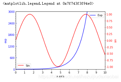
plt.legend()
绘制折线图#2
ax2 = ax1.twinx()
ax2.plot(x, y2, color="red", label='Sin')
ax2.set_ylabel("sin", color="red")
ax2.tick_params(axis='y', colors='red', direction='inout')
plt.legend()
项目二
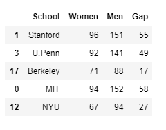
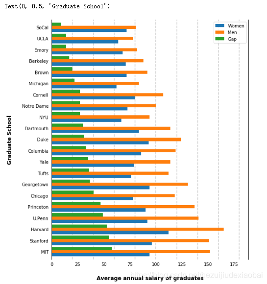
部分大学毕业生薪资统计 - 柱形图
加载查看数据集
# 加载数据
import pandas as pd
df = pd.read_csv("./DataSet/school/school.csv")

# 查看数据信息
df.sample(5)    # 随机取得5个样本
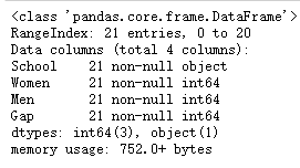
df.info()
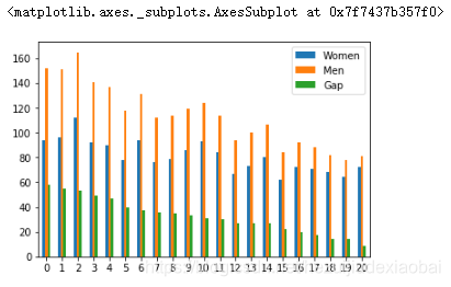
dataframe对象的绘图接口
df.plot.bar(rot=0)
坐标轴 && 刻度 && 虚线
from matplotlib.ticker import StrMethodFormatter

ax = df.plot(kind='barh', x='School', figsize=(8, 10), zorder=2, width=0.85)

#隐藏坐标轴
ax.spines['right'].set_visible(True)
ax.spines['top'].set_visible(False)
ax.spines['left'].set_visible(True)
ax.spines['bottom'].set_visible(False)

# 设置刻度
ax.tick_params(axis="both", which="both", bottom="false", top="false", labelbottom="true", left="false", right="false", labelleft="true")
# ax.tick_params(axis="both", which="both", bottom="off", top="off", labelbottom="on", left="off", right="off", labelleft="on")

# 绘制垂直横轴的虚线
x_vals = ax.get_xticks()
for tick in x_vals:
    ax.axvline(x=tick, linestyle='dashed', alpha=0.4, color='grey', zorder=1)

# 绘制水平横轴的虚线
# y_vals = ax.get_yticks()
# for tick in y_vals:
#     ax.axhline(y=tick, linestyle='dashed', alpha=0.4, color='grey', zorder=1)

ax.set_xlabel("Average annual salary of graduates", labelpad=20, weight='bold', size=12) #毕业生年平均薪酬
ax.set_ylabel("Graduate School", labelpad=20, weight='bold', size=12) #毕业学校
项目三
分析马拉松跑步数据
加载查看数据集
# 加载数据
import pandas as pd
marathon = pd.read_csv("./DataSet/marathon/marathon.csv")
# 查看数据相关信息
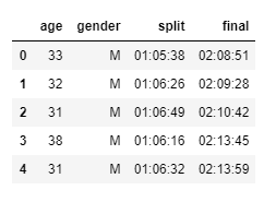
marathon.head()
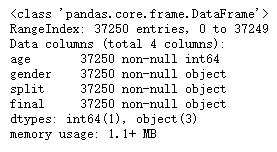
marathon.info()
help(map)
Make an iterator that computes the function using arguments from
each of the iterables. Stops when the shortest iterable is exhausted.

s = '01:05:38'
h, m,s = map(int, s.split(":"))
h, m, s
help(datetime.timedelta)
Difference between two datatime values.

datetime.timedelta(hours=h, minutes=m, seconds=s)
help(pd.read_csv)
converters : dict, default None
    Dict of functions for converting values in certain columns. Keys can either
    be integers or column labels.
特征工程
将split && final特征转换为时间类型
import datetime
def convert_time(s):
    h,m,s = map(int, s.split(":"))
    return datetime.timedelta(hours=h, minutes=m, seconds=s)
将convert_time用于读取数据的函数之中
marathon = pd.read_csv("./DataSet/marathon/marathon.csv",
                       converters={"split":convert_time, "final":convert_time})

marathon.info()

marathon.head()

将split && final的特征值转化为秒为单位的整数
# 将时间间隔的表述转化为整数,比如以秒为单位的整数。
d = datetime.timedelta(hours=1,minutes=0,seconds=0)
df = pd.DataFrame({'time':[d]})
df.astype(int)
# 这个结果不是以秒为单位的,而是以“纳秒”(ns)为单位
# 得到以秒为单位的整数
d = datetime.timedelta(hours=1,minutes=0,seconds=0)
df = pd.DataFrame({'time':[d]})
df.astype(int) * 1e-9
# 将split和final的特征值转化为秒为单位的整数
marathon['split_sec'] = marathon['split'].astype(int) * 1e-9
marathon['final_sec'] = marathon['final'].astype(int) * 1e-9
marathon.head()
# 查看各个特征信息
marathon.info()
# 统计各个特征
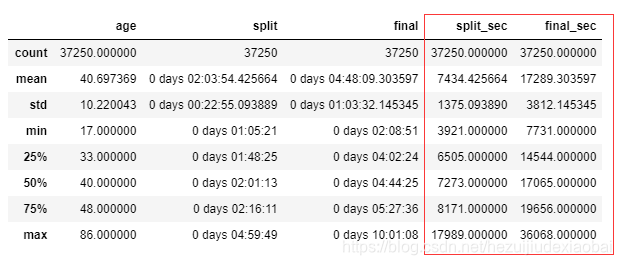
marathon.describe()
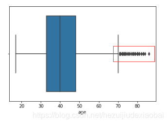
对特征age绘制箱线图,寻找离群值,即高龄运动员
ax = sns.boxplot(x=marathon['age'])
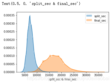
通过直方图,研究数据分布,比如split_sec和final_sec
import seaborn as sns
import matplotlib.pyplot as plt

sns.distplot([marathon['split_sec']], label='split_sec')
sns.distplot(marathon['final_sec'], label='final_sec')

plt.legend()
plt.xlabel('split_sec & final_sec')
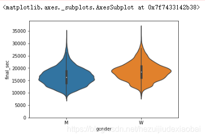
# 把gender这个分类特征添加进来,分析上述半程和全程
sns.violinplot(x='gender', y='final_sec', data=marathon)
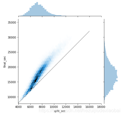
运动员的前后半程用时情况
好的选手是后半程用时和前半程应该近似。所以,我们也来研究一下,在marathon数据集中,这些运动员的前后半程用时情况。
g = sns.jointplot("split_sec", "final_sec", data=marathon, kind='hex')   #or: kind='scatter'

#绘制一条直线,作为参考
import numpy as np
g.ax_joint.plot(np.linspace(4000, 16000), np.linspace(8000, 32000), ":k")
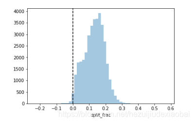
对半程情况深入统计
marathon['split_frac'] = 1 - 2 * marathon['split_sec'] / marathon["final_sec"]
marathon.head()

sns.distplot(marathon['split_frac'], kde=False)
plt.axvline(0, color='k', linestyle="--")   # 垂直于x轴的直线,0表示x轴位置
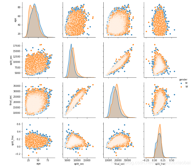
不同特征的关系
sns.pairplot(data=marathon,
             vars=['age', 'split_sec', 'final_sec', 'split_frac'],
             hue='gender')
不同年龄段占比
# 80岁以上的选手
(marathon.age >= 80).sum()
# 划分年龄段
marathon['age_dec'] = marathon['age'].map(lambda age: 10 * (age // 10)) # 10 * (78 // 10) -> 70
# 不同年龄段半程占比
sns.violinplot(x="age_dec", y="split_frac", hue="gender", data=marathon,
split=True, inner='quartile', palette=['lightblue', 'lightpink'])
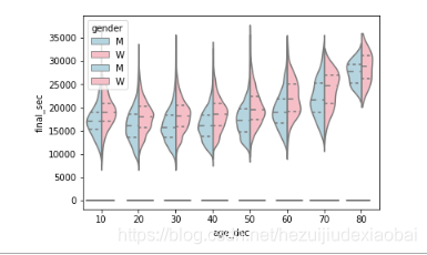
# 不同年龄段全程用时
sns.violinplot(x="age_dec", y="final_sec", hue="gender", data=marathon,
split=True, inner='quartile', palette=['lightblue', 'lightpink'])
项目四
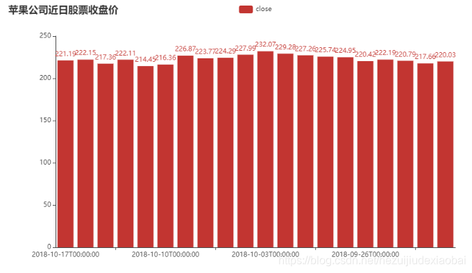
苹果公司近日股票收盘价
应用示例
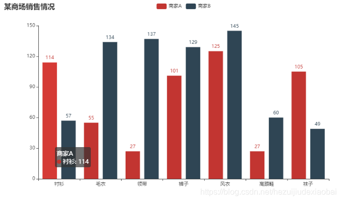
from pyecharts.charts import Bar
from pyecharts import options as opts

# V1 版本开始支持链式调用
bar = (
    Bar()
    .add_xaxis(["衬衫", "毛衣", "领带", "裤子", "风衣", "高跟鞋", "袜子"])
    .add_yaxis("商家A", [114, 55, 27, 101, 125, 27, 105])
    .add_yaxis("商家B", [57, 134, 137, 129, 145, 60, 49])
    .set_global_opts(title_opts=opts.TitleOpts(title="某商场销售情况"))
)
bar.render_notebook()

# # 不习惯链式调用的开发者依旧可以单独调用方法
# bar = Bar()
# bar.add_xaxis(["衬衫", "毛衣", "领带", "裤子", "风衣", "高跟鞋", "袜子"])
# bar.add_yaxis("商家A", [114, 55, 27, 101, 125, 27, 105])
# bar.add_yaxis("商家B", [57, 134, 137, 129, 145, 60, 49])
# bar.set_global_opts(title_opts=opts.TitleOpts(title="某商场销售情况"))
# bar.render_notebook()
加载数据集
import pandas as pd
appl_df = pd.read_csv("./DataSet/appl/appl.csv",
                      index_col=['date'], parse_dates=['date'])
df20 = appl_df.iloc[:20, :]

df20.head()
柱状图
from pyecharts.charts import Bar
from pyecharts import options as opts

bar = Bar()
bar.add_xaxis(df20.index.tolist()) #.tolist()
bar.add_yaxis('close',df20['close'].tolist())
bar.set_global_opts(title_opts=opts.TitleOpts(title="苹果公司近日股票收盘价"))
bar.render_notebook()
data = df20[['open','close','high','low']].values
data
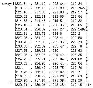
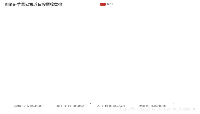
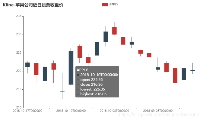
蜡烛图(K线图)
from pyecharts.charts import Kline
from pyecharts import options as opts
from pyecharts.globals import SymbolType

kline = (
        Kline()
        .add_xaxis(df20.index.tolist())
        .add_yaxis('kline', data) #data = df20[['open','close','high','low']].values
        .set_global_opts(
            yaxis_opts=opts.AxisOpts(is_scale=True),
            xaxis_opts=opts.AxisOpts(is_scale=True),
            title_opts=opts.TitleOpts(title="Kline-苹果公司近日股票收盘价"),
        )
    )
kline.render_notebook()
y_axis: Sequence
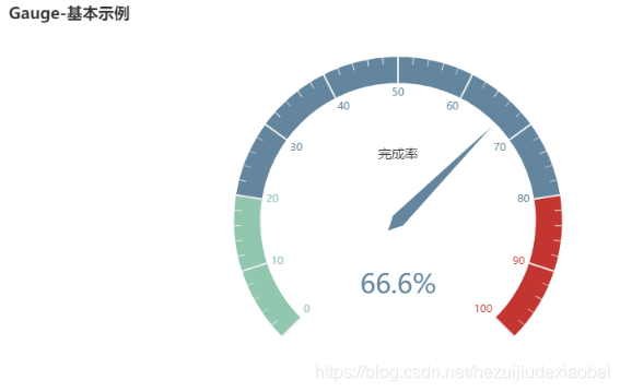
仪表盘示例
from pyecharts import options as opts
from pyecharts.charts import Gauge, Page

c = (
        Gauge()
        .add("", [("完成率", 66.6)])
        .set_global_opts(title_opts=opts.TitleOpts(title="Gauge-基本示例"))
    )
c.render_notebook()
水晶球示例
from pyecharts import options as opts
from pyecharts.charts import Liquid, Page
from pyecharts.globals import SymbolType

c = (
    Liquid()
    .add("lq", [0.6, 0.7])
    .set_global_opts(title_opts=opts.TitleOpts(title="Liquid-基本示例"))
)
c.render_notebook()

项目五
地理信息可视化
安装地图文件
!pip install echarts-countries-pypkg         # 全球国家地图
!pip install echarts-china-provinces-pypkg   # 中国省级地图
!pip install echarts-china-cities-pypkg      # 中国市级地图
!pip install echarts-china-counties-pypkg    # 中国县区地图
!pip install echarts-china-misc-pypkg        # 中国区域地图
下载pyecharts
!pip install --upgrade pip

!pip install pyecharts==1.0
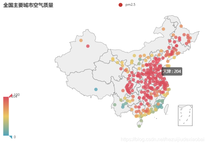
主要城市空气质量
# 导入相应库
from pyecharts import options as opts
from pyecharts.charts import Geo
from pyecharts.globals import ChartType, SymbolType

# 加载数据集
df = pd.read_csv("./DataSet/pm25/pm2.csv")
city = df['CITY_NAME']
value = df['Exposed days']
# city
# value

# 绘图
c = (
        Geo()
        .add_schema(maptype="china")
        .add("pm2.5", [list(z) for z in zip(city, value)])
        .set_series_opts(label_opts=opts.LabelOpts(is_show=False))
        .set_global_opts(
            visualmap_opts=opts.VisualMapOpts(),
            title_opts=opts.TitleOpts(title="全国主要城市空气质量"),
        )
    )
c.render_notebook()
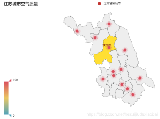
江苏省各城市空气质量
# 导入相应库
from pyecharts import options as opts
from pyecharts.charts import Geo
from pyecharts.globals import ChartType, SymbolType

# 加载数据
js = pd.read_csv("./DataSet/jiangsu/city_population.csv")
js_cities = [name[:-1] for name in js.name]
jspm = df[df['CITY_NAME'].isin(js_cities)]
# jspm

# 绘制
c = (
        Geo()
        .add_schema(maptype="江苏") #江苏
        .add(
            "江苏省各城市",
            [list(z) for z in zip(jspm['CITY_NAME'], jspm['Exposed days'])],
            type_= 'effectScatter', #涟漪特效散点图
        )
        .set_series_opts(label_opts=opts.LabelOpts(is_show=False))
        .set_global_opts(
            visualmap_opts=opts.VisualMapOpts(),
            title_opts=opts.TitleOpts(title="江苏各城市空气质量"),
        )
    )
c.render_notebook()
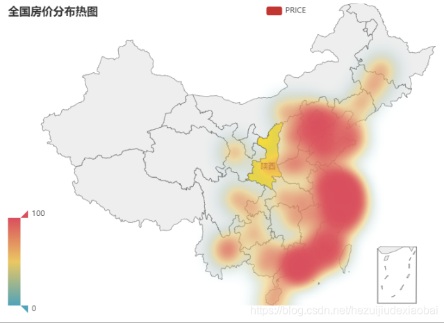
房价分布热图
# 导入相应库
from pyecharts import options as opts
from pyecharts.charts import Geo
from pyecharts.globals import ChartType, SymbolType

# 加载数据
hp = pd.read_csv("./DataSet/house/houseprice.csv")
hp['mean'] = hp.mean(axis=1)
hp.drop(index=46, inplace=True)    # 有城市在默认安装的地图文件中没有,将其删除
# hp

# 绘制
c = (
        Geo()
        .add_schema(maptype="china") #
        .add(
            "PRICE",
            [list(z) for z in zip(hp['city_name'], hp['mean'])],
            type_= 'heatmap', #热力图
            #type_= 'effectScatter', #涟漪特效散点图
        )
        .set_series_opts(label_opts=opts.LabelOpts(is_show=False))
        .set_global_opts(
            visualmap_opts=opts.VisualMapOpts(),
            title_opts=opts.TitleOpts(title="全国房价分布热图"),
        )
    )
c.render_notebook()
参考文档
Seaborn
help(sns.violinplot)
Draw a combination of boxplot and kernel density estimate.
help(sns.boxplot)
Draw a box plot to show distributions with respect to categories.
help(sns.kdeplot)
Fit and plot a univariate or bivariate kernel density estimate.
help(sns.pairplot)
Plot pairwise relationships in a dataset.
help(sns.jointplot)
Draw a plot of two variables with bivariate and univariate graphs.
Pandas
help(df.plot)
DataFrame plotting accessor and method.
kind : str
    'line' : line plot (default)
    'bar' : vertical bar plot
    'barh' : horizontal bar plot
    'hist' : histogram
    'box' : boxplot
    'kde' : Kernel Density Estimation plot
    'density' : same as 'kde'
    'area' : area plot
    'pie' : pie plot
    'scatter' : scatter plot
    'hexbin' : hexbin plot
help(df.plot.bar)
Vertical bar plot.
A bar plot is a plot that presents categorical data with
rectagular bars with lengths proportianal to the values that they
represent. A bar plot shows comparisons among discreate categories. One
axis of the plot shows the specific categories being compared, and the
other axis represents a measured value.
help(ax.spines)
Dictionary that remembers insertion order.
help(ax.spines[‘right’].set_visible)
Set the artist's visibility.
help(ax.tick_params)
Change the appearance of ticks, tick labels, and gridlines.
help(ax.get_xticks())
An array object represents a multidimensional, homogeneous array
of fixed-size items. An associated data-type object desctibes the
format of each element in the array (its byte-order, how many bytes it
occupies in memory, whether it is an integer, a floating point number,
or something else, etc.)
help(ax.axvline)
Add a vertical line across the axes.
help(ax.axhline)
Add a horizontal line across the axis.
Matplolib
help(AutoMinorLocator)
Dynamically find minor tick positions baes on the positions of
major ticks. The scale must be linear with major ticks evenly spaced.
pyecharts
help(Bar)
柱状图/条形图
help(Kline)
K线图
help(Gauge)
仪表盘
help(Liquid)
水晶球
help(Geo)
地理坐标系


 1202
1202


 到【灌水乐园】发言


