


R绘制散点图
参考资料:
《R语言数据分析与可视化从入门到精通》
《R数据可视化手册》
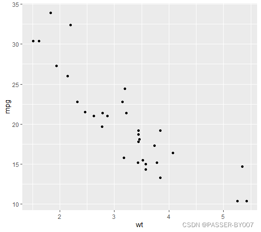
基本散点图
直接使用R基础包的绘图函数plot():
plot(mtcars$wt, mtcars$mpg)

或使用ggplot2中的qplot()函数:
library(ggplot2)
qplot(mtcars$wt, mtcars$mpg)

如果绘图所用的两个参数向量包含在同一个数据框内,则可以运行下面的命令:
library(ggplot2)
qplot(wt,mpg,data=mtcars)
# 或者
ggplot(mtcars, aes(x=wt, y=mpg)) +
  geom_point()
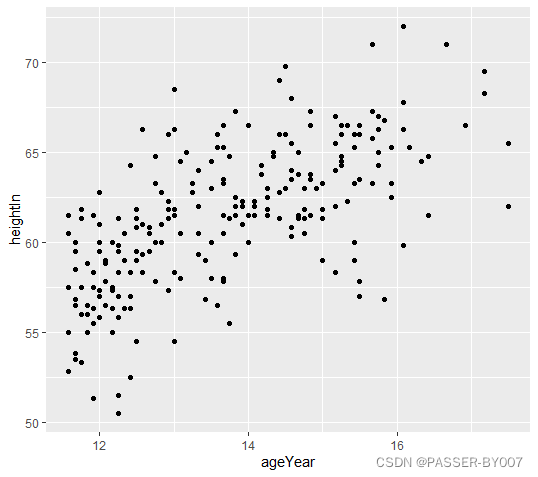
使用gcookbook中的数据集heightweight中的两列:ageYear,heightIn
library(gcookbook) # 为了使用数据
# 列出我们用到的列
head(heightweight[, c("ageYear", "heightIn")])
运行结果如下:
  ageYear heightIn
1   11.92     56.3
2   12.92     62.3
3   12.75     63.3
4   13.42     59.0
5   15.92     62.5
6   14.25     62.5
画图:
library(gcookbook) # 为了使用数据
library(ggplot2)
ggplot(heightweight, aes(x=ageYear, y=heightIn)) +
  geom_point()
设置点形和颜色
以上代码绘制了ggplot2的基本散点图。在绘图时,ggplot2会自动生成一些默认风格,不过这些风格都可以重新设置,也可以将其括号内的参数直接写进geom_point()中。
geom_point()函数中的shape参数、col参数和fill参数改变点的形状和颜色
library(gcookbook) # 为了使用数据
library(ggplot2)
ggplot(heightweight, aes(x=ageYear, y=heightIn)) +
  geom_point(shape=2, col="red")
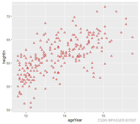
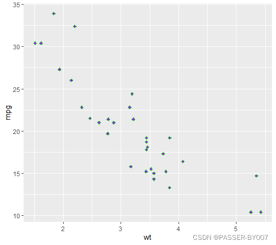
当shape为2时,点的颜色只能由col控制;但对于其他一些类型的点,如shape为23时,也可使用fill参数指定填充颜色:
library(ggplot2)
ggplot(mtcars, aes(x=wt, y=mpg)) +
  geom_point(shape=23, col="green", fill="purple")
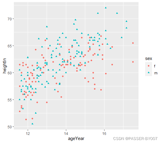
基于某变量对数据进行分组设置点形和颜色
同样,使用gcookbook中的heightweight数据集的sex、ageYear和heightIn三列
library(gcookbook) # 为了使用数据
# 列出要用的三个列
head(heightweight[, c("sex", "ageYear", "heightIn")])
  sex ageYear heightIn
1   f   11.92     56.3
2   f   12.92     62.3
3   f   12.75     63.3
4   f   13.42     59.0
5   f   15.92     62.5
6   f   14.25     62.5
library(gcookbook) # 为了使用数据
library(ggplot2)
ggplot(heightweight, aes(x=ageYear, y=heightIn, shape=sex, colour=sex)) +
  geom_point()
通过调用scale_shape_manual()函数可以使用其他点形;调用scale_colour_brewer()或者scale_colour_manual()函数可以使用其他调色板。
library(gcookbook) # 为了使用数据
library(ggplot2)
ggplot(heightweight, aes(x=ageYear, y=heightIn, shape=sex, colour=sex)) +
  geom_point() +
  scale_shape_manual(values=c(1,2)) +
  scale_colour_brewer(palette="Set1")


 2105
2105

 被折叠的 条评论
为什么被折叠?
被折叠的 条评论
为什么被折叠?
 到【灌水乐园】发言


