


5.1 盒模型的定义
CSS盒模型(Box Model)是CSS布局的核心,它定义了HTML元素在页面上如何显示。盒模型包括以下几个部分:
-
内容区域(Content Area):这是盒子的主要内容区域,包括文本、图片或其他媒体内容。
-
内边距(Padding):内容区域周围的空间,可以是透明的或有颜色的。内边距是可选的,并且不会影响盒子的最终尺寸。
-
边框(Border):围绕内边距和内容区域的边缘。边框可以有不同的样式(实线、虚线、点线等),宽度和颜色。
-
外边距(Margin):边框外的空间,用于在盒子之间创建距离。外边距总是透明的,并且垂直外边距可以发生折叠。
-
盒阴影(Box Shadow):可选的阴影效果,可以为盒子添加视觉效果。
-
轮廓(Outline):围绕盒子的边框,但不会影响盒子的布局。轮廓通常用于高亮显示或聚焦。
CSS的两种模型
1.标准盒模型
总宽度 = width + padding + border + margin
总高度 = height + padding + border + margin
2.IE盒模型
总宽度 = width + margin
总高度 = height + margin
padding 和 border 被包含在 width 和 height 内。
5.2 CSS元素的高度和宽度
1.盒模型的宽度
盒模型的宽度=左外边距(margin -left) +左边框(border -left)+左内边距(padding-left) +内容宽度
(width) +有内边距(padding-right) +右边框 (border-right)+右外边距(margin- right)。
<!DOCTYPE html>
<html>
	<head>
		<meta charset="utf-8" />
		<title>示例5.1</title>
		<style type="text/css">
			/* 重置所有元素的默认边距和内边距 */
			* {
				margin: 0; /* 设置所有元素的外边距为0 */
				padding: 0; /* 设置所有元素的内边距为0 */
			}
			/* 设置盒子的样式 */
			div {
				width: 100px;         /* 盒子的宽度设置为100px */
				border: 10px solid red; /* 盒子的边框为10px红色实线 */
				padding: 30px;        /* 盒子的内边距为30px */
				margin: 10px;         /* 盒子的外边距为10px */
				float: left;          /* 盒子左浮动,使其在同一行排列 */
			}
			/* 设置盒子中图片的样式 */
			.box img {
				max-width: 100%;      /* 图片最大宽度为盒子宽度 */
				max-height: 100%;     /* 图片最大高度为盒子高度 */
			}
		</style>
	</head>
	<body>
		<h1>盒模型示例</h1>
		<p>CSS盒模型本质上是一个盒子,外边距10px;内边距30px;边框10px的红色实线;盒子左浮动在同一行处。</p>
		<!-- 包含图片的盒子 -->
		<div class="box">
			<img src="img/float1.png" alt="第一张图片"/> <!-- 第一张图片 -->
		</div>
		<div class="box">
			<img src="img/float2.png" alt="第二张图片"/> <!-- 第二张图片 -->
		</div>
	</body>
</html>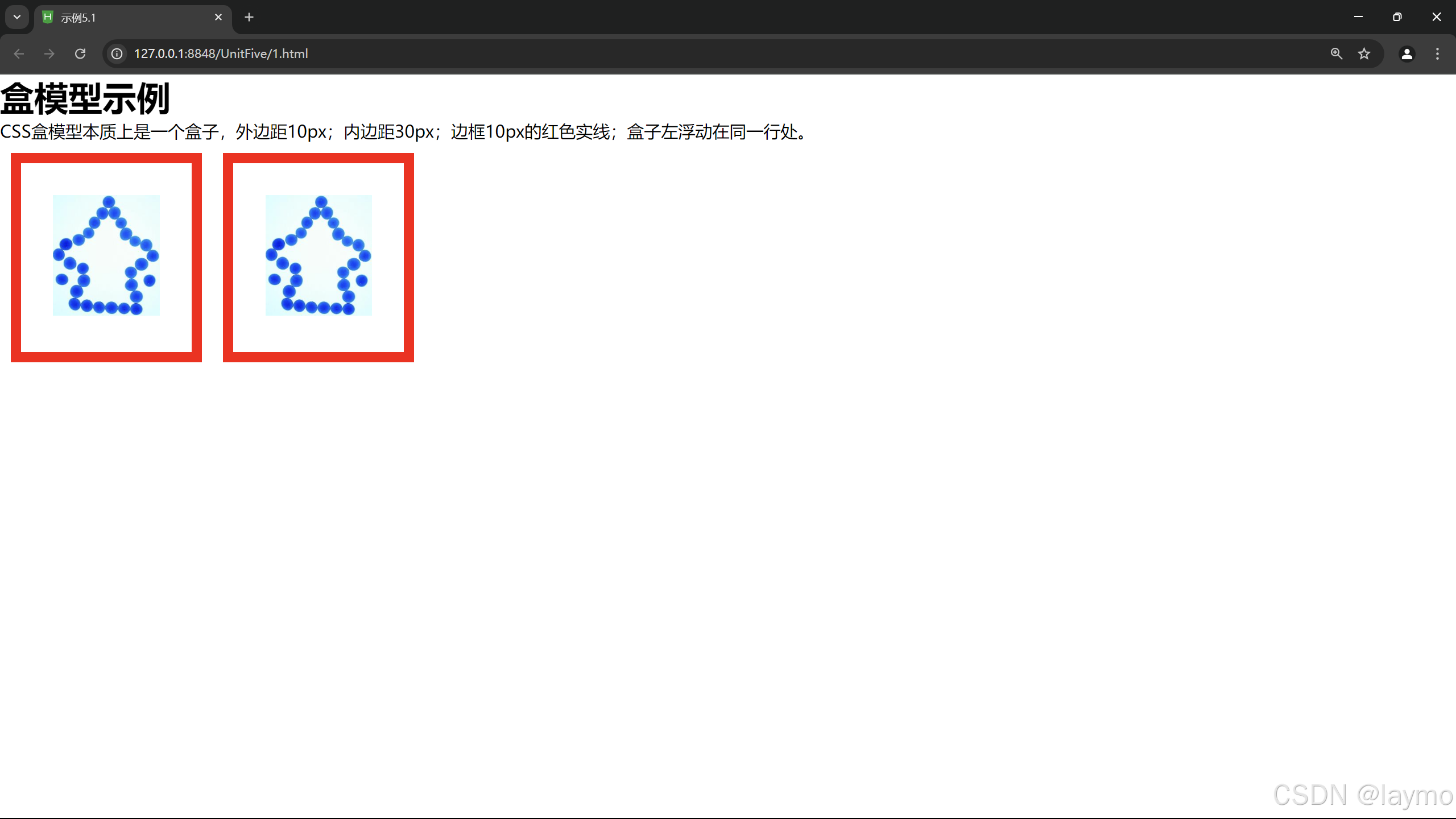
2. 盒模型的高度
盒模型的高度=上外边距(margin-top) +上边框(border-top)+上内边距(padding-top) +内容高度
(height) +下内边距(padding-bottom) +下边框(border-bottom) +下外边距(margin-bottom)。
<!DOCTYPE html>
<html>
	<head>
		<meta charset="utf-8">
		<title>示例5.2</title>
		<style type="text/css">
			.ap{
				width: 200px;
				height: 100px;
				border: 2px solid red;
				margin: 10px;
				background-color: lightblue;
			}
		</style>
	</head>
	<body>
		<div class="ap">这是div块级元素,可设置宽度和高度</div>
		<span class="ap">这是span行级元素,不能设置宽度和高度</span>

		</span></span>
	</body>
</html>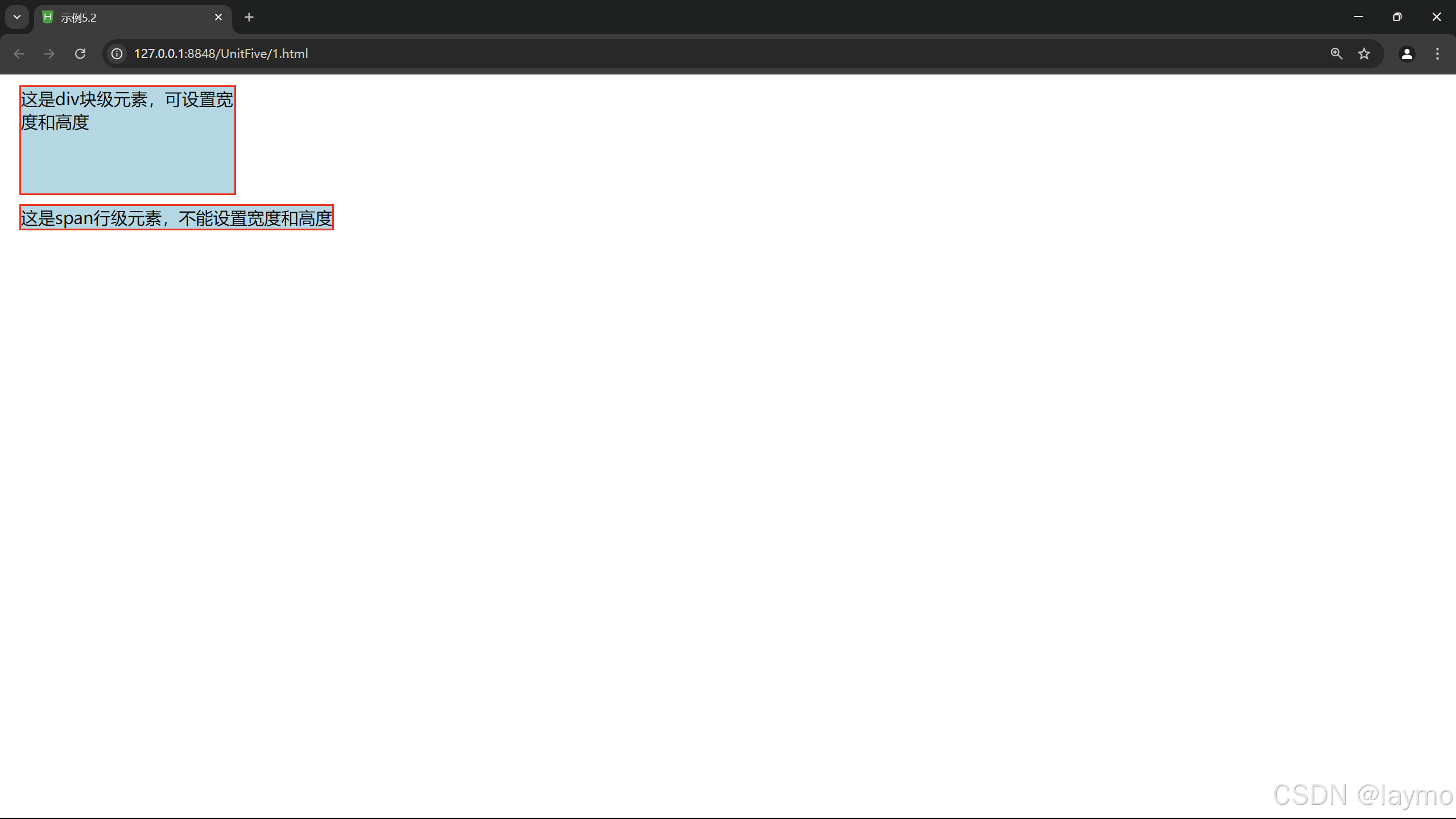
5.3 边距设置和边框设置
5.3.1 外边距设置
外边距是指元素与元素之间的距离,外边距设置属性,可分别设置 margin -top、margin-right、
margin-bottom、 margin-left,也可以用 margin 属性一次性设置所有外边距。
5.3.1.1 上外边距
属性:left、percent、auto
5.3.1.2 右外边距
属性:left、percent、auto
5.3.1.3 下外边距
属性:left、percent、auto
5.3.1.4 左外边距
属性:left、percent、auto
<!DOCTYPE html>
<html>
<head>
    <meta charset="utf-8">
    <title>示例5.3</title>
    <style type="text/css">
        /* 大盒子的样式 */
        #big {
            width: 450px; /* 设置宽度为450px */
            height: 200px; /* 设置高度为200px */
            margin: 0px; /* 外边距设置为0 */
            background-color: #ff0; /* 背景颜色为黄色 */
        }

        /* 小盒子的公共样式 */
        #small1, #small2, #small3, #small4 {
            width: 200px; /* 设置宽度为200px */
            height: 50px; /* 设置高度为50px */
            text-align: center; /* 文本居中对齐 */
            background-color: #0ff; /* 背景颜色为青色 */
        }

        /* 小盒子1的样式 */
        #small1 {
            margin-left: 20px; /* 左外边距20px */
            margin-bottom: 30px; /* 下外边距30px */
        }

        /* 小盒子2的样式 */
        #small2 {
            margin-right: 20px; /* 右外边距20px */
            margin-top: 10px; /* 上外边距10px */
            float: right; /* 右浮动,使其靠右对齐 */
        }

        /* 小盒子3的样式 */
        #small3 {
            margin-bottom: 5px; /* 下外边距5px */
        }

        /* 小盒子4的样式 */
        #small4 {
            margin-left: 10px; /* 左外边距10px */
            margin-top: 15px; /* 上外边距15px */
        }
    </style>
</head>
<body>
    <!-- 大盒子容器 -->
    <div id="big">
        <!-- 小盒子1 -->
        <div id="small1">A:左外边距20px,下外边距30px</div>
        <!-- 小盒子2 -->
        <div id="small2">B:右外边距20px,上外边距10px,右浮动</div>
        <!-- 小盒子3 -->
        <div id="small3">C:下外边距5px</div>
        <!-- 小盒子4 -->
        <div id="small4">D:左外边距10px,上外边距15px</div>
    </div>
</body>
</html>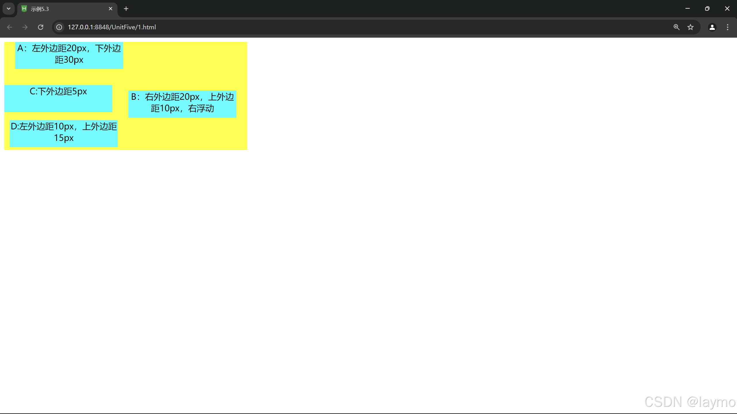
5.3.1.5 外边距
属性:left、percent、auto
<!DOCTYPE html>
<html lang="zh">
<head>
    <meta charset="UTF-8">
    <title>外边距设置示例</title>
    <style>
        /* 大盒子的样式 */
        #container {
            width: 600px; /* 容器宽度 */
            background-color: #f0f0f0; /* 背景颜色 */
            padding: 20px; /* 内边距 */
            border: 2px solid #ccc; /* 边框 */
            margin: 0 auto; /* 居中显示 */
        }

        /* 小盒子的公共样式 */
        .box {
            width: 100px; /* 小盒子宽度 */
            height: 100px; /* 小盒子高度 */
            background-color: #4caf50; /* 背景颜色 */
            color: white; /* 文本颜色 */
            text-align: center; /* 文本居中对齐 */
            line-height: 100px; /* 使文本垂直居中 */
        }

        /* 小盒子1的外边距 */
        #box1 {
            margin: 10px; /* 所有方向10px的外边距 */
        }

        /* 小盒子2的外边距 */
        #box2 {
            margin: 20px 15px; /* 上下20px,左右15px的外边距 */
        }

        /* 小盒子3的外边距 */
        #box3 {
            margin: 25px 0 5px 30px; /* 上25px,右0,下5px,左30px的外边距 */
        }
    </style>
</head>
<body>
    <div id="container">
        <div id="box1" class="box">盒子1</div>
        <div id="box2" class="box">盒子2</div>
        <div id="box3" class="box">盒子3</div>
    </div>
</body>
</html>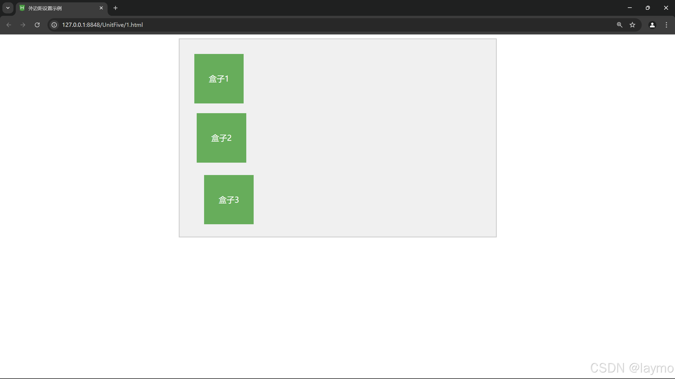
5.3.2 外边距的合并
通常,盒子与盒子之间的外边距相遇会互相影响,必须对 margin 属性深入了解,才能精确地控制
盒子的位置。
5.3.2.1 行级元素外边距合并
行级元素的盒子相遇,盒子与盒子之间的距离等于两个盒子外边距的总和。
<!DOCTYPE html>
<html>
<head>
    <meta charset="UTF-8">
    <title>行级元素外边距示例</title>
    <style type="text/css">
        *{
            margin: 50px;
        }
		.hb1{
			background-color: yellow;
			margin-right: 20px;
			padding: 30px;
		}
		.hb2{
			background-color: lightpink;
			margin-left: 30px;
			padding: 30px;
		}
    </style>
</head>
<body>
    <span class="hb1">黄色span</span>
	<span class="hb2">粉红色span</span>
</body>
</html>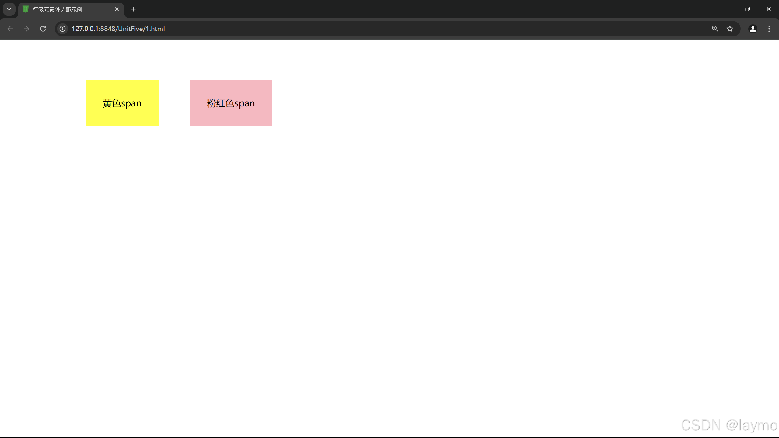
5.3.2.2 块级元素外边距合并
块级元素的盒子相遇,盒子与盒子之间的距离等于两盒子中外边距的较大者。
<!DOCTYPE html>
<html>
<head>
    <meta charset="utf-8"> <!-- 设置字符编码为 UTF-8 -->
    <title>垂直相遇块级元素之间的外边距设置</title> <!-- 网页标题 -->
    <style type="text/css">
        * {
            margin: 50px; /* 为所有元素设置 50 像素的外边距 */
        }
        .div1 {
            background-color: yellow; /* 设置背景色为黄色 */
            margin-bottom: 30px; /* 设置底部外边距为 30 像素 */
            padding: 30px; /* 设置内边距为 30 像素 */
        }
        .div2 {
            background-color: lightpink; /* 设置背景色为粉红色 */
            margin-top: 30px; /* 设置顶部外边距为 30 像素 */
            padding: 30px; /* 设置内边距为 30 像素 */
        }
    </style>
</head>
<body>
    <div class="div1">黄色div</div> <!-- 第一个块级元素,黄色背景 -->
    <div class="div2">粉红色div</div> <!-- 第二个块级元素,粉红色背景 -->
</body>
</html>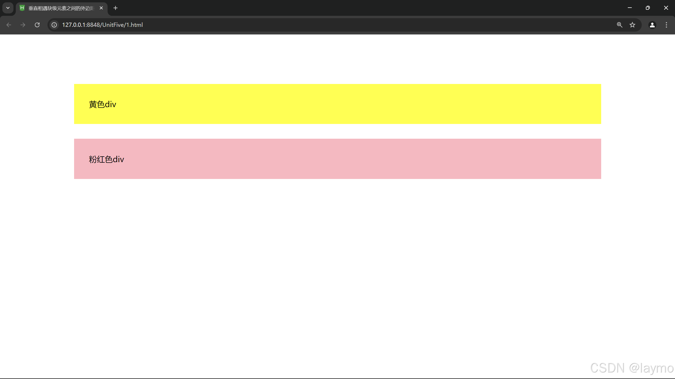
5.3.3 内边距设置
元素的内边距用来控制边框和内容区之间的空白距离,并非实体,用 padding 属性表示,类似于
HTML 中表格单元格的填充属性。内边距(padding) 和外边距(margin) 很相似,都是透明不可见
的,只是内边距和外边距之间还有边框。从语法和用法上来说,内边距的属性与外边距的属性也是
类似的,既可以使用复合属性,也可以使用单边属性,padding 属性接受 length 值或 percent值,
区别于外边距,内边距不可以使用负值。
内边距的属性:
padding-top: 设置元素的顶部内边距。
padding-right: 设置元素的右侧内边距。
padding-bottom: 设置元素的底部内边距。
padding-left: 设置元素的左侧内边距。
padding: 简写属性,可以同时设置所有内边距。
<!DOCTYPE html>
<html>
<head>
    <meta charset="utf-8">
    <title>内边距设置示例</title>
    <style type="text/css">
        .box {
            background-color: lightblue; /* 设置背景色为淡蓝色 */
            padding: 20px; /* 设置所有方向上的内边距为 20 像素 */
            border: 2px solid darkblue; /* 添加边框以便更好地看到内边距 */
        }
        .box1 {
            padding: 10px 20px; /* 上下内边距 10px,左右内边距 20px */
        }
        .box2 {
            padding: 30px 10px 20px 40px; /* 上、右、下、左内边距分别为 30px, 10px, 20px, 40px */
        }
    </style>
</head>
<body>
    <div class="box">这是一个带内边距的盒子</div>
    <div class="box box1">这是另一个盒子,内边距不同</div>
    <div class="box box2">这个盒子的四个方向有不同的内边距</div>
</body>
</html>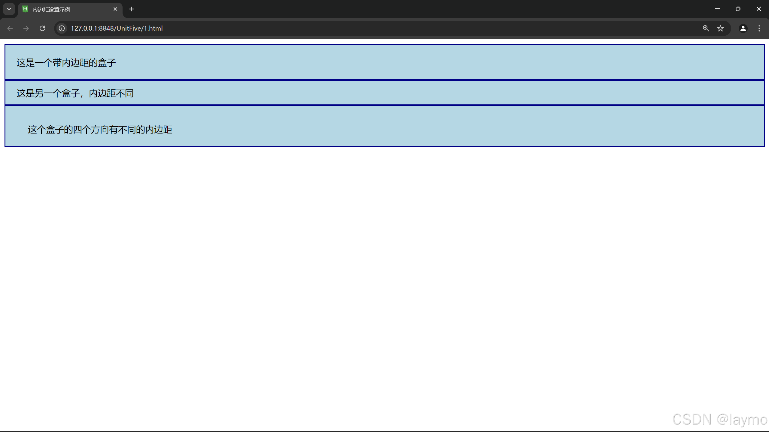
5.3.4 边框设置
元素外边距内就是元素的边框(bonder),它是用绕内边距和元素内容的一条或多条线在内边距和外
边距之间。边框的四条边分别用 border-lop、 border-ight、 border-hotan.oorder-lefr 表示,它们的
属性与内外边距的属性也是类似的,既可以使用复合属性,也可以使用单边属性。
边框作为盒模型的某个组成部分,边框的 CSS 样式设置将直接影响到盒子的尺寸和外观。而通过
使用border 属性,可以创建出更佳的边框效果,还可以应用于任何元素。border 属性设置通常有3
种:样式 (border-style)、宽度 (border-width) 和颜色 (border-color)。
1.上边框
语法:border-top:border-style I border-width I border-color 参数:该属性是复合属性。需要通过参数设置来实现。
2. 右边框
语法:border-right: border-style I border-width I border-color 参数:该属性是复合属性。需要通过参数设置来实现。
3.下边框
语法:border-bottom: border-slyle I border-width I border-color 参数:该属性是复合属性。需要通过参数设置来实现。
4.左边框
语法:border-left: border-slyle I border-widh I bander-color
公数:该属性是复介属性。需要通过参数设置来实现
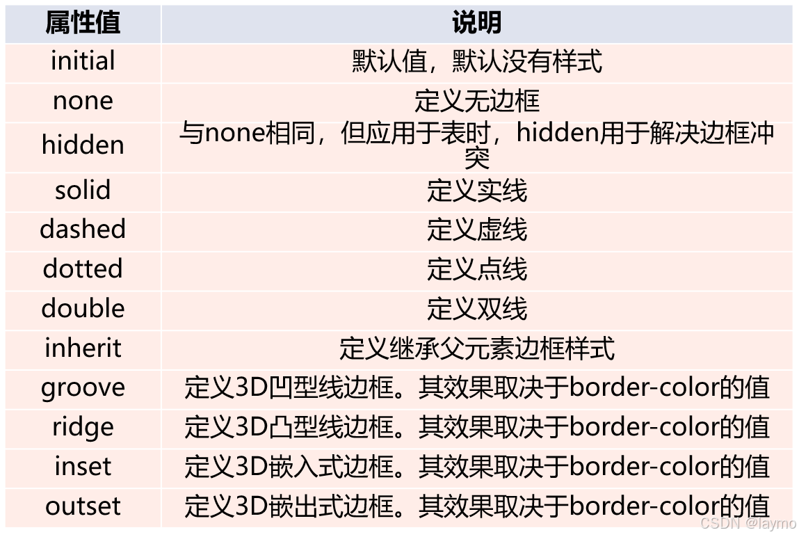
5.边框样式
在CSS中,样式是边据最亚要的一个设置,因为如果没有样式,优We) 页面中边框就不会显示。
<!DOCTYPE html>
<html>
	<head>
		<meta charset="utf-8">
		<title>5.8边框的设置</title>
		<style type="text/css">
		h2{
			text-align: center;
			border-bottom: dashed 5px red;
		}
		p{
			font-family: "楷体";
			border-top: solid thin purple;
			border-right: dashed 5px #9f6;
			border-bottom: double thick purple;
			border-left: dashed 5px #f99;
		}
		div{
			border-style: solid dashed double;
			border-width: 10px;
			border-color: deepskyblue;
		}
		</style>
	</head>
	<body>
		<h2>边框的实现</h2>
		<p>这个页面主要显示边框的不同样式,宽度和颜色,以实现对象的美观化。</p>
		<div>
			1.h2处所用边框CSS是5px红色虚线下边框<br/>
			2.p处所用边框CSS是10px蓝色实线,虚线,双实线,5px水绿色虚线右边框,粗的紫色双实线下边框,5px粉红色虚线左边框<br/>
			3.div处所用边框CSS是10px蓝色实线,虚线,双实线。
		</div>
	</body>
</html>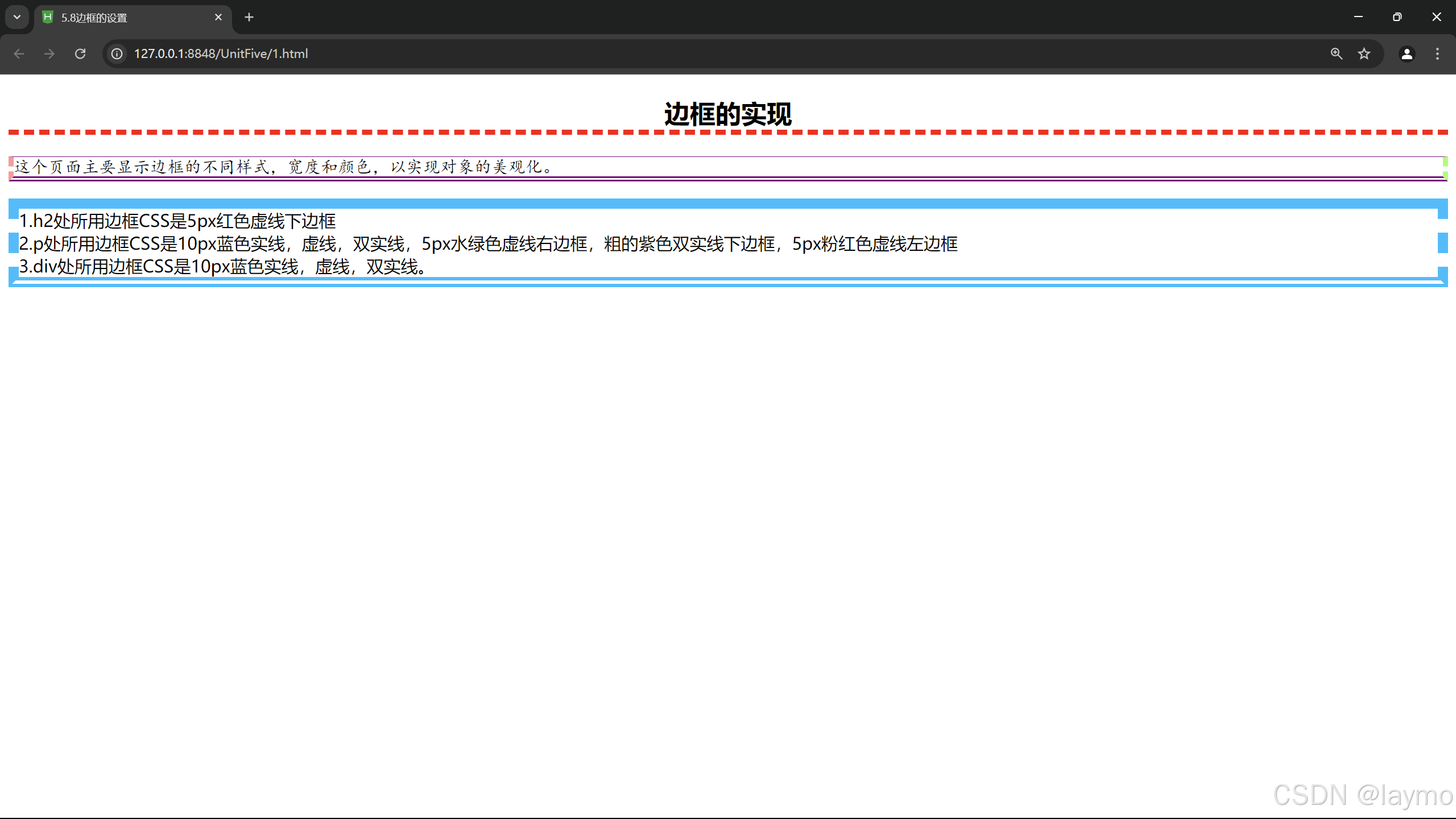
5.3.5 新增边框设置
1. 圆角边距
broder-radius:设置边框四个角有弧度成为圆角
<!DOCTYPE html>
<html>
	<head>
		<meta charset="utf-8">
		<title>5.9圆角边框设置</title>
		<style type="text/css">
			div{
				border:2px solid red;
				border-radius: 25px;
			}

		</style>
	</head>
	<body>
		<center>
			<div>利用box-shadow属性设置边框的红色阴影。其中阴影向左偏移15px,向上偏移20px,模糊距离为50px。</div>
		</center>
	</body>
</html>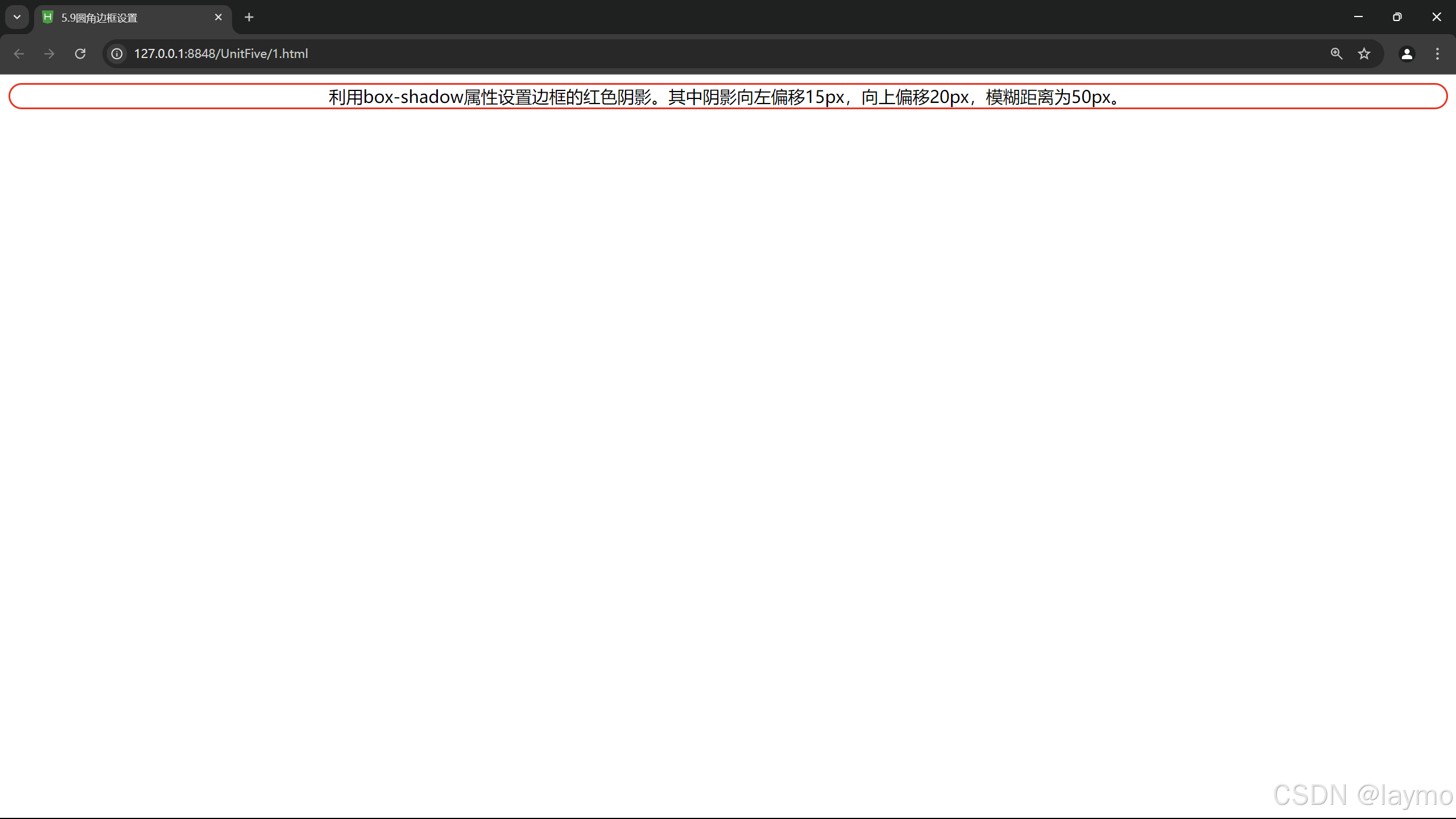
2.阴影边距
box-shadow:向四个边框添加一到多个阴影
<!DOCTYPE html>
<html>
	<head>
		<meta charset="utf-8">
		<title>5.10阴影边框设置</title>
		<style type="text/css">
			div{
				margin: 100px;
				border: 2px solid blue;
				box-shadow: -15px -10px 50px red;
			}
		</style>
	</head>
	<body>
		<div>利用box-shadow属性设置边框的红色阴影。其中阴影向左偏移15px,向上偏移20px,模糊距离为50px。</div>
	</body>
</html>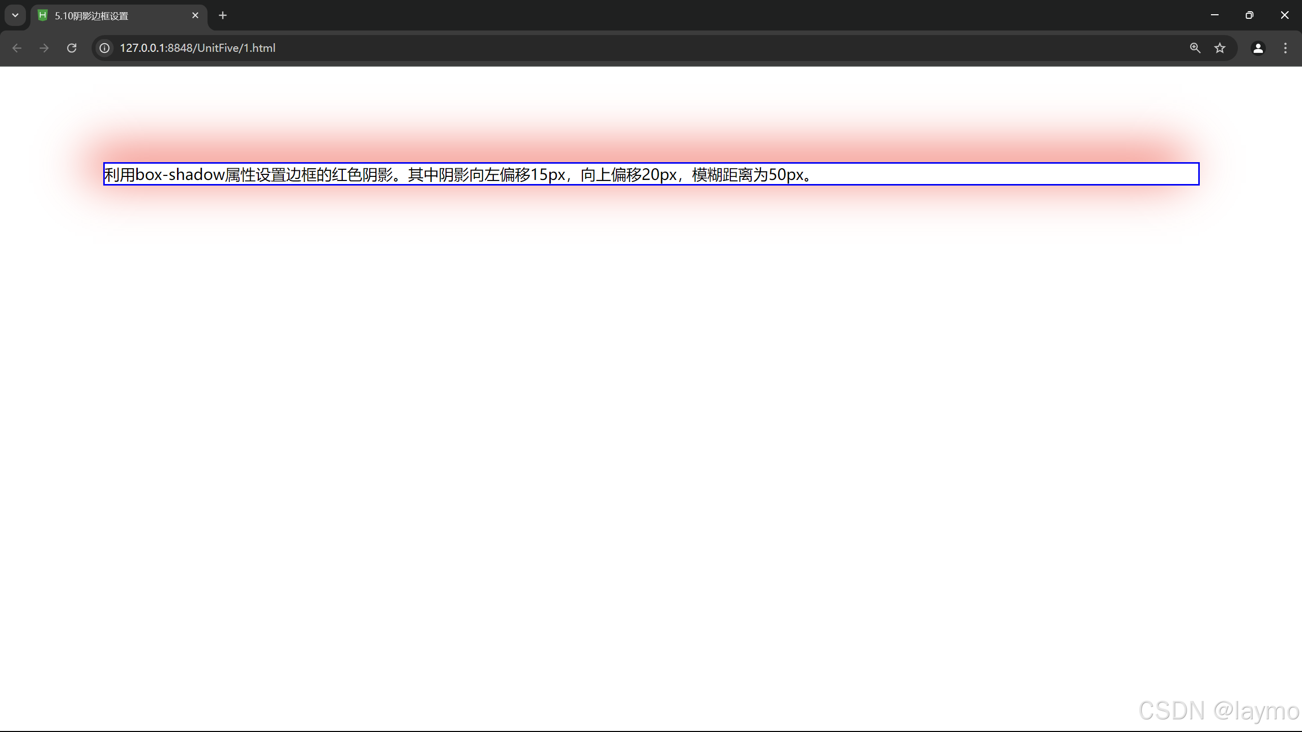
3.图片绘制边框
border-image:设置所有边框用图片显示
<!DOCTYPE html>
<html>
	<head>
		<meta charset="utf-8">
		<title>5.11图片边框设置</title>
		<style type="text/css">
			div{
				margin: 100px;
				border: 50px solid #9f6;
				border-image: url(img/border.jpg)round;

			}
		</style>
	</head>
	<body>
		<div>利用border-image属性设置图片边框铺满效果。上下向内偏移5px,左右偏移10px</div>
	</body>
</html>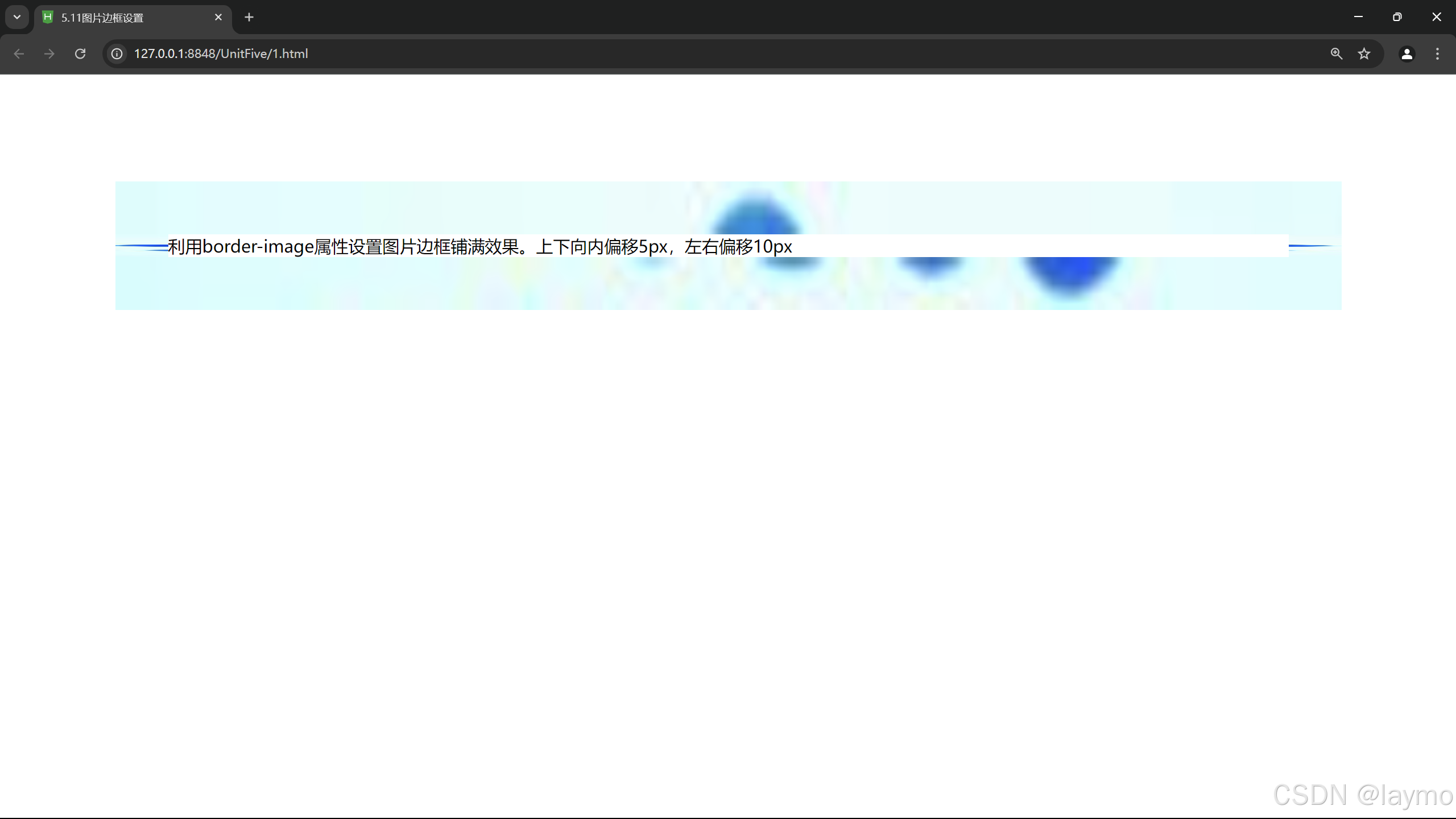
5.4 CSS元素的定位
5.4.1 static定位
static 是 HTML 元素的默认值,不受 top、right、bottom 和 left 属性影响,元素出现在正常的文档流中。
<!DOCTYPE html>
<html>
	<head>
		<meta charset="utf-8">
		<title>5.12静态定位</title>
		<style type="text/css">
			.father{
				border: 2px solid red;
				width: 300px;
				height: 250px;
			}
			.son1{
				border: 2px double red;
				background-color: yellow;
				width: 200px;
				height: 80px;
			}
			.son2{
				border: 2px double red;
				width: 200px;
				height: 25px;
				margin-top: 50px;
			}
		</style>
	</head>
	<body>
		<div class="father">父盒子:无定位
		<div class="son1">子盒子:无定位的盒子
		<h2>静态定位的盒子</h2>
		</div>
			<div class="son2">子盒子2:无定位的盒子</div>
		</div>
	</body>
</html>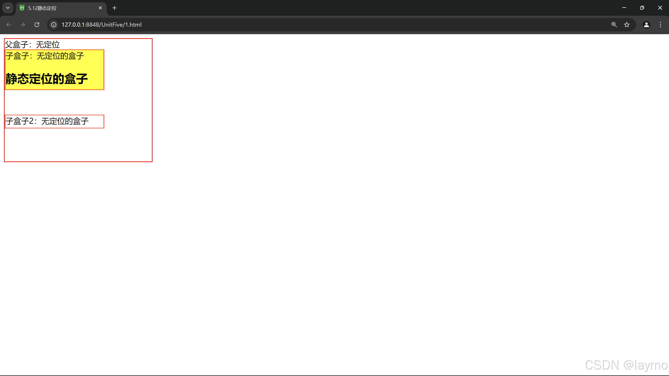
5.4.2 relative定位
relative 不脱离文档流的布局,需要参照父元素的四条边(不是浏览器),设置自身的lop、right、bottom 和leli 属性的参数,从盒子中独立出来浮在上面。相对定位只改变自身的位置,在文档流原先的位置留出空白区城。定位的起始位置为此元素原先在文档流的位置。
<!DOCTYPE html>
<html>
	<head>
		<meta charset="utf-8">
		<title>5.13相对定位</title>
		<style type="text/css">
			.father{
				border: 2px solid red;
				width: 300px;
				height: 250px;
			}
			.son1{
				border: 2px double red;
				background-color: yellow;
				width: 200px;
				height: 80px;
				position: relative;
				top: 10px;left: 30px;
			}
			.son2{
				border: 2px double red;
				width: 200px;
				height: 25px;
				margin-top: 50px;
			}
		</style>
	</head>
	<body>
		<div class="father">父盒子:无定位
		<div class="son1">子盒子:无定位的盒子
		<h2>静态定位的盒子</h2>
		</div>
			<div class="son2">子盒子2:无定位的盒子</div>
		</div>
	</body>
</html>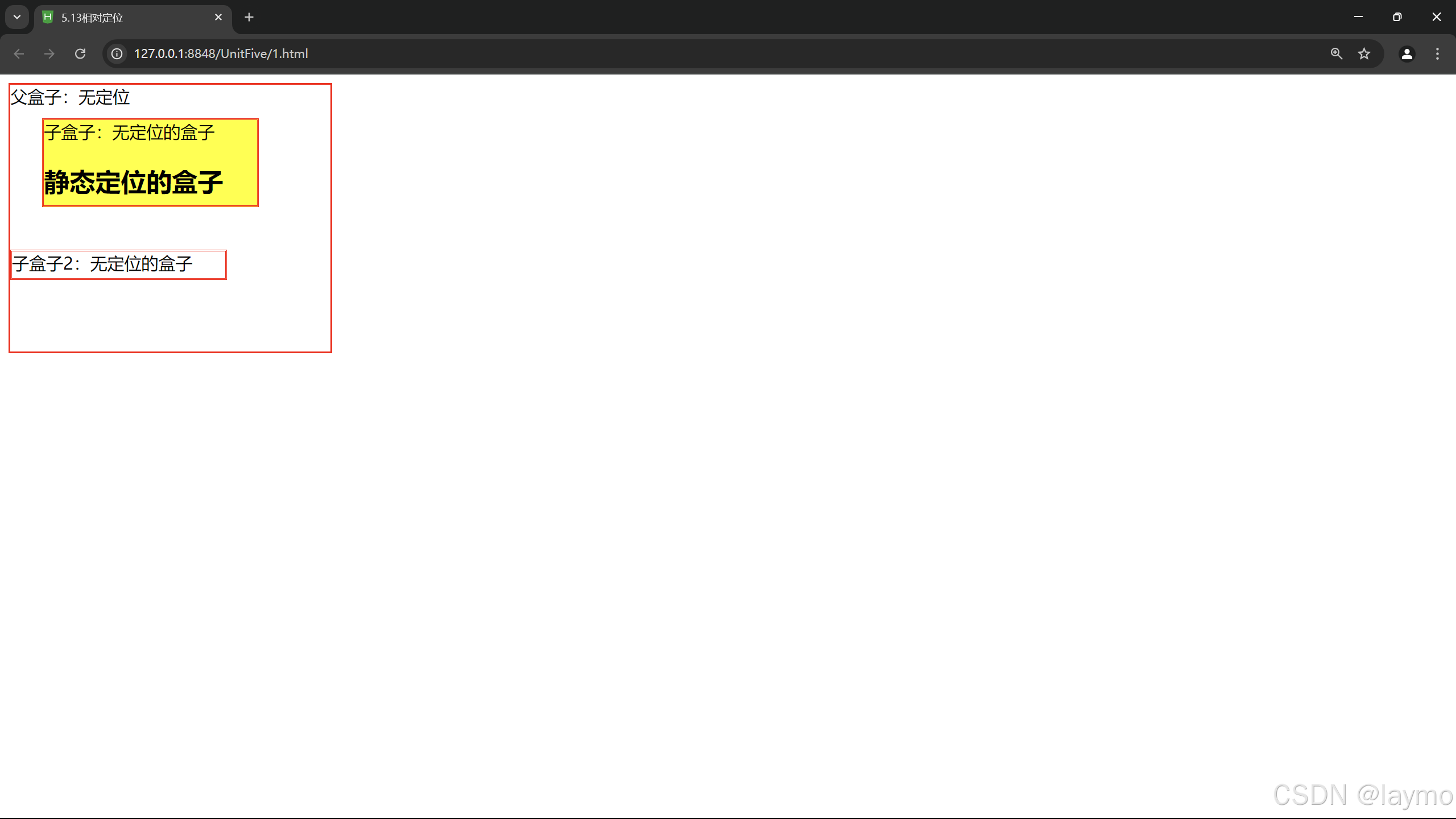
5.4.3 absolute定位
absolute 脱离原来文档流的布局,浮在其他盒子上面,独立出来。子盒子原来位置的空
间由后面的盒子填充。绝对定位的起始位置为最近已定位的父盒子,如果父盒子没有定位,那么子盒子的起始位置为浏览器,并随着滚动条的移动而改变位置。
<!DOCTYPE html>
<html lang="en">
<head>
    <meta charset="UTF-8">
    <meta name="viewport" content="width=device-width, initial-scale=1.0">
    <title></title>
    <style>
        .container {
            position: relative; /* 设置定位上下文 */
            width: 300px;
            height: 200px;
            border: 2px solid #000;
            margin: 20px;
        }

        .absolute-box {
            position: absolute; /* 绝对定位 */
            top: 20px; /* 距离容器顶部20px */
            left: 30px; /* 距离容器左侧30px */
            width: 100px;
            height: 100px;
            background-color: rgba(255, 0, 0, 0.5);
            border: 2px solid #ff0000;
        }
    </style>
</head>
<body>

<div class="container">
    <div class="absolute-box"></div>
    <p>这是一个容器元素。</p>
</div>

</body>
</html>
</html>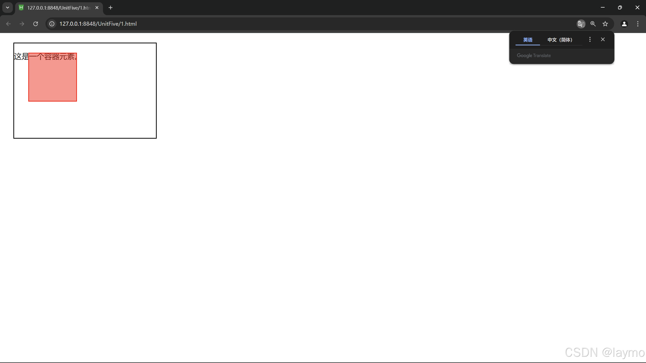
5.4.3.1 相对浏览器绝对定位
在CSS中,绝对定位(absolute)元素会相对于其最近的已定位祖先元素进行定位。如果没有这样的祖先元素,则它将相对于浏览器窗口(初始包含块)进行定位。
<!DOCTYPE html>
<html lang="en">
<head>
    <meta charset="UTF-8">
    <meta name="viewport" content="width=device-width, initial-scale=1.0">
    <title></title>
    <style>
        body {
            height: 1500px; /* 增加页面高度以便滚动 */
            margin: 0;
        }

        .absolute-box {
            position: absolute; /* 绝对定位 */
            top: 50px; /* 距离浏览器顶部50px */
            right: 30px; /* 距离浏览器右侧30px */
            width: 200px;
            height: 100px;
            background-color: rgba(0, 128, 255, 0.5);
            border: 2px solid #0080ff;
        }
    </style>
</head>
<body>

<div class="absolute-box">我位于浏览器窗口的右上方。</div>

<p>向下滚动查看效果...</p>
<p>这里是一些文本内容...</p>
<p>这里是一些文本内容...</p>
<p>这里是一些文本内容...</p>
<p>这里是一些文本内容...</p>
<p>这里是一些文本内容...</p>
<p>这里是一些文本内容...</p>

</body>
</html>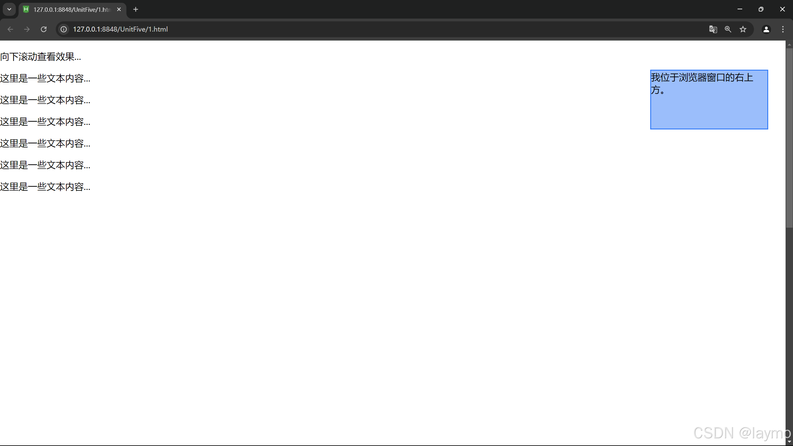
5.4.3.2 相对父盒子绝对定位
在CSS中,相对父盒子绝对定位是指一个元素使用 position: absolute; 定位,并且它相对于其最近的已定位父元素(即设置了 position 属性为 relative, absolute, 或 fixed 的元素)进行定位。如果没有这样的父元素,它将相对于浏览器窗口进行定位。
<!DOCTYPE html>
<html lang="en">
<head>
    <meta charset="UTF-8">
    <meta name="viewport" content="width=device-width, initial-scale=1.0">
    <title>Absolute Positioning Relative to Parent</title>
    <style>
        .parent {
            position: relative; /* 设置为相对定位,成为定位上下文 */
            width: 300px;
            height: 200px;
            border: 2px solid #000;
            margin: 20px;
            padding: 10px;
            background-color: #f0f0f0;
        }

        .absolute-box {
            position: absolute; /* 绝对定位 */
            top: 20px; /* 相对于父盒子顶部20px */
            left: 30px; /* 相对于父盒子左侧30px */
            width: 100px;
            height: 100px;
            background-color: rgba(255, 0, 0, 0.5);
            border: 2px solid #ff0000;
        }
    </style>
</head>
<body>

<div class="parent">
    <div class="absolute-box">我相对于父盒子定位</div>
    <p>这是父盒子的内容。</p>
</div>

</body>
</html>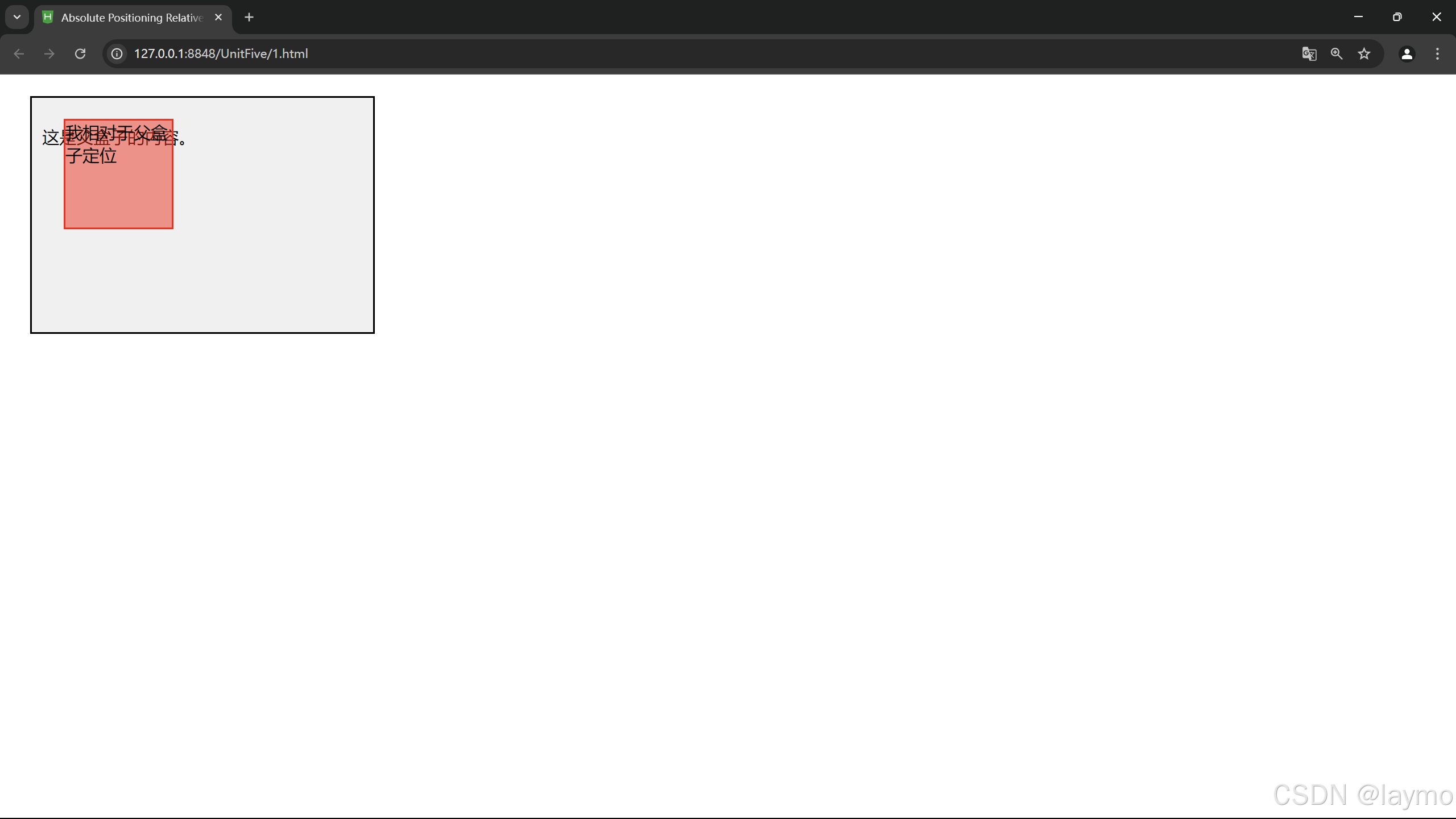
5.4.4 fixed定位
fixed 类似于 ahsolute,但在固定定位中,盒子的位置不随着滚动条的移动而改变位相对于测览器窗口是固定不变的。
<!DOCTYPE html>
<html lang="en">
<head>
    <meta charset="UTF-8">
    <meta name="viewport" content="width=device-width, initial-scale=1.0">
    <title></title>
    <style>
        body {
            height: 2000px; /* 增加页面高度以便滚动 */
            margin: 0;
            background-color: #e0e0e0;
        }

        .fixed-box {
            position: fixed; /* 固定定位 */
            top: 20px; /* 距离浏览器顶部20px */
            right: 20px; /* 距离浏览器右侧20px */
            width: 150px;
            height: 100px;
            background-color: rgba(0, 128, 0, 0.7);
            border: 2px solid #008000;
            box-shadow: 0 0 10px rgba(0, 0, 0, 0.5);
        }
    </style>
</head>
<body>

<div class="fixed-box">我会固定在这里!</div>

<p>向下滚动查看效果...</p>
<p>这里是一些文本内容...</p>
<p>这里是一些文本内容...</p>
<p>这里是一些文本内容...</p>
<p>这里是一些文本内容...</p>
<p>这里是一些文本内容...</p>
<p>这里是一些文本内容...</p>

</body>
</html>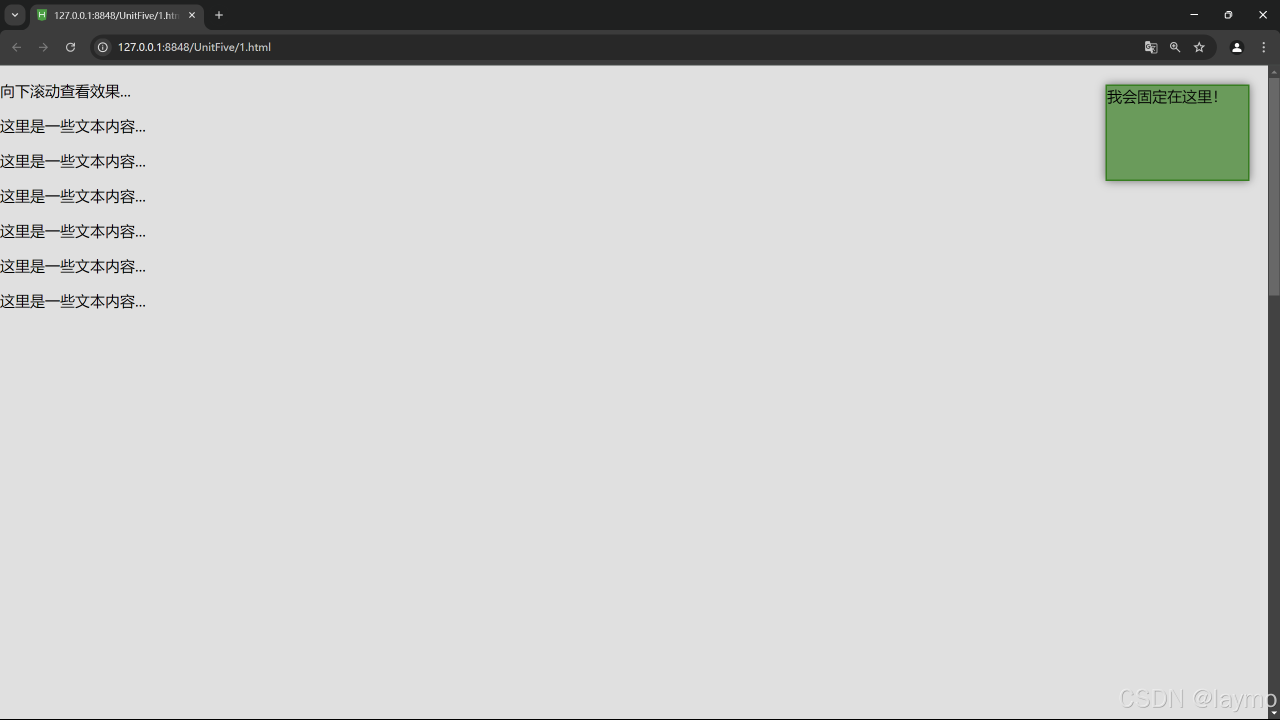
5.5 CSS元素的浮动
<!DOCTYPE html>
<html lang="en">
<head>
    <meta charset="UTF-8">
    <meta name="viewport" content="width=device-width, initial-scale=1.0">
    <title>Float Example</title>
    <style>
        .container {
            width: 600px;
            margin: 0 auto;
            background-color: #f0f0f0;
            padding: 10px;
        }

        .box {
            width: 200px;
            height: 150px;
            margin: 10px;
            background-color: #4CAF50;
            color: white;
            text-align: center;
            line-height: 150px; /* 垂直居中 */
        }

        .float-left {
            float: left;
        }

        .float-right {
            float: right;
        }
    </style>
</head>
<body>

<div class="container">
    <div class="box float-left">左浮动</div>
    <div class="box float-right">右浮动</div>
    <p>这是一些文本,用于展示浮动效果。这个文本将环绕在浮动的元素周围。继续添加更多文本,以查看浮动效果的变化。</p>
</div>

</body>
</html>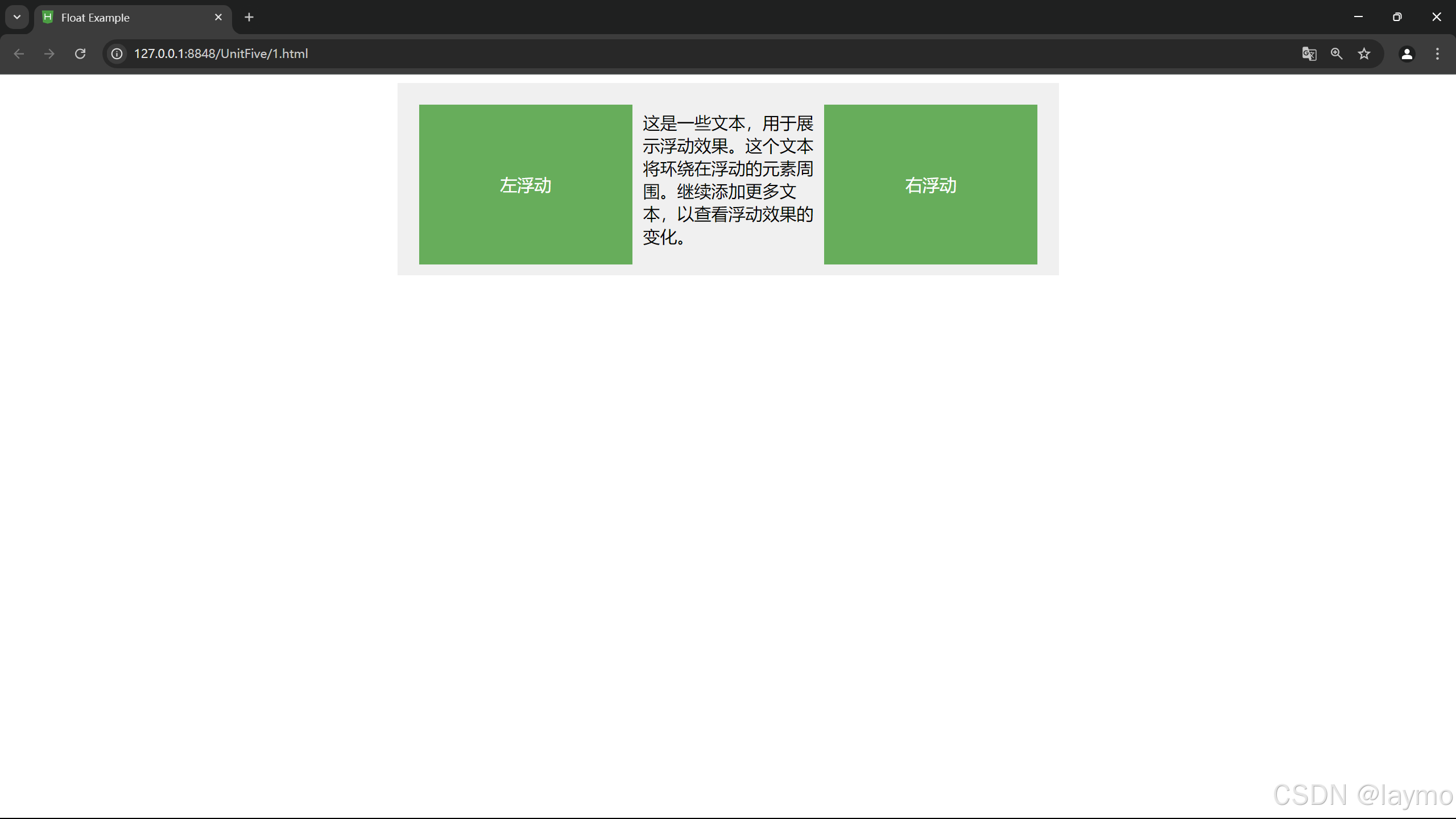
5.5.1 盒子的浮动元素
CSS中的浮动(Float)属性是一种布局手段,允许元素向左或向右移动,直到它的外边缘碰到包含框或另一个浮动元素的边缘。浮动元素会脱离常规文档流,但它还是会占据空间,影响其他元素的布局。
属性:left、right、none、inherit
<!DOCTYPE html>
<html lang="en">
<head>
    <meta charset="UTF-8">
    <meta name="viewport" content="width=device-width, initial-scale=1.0">
    <title>浮动盒子布局示例</title>
    <style>
        body {
            font-family: Arial, sans-serif;
            background-color: #eaeaea;
        }

        .container {
            width: 900px;
            margin: 20px auto;
            padding: 10px;
            background-color: #fff;
            border: 1px solid #ccc;
            overflow: hidden; /* 清除浮动 */
        }

        .box {
            width: 200px;
            height: 150px;
            margin: 10px;
            background-color: #4CAF50;
            color: white;
            text-align: center;
            line-height: 150px; /* 垂直居中 */
            float: left; /* 使盒子浮动 */
            border-radius: 5px; /* 圆角效果 */
        }

        .box:nth-child(odd) {
            background-color: #2196F3; /* 奇数盒子颜色 */
        }

        .box:nth-child(even) {
            background-color: #FF9800; /* 偶数盒子颜色 */
        }
    </style>
</head>
<body>

<div class="container">
    <div class="box">盒子 1</div>
    <div class="box">盒子 2</div>
    <div class="box">盒子 3</div>
    <div class="box">盒子 4</div>
    <div class="box">盒子 5</div>
    <div class="box">盒子 6</div>
</div>

</body>
</html>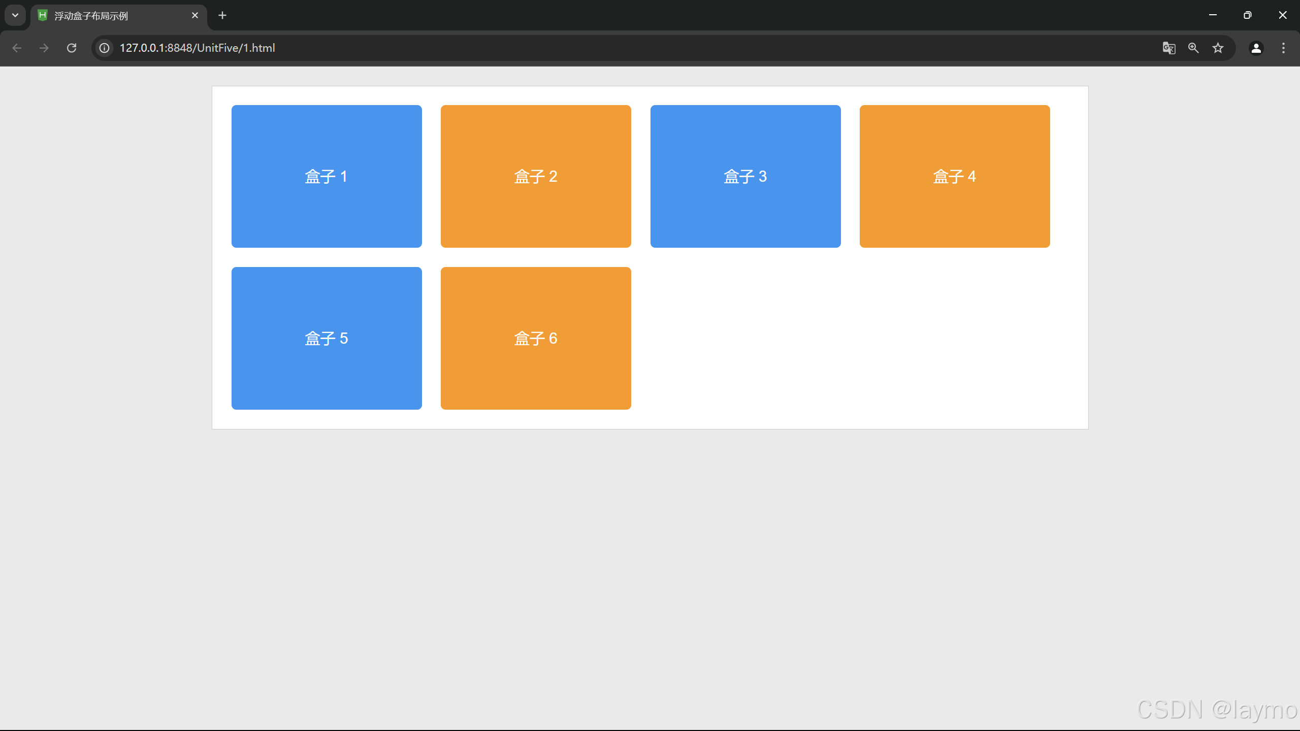
5.5.2 盒子的浮动清除
当一个元素浮动后,它下方的元素也会浮动上来,这可能会导致布局问题。为了解决这个问题,可以使用clear属性来阻止元素周围有浮动。
属性:left、right、none、both
<!DOCTYPE html>
<html lang="en">
<head>
    <meta charset="UTF-8">
    <meta name="viewport" content="width=device-width, initial-scale=1.0">
    <title>清除浮动示例</title>
    <style>
        body {
            font-family: Arial, sans-serif;
            background-color: #eaeaea;
        }

        .container {
            width: 900px;
            margin: 20px auto;
            background-color: #fff;
            border: 1px solid #ccc;
            overflow: hidden; /* 方法 1: 清除浮动 */
        }

        .box {
            width: 200px;
            height: 150px;
            margin: 10px;
            background-color: #4CAF50;
            color: white;
            text-align: center;
            line-height: 150px;
            float: left; /* 盒子浮动 */
            border-radius: 5px;
        }
    </style>
</head>
<body>

<div class="container">
    <div class="box">盒子 1</div>
    <div class="box">盒子 2</div>
    <div class="box">盒子 3</div>
    <div class="box">盒子 4</div>
</div>

</body>
</html>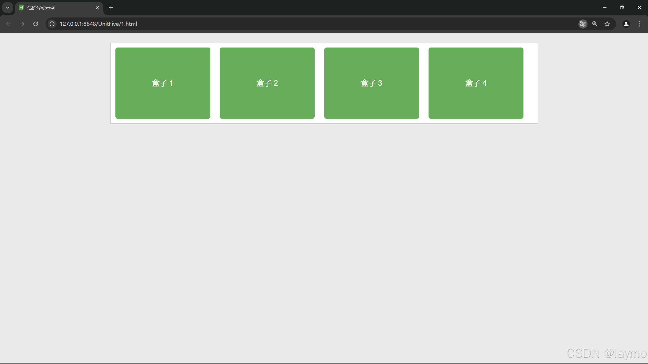
5.6 案例-昵心美食空间
<!DOCTYPE html>
<html>
<head>
<meta charset="utf-8" />
<title>昵心美食空间</title>
<style type="text/css">
*{
background-color:#FFFF99;
}
a{
color:red;
}
.all{
width:700px;
height:650px;
margin:10px auto;
padding:5px;
background-image:url(img/bg1.jpg):
}
.banner{
width:700px;
height:70px;
}
.menu{
width:690px;
height:40px;
padding:5px;
}
.main{
width:700px;
height:450px;
margin:5px 0px;
position:relative:
}
.left,.right{
width: 150px;height:440px;
border: 1px solid #999;
float:left;
}
.middle{
width:384px;
height:450px;
margin:0px 5px;
float:left;
font-size:20px;
font-family:"楷体";
font-weight:700;
color:#0000FF;
}
.one{
width:380px;
height:155px;
border:1px solid #999;
}
.two{
width:255px;
height:100px;
border:5px double red;
margin-top:20px;
margin-bottom:20px;
border-radius:25px;
}
.three{
width:380px;
height:135px;
border:1px solid #999;
}
.bottom{
width:700px;
height:70px;
}
</style>
</head>
<body>
<div class="all">
<div class="banner">
<img src="img/banner.jpg" width="700px" height="70px"/>
</div>
<div class="menu">
<img src="img/menu.jpg" width="690px" height="40px" />
</div>
<div class="main">
<div class="left">
<marquee direction="up">
<img src="img/mm_1.jpg" width="150px" height="140px"/>
<img src="img/mm_2.jpg" width="150px" height="140px"/>
<img src="img/mm_3.jpg" width="150px" height="140px"/>
</marquee>
</div>
<div class="middle">
<div class="one">
<img src="img/font.jpg" width="25px" height="25px"/>为你推荐
<br><br>
<img src="img/x_1.jpg" width="80px" height="40px"/>
<img src="img/x_2.jpg" width="80px" height="40px"/>
<img src="img/x_3.jpg" width="80px" height="40px"/>
<img src="img/x_4.jpg" width="80px" height="40px"/>
<img src="img/x_5.jpg" width="80px" height="40px"/>
<img src="img/x_6.jpg" width="80px" height="40px"/>
</div>
<center>
<div class="two">
<h1>昵心美食空间</h1>
</div>
</center>
<div class="three">
<img src="img/font.jpg" width="25px" height="25px" />团购信息
<br>
<a href="#">1.火锅团购</a><br>
<a href="#">2.烧烤团购</a><br>
<a href="#">3.自助餐团购</a><br>
<a href="#">4.新春特惠</a>
</div>
</div>
<div class="right">
<marquee direction="up">
<img src="img/good_1.jpg" width="150px" heighu="140px"/>
<img src="img/good_2.jpg" width="148px" height="140px"/>
<img src="img/good_3.jpg" width="148px" height="140px"/>
</marquee>
</div>
</div>
<div class="bottom">
<hr color="#0000FF">
<center style="font-family:'楷体'";>版权所有©昵心美食空间<br/>
地址:江门市大学路 XXX号 邮编:500000 电话:0750-9999999</center>
</div>
</div>
</body>
</html>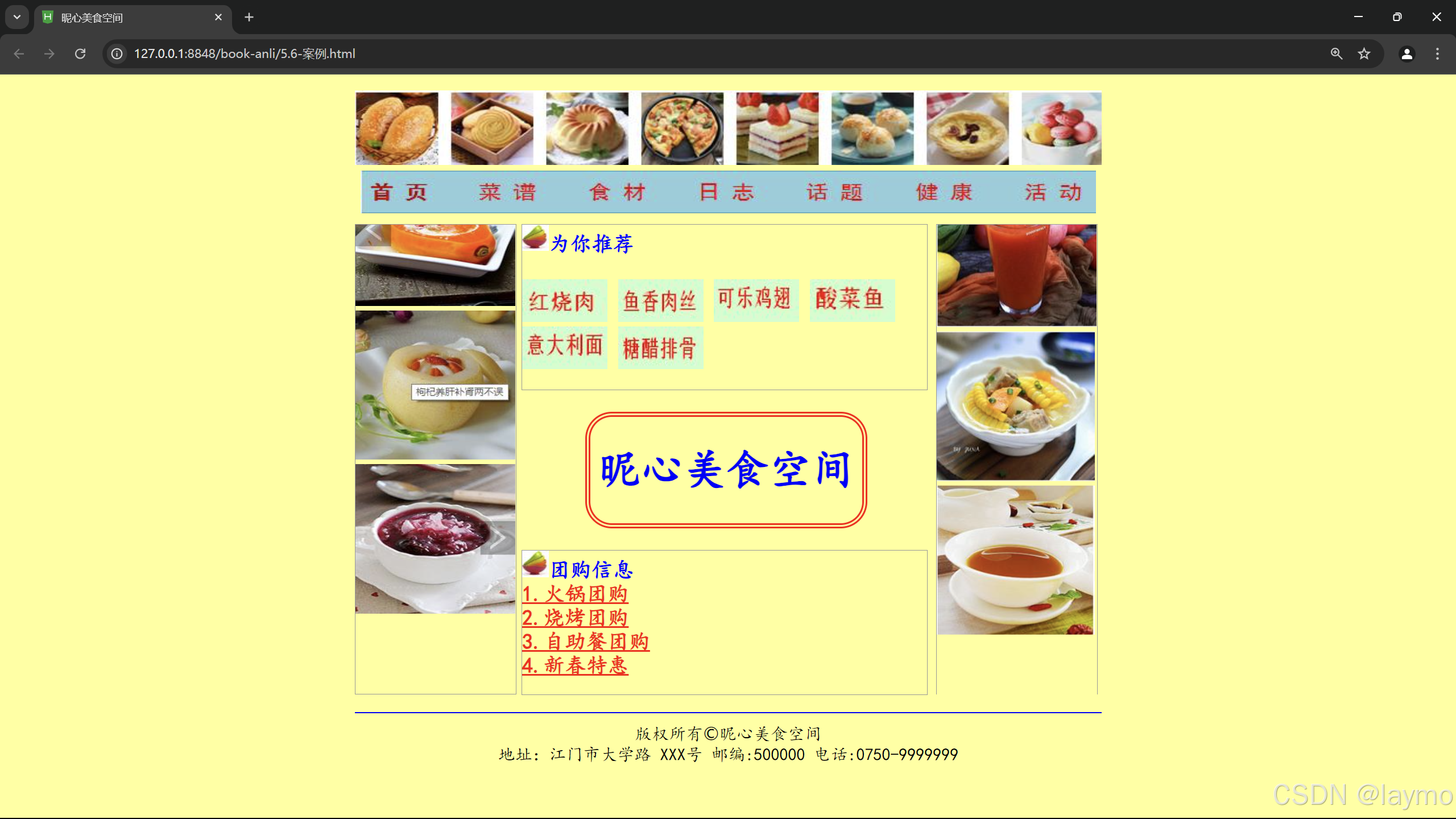


 扫一扫
扫一扫


 970
970

 被折叠的 条评论
为什么被折叠?
被折叠的 条评论
为什么被折叠?
 到【灌水乐园】发言


