


 本文详细介绍了如何使用HTML5、CSS3和jQuery构建一个响应式、可过滤的作品集,涵盖从文件结构、HTML标记到CSS样式和JavaScript功能的全过程。
可过滤投资组合( 如Tuts + hub )固有的视觉吸引力使它们非常受欢迎。 今天,我们将使用直接标记,CSS3和一点点的jQuery制作一个。
步骤1:文件结构
我们将在项目中使用以下文件结构:
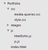
根据这些文件将项目组合在一起(您需要获取HTML5 Shiv ),让我们开始使用index.html中HTML标记。
步骤2:HTML标头
让我们保持较高的节奏,整理一下创建<head>所需要做的事情:
- 声明页面的媒体类型和字符集。
- 将视口的宽度设置为与设备的宽度相同,并将初始缩放比例设置为1( 在此处了解更多信息)
- 给我们的页面命名。
- 附加图标(对视网膜防护图标感兴趣吗? )
- 附上我们的主要样式表(style.css)
- 附上我们的样式表以处理媒体查询(media-queries.css)
- 链接到最新版本的jQuery。
- 添加HTML5 Shiv以处理旧浏览器HTML5兼容性问题。
这就是我们得到的:
<!doctype html>
<html lang="en">
	<head>
		<meta http-equiv="content-type" content="text/html; charset=utf-8" />
		<meta name="viewport" content="width=device-width, initial-scale=1.0">
		<title>John Doe's Portfolio</title>
		<link rel="shortcut icon" type="image/x-icon" href="images/favicon.ico">
		<link rel="stylesheet" href="css/style.css" media="screen">
		<link rel="stylesheet" href="css/media-queries.css" media="screen">
		<script src="http://code.jquery.com/jquery-latest.min.js"></script>
		<script src="js/js.js"></script>
		<!--[if lt IE 9]>
			<script src="js/html5shiv.js"></script>
		<![endif]-->
</head>步骤3:HTML基本标记
在主体中,我们首先添加一个“容器”以将所有元素保持在页面中央的设置宽度内。 在其中添加(准备另一个快速启动清单):
-
<header>作为我们的标题(“ John Doe”)。 - 基本导航(
<nav>)包括<ul>菜单,其中包含五个项目,每个项目都有其各自的ID。 - 带有“工作”类的缩略图的
<section>。 - 具有所有版权内容的
<footer>。
<body>
<div class="container">
<header>
<h1 class="title">
John Doe
</h1>
</header>
<nav>
<ul>
<li id="all">All</li>
<li id="web">Web</li>
<li id="print">Print</li>
<li id="illustration">Illustration</li>
<li id="logo">Logo</li>
</ul>
</nav>
<section class="work">
</section>
<footer>© 2012 John Doe. Valid HTML5.</footer>
</body>第4步:HTML图形和图像
我们将在缩略图中使用<figure>标签,并将应用其所属类别的类。 在图中,我们将添加一个<a>标签,其中包含缩略图背景的图像( <img> )和标题的描述列表 ( <dl> )。
<figure class="illustration">
	<a href="#">
		<img src="images/1.png" alt="" />
		<dl>
		</dl>
	</a>
</figure>步骤5:HTML字幕(DL,DT,DD)
如上所述,我们将为标题使用描述列表。 我们的描述术语( <dt> )将分别作为我们的小标题-客户和角色,而对于我们的描述( <dd> )-Envato和插图。
<figure class="illustration">
	<a href="#">
		<img src="images/1.png" alt="" />
		<dl>
			<dt>Client</dt>
				<dd>Envato</dd>
			<dt>Role</dt>
				<dd>Illustration</dd>
		</dl>
	</a>
</figure>步骤6:完整HTML
这是我们完成HTML标记的样子:
<!doctype html>
<html lang="en">
<head>
<meta http-equiv="content-type" content="text/html; charset=utf-8" />
<meta name="viewport" content="width=device-width, initial-scale=1.0">
<title>John Doe's Portfolio</title>
<link rel="shortcut icon" type="image/x-icon" href="images/favicon.ico">
<link rel="stylesheet" href="css/style.css" media="screen">
<link rel="stylesheet" href="css/media-queries.css" media="screen">
<script src="http://code.jquery.com/jquery-latest.min.js"></script>
<script src="js/js.js"></script>
<!--[if lt IE 9]>
<script src="js/html5shiv.js"></script>
<![endif]-->
</head>
<body>
<div class="container">
<header>
<h1 class="title">
John Doe
</h1>
</header>
<nav>
<ul>
<li id="all">All</li>
<li id="web">Web</li>
<li id="print">Print</li>
<li id="illustration">Illustration</li>
<li id="logo">Logo</li>
</ul>
</nav>
<section class="work">
<figure class="illustration">
<a href="#">
<img src="images/1.png" alt="" />
<dl>
<dt>Client</dt>
<dd>Envato</dd>
<dt>Role</dt>
<dd>Illustration</dd>
</dl>
</a>
</figure>
<figure class="print">
<a href="#">
<img src="images/2.png" alt="" />
<dl>
<dt>Client</dt>
<dd>Envato</dd>
<dt>Role</dt>
<dd>Print</dd>
</dl>
</a>
</figure>
<figure class="logo">
<a href="#">
<img src="images/3.png" alt="" />
<dl>
<dt>Client</dt>
<dd>Envato</dd>
<dt>Role</dt>
<dd>Logo</dd>
</dl>
</a>
</figure>
<figure class="web">
<a href="#">
<img src="images/4.png" alt="" />
<dl>
<dt>Client</dt>
<dd>Envato</dd>
<dt>Role</dt>
<dd>Web</dd>
</dl>
</a>
</figure>
<figure class="print">
<a href="#">
<img src="images/5.png" alt="" />
<dl>
<dt>Client</dt>
<dd>Envato</dd>
<dt>Role</dt>
<dd>Print</dd>
</dl>
</a>
</figure>
<figure class="web">
<a href="#">
<img src="images/6.png" alt="" />
<dl>
<dt>Client</dt>
<dd>Envato</dd>
<dt>Role</dt>
<dd>Web</dd>
</dl>
</a>
</figure>
<figure class="print">
<a href="#">
<img src="images/7.png" alt="" />
<dl>
<dt>Client</dt>
<dd>Envato</dd>
<dt>Role</dt>
<dd>Print</dd>
</dl>
</a>
</figure>
<figure class="web">
<a href="#">
<img src="images/8.png" alt="" />
<dl>
<dt>Client</dt>
<dd>Envato</dd>
<dt>Role</dt>
<dd>Web</dd>
</dl>
</a>
</figure>
<figure class="illustration">
<a href="#">
<img src="images/9.png" alt="" />
<dl>
<dt>Client</dt>
<dd>Envato</dd>
<dt>Role</dt>
<dd>Illustration</dd>
</dl>
</a>
</figure>
<figure class="print">
<a href="#">
<img src="images/10.png" alt="" />
<dl>
<dt>Client</dt>
<dd>Envato</dd>
<dt>Role</dt>
<dd>Print</dd>
</dl>
</a>
</figure>
<figure class="web">
<a href="#">
<img src="images/11.png" alt="" />
<dl>
<dt>Client</dt>
<dd>Envato</dd>
<dt>Role</dt>
<dd>Web</dd>
</dl>
</a>
</figure>
<figure class="logo">
<a href="#">
<img src="images/12.png" alt="" />
<dl>
<dt>Client</dt>
<dd>Envato</dd>
<dt>Role</dt>
<dd>Logo</dd>
</dl>
</a>
</figure>
<figure class="illustration">
<a href="#">
<img src="images/13.png" alt="" />
<dl>
<dt>Client</dt>
<dd>Envato</dd>
<dt>Role</dt>
<dd>Illustration</dd>
</dl>
</a>
</figure>
<figure class="web">
<a href="#">
<img src="images/14.png" alt="" />
<dl>
<dt>Client</dt>
<dd>Envato</dd>
<dt>Role</dt>
<dd>Web</dd>
</dl>
</a>
</figure>
<figure class="logo">
<a href="#">
<img src="images/15.png" alt="" />
<dl>
<dt>Client</dt>
<dd>Envato</dd>
<dt>Role</dt>
<dd>Logo</dd>
</dl>
</a>
</figure>
<figure class="print">
<a href="#">
<img src="images/16.png" alt="" />
<dl>
<dt>Client</dt>
<dd>Envato</dd>
<dt>Role</dt>
<dd>Print</dd>
</dl>
</a>
</figure>
</section>
<footer>© 2012 John Doe. Valid HTML5.</footer>
</div>
</body>
</html>现在让我们继续进行样式设计。
步骤7:CSS选择和滚动条
我们将从处理一些有趣的元素开始; 选择状态和滚动条(完全是可选的),再加上一些字体。
@import url(http://fonts.googleapis.com/css?family=Open+Sans:400,300);
@import url(http://fonts.googleapis.com/css?family=PT+Sans+Narrow);

::selection {
	background: #333;
	color: #FFF;
}

::-webkit-scrollbar {
	width: 9px;
}

::-webkit-scrollbar-track {
	background:#eee;
	border: thin solid lightgray;
	box-shadow: 0px 0px 3px rgba(0, 0, 0, 0.1) inset;
}

::-webkit-scrollbar-thumb {
	background:#999;
	border: thin solid gray;
}
在上面的代码中,我们从Google导入了两个Web字体-Open Sans和PT Sans Narrow。 然后,我们只需为用户选择设置深灰色背景和白色文本颜色。
然后,我们为滚动条(在Webkit浏览器中)设置9px的宽度,并为“轨道”赋予浅灰色背景,细边框和柔和的内嵌框阴影。 然后,我们给滚动条拇指添加了深灰色背景,并为其添加了细边框。
注意 :有关webkit-scrollbars的更多信息,请参见Chris Coyier的文章 。
步骤8:CSS正文
我们将为身体提供浅灰色的噪点背景,并应用我们先前导入的“ Open Sans”字体。 我们还将添加一个红色的顶部边框,以增强技巧。

让气氛更热烈...
body {
	font-family: 'Open Sans', sans-serif;
	background: url('../images/bg.gif');
	padding: 0;
	margin: 0;
	border-top: 10px solid #9d2e2c;
}步骤9:CSS容器
现在,对于我们的容器,我们将设置960px的宽度,顶部和底部边距为10px,然后通过将左右边距设置为' auto ',将其在页面上居中。 我们还将通过使用-webkit-transform: translateZ(0);来强制(某些)移动设备上的硬件加速-webkit-transform: translateZ(0); '。
.container {
	width: 960px;
	margin: 10px auto;
	-webkit-transform: translateZ(0);
}步骤10:CSS标头
我们将简单地增加标题font-size ,将文本居中,并为其赋予300的font-weight以使外观更加时尚。
header {
	text-align: center;
	font-weight: 300;
	font-size: 700%;
}步骤11:CSS页脚
我们将使文本水平居中对齐,分别添加50px的顶部和底部边距,将文本颜色设置为灰色,然后使用“ clear: both ”将其放置在“ work”部分的下方。
footer {
	text-align: center;
	height: 100px;
	line-height: 100px;
	color: gray;
	clear: both;
}
现在开始导航。
步骤12:CSS导航
首先,从<ul>删除所有默认样式。 然后,我们将添加50px的顶部和底部边距,并将文本与中心对齐。
nav ul {
	list-style: none;
	padding: 0;
	margin: 50px 0;
	text-align: center;
}
现在,通过使用' display: inline ',我们将所有<li>都显示在一行中。 我们将光标设置为'pointer',并为每个<li>添加10px的右边距。 默认的文本颜色将是浅灰色阴影,将在悬停时变为黑色。
我们还将添加一个小的过渡时间来设置颜色变化的动画。
nav ul li {
	display: inline;
	cursor: pointer;
	margin-right: 10px;
	color: #666;

	transition: 0.3s;
	-webkit-transition: 0.3s;
	-moz-transition: 0.3s;
	-o-transition: 0.3s;
	-ms-transition: 0.3s;
}

nav ul li:hover {
	color: #000;
} 由于最后一个<li>是umm,最后一个孩子,所以不需要任何右边距。 因此,我们将其删除。
nav ul li:last-child {
	margin-right: 0;
} 现在,让我们在<li>之后添加斜杠。 我们将使用' :after '伪选择器来完成此操作。 通过将其“ content ”设置为“ /”,将颜色设置为浅灰色,并设置适当的左边界,我们可以生成一种简单有效的链接分离系统。 我们还将通过在li:hover上强制其默认颜色来确保斜杠在悬停时不会改变颜色。
nav ul li:after {
	margin-left: 10px;
	content: '/';
	color: #bbb;
}

nav ul li:hover:after {
	color: #bbb;
} 同样,我们必须从最后一个<li>删除斜杠。
nav ul li:last-child:after {
	content: '';
}
这就是导航的全部内容,现在让我们进入缩略图。
第13步:CSS缩略图
首先,我们将在“ .work”部分添加20px的上下边距。
.work {
	margin: 20px 0;
}
接下来,我们将为每个“ .work figure ”(即所有缩略图)设置样式。 我们将使用' float: left '将它们对齐。 然后,我们将添加20px的边距,将高度和宽度设置为200px,并使用' -webkit-filter: sepia(0.4) '添加适度的棕褐色效果。 然后,将position设置为relative以便我们可以在figure中将其他元素(在本例中为标题)绝对定位。 然后,我们将添加一个柔和的box-shadow ,它也将作为我们的边界。 我们还将为包装盒增加和缩小比例增加一个过渡时间。
.work figure {
	float: left;
	margin: 20px;
	width: 200px;
	height: 200px;
	background: #9d2e2c;
	line-height: 200px;
	-webkit-filter: sepia(0.4);
	position: relative;
	padding: 0 !important;

	box-shadow: 0 0 5px 0 rgba(0, 0, 0, 0.5);

	transition: 0.6s;
	-webkit-transition: 0.6s;
	-moz-transition: 0.6s;
	-o-transition: 0.6s;
	-ms-transition: 0.6s;
}
通过将其高度和宽度设置为100%,可以确保我们的图像始终适合缩略图。
.work figure a img {
	height: 100%;
	width: 100%;
}
这就是我们的基本缩略图。 现在让我们处理他们的字幕。
步骤14:CSS字幕
说明清单
由于我们不希望标题一开始就可见,因此将其opacity设置为0 。 然后,我们将其绝对定位(在图中),并通过将全部4个属性( top , right , bottom和left )设置为0使其完全填满该图。
然后,将其line-height设置为2.5并为其提供深色,半透明的背景。 由于我们使用的是深色背景,因此我们将其文字颜色设置为白色。 我们还将添加一个小的过渡时间,以使其在figure:hover上不透明。
.work figure dl {
	opacity: 0;
	position: absolute;
	left: 0;
	right: 0;
	bottom: 0;
	top: 0;
	padding: 20px;
	margin: 0;
	line-height: 2.5;
	background: rgba(0, 0, 0, 0.8);
	color: white;

	transition: 0.6s;
	-webkit-transition: 0.6s;
	-moz-transition: 0.6s;
	-o-transition: 0.6s;
	-ms-transition: 0.6s;
} 因为我们希望它显示在缩略图上的悬停上,所以我们将其opacity在figure:hover上设置为1 。
.work figure:hover dl {
	opacity: 1;
}
说明条款
首先,我们将其font-family设置为“ PT Sans Narrow”。 为了使它们看起来比其描述小一些,我们将其font-size设置为80%。 然后,我们将使用' text-transform:uppercase '将描述术语(客户端和角色)转换为大写。 我们还将设置负的底边距,以避免术语及其描述之间的间距过大。
.work figure dl dt {
	text-transform: uppercase;
	font-family: 'PT Sans Narrow';
	font-size: 12px;
	margin-bottom: -16px;
}
定义说明
我们在这里不需要做太多–我们只需将margin设置为0 。 (默认情况下, <dd>的左边距很小。)
.work figure dl dd {
	margin-left: 0;
}
第15步:CSS “ current ” /“ not-current ”缩略图
.current
当给某个类别的缩略图指定.current类(通过JS)时,我们希望它们增长并恢复其正常色调(即,删除棕褐色)。 我们将使用' transform: scale(1.05) '将它们放大,从而将其缩放到x和y轴上原始大小的1.05倍,并使用' -webkit-filter: sepia(0)删除我们先前添加的-webkit-filter: sepia(0) '。
.current {
	-webkit-filter: sepia(0) !important;

	-webkit-transform: scale(1.05);
	-moz-transform: scale(1.05);
	-o-transform: scale(1.05);
	-ms-transform: scale(1.05);
	transform: scale(1.05);

	-webkit-backface-visibility: hidden;
	-moz-backface-visibility: hidden;
	-o-backface-visibility: hidden;
	-ms-backface-visibility: hidden;
	backface-visibility: hidden;
}
.not-current
在这里,我们将与.current缩略图完全相反—我们将使用' transform: scale(0.75) '将它们缩小到75%,并使用' -webkit-filter: grayscale(1)将它们变成黑白-webkit-filter: grayscale(1) '。
.not-current {
	-webkit-transform: scale(0.75);
	-moz-transform: scale(0.75);
	-o-transform: scale(0.75);
	-ms-transform: scale(0.75);
	transform: scale(0.75);

	-webkit-filter: grayscale(1) !important;
}
.current-li
我们将简单地将'.current-li'的文本颜色设置为黑色。
.current-li {
	color: #000;
}步骤16:完整CSS
这是我们完成CSS的样子:
/* Style */

@import url(http://fonts.googleapis.com/css?family=Open+Sans:400,300);
@import url(http://fonts.googleapis.com/css?family=PT+Sans+Narrow);

::selection {
	background: #333;
	color: #FFF;
}

::-webkit-scrollbar {
	width: 9px;
}

::-webkit-scrollbar-track {
	background:#eee;
	border: thin solid lightgray;
	box-shadow: 0px 0px 3px rgba(0, 0, 0, 0.1) inset;
}

::-webkit-scrollbar-thumb {
	background:#999;
	border: thin solid gray;
}

/* --------------------------
	Body
----------------------------- */

body {
	font-family: 'Open Sans', sans-serif;
	background: url('../images/bg.gif');
	padding: 0;
	margin: 0;
	border-top: 10px solid #9d2e2c;
}

/* --------------------------
	Container
----------------------------- */

.container {
	width: 960px;
	margin: 10px auto;
	-webkit-transform: translateZ(0);
}

a {
	text-decoration: none;
}

/* --------------------------
	Header
----------------------------- */

header {
	text-align: center;
	font-weight: 300;
	font-size: 700%;
}

/* --------------------------
	Footer
----------------------------- */

footer {
	text-align: center;
	height: 100px;
	line-height: 100px;
	color: gray;
	clear: both;
}

/* --------------------------
	Navigation
----------------------------- */

nav ul {
	list-style: none;
	padding: 0;
	margin: 50px 0;
	text-align: center;
}

nav ul li {
	display: inline;
	cursor: pointer;
	margin-right: 10px;
	color: #666;

	transition: 0.3s;
	-webkit-transition: 0.3s;
	-moz-transition: 0.3s;
	-o-transition: 0.3s;
	-ms-transition: 0.3s;
}

nav ul li:last-child {
	margin-right: 0;
}

nav ul li:hover {
	color: #000;
}

nav ul li:hover:after {
	color: #bbb;
}

nav ul li:after {
	margin-left: 10px;
	content: '/';
	color: #bbb;
}

nav ul li:last-child:after {
	content: '';
}

/* --------------------------
	Main Image Box
----------------------------- */

.work {
	margin: 20px 0;
}

.work figure {
	float: left;
	margin: 20px;
	width: 200px;
	height: 200px;
	background: #9d2e2c;
	line-height: 200px;
	-webkit-filter: sepia(0.4);
	position: relative;
	padding: 0 !important;

	box-shadow: 0 0 5px 0 rgba(0, 0, 0, 0.5);

	transition: 0.6s;
	-webkit-transition: 0.6s;
	-moz-transition: 0.6s;
	-o-transition: 0.6s;
	-ms-transition: 0.6s;
}

.work figure a img {
	height: 100%;
	width: 100%;
}

.work figure dl {
	opacity: 0;
	position: absolute;
	left: 0;
	right: 0;
	bottom: 0;
	top: 0;
	padding: 20px;
	margin: 0;
	line-height: 2.5;
	background: rgba(0, 0, 0, 0.8);
	color: white;

	transition: 0.6s;
	-webkit-transition: 0.6s;
	-moz-transition: 0.6s;
	-o-transition: 0.6s;
	-ms-transition: 0.6s;
}

.work figure:hover dl {
	opacity: 1;
}

.work figure dl dt {
	text-transform: uppercase;
	font-family: 'PT Sans Narrow';
	font-size: 12px;
	margin-bottom: -16px;
}

.work figure dl dd {
	margin-left: 0;
}

.current-li {
	color: #000;
}

.current {
	-webkit-filter: sepia(0) !important;

	-webkit-transform: scale(1.05);
	-moz-transform: scale(1.05);
	-o-transform: scale(1.05);
	-ms-transform: scale(1.05);
	transform: scale(1.05);

	-webkit-backface-visibility: hidden;
	-moz-backface-visibility: hidden;
	-o-backface-visibility: hidden;
	-ms-backface-visibility: hidden;
	backface-visibility: hidden;
}

.not-current {
	-webkit-transform: scale(0.75);
	-moz-transform: scale(0.75);
	-o-transform: scale(0.75);
	-ms-transform: scale(0.75);
	transform: scale(0.75);

	-webkit-filter: grayscale(1) !important;
}

.not-current:hover dl {
	opacity: 0 !important;
}
现在让我们开始研究JS。
步骤17:JS算法
这是我们将通过Javascript(按时间顺序)执行的操作:
- 检测
nav > li按。 - 通过给它们提供
.not-current类来按比例缩小所有缩略图。 - 将
.current-li类添加到所选类别的相应<li>。 - 仅从所选类别的缩略图中删除
.not-current类。 - 将
.current类添加到所选类别的所有缩略图。
这里的#2将使用scaleDown()函数完成,而#3,#4和#5将使用show(category)函数完成。
步骤18:JS scaleDown()函数
使用removeClass和addClass方法,我们将从具有该元素的元素中删除.current类,并将.current .not-current类添加到所有元素中。 我们还将从当前具有它的任何<li删除.current-li类。
function scaleDown() {

	$('.work > figure').removeClass('current').addClass('not-current');
	$('nav > ul > li').removeClass('current-li');

}
步骤19:JS show(category)函数
每次单击<li>时,将实现此功能。 首先,我们将调用scaleDown()函数来缩小所有缩略图。 然后,我们将.current-li类添加到与所选类别相对应的<li中。 然后,我们将类别缩略图的类从.current .not-current更改为.current (我们已将scaleDown()函数中的scaleDown() .not-current类应用于所有缩略图)。 最后,如果选择的类别是' all ',我们将从所有缩略图中删除动态添加的类(即.current和.current .not-current )。
注意 :由于每个类别的id ( <li )和class ( figure s)的名称是相同的,因此我们仅将<li称为“#+ category”,将figure s称为“ . + category . + category '。
function show(category) {

	scaleDown();

	$('#' + category).addClass('current-li');
	$('.' + category).removeClass('not-current');
	$('.' + category).addClass('current');

	if (category == "all") {
		$('nav > ul > li').removeClass('current-li');
		$('#all').addClass('current-li');
		$('.work > figure').removeClass('current, not-current');
	}

}步骤20:JS检测点击并实现show(category)函数
最后,通过document.ready方法,我们将.current-li类添加到li#all并检测nav > li点击。 然后,我们将获得单击的<li的id ,并实现show(category)函数,其中“ category ”将为“ this.id ”,即单击的<li> ID。 因此,例如,如果单击ID为#print的<li> ,将实现show('print') 。
$(document).ready(function(){

	$('#all').addClass('current-li');

	$("nav > ul > li").click(function(){
		show(this.id);
	});

});
这样就完成了我们的Javascript。
步骤21 :完整的JS
我们完成的JS看起来像这样:
function scaleDown() {

	$('.work > figure').removeClass('current').addClass('not-current');
	$('nav > ul > li').removeClass('current-li');

}

function show(category) {

	scaleDown();

	$('#' + category).addClass('current-li');
	$('.' + category).removeClass('not-current');
	$('.' + category).addClass('current');

	if (category == "all") {
		$('nav > ul > li').removeClass('current-li');
		$('#all').addClass('current-li');
		$('.work > figure').removeClass('current, not-current');
	}

}

$(document).ready(function(){

	$('#all').addClass('current-li');

	$("nav > ul > li").click(function(){
		show(this.id);
	});

});
现在,我们的网站已经可以正常运行了,让我们响应Swift。
第22步:使CSS具有响应能力
让我们打开“ media-queries.css”开始吧。 您如何选择实施媒体查询完全取决于您。 您可能希望在主样式表中包含媒体查询,甚至可能希望使它们模块化并且与每个样式声明都内联-这完全取决于您!
此处描述了每个断点所需的样式更改。
965px以下
- 将容器的宽度减小到840px
- 将缩略图的高度和宽度分别减小到170px,以便每行容纳4个缩略图[(170px + 40px)x 4 = 210px x 4 = 840px]
/* Small viewports — Old monitors, netbooks, tablets (landscape), etc. */

@media only screen and (max-width: 965px) {
	.container {
		width: 840px;
	}
	.work figure {
		width: 170px;
		height: 170px;
	}
}
860px以下
- 将容器的宽度减小到720px
- 将缩略图的高度和宽度分别增加到200px,以容纳每行3个[(200px + 40px)x 3 = 240px x 3 = 720px]
/* Smaller viewports — more tablets, old monitors */

@media only screen and (max-width: 860px) {
	.container {
		width: 720px;
	}
	.work figure {
		width: 200px;
		height: 200px;
	}
}
740px以下
- 将容器的宽度减小到600px
- 将
.not-current的不透明度降低到50%(因为我们现在主要针对移动设备工作) - 将缩略图的高度和宽度分别减小至160px,以容纳每行3个[(160px + 40px)x 3 = 200px x 3 = 600px]
/* Even smaller viewports — more tablets, etc. */

@media only screen and (max-width: 740px) {
	.container {
		width: 600px;
	}
	.work figure {
		width: 160px;
		height: 160px;
	}
	.not-current {
		opacity: 0.5;
	}
}
610px以下
- 将容器的宽度减小到460px
- 将缩略图的上下边距设置为20px,将左右边距设置为60px
- 将缩略图的高度和宽度分别增加回200像素,以每行容纳1个[(200像素+ 120像素)x 1 = 320像素x 1 = 320像素]
/* Mobile phones (Landscape) and Tablets (Portrait) */

@media only screen and (max-width: 610px) {
	.container {
		width: 460px;
	}
	header {
		font-size: 400%;
	}
	nav ul li {
	}
	.work figure {
		margin-left: 40px;
		margin-bottom: 60px;
	}
	.work figure dl {
		height: 40px;
		top: 200px;
		bottom: 0px;
	}
}
480px以下
- 将容器的宽度减小到320px
- 将缩略图的上下边距设置为20px,将左右边距设置为60px
- 将缩略图的高度和宽度分别增加回200像素,以每行容纳1个[(200像素+ 120像素)x 1 = 320像素x 1 = 320像素]
/* Mobile phones (Portrait) */

@media only screen and (max-width: 480px) {
	.container {
		width: 320px;
	}

	.work figure {
		width: 200px;
		height: 200px;
		margin: 20px 60px;
	}
}
浏览器兼容性
基本缩放功能(CSS转换)可在大多数主流浏览器中完美运行,其中包括:
- IE 9+(对于较低版本,请使用http://www.useragentman.com/IETransformsTranslator/)
- Firefox 14+
- Chrome21+
- Safari 5.1+
滤镜效果(深褐色和灰度)仅在Webkit浏览器中起作用。
jsFiddles
我为您制作了三个jsFiddles来进行尝试:
结论
而已! 我们已经成功创建了一个可运行,可过滤且响应Swift的产品组合。 希望本教程对您有所帮助。 谢谢阅读!


 扫一扫
扫一扫


 30万+
30万+

 被折叠的 条评论
为什么被折叠?
被折叠的 条评论
为什么被折叠?
 到【灌水乐园】发言


