


 本文通过Matplotlib库,展示了如何制作雷达图来比较活动前后员工在个人能力、QC知识等五个方面的表现变化。首先介绍了单个员工活动前后的状态,随后扩展到对比两种状态的图形,并详细解释了封闭折线和设置雷达图范围的方法。
Matplotlib绘制直方图
利用Jupter Notebook 绘制雷达图,主要介绍如何使用matplotlib库中的各种方法绘制雷达图和多对象雷达图,以及对图形的修饰。
以员工活动前后表现能力数据作为载体
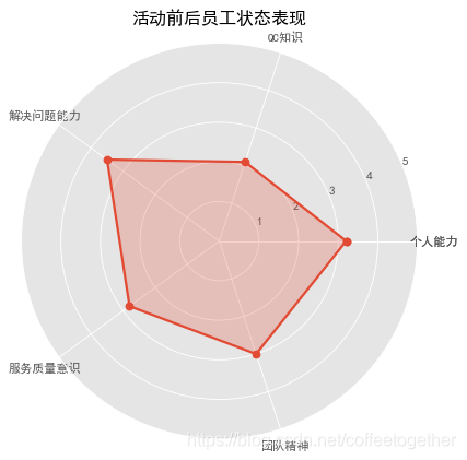
案例一 :活动前员工状态表现
# 导入第三方模块
import numpy as np
import matplotlib.pyplot as plt

# 设置中文为雅黑
plt.rcParams['font.sans-serif'] = ['SimHei']

# 构造数据
values = np.array([3.2,2.1,3.5,2.8,3])
feature = np.array(['个人能力','QC知识','解决问题能力','服务质量意识','团队精神'])
N = len(values)

# 设置雷达图的角度,用于平分切开一个圆面
angles=np.linspace(0,2*np.pi,N, endpoint=False)

# 将折线图形进行封闭操作
values = np.concatenate((values, [values[0]]))
angles = np.concatenate((angles, [angles[0]]))
feature=np.concatenate((feature,[feature[0]]))

# 创建图形
fig=plt.figure(figsize=(10,6),dpi=80)

# 这里一定要设置为极坐标格式
ax = fig.add_subplot(111, polar=True)

# 绘制折线图
ax.plot(angles, values, 'o-', linewidth=2)

# 填充颜色
ax.fill(angles, values, alpha=0.25)

# 添加每个特征的标签
ax.set_thetagrids(angles*180/np.pi, feature)

# 设置雷达图的范围
ax.set_ylim(0,5)

# 添加标题
plt.title('活动前后员工状态表现')

# 添加网格线
ax.grid(True)

# 显示图形
plt.show()
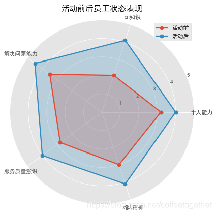
案例二:活动前后员工表现
# 导入第三方模块
import numpy as np
import matplotlib.pyplot as plt

# 设置中文 雅黑
plt.rcParams['font.sans-serif'] = ['SimHei']

# 构造数据
values = [3.2,2.1,3.5,2.8,3]
values2 = [4,4.1,4.5,4,4.1]
feature = ['个人能力','QC知识','解决问题能力','服务质量意识','团队精神']

N = len(values)

# 设置雷达图的角度,用于平分切开一个圆面
angles=np.linspace(0, 2*np.pi, N, endpoint=False)

# 将雷达图中的折线图封闭
values=np.concatenate((values,[values[0]]))
values2=np.concatenate((values2,[values2[0]]))
angles=np.concatenate((angles,[angles[0]]))
feature=np.concatenate((feature,[feature[0]]))

# 绘图
fig=plt.figure(figsize=(20,8),dpi=80)
ax = fig.add_subplot(111, polar=True)

# 绘制折线图
ax.plot(angles, values, 'o-', linewidth=2, label = '活动前')

# 填充颜色
ax.fill(angles, values, alpha=0.25)

# 绘制第二条折线图
ax.plot(angles, values2, 'o-', linewidth=2, label = '活动后')
ax.fill(angles, values2, alpha=0.25)

# 添加每个特征的标签
ax.set_thetagrids(angles*180/np.pi, feature)

# 设置雷达图的范围
ax.set_ylim(0,5)

# 添加标题
plt.title('活动前后员工状态表现')

# 添加网格线
ax.grid(True)

# 设置图例
plt.legend(loc = 'best')

# 显示图形
plt.show()


 1765
1765

 被折叠的 条评论
为什么被折叠?
被折叠的 条评论
为什么被折叠?
 到【灌水乐园】发言


