 Flex布局精要


 本文深入讲解了CSS中Flex布局的应用技巧,包括justify-content、align-items等属性的使用,以及flex-direction和flex-wrap对布局的影响。通过实例展示了如何利用flex-basis、order等属性优化子元素布局。
其实就是讲display:flex的用法,这玩意布局比较常用,可以省去不少功夫以及写float
flex布局中,须知所有布局交由属性去完成,不需要再写更多css;其次,float会直接失去作用。
布局中包括justify-content的横向布局,center进行居中,space-between想两侧分布,space-around平均分局,flex-start或者end就是左或者右对齐。
align-items对齐(需要设置高度才生效),除了方向,跟justify-content是一样的
align-content,align-items的加强版,items会让每一列都对齐,而align-content是让子元素作为一个整体来对齐.
flex-direction的网格摆放方式,常用的有row配合子元素的flex:1设置元素占比,flex-wrap:wrap进行元素换行进行移动、pc适配。
子元素中,flex-basis可以用来代替width或者height,这个得取决于flex-direction设置的是什么值,其优先级大于width。顺便一提,子元素还能设置align-self,与align-items等一样作用,但只作用于单个元素。
还有order:0,这个可以决定子元素的排序,比如我将item3设置为order:0,那么item3就会排到第一位。值越小越靠前
先上个栗子
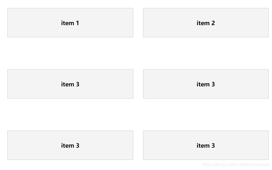
	<div id="container">
		<!-- .item{<h3>item $</h3>}*3 -->
		<div class="item">
			<h3>item 1</h3>
		</div>*6
    </div>


	#container{
		display: flex;
		flex-direction: row;
		flex-wrap: wrap;
		height: 600px;
		align-items: center;
	}
	.item{
		background-color: #f4f4f4;
		border: 1px solid #ccc;
		padding: 1rem;
		text-align: center;
		flex:1;
		margin: 1rem;
		flex-basis:250px;
	}
可以根据上述内容去更改css属性来熟悉下布局


 扫一扫
扫一扫


 4707
4707

 被折叠的 条评论
为什么被折叠?
被折叠的 条评论
为什么被折叠?
 到【灌水乐园】发言


