


老规矩,直接上代码
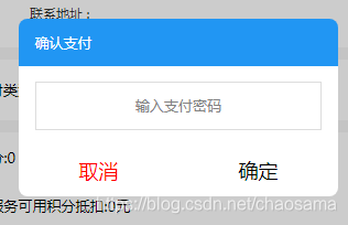
    <block wx:if="{{isShowConfirm}}">
      <view class='toast-box'>
        <view class='toastbg'></view>
        <view class='showToast'>
            <view class='toast-title'>
                <text>确认支付</text>
            </view>
            <view class='toast-main'>
                <view class='toast-input'>
                    <input type='password' placeholder='输入支付密码' bindinput='setValue' data-name='stuEidtName'></input>
                </view>
            </view>
            <view class='toast-button'>
                <view class='button1'>
                    <button catchtap='cancel'>取消</button>
                </view>
                <view class='button2'>
                    <button data-url="../allOrder/allOrder" catchtap='confirmAcceptance'>确定</button>
                </view>
            </view>
        </view>
    </view>
  </block>
.toast-box {
    width: 100%;
    height: 100%;
    opacity: 1;
    position: fixed;
    top: 0px;
    left: 0px;
}


.toastbg {
    opacity: 0.2;
    background-color: black;
    position: absolute;
    width: 100%;
    min-height: 100vh;
}

.showToast {
    position: absolute;
    opacity: 1;
    width: 70%;
    margin-left: 15%;
    margin-top: 40%;
}

.toast-title {
    padding-left: 5%;
    background-color: #2196f3;
    color: white;
    padding-top: 2vh;
    padding-bottom: 2vh;
    border-top-right-radius: 16rpx;
    border-top-left-radius: 16rpx;
}

.toast-main {
    padding-top: 2vh;
    padding-bottom: 2vh;
    background-color: white;
    text-align: center;
}

.toast-input {
    margin-left: 5%;
    margin-right: 5%;
    border: 1px solid #ddd;
    padding-left: 2vh;
    padding-right: 2vh;
    padding-top: 1vh;
    padding-bottom: 1vh;
}

.toast-button {
    display: flex;
}

.button1 {
    width: 50%;
}

.button2 {
    width: 50%;
}

.button1 button {
    width: 100%;
    background-color: white;
    color: red;
    border-radius: 0px;
    border-bottom-left-radius: 16rpx;
}

.button2 button{
    width: 100%;
    background-color: white;
    color: black;
    border-radius: 0px;
    border-bottom-right-radius: 16rpx;
}
顺便贴一下js好了,不关js事, 完全就是为了直接复制不会报错
  //data
  isShowConfirm:false

  setValue: function (e) {
    this.setData({
      walletPsd: e.detail.value
    })
  },
  cancel: function () {
    var that = this
    that.setData({
      isShowConfirm: false,
    })
  },
  confirmAcceptance:function(){
    var that = this
    that.setData({
      isShowConfirm: false,
    })
  },


 扫一扫
扫一扫


 1586
1586

 被折叠的 条评论
为什么被折叠?
被折叠的 条评论
为什么被折叠?
 到【灌水乐园】发言


