


 博客介绍了flex布局父项常见属性,着重讲解了justify - content属性,该属性用于设置主轴上子元素的排列方式。包括从头排、尾部排、居中对齐、平均分配剩余空间、先两边贴边再平分剩余空间等情况,还提及主轴为y轴时的相关设置。
1.flex布局父项常见属性
justify-content设置主轴上的子元素排列方式
justify-content 属性定义了项目在主轴上的对齐方式
注意:使用这个属性之前一定要确定好主轴是 哪个
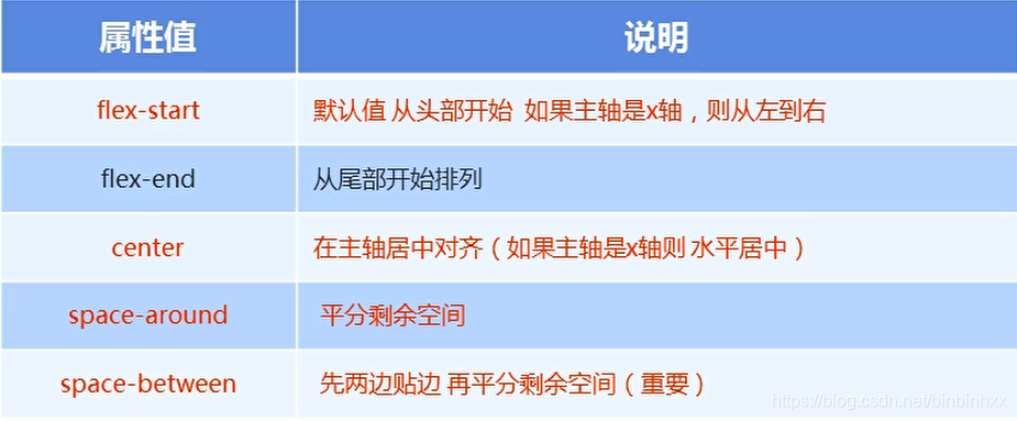
设置主轴上子元素的排列方式从头排
justify-content:flex-start;
<!DOCTYPE html>
<html lang="en">
<head>
    <meta charset="UTF-8">
    <meta name="viewport" content="width=device-width, initial-scale=1.0">
    <title>Document</title>
    <style>
        div{
            /* 它的所有子元素自动成为容器成员 */
            display:flex;
            width: 800px;
            height: 300px;
            background-color: pink;
            /* 默认的主轴式x轴 row */
            /* justify-content:是设置主轴上子元素的排列方式 */
            justify-content:flex-start;
        }
        div span {
            width: 150px;
            height:100px;
            background-color: purple;
        }
    </style>
</head>

<body>
    <div>
        <span>1</span>
        <span>2</span>
        <span>3</span>
        <span>4</span>
    </div>
</body>
</html>
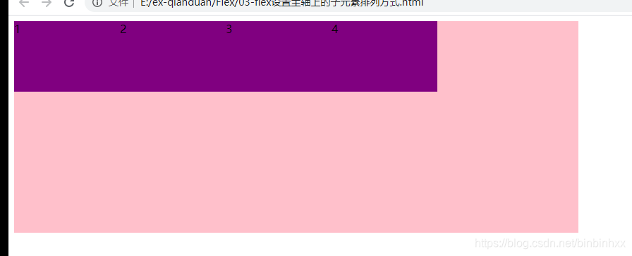
设置主轴上子元素的排列方式尾部排
justify-content:flex-end;
<!DOCTYPE html>
<html lang="en">
<head>
    <meta charset="UTF-8">
    <meta name="viewport" content="width=device-width, initial-scale=1.0">
    <title>Document</title>
    <style>
        div{
            /* 它的所有子元素自动成为容器成员 */
            display:flex;
            width: 800px;
            height: 300px;
            background-color: pink;
            /* 默认的主轴式x轴 row */
            /* justify-content:是设置主轴上子元素的排列方式 */
            /* justify-content:flex-start; */
            justify-content:flex-end;
        }
        div span {
            width: 150px;
            height:100px;
            background-color: purple;
        }
    </style>
</head>

<body>
    <div>
        <span>1</span>
        <span>2</span>
        <span>3</span>
        <span>4</span>
    </div>
</body>
</html>
设置主轴上子元素的排列方式居中对齐
justify-content:center;
<!DOCTYPE html>
<html lang="en">
<head>
    <meta charset="UTF-8">
    <meta name="viewport" content="width=device-width, initial-scale=1.0">
    <title>Document</title>
    <style>
        div{
            /* 它的所有子元素自动成为容器成员 */
            display:flex;
            width: 800px;
            height: 300px;
            background-color: pink;
            /* 默认的主轴式x轴 row */
            /* justify-content:是设置主轴上子元素的排列方式 */
            /* justify-content:flex-start; */
            justify-content:center;
        }
        div span {
            width: 150px;
            height:100px;
            background-color: purple;
        }
    </style>
</head>

<body>
    <div>
        <span>1</span>
        <span>2</span>
        <span>3</span>
        <span>4</span>
    </div>
</body>
</html>
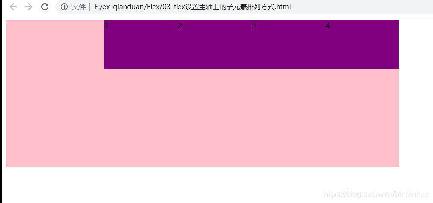
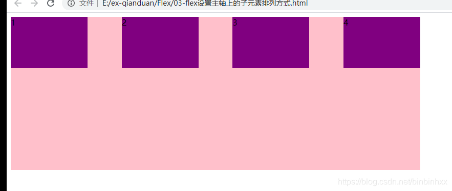
平均分配剩余空间
justify-content:space-around
<!DOCTYPE html>
<html lang="en">
<head>
    <meta charset="UTF-8">
    <meta name="viewport" content="width=device-width, initial-scale=1.0">
    <title>Document</title>
    <style>
        div{
            /* 它的所有子元素自动成为容器成员 */
            display:flex;
            width: 800px;
            height: 300px;
            background-color: pink;
            /* 默认的主轴式x轴 row */
            /* justify-content:是设置主轴上子元素的排列方式 */
            /* justify-content:flex-start; */
            /* justify-content:center; */
            /* 平分剩余空间 */
            justify-content:space-around;
        }
        div span {
            width: 150px;
            height:100px;
            background-color: purple;
        }
    </style>
</head>

<body>
    <div>
        <span>1</span>
        <span>2</span>
        <span>3</span>
        <span>4</span>
    </div>
</body>
</html>
先两边贴边再平分剩余空间
justify-content:space-between;
<!DOCTYPE html>
<html lang="en">
<head>
    <meta charset="UTF-8">
    <meta name="viewport" content="width=device-width, initial-scale=1.0">
    <title>Document</title>
    <style>
        div{
            /* 它的所有子元素自动成为容器成员 */
            display:flex;
            width: 800px;
            height: 300px;
            background-color: pink;
            /* 默认的主轴式x轴 row */
            /* justify-content:是设置主轴上子元素的排列方式 */
            /* justify-content:flex-start; */
            /* justify-content:center; */
            /* 平分剩余空间 */
            /* justify-content:space-around; */
            /* 先两边贴边,再分配剩余的空间  */
            justify-content:space-between;
        }
        div span {
            width: 150px;
            height:100px;
            background-color: purple;
        }
    </style>
</head>

<body>
    <div>
        <span>1</span>
        <span>2</span>
        <span>3</span>
        <span>4</span>
    </div>
</body>
</html>
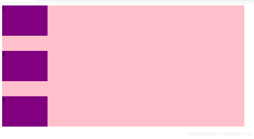
主轴为y轴:
先两边贴边再平分剩余空间(重要)
justify-content:space-between;
<!DOCTYPE html>
<html lang="en">
<head>
    <meta charset="UTF-8">
    <meta name="viewport" content="width=device-width, initial-scale=1.0">
    <title>Document</title>
    <style>
        div{
            /* 它的所有子元素自动成为容器成员 */
            display:flex;
            width: 800px;
            height: 400px;
            background-color: pink;
            /* 默认的主轴式x轴 row */
            /* justify-content:是设置主轴上子元素的排列方式 */
            /* justify-content:flex-start; */
            /* justify-content:center; */
            /* 平分剩余空间 */
            /* justify-content:space-around; */
            /* 先两边贴边,再分配剩余的空间  */
            flex-direction: column;
            justify-content:space-between;
        }
        div span {
            width: 150px;
            height:100px;
            background-color: purple;
        }
    </style>
</head>

<body>
    <div>
        <span>1</span>
        <span>2</span>
        <span>3</span>
        <!-- <span>4</span> -->
    </div>
</body>
</html>
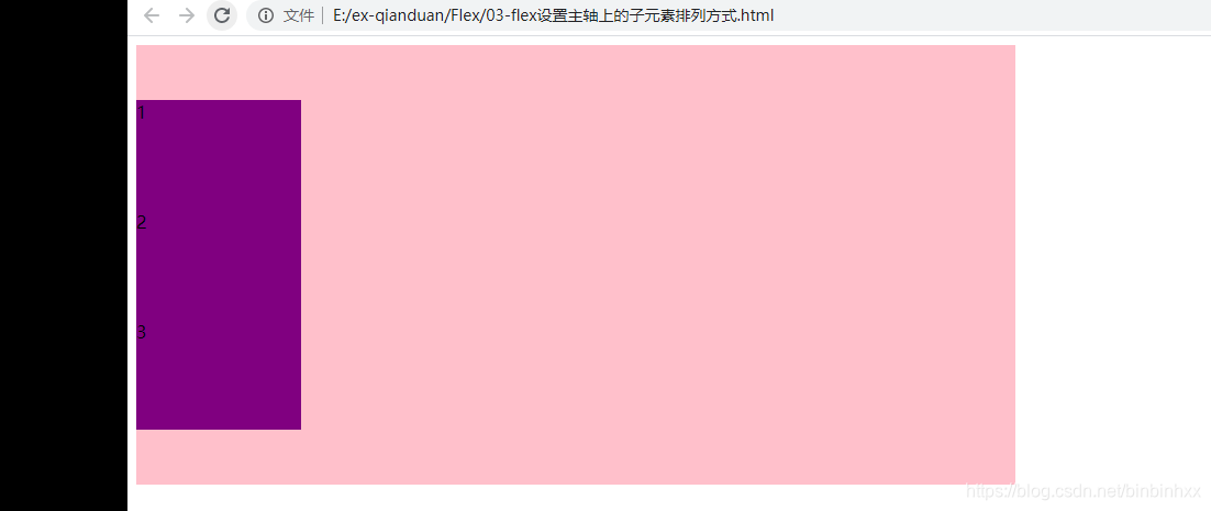
主轴为y轴:
居中对齐:
flex-direction: column;
justify-content:center;
<!DOCTYPE html>
<html lang="en">
<head>
    <meta charset="UTF-8">
    <meta name="viewport" content="width=device-width, initial-scale=1.0">
    <title>Document</title>
    <style>
        div{
            /* 它的所有子元素自动成为容器成员 */
            display:flex;
            width: 800px;
            height: 400px;
            background-color: pink;
            /* 默认的主轴式x轴 row */
            /* justify-content:是设置主轴上子元素的排列方式 */
            /* justify-content:flex-start; */
            /* justify-content:center; */
            /* 平分剩余空间 */
            /* justify-content:space-around; */
            /* 先两边贴边,再分配剩余的空间  */
            flex-direction: column;
            justify-content:center;
        }
        div span {
            width: 150px;
            height:100px;
            background-color: purple;
        }
    </style>
</head>

<body>
    <div>
        <span>1</span>
        <span>2</span>
        <span>3</span>
        <!-- <span>4</span> -->
    </div>
</body>
</html>


 扫一扫
扫一扫


 181
181

 被折叠的 条评论
为什么被折叠?
被折叠的 条评论
为什么被折叠?
 到【灌水乐园】发言


