


 这篇博客深入解析了CSS中的.mapBox和.map类选择器的用法,通过示例展示了如何创建一个具有左右两侧展开效果的布局。文章详细解释了.box-sizing、.leftMask和.rightMask等样式属性的作用,并利用关键帧动画(@keyframes)实现了平滑的展开动画效果。对于前端开发者来说,这是一个了解和实践CSS布局及动画技巧的好资源。
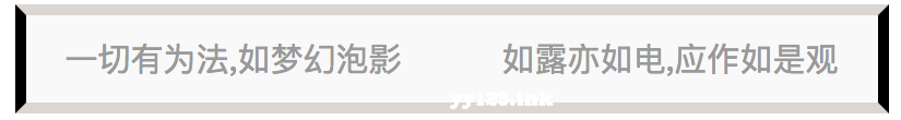
基本上都能看懂 .mapBox{ box-sizing: border-box; width: 800px; margin: auto; background-color: #e2deda; font-size: 30px; color: #aaa; } .map{ box-sizing: inherit; height: 100px; width: inherit; position: relative; margin: auto; } .left{ box-sizing: border-box; position: absolute; top:0; left:0; width: 50%; height: 100px; line-height: 100px; background-color: #FAFAFA; text-align: center; } .leftMask{ box-sizing: border-box; position: absolute; z-index: 3; top:0; left:0; width: 400px; height: 100px; background-color: #e2deda; animation: leftSpread 5s ease forwards; } .right{ box-sizing: border-box; position: absolute; top:0; right:0; width:400px; height: 100px; line-height: 100px; text-align: center; background-color: #FAFAFA; } .rightMask{ box-sizing: border-box; position: absolute; z-index: 3; top:0; left:50%; right: 0; height: 100px; background-color: #e2deda; animation: rightSpread 5s ease forwards; } .mask{ box-sizing: border-box; z-index: 5; height: 100px; animation: spread 5s ease forwards; background-size: 13%; border-top:10px solid #e2deda; border-left:10px solid black; border-right:10px solid black; border-bottom:10px solid #e2deda; position: absolute; left: 50%; right: 50%; top:0; bottom: 0; } @keyframes spread { from { } to { left: 0; right: 0; } } @keyframes leftSpread { from { width: 50%; } to { width: 0; } } @keyframes rightSpread { from { } to { left: 100%; } }
dd:


 扫一扫
扫一扫


 439
439


 到【灌水乐园】发言


