


Responsive Layouts in Qt
Qt中的响应式布局
May 12, 2023 by jan-arve | Comments
2023年5月12日作者:jan arve |评论
The Problem
存在的问题
Qt has (almost) been here since the dawn of graphical user interfaces, being released just 5 years after Windows 3.0. Needless to say, technologies, expectations and duties for an UI toolkit evolved substantially over the years. Organizing and layouting of visual elements like buttons is one of those duties that changed significantly: From small screens with few pixels and fixed size embedded apps we came a long way to high resolution screens and handheld devices of all form factors. The changes in design philosophy are even more dramatic. Applications need to look and feel good on many devices as well as in different configurations, landscape and portrait, windowed and full screen. More than that, they need to be able to switch seamlessly between those modes.
自从图形用户界面出现以来,Qt(几乎)就一直在这里,它是在Windows 3.0发布5年后发布的。不用说,多年来,UI工具包的技术、期望和职责都有了很大的发展。按钮等视觉元素的组织和布局是发生了重大变化的职责之一:从像素较少的小屏幕和固定尺寸的嵌入式应用程序,我们在高分辨率屏幕和各种形状的手持设备方面取得了长足的进步。设计理念的变化甚至更加引人注目。应用程序需要在许多设备上以及不同的配置(横向和纵向、窗口和全屏)中看起来和感觉都很好。除此之外,他们还需要能够在这些模式之间无缝切换。
The longevity of Qt is remarkable and would not have been possible without constantly reviewing and updating existing APIs. This is an exercise we conducted recently with the layouting system. The layouting system of Qt stayed basically the same over a long time, only slightly extended by QtQuick, its anchoring concept and some adaptions for high-dpi devices. We wanted to know if this system still conforms to the demands of modern UIs and workflows. This is also a good opportunity to look at other technologies and frameworks, in particular HTML and CSS, Material/Flutter and Microsoft's Fluent to see what they do different or even better. We are curious about any concepts that cannot be implemented in QML and eager to fill these gaps. In order to identify any gaps in our API and to find the best practice with Qt layouts, we implemented many examples from those frameworks in QML. In the following we present some of the outcomes to give you an update on how we think of layouts and where the future could lead to. We hope to inspire some of you and collect feedback on the current system, our thoughts and ideas for the future. If you are passionate about Qts layout system, this is the opportunity to raise your voice and let us hear your opinion!
Qt的寿命是惊人的,如果不不断审查和更新现有的API,这是不可能的。这是我们最近对布局系统进行的一次练习。Qt的布局系统在很长一段时间内基本保持不变,只是被QtQuick、其锚定概念和一些针对高dpi设备的适配稍微扩展了一点。我们想知道这个系统是否仍然符合现代UI和工作流程的要求。这也是一个很好的机会,可以看看其他技术和框架,特别是HTML和CSS、Material/Flutter和微软的Fluent,看看它们有什么不同之处,甚至更好。我们对QML中无法实现的任何概念感到好奇,并渴望填补这些空白。为了找出API中的任何差距,并找到Qt布局的最佳实践,我们在QML中实现了这些框架中的许多示例。在下文中,我们将介绍一些结果,让您了解我们如何看待布局以及未来的发展方向。我们希望激励您中的一些人,并收集有关当前系统、我们对未来的想法和想法的反馈。如果您对Qts布局系统充满热情,这是一个提高您的声音并让我们听到您意见的机会!
HTML and CSS Inspired Responsive Layouting
受HTML和CSS启发的响应式布局
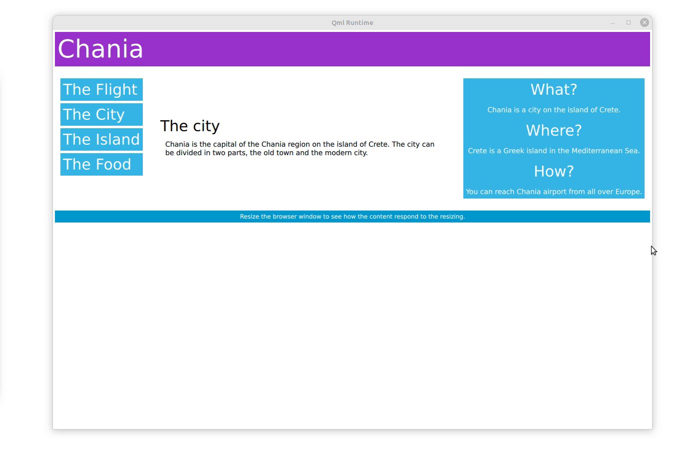
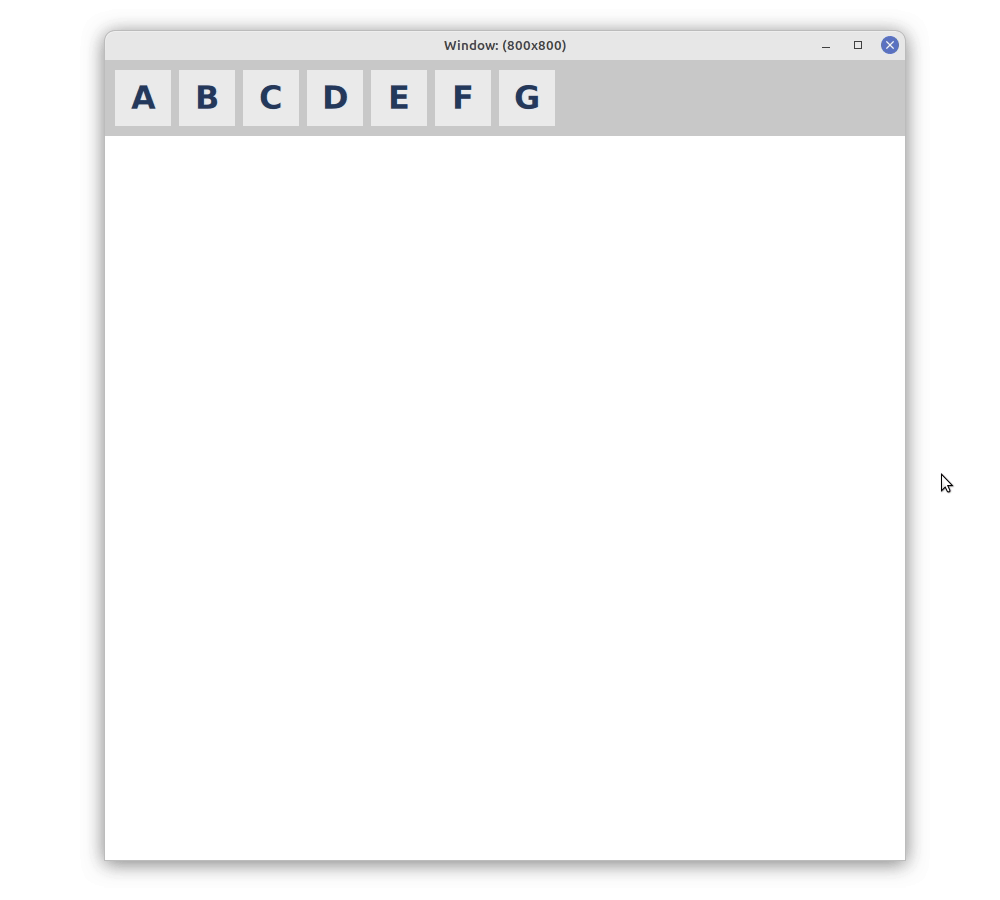
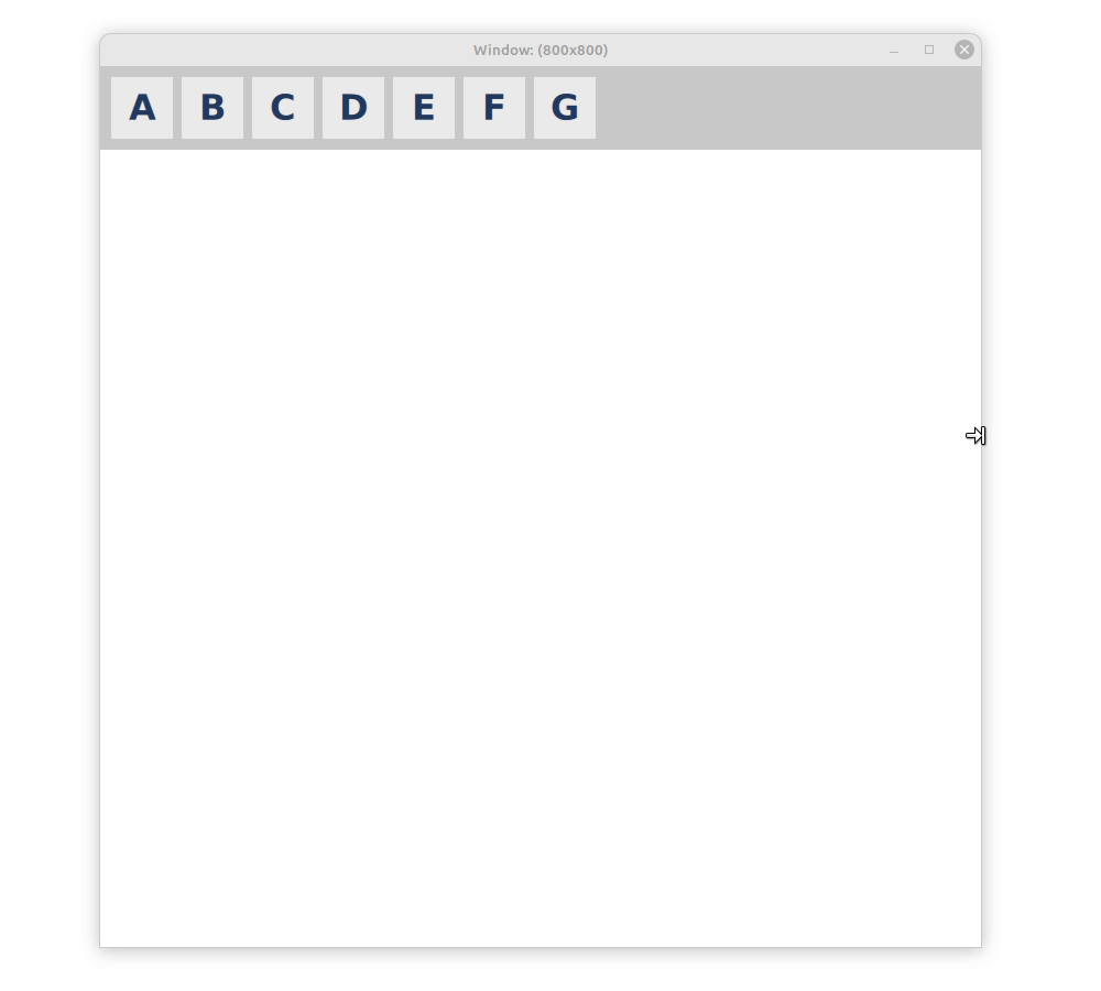
Responsive layouts plays a big role in web design and this technology can provide a good source of inspiration. An interesting concept is the clear separation of content (HTML) and appearance (CSS stylesheets). This gives great flexibility, since one can easily change the layout (in CSS) in order to adapt to different screen sizes, while not having to alter the HTML content hierarchy. How this plays out in practice can be seen in the responsive web design tutorial of w3school. The example is straight forward: HTML tags are used to create a hierarchy of different elements. The visual representation of these elements, including their size and positioning, is described in the CSS stylesheet, depending on the device and in particular its width. The w3school example uses a 12-column layout with three vertical areas: The left area covers three columns, the middle area covers 6 columns, and the right area covers the remaining three columns. When the screen is below 768 pixels, it will make all three areas 100% wide, such that they appear beneath each other. The first layout makes great use of large devices in landscape format, the latter works well on small devices or in portrait mode.
响应式布局在网页设计中发挥着重要作用,这项技术可以提供很好的灵感来源。一个有趣的概念是内容(HTML)和外观(CSS样式表)的清晰分离。这提供了很大的灵活性,因为可以很容易地更改布局(在CSS中)以适应不同的屏幕大小,而不必更改HTML内容层次结构。这在实践中的表现可以在w3school的响应式网页设计教程中看到。示例很简单:HTML标记用于创建不同元素的层次结构。CSS样式表中描述了这些元素的视觉表示,包括它们的大小和位置,具体取决于设备,尤其是设备的宽度。w3school示例使用具有三个垂直区域的12列布局:左侧区域覆盖三列,中间区域覆盖6列,右侧区域覆盖其余三列。当屏幕低于768像素时,这将使所有三个区域都达到100%宽,从而使它们看起来在彼此下方。第一种布局充分利用了横向格式的大型设备,后者在小型设备或纵向模式下也能很好地工作。
How do the Qt layouts compare to this? The first thing we must consider is the separation of content and layout. There is no dedicated language for styling like CSS in Qt, but we have our one-for-all scripting language QML, that we can use for the content as well as for the layout. We can also, to some extent, declare them in separate places: First, we define our contents and the hierarchy with declarative QML. On top of our hierarchy there is a GridLayout with three columns. The header and the bottom items span the complete width of the window and therefore occupy three columns. Between the header and bottom there are three columns of items. This matches the description of the content from the responsive w3school example.
Qt布局与此相比如何?我们必须考虑的第一件事是内容和布局的分离。Qt中没有像CSS这样的专用语言来进行样式设计,但我们有一种通用的脚本语言QML,我们可以用于内容和布局。在某种程度上,我们也可以在不同的地方声明它们:首先,我们用声明性QML定义我们的内容和层次结构。在我们的层次结构的顶部有一个GridLayout,它有三列。标题和底部项目跨越了窗口的整个宽度,因此占据了三列。在标题和底部之间有三列项目。这与响应w3school示例中的内容描述相匹配。
All that is missing is the description of the layout by the CSS part of the w3school example. An elegant way to do this in QML are states, modifying the layout, depending on the device or window width. We need two states, representing the narrow, vertical oriented layout and the wide, horizontal oriented layout. For the narrow layout, we let all columns occupy the whole width and therefore set their column span to three, corresponding to 100% as in the CSS example. The grid layout in Qt behaves the same way as CSS and automatically puts items in the next row if there is not enough space in the current row (flow layout), making the blocks of items appear beneath each other. In the wide layout, we can fit all columns next to each other, which can be achieved by setting their column span to one. The example on w3school continues to add a third intermittent state, but also this can be done easily with QML, simply adding another state.
缺少的只是w3school示例中CSS部分对布局的描述。在QML中实现这一点的一种优雅方法是状态,根据设备或窗口宽度修改布局。我们需要两种状态,分别代表窄的、垂直的布局和宽的、水平的布局。对于窄布局,我们让所有列占据整个宽度,因此将它们的列跨度设置为三,对应于CSS示例中的100%。Qt中的网格布局与CSS的行为方式相同,如果当前行中没有足够的空间(流布局),则会自动将项目放在下一行中,使项目块显示在彼此下方。在宽布局中,我们可以将所有列并排放置,这可以通过将它们的列跨度设置为1来实现。w3school上的示例继续添加第三个间歇状态,但这也可以通过QML轻松完成,只需添加另一个状态即可。
GridLayout {
    anchors.left: parent.left
    anchors.right: parent.right
    columns: 3
    states: [
        State {
            when: window.width <= 600
            PropertyChanges { target: leftBox; Layout.columnSpan: 3 }
            PropertyChanges { target: contentBox; Layout.columnSpan: 3 }
            PropertyChanges { target: rightBox; Layout.columnSpan: 3 }
        },
        State {
            when: window.width > 600 && window.width <= 768
            PropertyChanges { target: leftBox; Layout.columnSpan: 1 }
            PropertyChanges { target: contentBox; Layout.columnSpan: 1 }
            PropertyChanges { target: rightBox; Layout.columnSpan: 2 }
        },
        State {
            when: window.width > 768
            PropertyChanges { target: leftBox; Layout.columnSpan: 1 }
            PropertyChanges { target: contentBox; Layout.columnSpan: 1 }
            PropertyChanges { target: rightBox; Layout.columnSpan: 1 }
        }
    ]
    ...

    ColumnLayout {
        id: leftBox
        ...
    }
    ColumnLayout {
        id: contentBox
        ...
    }
    ColumnLayout {
        id: rightBox
        ...
    }
    ...
}
The full code can be accessed here and runs with Qt6.5.
完整的代码可以在这里访问,并使用Qt6.5运行。
Both CSS and QML layouts are flexible and some experimenting showed that we can create complex responsive layouts with both. The CSS stylesheet is replaced by a state machine in QML, which provides some form of separation. Naturally, being well accommodated to Qt and very foreign to the web world, I prefer the latter for its flexibility and additional functionality: Instead of relying on a uniform width as in CSS, the Qt layout can make some smarter decisions, based on its content.
CSS和QML布局都是灵活的,一些实验表明,我们可以用两者创建复杂的响应布局。QML中的状态机取代了CSS样式表,它提供了某种形式的分离。当然,我更喜欢后者,因为它的灵活性和额外的功能:Qt布局可以根据其内容做出一些更明智的决定,而不是像CSS那样依赖于统一的宽度。
Improving the QML Layout: Align:Justify?
改进QML布局:对齐?
Is there a possibility to make the Qt experience better? We think so, yes. Looking at the example, we simply changed the layout from a three column wide layout to a single column layout. Changing the column span of several items to implement this seems complicated and unintuitive, when apparently just the number of columns changed from three to one. So here is an even simpler solution, omitting any states, simply changing the number of columns:
有没有可能让Qt体验更好?我们认为是的。在这个例子中,我们简单地将布局从三列宽的布局更改为单列布局。改变几个项目的列跨度来实现这一点似乎既复杂又不直观,因为显然只是列的数量从三个变为一个。因此,这里有一个更简单的解决方案,省略任何状态,只需更改列数:
GridLayout {
    anchors.left: parent.left
    anchors.right: parent.right
    columns: (window.width > 768)? 3 : 1;
    ...
}
This solution works well when there are only two states and if these states represent the edge-cases of fully horizontal or vertical layouts. In the example with three states, it is difficult to find combinations of column spans and number of columns where the layout makes sense and leaves no blank spots.
当只有两个状态并且这些状态表示完全水平或垂直布局的边缘情况时,此解决方案可以很好地工作。在具有三种状态的示例中,很难找到列跨度和列数的组合,其中布局是有意义的并且不留空白点。
In an effort to make the responsive layouts possible with even the simplest code, we tried to extend the QML Layout class to avoid such blank spaces. The idea was to extend the layout with an additional property, that we call flowAlignment for now. This property allows the layout to reposition and stretch items when there is free space available. Like setting a text, we want to position items to the left, right or center and maybe want to stretch them to fill up the whole row. The flowAlignment property can take all these states and the layout will move the items accordingly. The align justify mode is the solution to the issue mentioned above, and probably the most useful case; but in an attempt to use a familiar and complete API, we also implemented the rest. With this change we can implement a reasonable responsive layout in few lines of code:
为了用最简单的代码实现响应布局,我们尝试扩展QML布局类以避免此类空白。我们的想法是用一个额外的属性来扩展布局,我们现在称之为flowAlignment。此属性允许布局在有可用空间时重新定位和拉伸项目。就像设置文本一样,我们希望将项目定位在左侧、右侧或中间,并可能希望拉伸它们以填充整行。flowAlignment属性可以采用所有这些状态,布局将相应地移动项目。align justify模式是上述问题的解决方案,可能也是最有用的情况;但为了使用熟悉且完整的API,我们还实现了其余部分。通过此更改,我们可以在几行代码中实现合理的响应布局:
GridLayout {
    flowAlignment: GridLayout.AlignJustify // new property
    anchors.left: parent.left
    anchors.right: parent.right
    columns: (window.width > 768)? 3 : (window.width > 600)? 2 : 1;
    ...
}
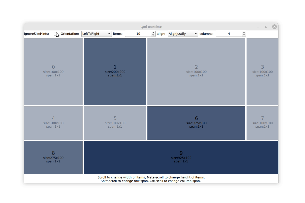
It looks just like the example above with three states. The full example code can be accessed here but requires a patch for Qt6.5 to run. We also provide an example to play around with various item sizes and alignment flags that looks like this:
它看起来就像上面的例子,有三个状态。完整的示例代码可以在这里访问,但需要Qt6.5的补丁才能运行。我们还提供了一个示例,用于处理各种物品尺寸和对齐标志,如下所示:
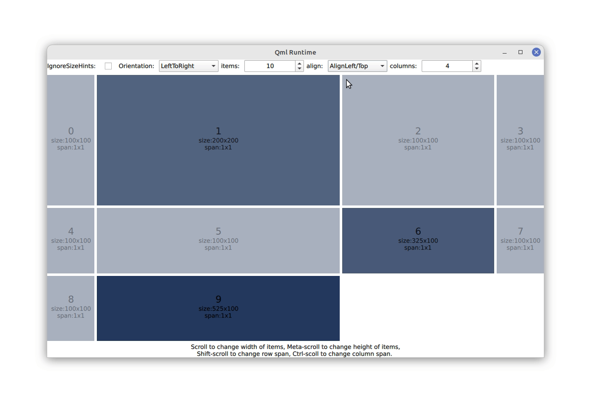
We think this addition increases the flexibility of responsive layouts substantially. It allows to change the number of columns and rows quickly without worrying or even thinking about filling up all lines. A nice side effect is, that we can make smart decisions at runtime when expanding items to fulfill the align-justify rule and increase the size of the item with the largest preferred size. Unfortunately, this addition has to live deep in the existing layout class and will require a patch and recompiling of Qt.
我们认为这一添加大大增加了响应式布局的灵活性。它允许快速更改列和行的数量,而不用担心甚至不用考虑填满所有行。一个很好的副作用是,我们可以在扩展项目时在运行时做出明智的决定,以满足对齐对齐规则,并增加具有最大首选大小的项目的大小。不幸的是,这个添加必须深入到现有的布局类中,并且需要对Qt进行补丁和重新编译。
Material and Flutter
Material和Flutter
Material is the dominant design language on Android devices and Google apps, and it comes with a strong opinion on how layouts should be. Qt supports Android and it should therefore support the design language for this platform. Aside from that, Material provides a lot of great ideas and inspiration. So maybe we can even learn a thing or two for the benefit of all other platforms.
Material是Android设备和谷歌应用程序上的主要设计语言,它对布局应该如何有着强烈的意见。Qt支持Android,因此它应该支持该平台的设计语言。除此之外,Material提供了很多很棒的想法和灵感。因此,为了所有其他平台的利益,我们甚至可以学习一两件事。
The (now outdated but still interesting) Material1 Design provides an interesting concept for layouts: Everything is arranged in a rigid grid of twelve equally sized columns, a concept that is also popular in web design. To our surprise, this super simple concept cannot be created easily in Qt, because our layouts try to be smart and therefore do not like uniform widths, at least not without setting it individually on every item. However, making something less smart is usually not that difficult, and we could easily dumb down our layouts with a new flag, that we called uniformCellSize for now. With this flag it is very easy to make a layout of twelve equally sized columns and recreate the responsive layouts as suggested by Material1 (of course with state machines to alter the appearance). Might this be a good addition to our layouts? After all, the concept of uniform column widths was dropped in the newer versions of Material, which might indicate that is was not the best idea to start with. We have two patches, here and here for this new property, so take it for a ride and tell us what you think!
Material1 Design(现在已经过时,但仍然很有趣)为布局提供了一个有趣的概念:所有东西都排列在由十二个同等大小的柱子组成的刚性网格中,这一概念在网页设计中也很流行。令我们惊讶的是,这个超级简单的概念在Qt中无法轻松创建,因为我们的布局试图变得智能,因此不喜欢统一的宽度,至少在每个项目上都要单独设置。然而,让一些不那么智能的东西变得不那么困难,我们可以很容易地用一个新的标志来降低我们的布局,我们现在称之为uniformCellSize。有了这个标志,可以很容易地制作十二个大小相等的列的布局,并按照Material1的建议重新创建响应布局(当然,使用状态机来改变外观)。这可能是对我们布局的一个很好的补充吗?毕竟,统一列宽的概念在新版本的Material中被删除了,这可能表明这不是最好的开始。我们有两个补丁,在这里和这里为这个新的物业,所以测试下它,告诉我们你的想法!
The example from above lets you also play around with this property:
上面的示例还允许使用此属性:
Material3 and Adaptive Scaffold
Material3和适应性脚手架
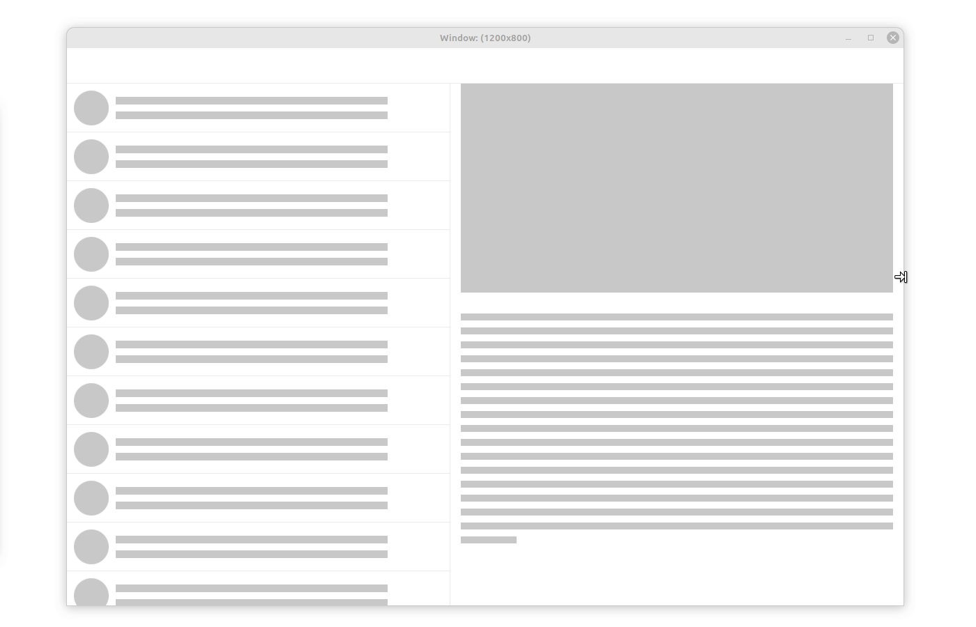
The renewed Material3 adaptive layout drops the rigid grid and suggests a different approach, based on various navigation bars and bodies. Android's in-house toolkit Flutter provides an implementation of this layouting concept called adaptive scaffold. As an exercise we tried to recreate the respective example with the layouts available in Qt.
更新后的Material3自适应布局去掉了刚性网格,并基于各种导航栏和实体提出了不同的方法。Android的内部工具包Flutter提供了一种称为自适应脚手架的布局概念的实现。作为练习,我们试图用Qt中可用的布局重新创建相应的示例。
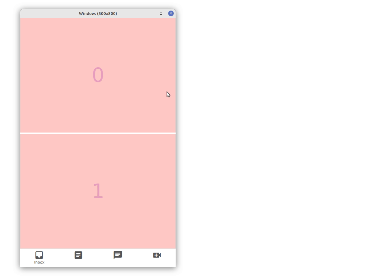
Using states as before, we can recreate this example, changing columns and rows, turning items visible and invisible, changing parents and layouts, creating multiple instances of the same button at different positions. But is it pretty? Absolutely not, so we tried to come up with a better solution. The idea is to have multiple layouts where one of them is activated depending on the screen size. To not define the same button multiple times, we added minimalistic items that can be used as placeholder. We call it LayoutItemProxy for now. Items themselves can be defined in an arbitrary place of the QML file and used by many proxies in many different layouts. If a layout and a LayoutProxyItem therein are visible, the proxy will take over the items position and size and control its visibility. It will also act as the items parent to make sure that events are delivered appropriately and that the drawing order of the layout makes sense. The other way around, the LayoutProxyItem will forward the preferred size and all other relevant layout properties of the item to the layout (we are still working on figuring out which properties are relevant). Further, we can set additional Layout parameters on the Proxy. This way we can define multiple layouts for different devices, full of LayoutProxyItems. Depending on the device or the current window size, we can show and hide layouts and the corresponding LayoutItemProxies will pull the items in the correct place. A prototype for the LayoutItemProxy and some demonstration examples can be found in [this patch].
与以前一样使用状态,我们可以重新创建此示例,更改列和行,将项目变为可见和不可见,更改父项和布局,在不同位置创建同一按钮的多个实例。但它漂亮吗?绝对不是,所以我们试图想出一个更好的解决方案。这个想法是有多个布局,其中一个布局根据屏幕大小被激活。为了不多次定义同一个按钮,我们添加了可以用作占位符的极简主义项目。我们现在称之为LayoutItemProxy。项目本身可以在QML文件的任意位置定义,并由许多不同布局中的许多代理使用。如果布局和其中的LayoutProxyItem可见,则代理将接管项目的位置和大小,并控制其可见性。它还将充当项目的父项,以确保事件得到适当传递,并且布局的绘图顺序是合理的。反过来,LayoutProxyItem会将项目的首选大小和所有其他相关布局属性转发到布局(我们仍在努力找出哪些属性是相关的)。此外,我们可以在代理上设置其他布局参数。通过这种方式,我们可以为不同的设备定义多个布局,其中充满LayoutProxyItems。根据设备或当前窗口大小,我们可以显示和隐藏布局,相应的LayoutItemProxies会将项目拉到正确的位置。LayoutItemProxy的原型和一些演示示例可以在[this patch]中找到。
The example of the adaptive scaffold boils down to defining all items that we will need at some point with an arbitrary parent and at an arbitrary point in the QML hierarchy. We continue with definitions of the layouts for compact, medium and large devices, full of LayoutItemProxy targeting the actual items. Adding a small helper component to control the visibility of layouts following the device or window size finishes the example.
自适应脚手架的例子可以归结为定义我们在QML层次结构中的任意父级和任意点上需要的所有项。我们继续定义紧凑型、中型和大型设备的布局,充满了针对实际项目的LayoutItemProxy。添加一个小的辅助组件来控制布局的可见性,使其符合设备或窗口的大小。
Once the LayoutProxyItem was in place, this example was fairly simple to write in QML. It is also a very flexible concept which we tried to demonstrate in the example with various nested structures, a mix of real and proxy items and even a Flickable. Some care has to be given when looking for parent items (avoid using parent in an item that is targeted by a proxy) but generally speaking everything should behave as normal since we simply reposition the item with the proxy.
一旦LayoutProxyItem就位,这个例子在QML中编写起来就相当简单了。它也是一个非常灵活的概念,我们试图在示例中用各种嵌套结构、真实项和代理项的混合,甚至Flickable来演示它。在寻找父项时必须注意(避免在代理所针对的项中使用父项),但一般来说,一切都应该正常,因为我们只是用代理重新定位该项。
LayoutChooser {
    id: layoutChooser
    width: parent.width
    height: parent.height

    layoutChoices: [
        smallLayout,
        mediumLayout,
        largeLayout
    ]

    criteria: [
        width < 700,
        width > 1000,
        true
    ]

    MyButton {
        id: articlesButton
        objectName: "articlesButton"
        iconId: 0xef42 // see https://fonts.google.com/icons
    }

    // more buttons

    Repeater { // many more items
        id: rep
        model: 12
        Rectangle {
            color: '#ffc9c5'
            implicitHeight: width
            implicitWidth: 256
            Layout.fillWidth: true
            Layout.fillHeight: true
        }
    }

    property Item smallLayout: ColumnLayout {
        height: parent.height
        width: parent.width
        Repeater {
            model: 2
            LayoutItemProxy { target: rep.itemAt(index) }
        }
        RowLayout {
            Layout.fillHeight: false
            Layout.fillWidth: true
            LayoutItemProxy { target: inboxButton }
            LayoutItemProxy { target: articlesButton }
            LayoutItemProxy { target: chatButton }
            LayoutItemProxy { target: videoButton }
        }
    }

    property Item mediumLayout: ColumnLayout {
    ... // define medium layout with LayoutItemProxies
    }

    property Item largeLayout: ColumnLayout {
    ... // define large layout with LayoutItemProxies
    }

    ...
}
Using this concept we should also be able to provide an adaptive scaffold class with Qt, facilitating application developers with their responsive layouts. However, both the LayoutProxyItem and a hypothetical adaptive scaffold can live happily in the application code base, so there might be no need to provide this with Qt. This feature is also widely independent of the rest of the layout API, making it easy to maintain. Another positive aspect is, that animations as shown in the flutter example can be added at a single point, namely the LayoutProxyItem for all items. Again, we invite you to play around with the example and the code to see whether you like or what you are missing.
使用这个概念,我们还应该能够提供一个具有Qt的自适应脚手架类,为应用程序开发人员提供响应式布局。然而,LayoutProxyItem和假设的自适应脚手架都可以在应用程序代码库中愉快地生活,因此可能不需要用Qt提供这一点。此功能也与布局API的其余部分完全无关,因此易于维护。另一个积极的方面是,如flutter示例中所示的动画可以添加到一个点,即所有项目的LayoutProxyItem。再次,我们邀请您仔细研究示例和代码,看看您是否喜欢或缺少什么。
By the way: We needed to replicate the Material icons for this example. This was fairly easy using a FontLoader and the Material3 icon font. See the example for details.
顺便说一句:对于这个例子,我们需要复制材质图标。使用FontLoader和Material3图标字体,这相当容易。有关详细信息,请参见示例。
Microsoft and Fluent
Last, we take a look at how Microsoft suggests to do responsive layouts in their design concept Fluent. Microsoft breaks responsive layouts down to six concepts: Reposition, Resize, Reflow, Show/hide, Replace and Re-architect and shows an example for each. We implemented these examples with the techniques showed before, relying widely on the LayoutProxyItem. Here are the more interesting examples for:
最后,我们来看看微软建议如何在其设计概念Fluent中进行响应式布局。微软将响应式布局分解为六个概念:重新定位、调整大小、回流、显示/隐藏、替换和重新设计,并为每个概念展示了一个示例。我们使用前面展示的技术实现了这些示例,广泛依赖LayoutProxyItem。以下是更有趣的示例:
It was pretty easy to implement these examples with QML. Specific behavior like the Show/hide example has to be implemented manually by the application developer but we do not see the requirement of including these specifics into the Qt codebase right now.
用QML实现这些示例非常容易。像Show/hide示例这样的特定行为必须由应用程序开发人员手动实现,但我们现在看不到将这些细节包含在Qt代码库中的要求。
Wrap up
总结
So these are our current ideas for responsive layouts. Generally, we think that Qt is well suited for most problems and we could implement many examples with simple state machines. Changing the hierarchy of the layout as shown in the Adaptive Scaffold example and Re-architecture concept of Fluent is currently not well represented in the QtQuick API and required the addition of a LayoutProxyItem. We are curious to hear from you what you think of this solution and whether you want to see more of it. Do you want it to be part of Qt or would you be happy to copy some example code into your application? We also added two more APIs to simplify the solution to other issues, namely the flowAlignment and uniformCellSize properties. We are equally curious to hear from you what you think about those.
因此,这些是我们目前对响应式布局的想法。一般来说,我们认为Qt非常适合大多数问题,并且我们可以用简单的状态机实现许多示例。如Fluent的Adaptive Scaffold示例和Re-architecture概念所示,更改布局层次结构目前在QtQuick API中没有得到很好的表示,需要添加LayoutProxyItem。我们很想听听您对这个解决方案的看法,以及您是否希望看到更多的解决方案。您希望它成为Qt的一部分,还是愿意将一些示例代码复制到您的应用程序中?我们还添加了另外两个API来简化其他问题的解决方案,即flowAlignment和uniformCellSize属性。我们同样很想听听你对这些的看法。
Another interesting aspect that we discovered during this exercise is that most frameworks provide higher level APIs for responsive layouts (Flutter has adaptive scaffold, Fluent NavigationView), closer to the API of QMainWindow and its toolbars than to QtQuick. Would you like to see such an API coming to QtQuick as well or are you happy to set this up yourself? Would you rely on a third party providing this high level API or do you think it should be integrated in Qt itself?
我们在本练习中发现的另一个有趣的方面是,大多数框架都为响应性布局提供了更高级别的API(Flutter具有自适应脚手架Fluent NavigationView),与QMainWindow及其工具栏的API相比,它更接近QtQuick。你想看到这样的API也出现在QtQuick中吗?还是你很乐意自己设置?您会依赖第三方提供这种高级API吗?还是您认为应该将其集成到Qt本身?
Do you know of any other concept for layouts that you would like to see reflected in the QtQuick API? Do you have any more complex cases that we do not cover with the examples shown here? Leave us a comment or a link below and we promise to have a look at it.
你知道你想在QtQuick API中看到的其他布局概念吗?你有没有更复杂的案例,我们没有在这里展示的例子中涵盖?在下面给我们留言或链接,我们保证会看一看。


 扫一扫
扫一扫


 577
577

 被折叠的 条评论
为什么被折叠?
被折叠的 条评论
为什么被折叠?
 到【灌水乐园】发言


