


Flutter的布局主要分为 单子组件 和 多子组件 两大类:
Container、Padding、Align这些属于单子组件,而Row、Column、ListView这些则是多子组件。
单子组件
Align组件
Align 是一个用于控制子组件位置的单子布局组件。它通过指定对齐方式(如居中、右上角、底部等)将子组件放置在可用空间内的特定位置,常用于精确控制子组件的布局。在 Android/iOS 中 align 只是一个属性,在 Flutter 中是一个组件。

    /**
     * Align 默认会填满父容器的可用空间,可以通过 widthFactor 和 heightFactor 按比例缩设置。
     */
    Align(
      child: Icon(Icons.people, size: 36, color: Colors.blue),
      /**
       * 对齐方式,默认居中对齐 (子组件在父容器中的对齐位置)
       * 使用 Alignment(x, y) 或 AlignmentDirectional(start, y)(支持 RTL 布局)指定坐标
       */
      alignment: Alignment.topCenter,
      /**
       * 按子组件的尺寸比例控制 Align 自身大小
       * Align 宽度为子组件的 3 倍,高度为子组件的 2 倍
       */
      widthFactor: 3,
      heightFactor: 2
    );
Center组件
Center 是一个专门用于将子组件居中对齐的单子布局组件。Center 继承 Align,它是 Align 组件的简化版本,默认将子组件放置在父容器的中心位置,非常适合快速实现居中布局。

    // Center 不支持设置背景色
    Center(
      child: Icon(Icons.people, size: 36, color: Colors.blue),
      widthFactor: 3,
      heightFactor: 3
    );
Padding 组件
Padding 是一个用于为子组件添加内边距(即子组件与其父容器之间的空白区域)的布局组件。它是控制界面元素间距的核心工具之一,常用于优化视觉效果或避免内容紧贴容器边缘。
Padding 在Android/iOS 也是一个属性,在 Flutter 是一个组件。

    return Padding(
        // 通过 EdgeInsets 设置不同方向的内边距(如上下左右、对称或自定义)
        padding: EdgeInsets.all(16),
        child: Text(
          "我在练习书法,但不是写在纸上,而是用心去感受每一个字的灵魂。这是一种玄学,也是一种艺术。",
          style: TextStyle(color: Colors.teal, fontSize: 18)
        )
    );
Container 组件
Container 是最常用且功能最丰富的布局组件之一,可以用来设置边距(margin)、填充(padding)、背景颜色(color)、装饰(decoration)、变换(如旋转、缩放)等,可以快速实现复杂的视觉效果。类似于 Android 的 View,iOS 的 UIView,在开发中使用频率较高。

    /**
     * 注:容器的大小可以通过 width、height属性来指定,也可以通过 constraints 来指定,
     * 如果同时存在时,width、height优先。(Container内部会根据width、height来生成一个 constraints)
     * color和decoration是互斥的,当指定color时,Container内会自动创建一个 decoration.
     */
    return Container(
      color: Colors.blueGrey,
      width: 240,
      height: 120,
      child: Text(
          "我在练习书法,但不是写在纸上,而是用心去感受每一个字的灵魂。这是一种玄学,也是一种艺术。",
          overflow: TextOverflow.ellipsis
      ),
      alignment: Alignment.center,
      padding: EdgeInsets.all(8),
      margin: EdgeInsets.all(20)
    );
BoxDecoration 组件
BoxDecoration 是一个用于定义容器(如 Container、DecoratedBox)视觉样式的类,支持设置背景色、边框、圆角、阴影、渐变等复杂装饰效果。它是构建精美 UI 的核心工具之一。

    return Container(
      width: 150,
      height: 150,
      child: Text("我在练习书法,但不是写在纸上,而是用心去感受每一个字的灵魂。这是一种玄学,也是一种艺术。"),
      margin: EdgeInsets.all(16),
      padding: EdgeInsets.all(12),
      decoration: BoxDecoration(
          // 背景颜色
          // color: Colors.blueGrey,
          // 边框样式(支持单边设置)
          border: Border.all(color: Colors.blue, width: 2),
          // 圆角半径(需与 shape 配合)
          borderRadius: BorderRadius.circular(10),
          // 阴影效果(支持多个叠加)
          boxShadow: [BoxShadow(color: Colors.red, blurRadius: 5)],
          // 渐变背景(与 color 互斥),只保留一个
          gradient: LinearGradient(colors: [Colors.blueGrey, Colors.grey])),
    );
多子组件
在开发中经常需要将多个 Widget 放在一起进行布局,比如水平方向、垂直方向排列,甚至有时候需要他们进行层叠,比如图片上面放一段文字等;
这个时候我们需要使用多子布局组件(Multi-child layout widgets)
Flex 组件
Flex 组件是用于创建灵活布局的核心组件,支持通过主轴和交叉轴方向控制子组件的排列方式。它与 Row 和 Column 密切相关(实际上 Row 和 Column 是 Flex 的子类),但 Flex 提供了更底层的控制能力,允许开发者自定义布局方向和其他高级行为。
- Flex组件和Row、Column属性主要的区别就是多一个direction。
- 当direction的值为Axis.horizontal的时候,则是Row。
- 当direction的值为Axis.vertical的时候,则是Column。

    Flex(
      direction: Axis.vertical,
      // direction: Axis.horizontal,
      children: [
        Icon(Icons.add),
        Icon(Icons.remove),
        Icon(Icons.center_focus_strong),
      ],
    );
| 特性 | Flex | Row/Column |
|---|---|---|
| 方向灵活性 | ✅ 可动态切换 horizontal/vertical | ❌ 固定方向(Row 水平,Column 垂直) |
| 代码复杂度 | ❌ 需手动指定方向 | ✅ 直接使用 Row 或 Column |
| 适用场景 | 需要动态布局方向时 | 明确方向时优先使用 |
Row 组件
Row 是一个用于水平排列子组件的多子布局组件,属于 Flex 布局的子类(相当于 Flex(direction: Axis.horizontal) 的简化版本)。它通过灵活的主轴和交叉轴对齐方式,实现复杂的水平布局需求。

    Row(
      children: [
        Container(color: Colors.redAccent,width: 40,height: 40),
        Container(color: Colors.blueGrey,width: 80,height: 80),
        Container(color: Colors.green,width: 60,height: 60),
        Container(color: Colors.orange,width: 100,height: 100)
      ],
      // 主轴(水平方向)对齐方式(如 spaceBetween、start、center)
      mainAxisAlignment: MainAxisAlignment.spaceEvenly,
      // 交叉轴(垂直方向)对齐方式(如 stretch、baseline、end)
      crossAxisAlignment: CrossAxisAlignment.end,
      // 主轴的尺寸策略:MainAxisSize.max(填满父容器宽度) MainAxisSize.min(包裹子组件宽度)
      mainAxisSize: MainAxisSize.max
    );
Column 组件
Column 是一个用于垂直排列子组件的多子布局组件,属于 Flex 布局的子类(相当于 Flex(direction: Axis.vertical) 的简化版本)。它通过主轴(垂直方向)和交叉轴(水平方向)控制子组件的排列方式,适用于表单、列表、卡片内容等垂直布局场景。

    /**
     * Column的宽度是由子 Widget的最大宽度决定的
     * Column的所有子 Widget必须有一个明确的高度, 否则会报 hasSize的错误
     * Expanded 或 Flexible 处理动态高度分配。
     * 通过 crossAxisAlignment.stretch 实现水平拉伸效果。
     */
    Column(
      children: [
        // Expanded 强制子组件填满剩余垂直空间(按 flex 权重分配) Flexible按比例分配空间,但不强制填满剩余高度
        Expanded(
          child: Container(color: Colors.redAccent, width: 40, height: 40),
          flex: 1,
        ),
        Container(color: Colors.blueGrey, width: 80, height: 80),
        Container(color: Colors.green, width: 60, height: 60),
        Expanded(
          child: Container(color: Colors.orange, width: 100, height: 100),
          flex: 2,
        )
      ],
      // 交叉轴(垂直方向)对齐方式(如 stretch、baseline、end)
      crossAxisAlignment: CrossAxisAlignment.end
    );
Stack 组件
Stack 是一个用于层叠排列子组件的多子布局组件,允许子组件通过绝对或相对定位覆盖在彼此之上。它常用于实现悬浮按钮、对话框、图片叠加文字等需要视觉层叠的场景。
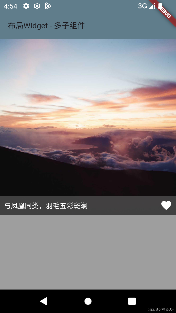
Positioned组件只能在Stack中使用
    Stack(
      children: [
        Image.network("https://picsum.photos/2000"),
        Positioned(
            // 填充满父布局,double.infinity(无限大)
            // width: double.infinity,
            left: 0,
            right: 0,
            bottom: 0,
            child: Container(
              padding: EdgeInsets.all(8),
              color: Color.fromARGB(150, 100, 100, 100),
              child: Row(
                children: [
                  Text("与凤凰同类,羽毛五彩斑斓", style: TextStyle(color: Colors.white)),
                  Icon(Icons.favorite,color: Colors.white)
                ],
                mainAxisAlignment: MainAxisAlignment.spaceBetween
              )
            )
        )
      ]
    );
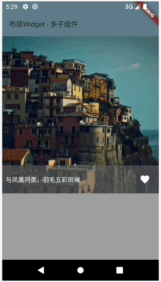
class MyStatefulWidget extends StatefulWidget {
  const MyStatefulWidget({super.key});

  @override
  State<MyStatefulWidget> createState() => _MyStatefulWidgetState();
}

class _MyStatefulWidgetState extends State<MyStatefulWidget> {

  var _isFavor = false;

  @override
  Widget build(BuildContext context) {
    return Stack(
        children: [
          Image.network("https://picsum.photos/2000"),
          Positioned(
              left: 0,
              right: 0,
              bottom: 0,
              child: Container(
                  padding: EdgeInsets.all(8),
                  color: Color.fromARGB(150, 100, 100, 100),
                  child: Row(
                      children: [
                        Text("与凤凰同类,羽毛五彩斑斓", style: TextStyle(color: Colors.white)),
                        IconButton(
                          icon: Icon(
                              Icons.favorite,
                              color: _isFavor ? Colors.red : Colors.white
                          ),
                          onPressed: (){
                            setState(() {
                              _isFavor = !_isFavor;
                            });
                          },
                        )
                      ],
                      mainAxisAlignment: MainAxisAlignment.spaceBetween
                  )
              )
          )
        ]
    );
  }
}
ListView
ListView 是最常用的滚动列表组件,用于展示垂直或水平方向的可滚动数据集合。

    ListView(
      children: [
        Padding(
          padding: EdgeInsets.all(8),
          child: Text('应龙:有翼的龙,曾帮助黄帝战胜蚩尤。它也是传说中的一种祥瑞之物。')
        ),
        Padding(
            padding: EdgeInsets.all(8),
            child: Text('烛龙:又称为“烛阴”,人面蛇身,全身赤红,住在章尾山,眼睛竖立,睁开眼就是白天,闭上眼就是黑夜。')
        ),
        Padding(
            padding: EdgeInsets.all(8),
            child: Text('青鸾:与凤凰同类,羽毛五彩斑斓,常被描述为神仙的坐骑或信使。')
        )
      ]
    );
ListTile (使用较少)
在开发中,经常见到一种列表,有一个图标或图片(Icon),有一个标题(Title),有一个子标题(Subtitle),还有尾部一个图标(Icon)。系统有提供类似布局组件 ListTile。

注:通过构造函数中 children 传入 Widget 有性能问题,如果有 10W 条数据怎么办?
可以通过 ListView.builder 来构建子Widget,该构造函数将创建子Widget交给了一个抽象的方法,交给 ListView 进行管理,ListView 会在真正需要的时候去创建子Widget,而不是一开始就全部初始化好。
ListView.builder

    ListView.builder(
      // 表示列表项的数量,如果为空,则表示ListView为无限列表
      itemCount: 1000,
      itemBuilder: (BuildContext context, int index) {
        return Padding(
            padding: EdgeInsets.all(8),
            child: Text('$index 应龙:有翼的龙...')
        );
      }
    );
ListView.separated
ListView.separated 可以生成列表项之间的分割器,它比 ListView.builder 多了一个sparatorBuilder 参数,该参数是一个分割器生成器。

    return ListView.separated(
      itemCount: 1000,
      itemBuilder: (BuildContext context, int index) {
        return Padding(
            padding: EdgeInsets.all(8),
            child: Text('$index 应龙:有翼的龙...')
        );
      },
      separatorBuilder: (BuildContext context, int index){
        return Divider(color: Colors.red);
      }
    );
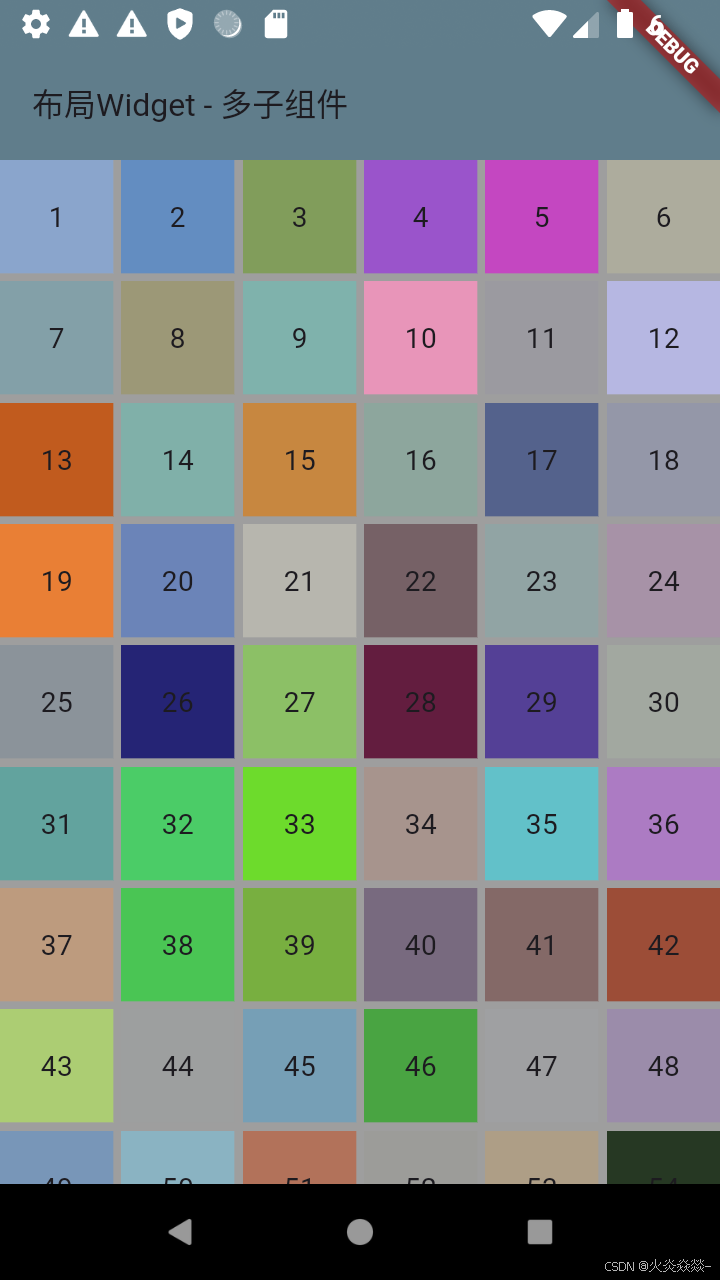
GridView
GridView.count
固定列数的网格布局,适用于简单静态内容。
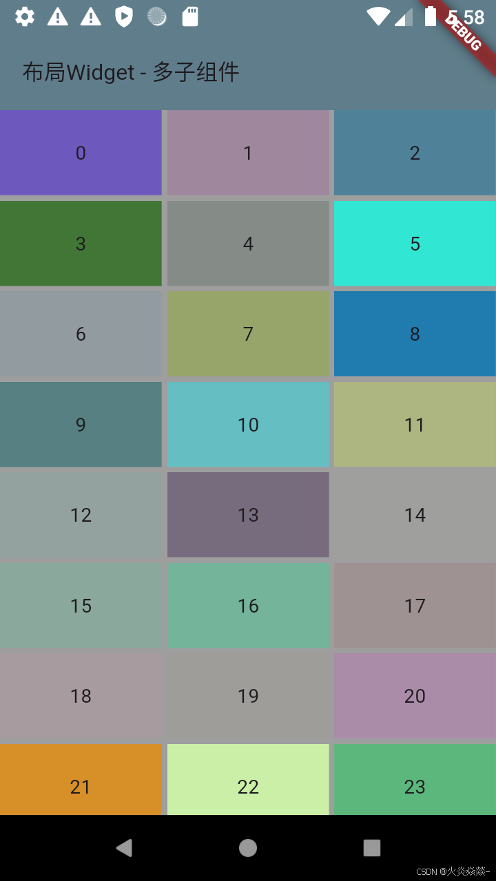
    GridView.count(
        crossAxisCount: 3, // 固定列数
        mainAxisSpacing: 4, // 行间距
        crossAxisSpacing: 4, // 列间距
        childAspectRatio: 1.9, // 宽高比 (默认1.1)
        children: List.generate(100, (index) {
          return Container(
              color: Color.fromARGB(Random().nextInt(256), Random().nextInt(256), Random().nextInt(256), Random().nextInt(256)),
              alignment: Alignment.center,
              child: Text("$index"));
        })
    );
GridView.extent
根据最大宽度动态调整列数,适合响应式布局。
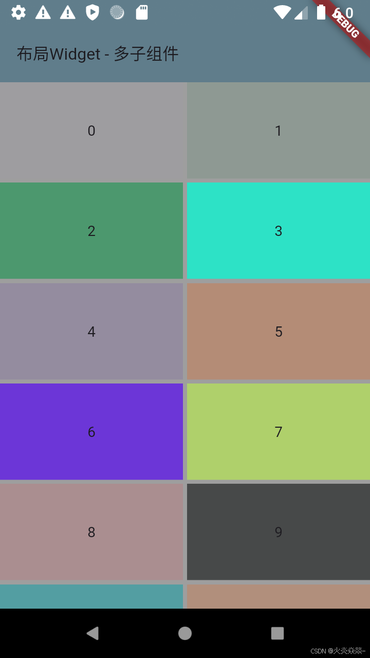
    GridView.extent(
        maxCrossAxisExtent: 260, // 单个子项最大宽度(超出则换行)
        mainAxisSpacing: 4, // 行间距
        crossAxisSpacing: 4, // 列间距
        childAspectRatio: 1.9, // 宽高比 (默认1.1)
        children: List.generate(100, (index) {
          return Container(
              color: Color.fromARGB(Random().nextInt(256), Random().nextInt(256), Random().nextInt(256), Random().nextInt(256)),
              alignment: Alignment.center,
              child: Text("$index"));
        })
    );
GridView.builder(推荐)
动态创建 item,高性能处理大量数据
    GridView.builder(
        itemCount: 100, // 单个子项最大宽度(超出则换行)
        scrollDirection: Axis.vertical, // 设置滚动方向
        gridDelegate: SliverGridDelegateWithFixedCrossAxisCount(
          crossAxisCount: 6, // 固定列数
          mainAxisSpacing: 4, // 行间距
          crossAxisSpacing: 4, // 列间距
        ),
        itemBuilder: (context,index){
          return Container(
              color: Color.fromARGB(Random().nextInt(256), Random().nextInt(256), Random().nextInt(256), Random().nextInt(256)),
              alignment: Alignment.center,
              child: Text("${index+1}"));
        }
    );
Slivers
Slivers 是 Flutter 中用于构建可滚动区域的特殊组件,能更精细控制滚动行为。
-
与普通组件的区别:
-
普通组件(如
Column)一次性渲染所有内容 -
Slivers(如
SliverList)按需懒加载子项,适合大数据量
-
-
家族成员:
-
SliverAppBar(可折叠的标题栏) -
SliverList/SliverGrid(列表/网格) -
SliverToBoxAdapter(包裹普通组件) -
SliverPersistentHeader(固定头部)
-
Slivers 必须包裹在 CustomScrollView 中才能协作滚动
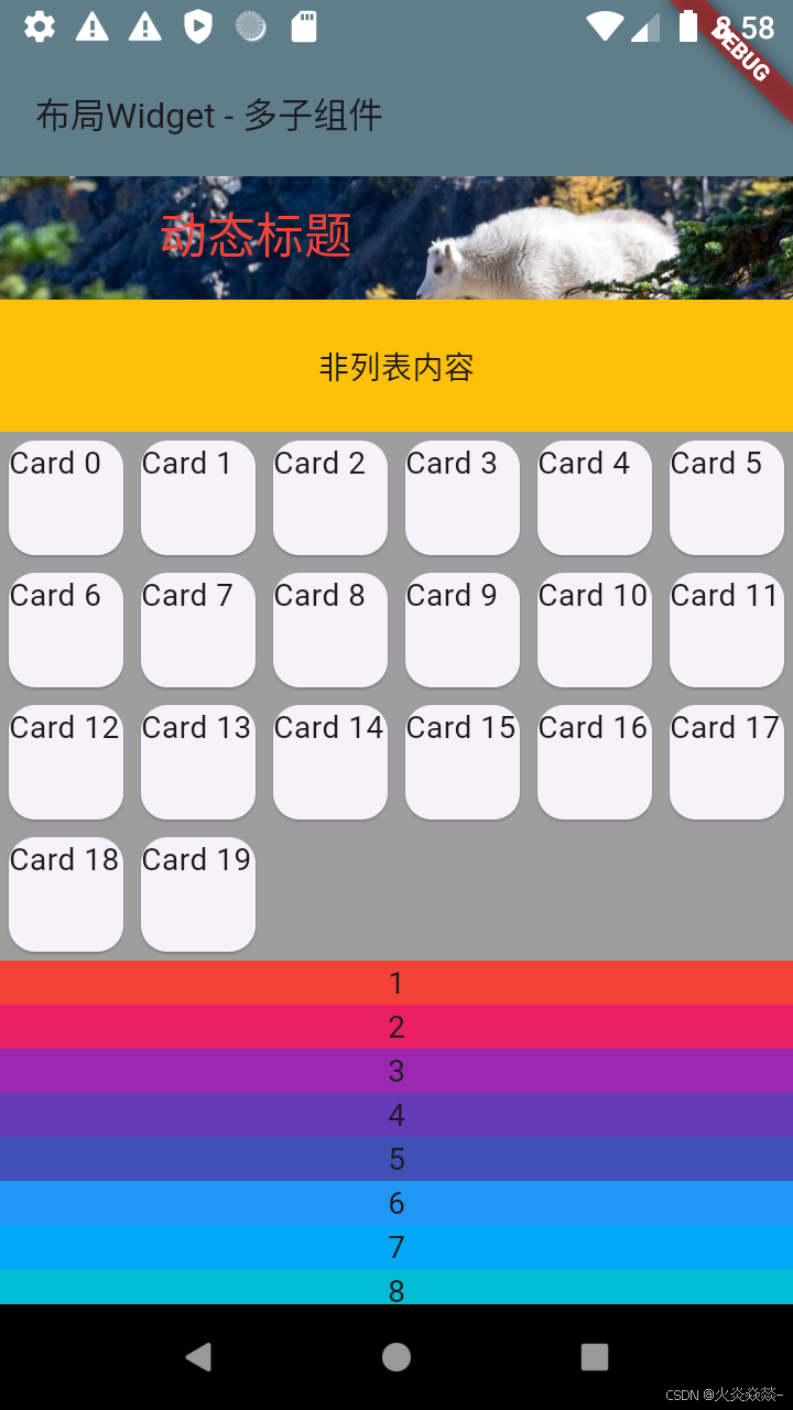
    CustomScrollView(
      slivers: [
        // 添加一个AppBar,通常用来作为CustomScrollView的HeaderView
        SliverAppBar(
          expandedHeight: 50,
          floating: true,
          pinned: true,
          flexibleSpace: FlexibleSpaceBar(
            title: Text("动态标题", style: TextStyle(color: Colors.red)),
            background: Image.network("https://picsum.photos/2000", fit: BoxFit.cover)
          )
        ),
        SliverToBoxAdapter(
          child: Container(
            height: 60,
            color: Colors.amber,
            alignment: Alignment.center,
            child: Text("非列表内容")
          )
        ),
        // 类似 GridView
        SliverGrid(
            delegate: SliverChildBuilderDelegate((context,index) => Card(
              child: Text("Card $index")
            ),
            childCount: 20
            ),
            gridDelegate: SliverGridDelegateWithFixedCrossAxisCount(crossAxisCount: 6)
        ),
        // 类似 ListView
        SliverList(
            delegate: SliverChildBuilderDelegate((context, index) => Container(
                      height: 20,
                      color: Colors.primaries[index % 18],
                      alignment: Alignment.center,
                      child: Text("${index + 1}"),
                    ),
                childCount: 66)
        )
      ]
    );
监听滚动事件
监听滚动事件通常通过 ScrollController来实现。另外,NotificationListener也是一个选择,特别是当需要监听不同类型的滚动通知时。
ScrollController
通过 ScrollController 直接监听滚动位置的变化,适用于需要实时获取滚动偏移量的场景。
class MyStatefulWidget extends StatefulWidget {
  @override
  State<MyStatefulWidget> createState() => _MyStatefulWidgetState();
}

/**
 *  1 创建 ScrollController
 *  2 将控制器附加到滚动组件
 *  3 监听滚动事件
 *  4 释放资源(避免内存泄漏)
 */
class _MyStatefulWidgetState extends State<MyStatefulWidget> {

  // 1. 创建 ScrollController
  // initialScrollOffset 初始化滚动位置
  var controller = ScrollController(initialScrollOffset: 100);

  @override
  void initState() {
    super.initState();
    // 3. 添加滚动监听
    controller.addListener((){
      print("监听滚动 -- ${controller.offset}");
    });
  }

  @override
  void dispose() {
    // 4. 释放控制器
    controller.dispose();
    super.dispose();
  }

  @override
  Widget build(BuildContext context) {
    return ListView.builder(
      // 2. 将控制器附加到 ListView
        controller: controller,
        itemCount: 1000,
        itemBuilder: (BuildContext context, int index) {
          return Padding(
              padding: EdgeInsets.all(8),
              child: Text("${index} 有翼的龙,曾帮助黄帝战胜蚩尤。它也是传说中的一种祥瑞之物。"));
        });
  }
}
NotificationListener
通过 NotificationListener 监听滚动事件通知,适用于需要更精细控制(如拦截特定滚动行为)的场景。
/**
 *  NotificationListener 是一个 Widget
 *  NotificationListener 需要一个 onNotification 回调函数,用于实现监听处理逻辑
 *  回调可以返回一个布尔值,代表是否阻止事件继续向上冒泡,如果为true冒泡终止,事件停止向上传播,如果不返回或者返回值为false冒泡继续
 */
class _MyStatefulWidgetState extends State<MyStatefulWidget> {
  @override
  Widget build(BuildContext context) {
    return NotificationListener(
      child: ListView.builder(
          itemCount: 1000,
          itemBuilder: (BuildContext context, int index) {
            return Padding(
                padding: EdgeInsets.all(8),
                child: Text("${index} 有翼的龙,曾帮助黄帝战胜蚩尤。它也是传说中的一种祥瑞之物。"));
          }
      ),
      onNotification: (ScrollNotification notification){
        if (notification is ScrollStartNotification){
          print("开始滚动");
        } else if (notification is ScrollUpdateNotification){
          print("正在滚动 ${notification.metrics.pixels}");
        } else if (notification is ScrollEndNotification){
          print("结束滚动");
        }
        return true;
      }
    );
  }
}


 扫一扫
扫一扫


 3860
3860

 被折叠的 条评论
为什么被折叠?
被折叠的 条评论
为什么被折叠?
 到【灌水乐园】发言


