


# 生成模拟数据
plotdata <- data.frame(group = rep(paste("group", 1:4, sep = ""), 5),
                   auc = rnorm(20))
# 设置字体
windowsFonts(newman = windowsFont(family = "Times New Roman"))
library(ggplot2)

# plotdata中group指定分组
fig_a <- ggplot(data = plotdata,
                aes(x = group, y = auc, group = group, fill = group)) +
  # width设置箱式图中‘须’的宽度
  stat_boxplot(geom = "errorbar", width = 0.15) +
  # outlier.alpha = 0隐藏离群值, width设置箱体宽度
  geom_boxplot(width = 0.35, outlier.alpha = 0) +
  # labs设置坐标轴标签
  labs(x = "", y = "AUC(%)") +
  # 修改x轴刻度标签, breaks指定待修改的标签, labels指定最终刻度的标签
  scale_x_discrete(breaks = paste("group", 1:4, sep = ""),
                   labels = c("GCN", "MLP", "CNN", "RF")) +
  # 修改y轴刻度标签
  scale_y_continuous(limits = c(-2.5, 2.5), expand = c(0, 0),
                     breaks = seq(-2, 2, 1), labels = seq(-2, 2, 1)) +
  # 去掉图例
  guides(fill = "none") +
  # 设置背景和坐标轴
  theme(panel.grid.major = element_blank(),
        panel.grid.minor = element_blank(),
        panel.background = element_blank(),
        axis.line = element_line(colour = "black"),
        # 设置x轴刻度标签的字体
        axis.text.x = element_text(size = rel(1.8), family = "newman", colour = "black"),
        # 设置x轴刻度标签的字体
        axis.text.y = element_text(size = rel(2), family = "newman", colour = "black"),
        # 设置x轴题目的字体
        axis.title.x = element_text(size = rel(2), family = "newman", colour = "black"),
        # 设置y轴题目的字体
        axis.title.y = element_text(size = rel(2), family = "newman", colour = "black")) +
  # 翻转箱式图
  coord_flip()

# 导出图片至本地
tiff('Fig_a.tiff', width = 3600, height = 3200, res = 600, compression = "lzw")
print(fig_a)
dev.off()


# 组合图
fig_b <- ggplot(data = plotdata, aes(x = group, y = auc, group = group, fill = group)) +
  stat_boxplot(geom = "errorbar", width = 0.15) +
  # outlier.alpha = 0就可以隐藏离群值
  geom_boxplot(width = 0.35, outlier.alpha = 0) +
  labs(x = "", y = "AUC(%)") +
  scale_x_discrete(breaks = paste("group", 1:4, sep = ""),
                   labels = c("GCN", "MLP", "CNN", "RF")) +
  scale_y_continuous(limits = c(-2.5, 2.5), expand = c(0, 0),
                     breaks = seq(-2, 2, 1), labels = seq(-2, 2, 1)) +
  guides(fill = "none") +
  theme(panel.grid.major = element_blank(),
        panel.grid.minor = element_blank(),
        panel.background = element_blank(),
        axis.line = element_line(colour = "black"),
        axis.text.x = element_text(size = rel(1.8), family = "newman",
                                   colour = "black"),
        axis.text.y = element_text(size = rel(2), family = "newman",
                                   colour = "black"),
        axis.title.x = element_text(size = rel(2), family = "newman",
                                    colour = "black"),
        axis.title.y = element_text(size = rel(2), family = "newman",
                                    colour = "black")) +
  coord_flip()


library(ggpubr)
# 将图片组合, fig_a, fig_b指定待组合的ggplot2子图;可以有更多子图
combine_plot <- ggarrange(fig_a,
                          fig_b,
                          # 组合图行数
                          nrow = 1,
                          # 组合图列数
                          ncol = 2,
                          # 每个子图的宽度
                          widths = c(0.45, 0.45),
                          # 每个子图的高度
                          heights = c(1, 1)
                          # labels = c("A", "B"),
                          # font.label = list(size = 24, color = "black", family = "newman")
                          )
tiff("组合图.tiff", width = 7800, height = 3800, compression = "lzw",
     res = 600)
print(combine_plot)
dev.off()
rm(list = ls())
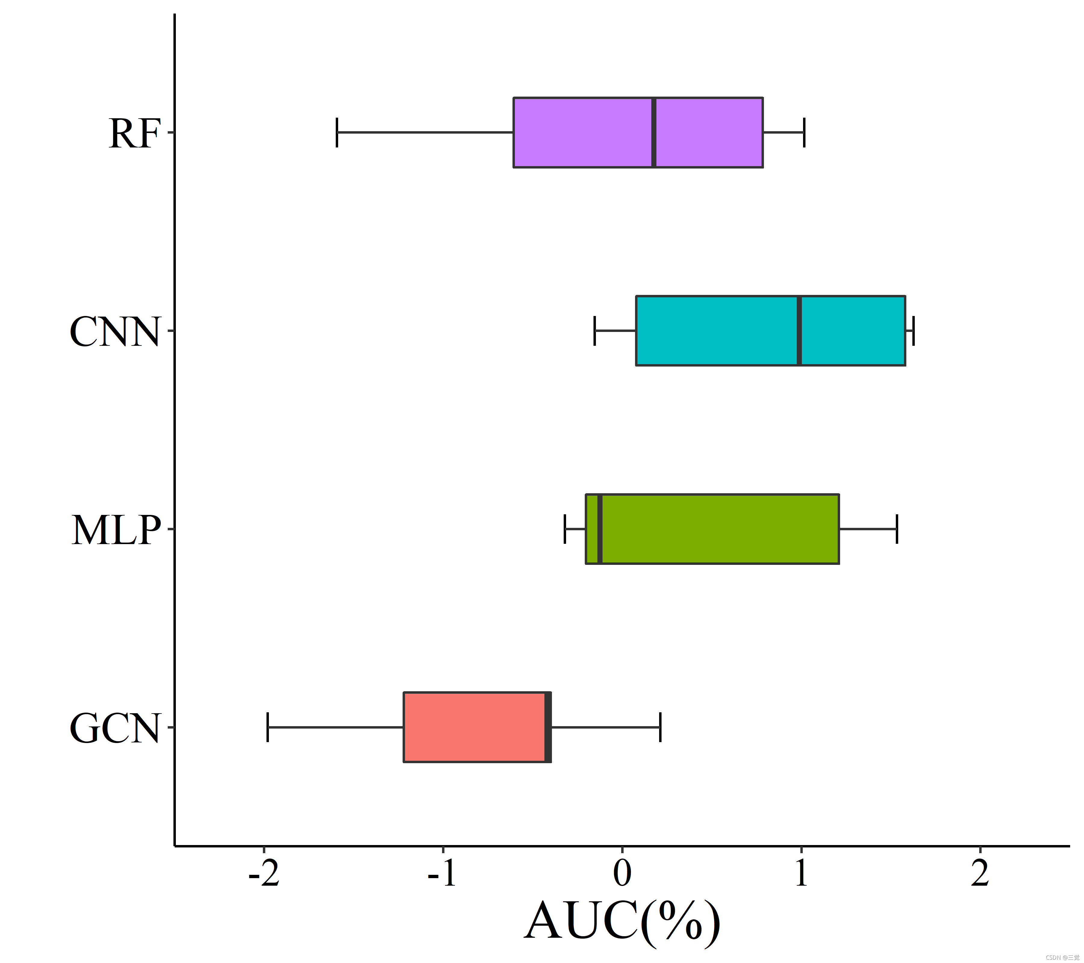
Fig_a:
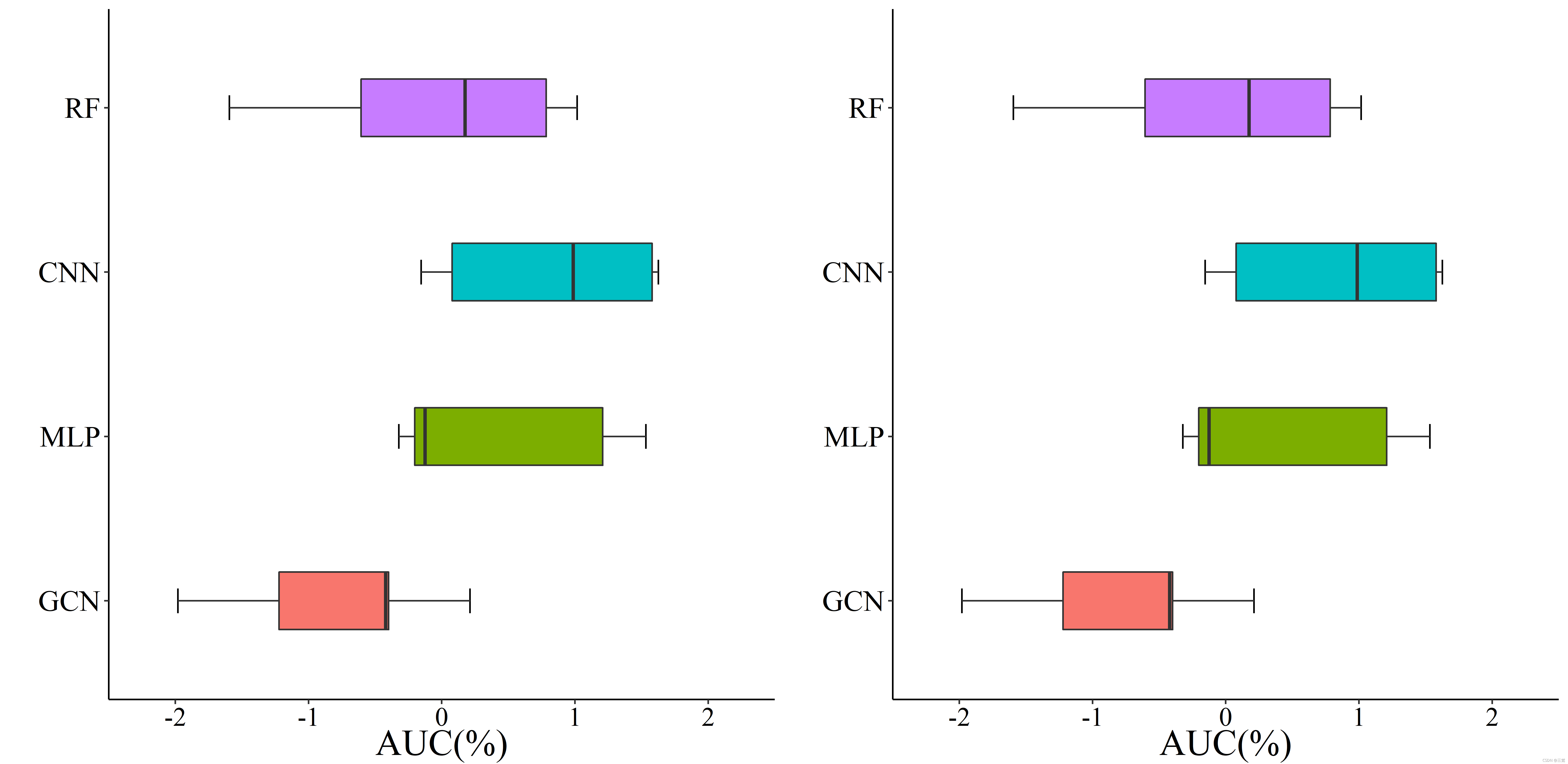
组合图:


 4368
4368

 被折叠的 条评论
为什么被折叠?
被折叠的 条评论
为什么被折叠?
 到【灌水乐园】发言


