


弹性盒子是 CSS3 的一种新的布局模式。
一.CSS弹性盒子
弹性盒子由弹性容器(Flex container)和弹性子元素(Flex item)组成。
弹性容器(Flex container)---能够包含其他元素的html元素【div】
弹性子元素(Flex item)------被包含在弹性容器中的元素。
弹性容器通过设置 display 属性的值为 flex 或 inline-flex将其定义为弹性容器。
弹性子元素通常在弹性盒子内一行显示。默认情况每个容器只有一行。
1.display--指定 HTML 元素盒子类型。
display 属性的值为 flex 或 inline-flex将其定义为弹性容器
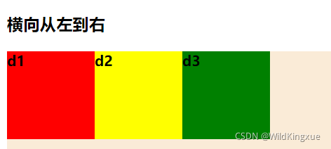
2.flex-direction--指定了弹性容器中子元素的排列方式。
.row:横向从左到右排列(左对齐),默认的排列方式。
<!DOCTYPE html>
<html>
	<head>
		<meta charset="utf-8">
		<title>弹性flex</title>
		<style type="text/css">
			#div1{
				width: 600px;
				height: 600px;
				background-color: antiquewhite;
				display: flex;
				flex-direction: row;
			}
			#d1{
				width: 100px;
				height: 100px;
				background-color: red;
			}
			#d2{
				width: 100px;
				height: 100px;
				background-color: yellow;
			}
			#d3{
				width: 100px;
				height: 100px;
				background-color: green;
			}
		</style>
	</head>
	<body>
		<h3>横向从左到右</h3>
		<div id="div1">
			<div id="d1">
				<b>d1</b>
			</div>
			<div id="d2">
				<b>d2</b>
			</div>
			<div id="d3">
				<b>d3</b>
			</div>
		</div>
	</body>
</html>
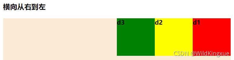
.row-reverse:反转横向排列(右对齐,从后往前排)
<!DOCTYPE html>
<html>
	<head>
		<meta charset="utf-8">
		<title>弹性flex</title>
		<style type="text/css">
			#div1{
				width: 600px;
				height: 600px;
				background-color: antiquewhite;
				display: flex;
				flex-direction: row-reverse;
			}
			#d1{
				width: 100px;
				height: 100px;
				background-color: red;
			}
			#d2{
				width: 100px;
				height: 100px;
				background-color: yellow;
			}
			#d3{
				width: 100px;
				height: 100px;
				background-color: green;
			}
		</style>
	</head>
	<body>
		<h3>横向从右到左</h3>
		<div id="div1">
			<div id="d1">
				<b>d1</b>
			</div>
			<div id="d2">
				<b>d2</b>
			</div>
			<div id="d3">
				<b>d3</b>
			</div>
		</div>
	</body>
</html>
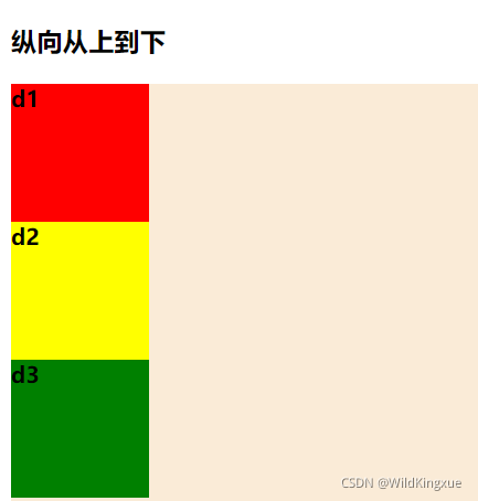
.column:纵向排列。
<!DOCTYPE html>
<html>
	<head>
		<meta charset="utf-8">
		<title>弹性flex</title>
		<style type="text/css">
			#div1{
				width: 600px;
				height: 600px;
				background-color: antiquewhite;
				display: flex;
				flex-direction: column;
			}
			#d1{
				width: 100px;
				height: 100px;
				background-color: red;
			}
			#d2{
				width: 100px;
				height: 100px;
				background-color: yellow;
			}
			#d3{
				width: 100px;
				height: 100px;
				background-color: green;
			}
		</style>
	</head>
	<body>
		<h3>纵向从上到下</h3>
		<div id="div1">
			<div id="d1">
				<b>d1</b>
			</div>
			<div id="d2">
				<b>d2</b>
			</div>
			<div id="d3">
				<b>d3</b>
			</div>
		</div>
	</body>
</html>
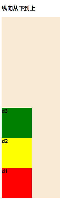
.column-reverse:反转纵向排列,从后往前排,最后一项排在最上面。
<!DOCTYPE html>
<html>
	<head>
		<meta charset="utf-8">
		<title>弹性flex</title>
		<style type="text/css">
			#div1{
				width: 600px;
				height: 600px;
				background-color: antiquewhite;
				display: flex;
				flex-direction: column-reverse;
			}
			#d1{
				width: 100px;
				height: 100px;
				background-color: red;
			}
			#d2{
				width: 100px;
				height: 100px;
				background-color: yellow;
			}
			#d3{
				width: 100px;
				height: 100px;
				background-color: green;
			}
		</style>
	</head>
	<body>
		<h3>纵向从下到上</h3>
		<div id="div1">
			<div id="d1">
				<b>d1</b>
			</div>
			<div id="d2">
				<b>d2</b>
			</div>
			<div id="d3">
				<b>d3</b>
			</div>
		</div>
	</body>
</html>
3.justify-content--设置弹性盒子元素在主轴(横轴)方向上的对齐方式。
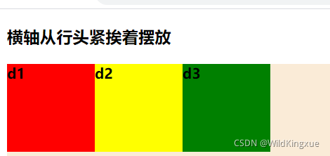
flex-start:弹性子元素向行头紧挨着摆放
<!DOCTYPE html>
<html>
	<head>
		<meta charset="utf-8">
		<title>弹性flex</title>
		<style type="text/css">
			#div1{
				width: 600px;
				height: 600px;
				background-color: antiquewhite;
				display: flex;
				justify-content: flex-start;
			}
			#d1{
				width: 100px;
				height: 100px;
				background-color: red;
			}
			#d2{
				width: 100px;
				height: 100px;
				background-color: yellow;
			}
			#d3{
				width: 100px;
				height: 100px;
				background-color: green;
			}
		</style>
	</head>
	<body>
		<h3>横轴从行头紧挨着摆放</h3>
		<div id="div1">
			<div id="d1">
				<b>d1</b>
			</div>
			<div id="d2">
				<b>d2</b>
			</div>
			<div id="d3">
				<b>d3</b>
			</div>
		</div>
	</body>
</html>
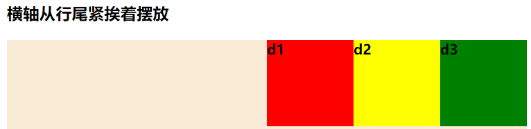
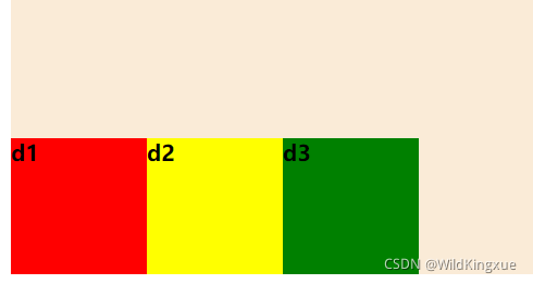
flex-end:弹性子元素向行尾紧挨着摆放
<!DOCTYPE html>
<html>
	<head>
		<meta charset="utf-8">
		<title>弹性flex</title>
		<style type="text/css">
			#div1{
				width: 600px;
				height: 600px;
				background-color: antiquewhite;
				display: flex;
				justify-content: flex-end;
			}
			#d1{
				width: 100px;
				height: 100px;
				background-color: red;
			}
			#d2{
				width: 100px;
				height: 100px;
				background-color: yellow;
			}
			#d3{
				width: 100px;
				height: 100px;
				background-color: green;
			}
		</style>
	</head>
	<body>
		<h3>横轴从行尾紧挨着摆放</h3>
		<div id="div1">
			<div id="d1">
				<b>d1</b>
			</div>
			<div id="d2">
				<b>d2</b>
			</div>
			<div id="d3">
				<b>d3</b>
			</div>
		</div>
	</body>
</html>
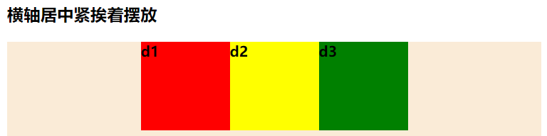
center:弹性项目居中紧挨着摆放。
<!DOCTYPE html>
<html>
	<head>
		<meta charset="utf-8">
		<title>弹性flex</title>
		<style type="text/css">
			#div1{
				width: 600px;
				height: 600px;
				background-color: antiquewhite;
				display: flex;
				justify-content: center;
			}
			#d1{
				width: 100px;
				height: 100px;
				background-color: red;
			}
			#d2{
				width: 100px;
				height: 100px;
				background-color: yellow;
			}
			#d3{
				width: 100px;
				height: 100px;
				background-color: green;
			}
		</style>
	</head>
	<body>
		<h3>横轴居中紧挨着摆放</h3>
		<div id="div1">
			<div id="d1">
				<b>d1</b>
			</div>
			<div id="d2">
				<b>d2</b>
			</div>
			<div id="d3">
				<b>d3</b>
			</div>
		</div>
	</body>
</html>
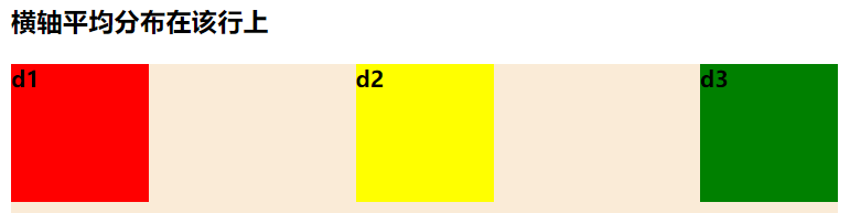
space-between:弹性项目平均分布在该行上。
<!DOCTYPE html>
<html>
	<head>
		<meta charset="utf-8">
		<title>弹性flex</title>
		<style type="text/css">
			#div1{
				width: 600px;
				height: 600px;
				background-color: antiquewhite;
				display: flex;
				justify-content: space-between;
			}
			#d1{
				width: 100px;
				height: 100px;
				background-color: red;
			}
			#d2{
				width: 100px;
				height: 100px;
				background-color: yellow;
			}
			#d3{
				width: 100px;
				height: 100px;
				background-color: green;
			}
		</style>
	</head>
	<body>
		<h3>横轴平均分布在该行上</h3>
		<div id="div1">
			<div id="d1">
				<b>d1</b>
			</div>
			<div id="d2">
				<b>d2</b>
			</div>
			<div id="d3">
				<b>d3</b>
			</div>
		</div>
	</body>
</html>
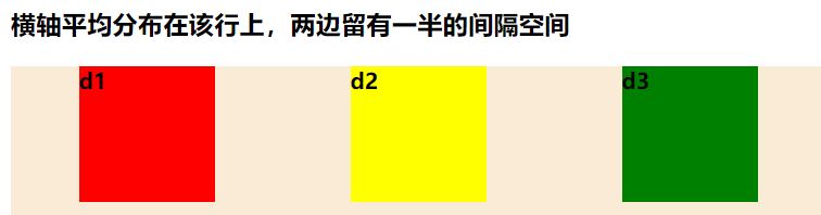
space-around:弹性项目平均分布在该行上,两边留有一半的间隔空间。如果剩余空间为负或者只有一个弹性项,则该值等同于center。
<!DOCTYPE html>
<html>
	<head>
		<meta charset="utf-8">
		<title>弹性flex</title>
		<style type="text/css">
			#div1{
				width: 600px;
				height: 600px;
				background-color: antiquewhite;
				display: flex;
				justify-content: space-around;
			}
			#d1{
				width: 100px;
				height: 100px;
				background-color: red;
			}
			#d2{
				width: 100px;
				height: 100px;
				background-color: yellow;
			}
			#d3{
				width: 100px;
				height: 100px;
				background-color: green;
			}
		</style>
	</head>
	<body>
		<h3>横轴平均分布在该行上,两边留有一半的间隔空间</h3>
		<div id="div1">
			<div id="d1">
				<b>d1</b>
			</div>
			<div id="d2">
				<b>d2</b>
			</div>
			<div id="d3">
				<b>d3</b>
			</div>
		</div>
	</body>
</html>
4.align-items--设置弹性盒子元素在侧轴(纵轴)方向上的对齐方式。
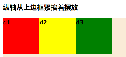
flex-start:弹性子元素向行头紧挨着摆放
<!DOCTYPE html>
<html>
	<head>
		<meta charset="utf-8">
		<title>弹性flex</title>
		<style type="text/css">
			#div1{
				width: 600px;
				height: 600px;
				background-color: antiquewhite;
				display: flex;
				align-items: flex-start;
			}
			#d1{
				width: 100px;
				height: 100px;
				background-color: red;
			}
			#d2{
				width: 100px;
				height: 100px;
				background-color: yellow;
			}
			#d3{
				width: 100px;
				height: 100px;
				background-color: green;
			}
		</style>
	</head>
	<body>
		<h3>纵轴从上边框紧挨着摆放</h3>
		<div id="div1">
			<div id="d1">
				<b>d1</b>
			</div>
			<div id="d2">
				<b>d2</b>
			</div>
			<div id="d3">
				<b>d3</b>
			</div>
		</div>
	</body>
</html>
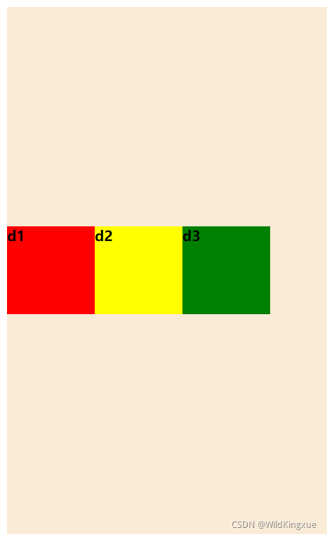
flex-end:弹性子元素向行尾紧挨着摆放
<!DOCTYPE html>
<html>
	<head>
		<meta charset="utf-8">
		<title>弹性flex</title>
		<style type="text/css">
			#div1{
				width: 600px;
				height: 600px;
				background-color: antiquewhite;
				display: flex;
				align-items: flex-end;
			}
			#d1{
				width: 100px;
				height: 100px;
				background-color: red;
			}
			#d2{
				width: 100px;
				height: 100px;
				background-color: yellow;
			}
			#d3{
				width: 100px;
				height: 100px;
				background-color: green;
			}
		</style>
	</head>
	<body>
		<h3>纵轴从下边框紧挨着摆放</h3>
		<div id="div1">
			<div id="d1">
				<b>d1</b>
			</div>
			<div id="d2">
				<b>d2</b>
			</div>
			<div id="d3">
				<b>d3</b>
			</div>
		</div>
	</body>
</html>
center:弹性项目居中紧挨着摆放。
<!DOCTYPE html>
<html>
	<head>
		<meta charset="utf-8">
		<title>弹性flex</title>
		<style type="text/css">
			#div1{
				width: 600px;
				height: 600px;
				background-color: antiquewhite;
				display: flex;
				align-items: center;
			}
			#d1{
				width: 100px;
				height: 100px;
				background-color: red;
			}
			#d2{
				width: 100px;
				height: 100px;
				background-color: yellow;
			}
			#d3{
				width: 100px;
				height: 100px;
				background-color: green;
			}
		</style>
	</head>
	<body>
		<h3>纵轴从中间紧挨着摆放</h3>
		<div id="div1">
			<div id="d1">
				<b>d1</b>
			</div>
			<div id="d2">
				<b>d2</b>
			</div>
			<div id="d3">
				<b>d3</b>
			</div>
		</div>
	</body>
</html>
space-between:弹性项目平均分布在该行上。
space-around:弹性项目平均分布在该行上,两边留有一半的间隔空间。如果剩余空间为负或者只有一个弹性项,则该值等同于center。
5.flex-wrap--设置弹性盒子的子元素超出父容器时是否换行。
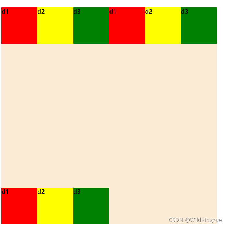
nowrap - 默认, 弹性容器为单行。该情况下弹性子项可能会溢出容器。
<!DOCTYPE html>
<html>
	<head>
		<meta charset="utf-8">
		<title>弹性flex</title>
		<style type="text/css">
			#div1{
				width: 600px;
				height: 600px;
				background-color: antiquewhite;
				display: flex;
				flex-wrap: nowrap;
			}
			#d1{
				width: 100px;
				height: 100px;
				background-color: red;
			}
			#d2{
				width: 100px;
				height: 100px;
				background-color: yellow;
			}
			#d3{
				width: 100px;
				height: 100px;
				background-color: green;
			}
		</style>
	</head>
	<body>
		<h3> 弹性容器为单行</h3>
		<div id="div1">
			<div id="d1">
				<b>d1</b>
			</div>
			<div id="d2">
				<b>d2</b>
			</div>
			<div id="d3">
				<b>d3</b>
			</div>
			<div id="d1">
				<b>d1</b>
			</div>
			<div id="d2">
				<b>d2</b>
			</div>
			<div id="d3">
				<b>d3</b>
			</div>
			<div id="d1">
				<b>d1</b>
			</div>
			<div id="d2">
				<b>d2</b>
			</div>
			<div id="d3">
				<b>d3</b>
			</div>
		</div>
	</body>
</html>
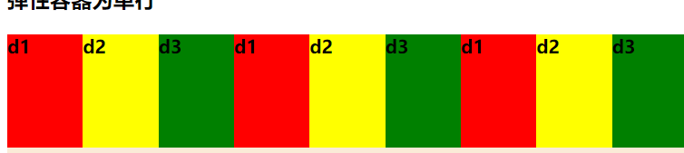
wrap - 弹性容器为多行。该情况下弹性子项溢出的部分会被放置到新行,子项内部会发生断行
<!DOCTYPE html>
<html>
	<head>
		<meta charset="utf-8">
		<title>弹性flex</title>
		<style type="text/css">
			#div1{
				width: 600px;
				height: 600px;
				background-color: antiquewhite;
				display: flex;
				flex-wrap: wrap;
			}
			#d1{
				width: 100px;
				height: 100px;
				background-color: red;
			}
			#d2{
				width: 100px;
				height: 100px;
				background-color: yellow;
			}
			#d3{
				width: 100px;
				height: 100px;
				background-color: green;
			}
		</style>
	</head>
	<body>
		<h3> 弹性容器为多行,从上往下</h3>
		<div id="div1">
			<div id="d1">
				<b>d1</b>
			</div>
			<div id="d2">
				<b>d2</b>
			</div>
			<div id="d3">
				<b>d3</b>
			</div>
			<div id="d1">
				<b>d1</b>
			</div>
			<div id="d2">
				<b>d2</b>
			</div>
			<div id="d3">
				<b>d3</b>
			</div>
			<div id="d1">
				<b>d1</b>
			</div>
			<div id="d2">
				<b>d2</b>
			</div>
			<div id="d3">
				<b>d3</b>
			</div>
		</div>
	</body>
</html>
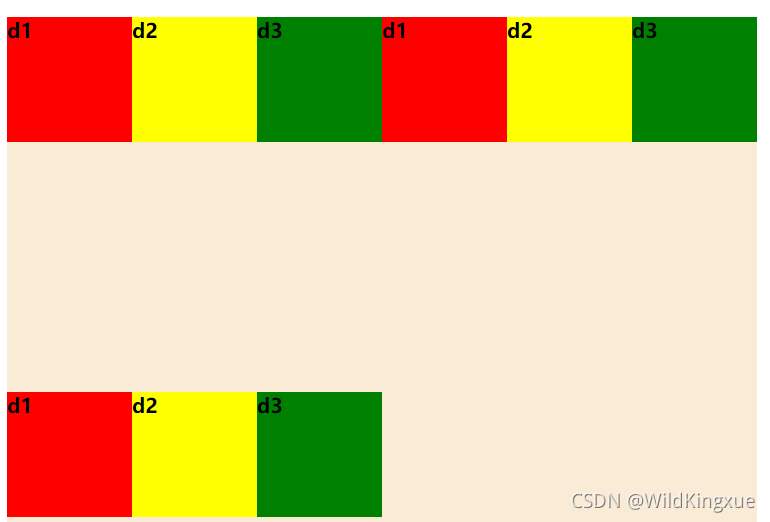
wrap-reverse -反转 wrap 排列。
<!DOCTYPE html>
<html>
	<head>
		<meta charset="utf-8">
		<title>弹性flex</title>
		<style type="text/css">
			#div1{
				width: 600px;
				height: 600px;
				background-color: antiquewhite;
				display: flex;
				flex-wrap: wrap-reverse;
			}
			#d1{
				width: 100px;
				height: 100px;
				background-color: red;
			}
			#d2{
				width: 100px;
				height: 100px;
				background-color: yellow;
			}
			#d3{
				width: 100px;
				height: 100px;
				background-color: green;
			}
		</style>
	</head>
	<body>
		<h3> 弹性容器为多行,从下往上</h3>
		<div id="div1">
			<div id="d1">
				<b>d1</b>
			</div>
			<div id="d2">
				<b>d2</b>
			</div>
			<div id="d3">
				<b>d3</b>
			</div>
			<div id="d1">
				<b>d1</b>
			</div>
			<div id="d2">
				<b>d2</b>
			</div>
			<div id="d3">
				<b>d3</b>
			</div>
			<div id="d1">
				<b>d1</b>
			</div>
			<div id="d2">
				<b>d2</b>
			</div>
			<div id="d3">
				<b>d3</b>
			</div>
		</div>
	</body>
</html>
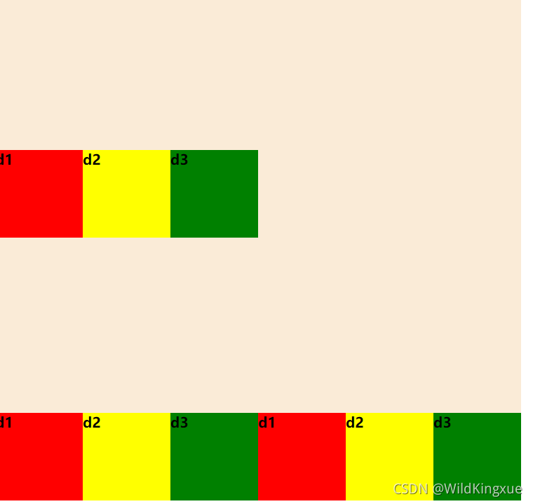
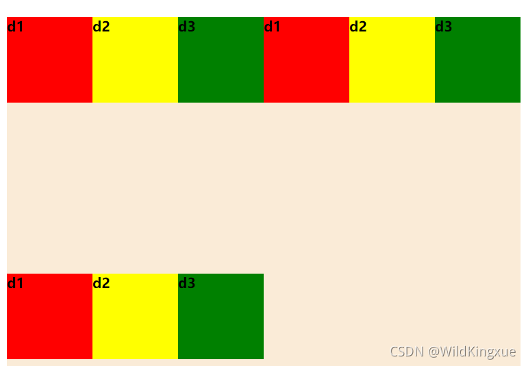
6.align-content--修改 flex-wrap 属性的行为,类似 align-items, 但不是设置子元素对齐,而是设置行对齐
stretch - 默认。各行将会伸展以占用剩余的空间。
flex-start - 各行向弹性盒容器的起始位置堆叠。
flex-end - 各行向弹性盒容器的结束位置堆叠。
center -各行向弹性盒容器的中间位置堆叠。
<!DOCTYPE html>
<html>
	<head>
		<meta charset="utf-8">
		<title>弹性flex</title>
		<style type="text/css">
			#div1{
				width: 600px;
				height: 600px;
				background-color: antiquewhite;
				display: flex;
				align-items: flex-start;
			}
			#d1{
				width: 100px;
				height: 100px;
				background-color: red;
				align-self: center;
			}
			#d2{
				width: 100px;
				height: 100px;
				background-color: yellow;
				align-self: flex-start;
			}
			#d3{
				width: 100px;
				height: 100px;
				background-color: green;
				align-self: flex-end;
			}
		</style>
	</head>
	<body>
		<h3>纵轴从上边框紧挨着摆放</h3>
		<div id="div1">
			<div id="d1">
				<b>d1</b>
			</div>
			<div id="d2">
				<b>d2</b>
			</div>
			<div id="d3">
				<b>d3</b>
			</div>
		</div>
	</body>
</html>
space-between -各行在弹性盒容器中平均分布。
space-around - 各行在弹性盒容器中平均分布,两端保留子元素与子元素之间间距大小
的一半。
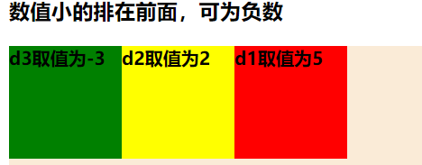
7.order--设置弹性盒子的子元素排列顺序。
整数数字:用整数值来定义排列顺序,数值小的排在前面。可以为负值
<!DOCTYPE html>
<html>
	<head>
		<meta charset="utf-8">
		<title>弹性flex</title>
		<style type="text/css">
			#div1{
				width: 600px;
				height: 600px;
				background-color: antiquewhite;
				display: flex;
				flex-direction: row;
			}
			#d1{
				width: 100px;
				height: 100px;
				background-color: red;
				order: 5;
			}
			#d2{
				width: 100px;
				height: 100px;
				background-color: yellow;
				order: 2;
			}
			#d3{
				width: 100px;
				height: 100px;
				background-color: green;
				order: -3;
			}
		</style>
	</head>
	<body>
		<h3>数值小的排在前面,可为负数</h3>
		<div id="div1">
			<div id="d1">
				<b>d1取值为5</b>
			</div>
			<div id="d2">
				<b>d2取值为2</b>
			</div>
			<div id="d3">
				<b>d3取值为-3</b>
			</div>
		</div>
	</body>
</html>
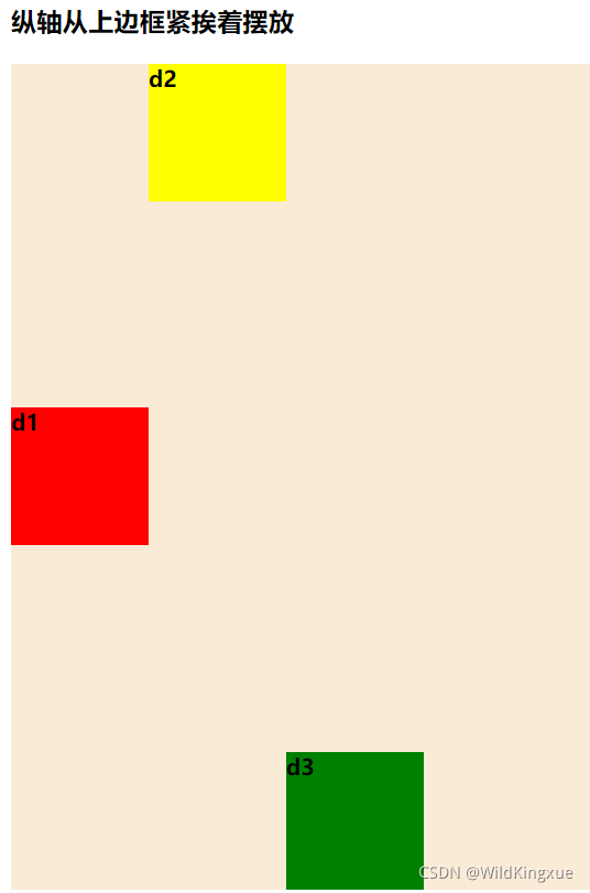
8.align-self--在弹性子元素上使用。覆盖容器的 align-items 属性。
auto:如果'align-self'的值为'auto',则其计算值为元素的父元素的'align-items'值,如果其没有父元素,则计算值为'stretch'。
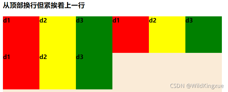
flex-start:弹性盒子元素的侧轴(纵轴)起始位置的边界紧靠住该行的侧轴起始边界。
<!DOCTYPE html>
<html>
	<head>
		<meta charset="utf-8">
		<title>弹性flex</title>
		<style type="text/css">
			#div1{
				width: 600px;
				height: 600px;
				background-color: antiquewhite;
				display: flex;
				flex-wrap: wrap;
				align-content: flex-start;
			}
			#d1{
				width: 100px;
				height: 100px;
				background-color: red;
			}
			#d2{
				width: 100px;
				height: 100px;
				background-color: yellow;
			}
			#d3{
				width: 100px;
				height: 100px;
				background-color: green;
			}
		</style>
	</head>
	<body>
		<h3>从顶部换行但紧挨着上一行</h3>
		<div id="div1">
			<div id="d1">
				<b>d1</b>
			</div>
			<div id="d2">
				<b>d2</b>
			</div>
			<div id="d3">
				<b>d3</b>
			</div>
			<div id="d1">
				<b>d1</b>
			</div>
			<div id="d2">
				<b>d2</b>
			</div>
			<div id="d3">
				<b>d3</b>
			</div>
			<div id="d1">
				<b>d1</b>
			</div>
			<div id="d2">
				<b>d2</b>
			</div>
			<div id="d3">
				<b>d3</b>
			</div>
		</div>
	</body>
</html>
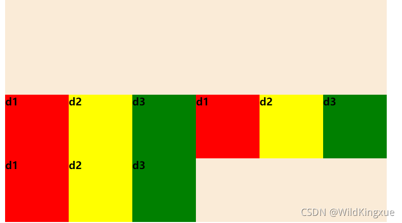
flex-end:弹性盒子元素的侧轴(纵轴)起始位置的边界紧靠住该行的侧轴结束边界。
<!DOCTYPE html>
<html>
	<head>
		<meta charset="utf-8">
		<title>弹性flex</title>
		<style type="text/css">
			#div1{
				width: 600px;
				height: 600px;
				background-color: antiquewhite;
				display: flex;
				flex-wrap: wrap;
				align-content: flex-end;
			}
			#d1{
				width: 100px;
				height: 100px;
				background-color: red;
			}
			#d2{
				width: 100px;
				height: 100px;
				background-color: yellow;
			}
			#d3{
				width: 100px;
				height: 100px;
				background-color: green;
			}
		</style>
	</head>
	<body>
		<h3>最后一行紧挨着底部,行与行之间紧挨</h3>
		<div id="div1">
			<div id="d1">
				<b>d1</b>
			</div>
			<div id="d2">
				<b>d2</b>
			</div>
			<div id="d3">
				<b>d3</b>
			</div>
			<div id="d1">
				<b>d1</b>
			</div>
			<div id="d2">
				<b>d2</b>
			</div>
			<div id="d3">
				<b>d3</b>
			</div>
			<div id="d1">
				<b>d1</b>
			</div>
			<div id="d2">
				<b>d2</b>
			</div>
			<div id="d3">
				<b>d3</b>
			</div>
		</div>
	</body>
</html>
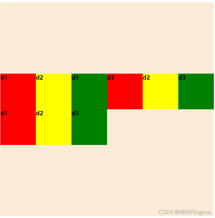
center:弹性盒子元素在该行的侧轴(纵轴)上居中放置。(如果该行的尺寸小于弹性盒子元素的尺寸,则会向两个方向溢出相同的长度)。
<!DOCTYPE html>
<html>
	<head>
		<meta charset="utf-8">
		<title>弹性flex</title>
		<style type="text/css">
			#div1{
				width: 600px;
				height: 600px;
				background-color: antiquewhite;
				display: flex;
				flex-wrap: wrap;
				align-content: center;
			}
			#d1{
				width: 100px;
				height: 100px;
				background-color: red;
			}
			#d2{
				width: 100px;
				height: 100px;
				background-color: yellow;
			}
			#d3{
				width: 100px;
				height: 100px;
				background-color: green;
			}
		</style>
	</head>
	<body>
		<h3>从中间开始行与行之间紧挨</h3>
		<div id="div1">
			<div id="d1">
				<b>d1</b>
			</div>
			<div id="d2">
				<b>d2</b>
			</div>
			<div id="d3">
				<b>d3</b>
			</div>
			<div id="d1">
				<b>d1</b>
			</div>
			<div id="d2">
				<b>d2</b>
			</div>
			<div id="d3">
				<b>d3</b>
			</div>
			<div id="d1">
				<b>d1</b>
			</div>
			<div id="d2">
				<b>d2</b>
			</div>
			<div id="d3">
				<b>d3</b>
			</div>
		</div>
	</body>
</html>
baseline:如弹性盒子元素的行内轴与侧轴为同一条,则该值与'flex-start'等效。其它情况下,该值将参与基线对齐。
<!DOCTYPE html>
<html>
	<head>
		<meta charset="utf-8">
		<title>弹性flex</title>
		<style type="text/css">
			#div1{
				width: 600px;
				height: 600px;
				background-color: antiquewhite;
				display: flex;
				flex-wrap: wrap;
				align-content: space-between;
			}
			#d1{
				width: 100px;
				height: 100px;
				background-color: red;
			}
			#d2{
				width: 100px;
				height: 100px;
				background-color: yellow;
			}
			#d3{
				width: 100px;
				height: 100px;
				background-color: green;
			}
		</style>
	</head>
	<body>
		<h3>上下不留有空隙</h3>
		<div id="div1">
			<div id="d1">
				<b>d1</b>
			</div>
			<div id="d2">
				<b>d2</b>
			</div>
			<div id="d3">
				<b>d3</b>
			</div>
			<div id="d1">
				<b>d1</b>
			</div>
			<div id="d2">
				<b>d2</b>
			</div>
			<div id="d3">
				<b>d3</b>
			</div>
			<div id="d1">
				<b>d1</b>
			</div>
			<div id="d2">
				<b>d2</b>
			</div>
			<div id="d3">
				<b>d3</b>
			</div>
		</div>
	</body>
</html>
stretch:如果指定侧轴大小的属性值为'auto',则其值会使项目的边距盒的尺寸尽可能接近所在行的尺寸,但同时会遵照'min/max-width/height'属性的限制。
<!DOCTYPE html>
<html>
	<head>
		<meta charset="utf-8">
		<title>弹性flex</title>
		<style type="text/css">
			#div1{
				width: 600px;
				height: 600px;
				background-color: antiquewhite;
				display: flex;
				flex-wrap: wrap;
				align-content: stretch;
			}
			#d1{
				width: 100px;
				height: 100px;
				background-color: red;
			}
			#d2{
				width: 100px;
				height: 100px;
				background-color: yellow;
			}
			#d3{
				width: 100px;
				height: 100px;
				background-color: green;
			}
		</style>
	</head>
	<body>
		<h3>默认值,与flex-wrap: nowrap相同</h3>
		<div id="div1">
			<div id="d1">
				<b>d1</b>
			</div>
			<div id="d2">
				<b>d2</b>
			</div>
			<div id="d3">
				<b>d3</b>
			</div>
			<div id="d1">
				<b>d1</b>
			</div>
			<div id="d2">
				<b>d2</b>
			</div>
			<div id="d3">
				<b>d3</b>
			</div>
			<div id="d1">
				<b>d1</b>
			</div>
			<div id="d2">
				<b>d2</b>
			</div>
			<div id="d3">
				<b>d3</b>
			</div>
		</div>
	</body>
</html>
9.flex--设置弹性盒子的子元素如何分配空间。
auto: 计算值为 1 1 auto
initial: 计算值为 0 1 auto
none:计算值为 0 0 auto
二.Bootstrap弹性盒子
Bootstrap4 通过 flex 类来控制页面的布局。
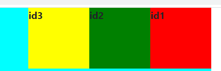
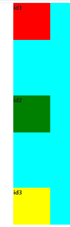
1.d-inline-flex--显示在同一行上的弹性盒子容器
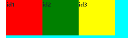
2..flex-row--设置弹性子元素水平显示【默认的】
.flex-row-reverse: 类用于设置右对齐显示
<!DOCTYPE html>
<html>
	<head>
		<meta charset="utf-8">
		<meta name="viewport" content="width=device-width, initial-scale=1">
		<!-- 新 Bootstrap4 核心 CSS 文件 -->
		<link rel="stylesheet" href="https://cdn.staticfile.org/twitter-bootstrap/4.3.1/css/bootstrap.min.css">
		<!-- jQuery文件。务必在bootstrap.min.js 之前引入 -->
		<script src="https://cdn.staticfile.org/jquery/3.2.1/jquery.min.js"></script>
		<!-- bootstrap.bundle.min.js 用于弹窗、提示、下拉菜单,包含了 popper.min.js -->
		<script src="https://cdn.staticfile.org/popper.js/1.15.0/umd/popper.min.js"></script>
		<!-- 最新的 Bootstrap4 核心 JavaScript 文件 -->
		<script src="https://cdn.staticfile.org/twitter-bootstrap/4.3.1/js/bootstrap.min.js"></script>
		<title>Bootstrap4 Flex(弹性)布局</title>
	</head>
	<body>
		<div class="container">
			<div class="flex-row-reverse d-inline-flex" style="width: 600px;height: 600px;background-color: aqua;float: left;">
				<div class="" style="width: 100px;height: 100px;background-color: red;">
					<b>id1</b>
				</div>
				<div class="" style="width: 100px;height: 100px;background-color: green;">
					<b>id2</b>
				</div>
				<div class="" style="width: 100px;height: 100px;background-color: yellow;">
					<b>id3</b>
				</div>
			</div>

		</div>
	</body>
</html>
.flex-row :类用于设置左对齐显示【默认值】
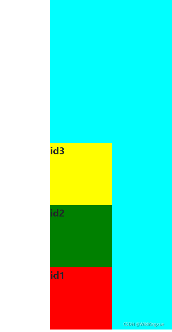
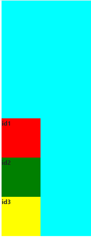
3.flex-column--设置弹性子元素垂直方向显示。
.flex-column--子元素垂直显示【从上往下】
.flex-column-reverse:翻转子元素【从下往上】
<!DOCTYPE html>
<html>
	<head>
		<meta charset="utf-8">
		<meta name="viewport" content="width=device-width, initial-scale=1">
		<!-- 新 Bootstrap4 核心 CSS 文件 -->
		<link rel="stylesheet" href="https://cdn.staticfile.org/twitter-bootstrap/4.3.1/css/bootstrap.min.css">
		<!-- jQuery文件。务必在bootstrap.min.js 之前引入 -->
		<script src="https://cdn.staticfile.org/jquery/3.2.1/jquery.min.js"></script>
		<!-- bootstrap.bundle.min.js 用于弹窗、提示、下拉菜单,包含了 popper.min.js -->
		<script src="https://cdn.staticfile.org/popper.js/1.15.0/umd/popper.min.js"></script>
		<!-- 最新的 Bootstrap4 核心 JavaScript 文件 -->
		<script src="https://cdn.staticfile.org/twitter-bootstrap/4.3.1/js/bootstrap.min.js"></script>
		<title>Bootstrap4 Flex(弹性)布局</title>
	</head>
	<body>
		<div class="container">
			<div class="flex-column-reverse d-inline-flex" style="width: 600px;height: 600px;background-color: aqua;float: left;">
				<div class="" style="width: 100px;height: 100px;background-color: red;">
					<b>id1</b>
				</div>
				<div class="" style="width: 100px;height: 100px;background-color: green;">
					<b>id2</b>
				</div>
				<div class="" style="width: 100px;height: 100px;background-color: yellow;">
					<b>id3</b>
				</div>
			</div>

		</div>
	</body>
</html>
4.justify-content-* --修改内容排版。
start (默认)--从左到右
<!DOCTYPE html>
<html>
	<head>
		<meta charset="utf-8">
		<meta name="viewport" content="width=device-width, initial-scale=1">
		<!-- 新 Bootstrap4 核心 CSS 文件 -->
		<link rel="stylesheet" href="https://cdn.staticfile.org/twitter-bootstrap/4.3.1/css/bootstrap.min.css">
		<!-- jQuery文件。务必在bootstrap.min.js 之前引入 -->
		<script src="https://cdn.staticfile.org/jquery/3.2.1/jquery.min.js"></script>
		<!-- bootstrap.bundle.min.js 用于弹窗、提示、下拉菜单,包含了 popper.min.js -->
		<script src="https://cdn.staticfile.org/popper.js/1.15.0/umd/popper.min.js"></script>
		<!-- 最新的 Bootstrap4 核心 JavaScript 文件 -->
		<script src="https://cdn.staticfile.org/twitter-bootstrap/4.3.1/js/bootstrap.min.js"></script>
		<title>Bootstrap4 Flex(弹性)布局</title>
	</head>
	<body>
		<div class="container">
			<div class="d-inline-flex justify-content-start  " style="width: 600px;height: 600px;background-color: aqua;float: left;">
				<div class="" style="width: 100px;height: 100px;background-color: red;">
					<b>id1</b>
				</div>
				<div class="" style="width: 100px;height: 100px;background-color: green;">
					<b>id2</b>
				</div>
				<div class="" style="width: 100px;height: 100px;background-color: yellow;">
					<b>id3</b>
				</div>
			</div>

		</div>
	</body>
</html>
end--从右到左
<!DOCTYPE html>
<html>
	<head>
		<meta charset="utf-8">
		<meta name="viewport" content="width=device-width, initial-scale=1">
		<!-- 新 Bootstrap4 核心 CSS 文件 -->
		<link rel="stylesheet" href="https://cdn.staticfile.org/twitter-bootstrap/4.3.1/css/bootstrap.min.css">
		<!-- jQuery文件。务必在bootstrap.min.js 之前引入 -->
		<script src="https://cdn.staticfile.org/jquery/3.2.1/jquery.min.js"></script>
		<!-- bootstrap.bundle.min.js 用于弹窗、提示、下拉菜单,包含了 popper.min.js -->
		<script src="https://cdn.staticfile.org/popper.js/1.15.0/umd/popper.min.js"></script>
		<!-- 最新的 Bootstrap4 核心 JavaScript 文件 -->
		<script src="https://cdn.staticfile.org/twitter-bootstrap/4.3.1/js/bootstrap.min.js"></script>
		<title>Bootstrap4 Flex(弹性)布局</title>
	</head>
	<body>
		<div class="container">
			<div class="d-inline-flex flex-column justify-content-end" style="width: 600px;height: 600px;background-color: aqua;float: left;">
				<div class="" style="width: 100px;height: 100px;background-color: red;">
					<b>id1</b>
				</div>
				<div class="" style="width: 100px;height: 100px;background-color: green;">
					<b>id2</b>
				</div>
				<div class="" style="width: 100px;height: 100px;background-color: yellow;">
					<b>id3</b>
				</div>
			</div>

		</div>
	</body>
</html>
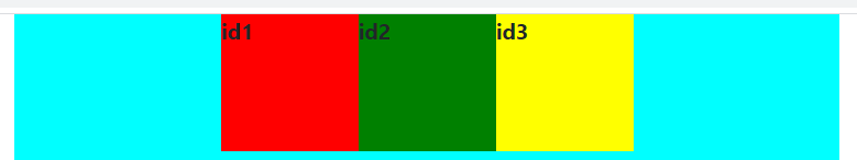
center--居中
横排居中:
<!DOCTYPE html>
<html>
	<head>
		<meta charset="utf-8">
		<meta name="viewport" content="width=device-width, initial-scale=1">
		<!-- 新 Bootstrap4 核心 CSS 文件 -->
		<link rel="stylesheet" href="https://cdn.staticfile.org/twitter-bootstrap/4.3.1/css/bootstrap.min.css">
		<!-- jQuery文件。务必在bootstrap.min.js 之前引入 -->
		<script src="https://cdn.staticfile.org/jquery/3.2.1/jquery.min.js"></script>
		<!-- bootstrap.bundle.min.js 用于弹窗、提示、下拉菜单,包含了 popper.min.js -->
		<script src="https://cdn.staticfile.org/popper.js/1.15.0/umd/popper.min.js"></script>
		<!-- 最新的 Bootstrap4 核心 JavaScript 文件 -->
		<script src="https://cdn.staticfile.org/twitter-bootstrap/4.3.1/js/bootstrap.min.js"></script>
		<title>Bootstrap4 Flex(弹性)布局</title>
	</head>
	<body>
		<div class="container">
			<div class="d-inline-flex justify-content-center" style="width: 600px;height: 600px;background-color: aqua;float: left;">
				<div class="" style="width: 100px;height: 100px;background-color: red;">
					<b>id1</b>
				</div>
				<div class="" style="width: 100px;height: 100px;background-color: green;">
					<b>id2</b>
				</div>
				<div class="" style="width: 100px;height: 100px;background-color: yellow;">
					<b>id3</b>
				</div>
			</div>

		</div>
	</body>
</html>
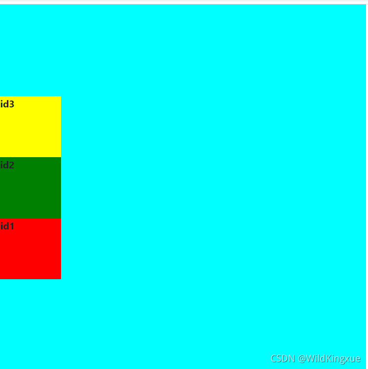
纵排居中:
<!DOCTYPE html>
<html>
	<head>
		<meta charset="utf-8">
		<meta name="viewport" content="width=device-width, initial-scale=1">
		<!-- 新 Bootstrap4 核心 CSS 文件 -->
		<link rel="stylesheet" href="https://cdn.staticfile.org/twitter-bootstrap/4.3.1/css/bootstrap.min.css">
		<!-- jQuery文件。务必在bootstrap.min.js 之前引入 -->
		<script src="https://cdn.staticfile.org/jquery/3.2.1/jquery.min.js"></script>
		<!-- bootstrap.bundle.min.js 用于弹窗、提示、下拉菜单,包含了 popper.min.js -->
		<script src="https://cdn.staticfile.org/popper.js/1.15.0/umd/popper.min.js"></script>
		<!-- 最新的 Bootstrap4 核心 JavaScript 文件 -->
		<script src="https://cdn.staticfile.org/twitter-bootstrap/4.3.1/js/bootstrap.min.js"></script>
		<title>Bootstrap4 Flex(弹性)布局</title>
	</head>
	<body>
		<div class="container">
			<div class="d-inline-flex flex-column-reverse justify-content-center" style="width: 600px;height: 600px;background-color: aqua;float: left;">
				<div class="" style="width: 100px;height: 100px;background-color: red;">
					<b>id1</b>
				</div>
				<div class="" style="width: 100px;height: 100px;background-color: green;">
					<b>id2</b>
				</div>
				<div class="" style="width: 100px;height: 100px;background-color: yellow;">
					<b>id3</b>
				</div>
			</div>

		</div>
	</body>
</html>
between
<!DOCTYPE html>
<html>
	<head>
		<meta charset="utf-8">
		<meta name="viewport" content="width=device-width, initial-scale=1">
		<!-- 新 Bootstrap4 核心 CSS 文件 -->
		<link rel="stylesheet" href="https://cdn.staticfile.org/twitter-bootstrap/4.3.1/css/bootstrap.min.css">
		<!-- jQuery文件。务必在bootstrap.min.js 之前引入 -->
		<script src="https://cdn.staticfile.org/jquery/3.2.1/jquery.min.js"></script>
		<!-- bootstrap.bundle.min.js 用于弹窗、提示、下拉菜单,包含了 popper.min.js -->
		<script src="https://cdn.staticfile.org/popper.js/1.15.0/umd/popper.min.js"></script>
		<!-- 最新的 Bootstrap4 核心 JavaScript 文件 -->
		<script src="https://cdn.staticfile.org/twitter-bootstrap/4.3.1/js/bootstrap.min.js"></script>
		<title>Bootstrap4 Flex(弹性)布局</title>
	</head>
	<body>
		<div class="container">
			<div class="d-inline-flex flex-column justify-content-between " style="width: 600px;height: 600px;background-color: aqua;float: left;">
				<div class="" style="width: 100px;height: 100px;background-color: red;">
					<b>id1</b>
				</div>
				<div class="" style="width: 100px;height: 100px;background-color: green;">
					<b>id2</b>
				</div>
				<div class="" style="width: 100px;height: 100px;background-color: yellow;">
					<b>id3</b>
				</div>
			</div>

		</div>
	</body>
</html>
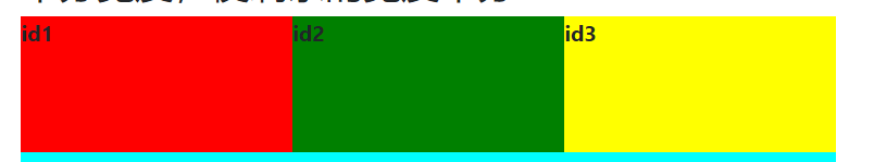
5.flex-fill--设置各个弹性子元素的宽度是一样的。
<!DOCTYPE html>
<html>
	<head>
		<meta charset="utf-8">
		<meta name="viewport" content="width=device-width, initial-scale=1">
		<!-- 新 Bootstrap4 核心 CSS 文件 -->
		<link rel="stylesheet" href="https://cdn.staticfile.org/twitter-bootstrap/4.3.1/css/bootstrap.min.css">
		<!-- jQuery文件。务必在bootstrap.min.js 之前引入 -->
		<script src="https://cdn.staticfile.org/jquery/3.2.1/jquery.min.js"></script>
		<!-- bootstrap.bundle.min.js 用于弹窗、提示、下拉菜单,包含了 popper.min.js -->
		<script src="https://cdn.staticfile.org/popper.js/1.15.0/umd/popper.min.js"></script>
		<!-- 最新的 Bootstrap4 核心 JavaScript 文件 -->
		<script src="https://cdn.staticfile.org/twitter-bootstrap/4.3.1/js/bootstrap.min.js"></script>
		<title>Bootstrap4 Flex(弹性)布局</title>
	</head>
	<body>
		<div class="container">
			<h3>平分宽度,使剩余的宽度平分</h3>
			<div class="d-inline-flex justify-content-start" style="width: 600px;height: 600px;background-color: aqua;float: left;">
				<div class="flex-fill" style="width: 100px;height: 100px;background-color: red;">
					<b>id1</b>
				</div>
				<div class="flex-fill" style="width: 100px;height: 100px;background-color: green;">
					<b>id2</b>
				</div>
				<div class="flex-fill" style="width: 100px;height: 100px;background-color: yellow;">
					<b>id3</b>
				</div>
			</div>

		</div>
	</body>
</html>
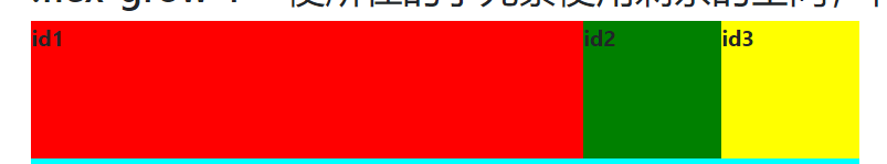
6..flex-grow-1--设置子元素用剩下的空间。
<!DOCTYPE html>
<html>
	<head>
		<meta charset="utf-8">
		<meta name="viewport" content="width=device-width, initial-scale=1">
		<!-- 新 Bootstrap4 核心 CSS 文件 -->
		<link rel="stylesheet" href="https://cdn.staticfile.org/twitter-bootstrap/4.3.1/css/bootstrap.min.css">
		<!-- jQuery文件。务必在bootstrap.min.js 之前引入 -->
		<script src="https://cdn.staticfile.org/jquery/3.2.1/jquery.min.js"></script>
		<!-- bootstrap.bundle.min.js 用于弹窗、提示、下拉菜单,包含了 popper.min.js -->
		<script src="https://cdn.staticfile.org/popper.js/1.15.0/umd/popper.min.js"></script>
		<!-- 最新的 Bootstrap4 核心 JavaScript 文件 -->
		<script src="https://cdn.staticfile.org/twitter-bootstrap/4.3.1/js/bootstrap.min.js"></script>
		<title>Bootstrap4 Flex(弹性)布局</title>
	</head>
	<body>
		<div class="container">
			<h3>.flex-grow-1---使所在的子元素使用剩余的空间,有多值时则平分</h3>
			<div class="d-inline-flex justify-content-start  " style="width: 600px;height: 600px;background-color: aqua;float: left;">
				<div class="flex-grow-1" style="width: 100px;height: 100px;background-color: red;">
					<b>id1</b>
				</div>
				<div class="flex-grow-2" style="width: 100px;height: 100px;background-color: green;">
					<b>id2</b>
				</div>
				<div class="flex-grow-3" style="width: 100px;height: 100px;background-color: yellow;">
					<b>id3</b>
				</div>
			</div>
		</div>
	</body>
</html>
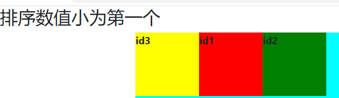
7.order 类可以设置弹性子元素的排序,从 .order-1 到 .order-12,数字越低权重越高【可以为负值】
<!DOCTYPE html>
<html>
	<head>
		<meta charset="utf-8">
		<meta name="viewport" content="width=device-width, initial-scale=1">
		<!-- 新 Bootstrap4 核心 CSS 文件 -->
		<link rel="stylesheet" href="https://cdn.staticfile.org/twitter-bootstrap/4.3.1/css/bootstrap.min.css">
		<!-- jQuery文件。务必在bootstrap.min.js 之前引入 -->
		<script src="https://cdn.staticfile.org/jquery/3.2.1/jquery.min.js"></script>
		<!-- bootstrap.bundle.min.js 用于弹窗、提示、下拉菜单,包含了 popper.min.js -->
		<script src="https://cdn.staticfile.org/popper.js/1.15.0/umd/popper.min.js"></script>
		<!-- 最新的 Bootstrap4 核心 JavaScript 文件 -->
		<script src="https://cdn.staticfile.org/twitter-bootstrap/4.3.1/js/bootstrap.min.js"></script>
		<title>Bootstrap4 Flex(弹性)布局</title>
	</head>
	<body>
		<h3>排序数值小为第一个</h3>
		<div class="container">
			<div class="flex-row d-inline-flex" style="width: 600px;height: 600px;background-color: aqua;float: left;">
				<div class="order-2" style="width: 100px;height: 100px;background-color: red;">
					<b>id1</b>
				</div>
				<div class="order-3" style="width: 100px;height: 100px;background-color: green;">
					<b>id2</b>
				</div>
				<div class="order-1" style="width: 100px;height: 100px;background-color: yellow;">
					<b>id3</b>
				</div>
			</div>

		</div>
	</body>
</html>


 扫一扫
扫一扫


 920
920

 被折叠的 条评论
为什么被折叠?
被折叠的 条评论
为什么被折叠?
 到【灌水乐园】发言


