


 本文详细介绍了CSS中的定位属性,包括absolute定位如何相对于最近的已定位祖先元素定位,relative定位如何相对自身位置调整,以及sticky定位在滚动时的粘性效果。同时提到了display和visibility的区别,并解释了置换元素的概念。
1.position:absolute;
相对于容器的位置,如果没有position:relative;容器为body
2.position: relative;
(1)确定容器时候:容器元素定位position:relative
(2)相对自己容器的定位
如果相对定位过约束了,需要把其中一个值设置为另一个值的相反数,
eg: top:10rem,bottom:-10rem;
dispaly:none//检查元素还是可以看得到的,只是不占文档流的位置
visibility:hiddern//相当于opacity:0
置换元素可以理解为可以改变的标签,即在标签里面写东西,比如input可以在里面写type改变,
img可以在里面写src ,alt…
3.position:sticky
https://www.cnblogs.com/coco1s/p/6402723.html
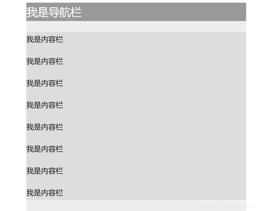
<head>
<meta charset="UTF-8">
<meta name="viewport" content="width=device-width, initial-scale=1.0">
<meta http-equiv="X-UA-Compatible" content="ie=edge">
<title>Document</title>
<style>
.container {
background: #eee;
width: 600px;
height: 1000px;
margin: 0 auto;
}
nav {
position: -webkit-sticky;
position: sticky;
top:0;
}
nav {
height: 50px;
background: #999;
color: #fff;
font-size: 30px;
line-height: 50px;
}
.content {
margin-top: 30px;
background: #ddd;
}
p {
line-height: 40px;
font-size: 20px;
}
</style>
</head>
<body>
<div class="container">
<nav>我是导航栏</nav>
<div class="content">
<p>我是内容栏</p>
<p>我是内容栏</p>
<p>我是内容栏</p>
<p>我是内容栏</p>
<p>我是内容栏</p>
<p>我是内容栏</p>
<p>我是内容栏</p>
<p>我是内容栏</p>
</div>
</div>
</body>
</html>
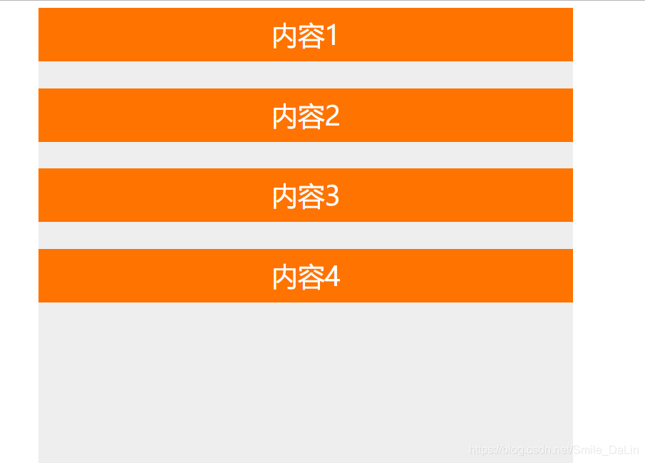
<!DOCTYPE html>
<html lang="en">
<head>
<meta charset="UTF-8">
<meta name="viewport" content="width=device-width, initial-scale=1.0">
<meta http-equiv="X-UA-Compatible" content="ie=edge">
<title>Document</title>
<style>
.container {
background: #eee;
width: 600px;
height: 1000px;
margin: 0 auto;
}
.sticky-box {
position: -webkit-sticky;
position: sticky;
height: 60px;
margin-bottom: 30px;
background: #ff7300;
top: 0px;
}
div {
font-size: 30px;
text-align: center;
color: #fff;
line-height: 60px;
}
</style>
</head>
<body>
<div class="container">
<div class="sticky-box">内容1</div>
<div class="sticky-box">内容2</div>
<div class="sticky-box">内容3</div>
<div class="sticky-box">内容4</div>
</div>
</body>
</html>


 扫一扫
扫一扫


 3万+
3万+

 被折叠的 条评论
为什么被折叠?
被折叠的 条评论
为什么被折叠?
 到【灌水乐园】发言


