


CSS-6.2-CSS常用文本属性
CSS的文本属性
1.CSS属性可以控制文字的大小、颜色和字体
2.可以设置整个段落的行高、对齐方式等属性
3.大大提高网页的可读性
CSS常用文本属性
1.字体、字号与颜色属性
2.文本属性
一:字体、字号与颜色属性
字体、字号与颜色属性
1.字体
2.字号
3.字体颜色
1、字体
字体
1.font-family
2.font-style
3.font
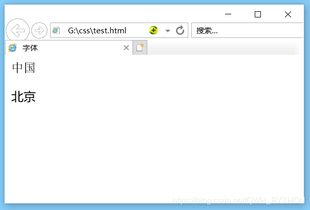
(1)font_family
- 设置字体
- 可以同时设置多个字体,多个字体样式之间用逗号分隔
- 浏览器解析时,会从左往右依次查找,选择可用字体
- 当浏览器查找不到可用字体时,将使用系统默认字体
<!DOCTYPE html>
<html lang="en">
<head>
	<meta charset="UTF-8">
	<title>字体</title>
	<style type="text/css">
		/* 设置字体为,微软雅黑 */
		p{
			font-family: 微软雅黑;
		}
	</style>
</head>
<body>
	<div>中国</div>
	<p>北京</p>
</body>
</html>
效果图
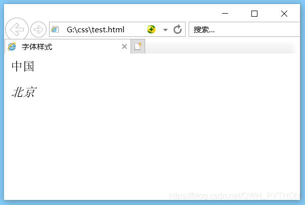
(2)font-style
- 设置字体样式
- 属性值
- normal:正常(默认)
- italic:斜体
<!DOCTYPE html>
<html lang="en">
<head>
	<meta charset="UTF-8">
	<title>字体样式</title>
	<style type="text/css">
		/* 设置字体样式 */
		p{
			font-style: italic;
		}
	</style>
</head>
<body>
	<div>中国</div>
	<p>北京</p>
</body>
</html>
效果图
(3)font
- 缩写形式
- font的缩写形式的顺序依次为
- font-style:字体样式
- font-weight:字体粗细
- font-size/line-height:字号/行高
- font-family:字体
<!DOCTYPE html>
<html lang="en">
<head>
	<meta charset="UTF-8">
	<title>font</title>
	<style type="text/css">
		/* font缩写形式顺序 */
		p{
			font:italic bold 200%/7 微软雅黑;
		}
	</style>
</head>
<body>
	<div>中国</div>
	<p>北京</p>
</body>
</html>
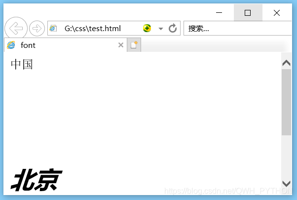
font属性的注意事项
1.必须严格按照顺序书写
2.多个样式之间用空格分隔
3.font-size/line-height必须作为一对用/分隔
4.font-size和font-family必须指定,其他样式不指定将采用默认样式显示
2、字号
字号
1.font-weight
2.font-size
(1)font-weight
- 设置字体粗细
- 属性值
- bold:加粗
- lighter:细体
- 100~900:400为正常,700为加粗
(2)font-size
- 设置字体大小
- 属性值
- 18px
- 大部分浏览器字体默认大小是18px
- 200%
- 浏览器默认字体大小的百分比
- 18px
3、字体颜色
字体颜色
1.color
2.opacity
(1)color
- 设置字体颜色
- 直接写颜色的英文单词
- red
- green
- blue
- 十六进制写法(0-9、a-f)
- 红色:#ff0000
- 绿色:#00ff00
- 蓝色:#0000ff
- rgb(0-255,0-255,0-255)
- 红色:rgb(255,0,0)
- 绿色:rgb(0,255,0)
- 蓝色:rgb(0,0,255)
- rgba(0-255,0-255,0-255,0-1)
- 第四位表示透明度
- 0表示全透明
- 1表示不透明
- 第四位表示透明度
- 直接写颜色的英文单词
(2)opacity
- 设置透明的
- 0表示全透明
- 1表示不透明
<!DOCTYPE html>
<html lang="en">
<head>
	<meta charset="UTF-8">
	<title>字体透明度</title>
	<style type="text/css">
		/* 使用rgba设置div透明度时,div的子元素透明度不受影响 */
		div{
			color: rgba(255,0,0,0.5)
		}
		div .box1{
			color: rgb(255,0,0);
		}
		/* 使用opacity设置p透明度时,p的子元素受到了影响 */
		p{
			color:red;
			opacity: 0.5;
		}
		p .box2{
			color:red;
		}
	</style>
</head>
<body>
	<div>广东<div class="box1">广州</div></div>
	<p>福建<p class="box2">厦门</p></p>
</body>
</html>
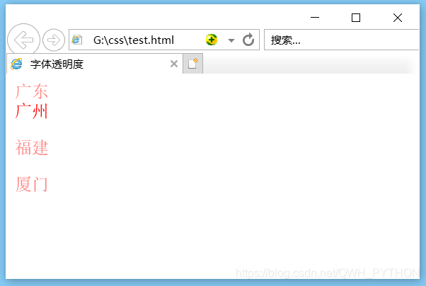
设置透明度注意事项
1.使用rgba设置透明度时,只会使当前元素透明,不会改变子元素
2.使用opacity设置透明度时,当前元素以及子元素均会透明
二:文本属性
文本属性
1.line-height
2.text-align
3.letter-spacing
4.text-decoration
5.overflow
6.text-overflow
7.white-space
8.text-shadow
9.text-indent
10.text-stroke
1、line-height
- 设置行高
- 属性值
- 像素单位
- 48px
- 纯数值
- 表示正常行高的倍数
- 百分数
- 表示正常行高的百分数
- 像素单位
<!DOCTYPE html>
<html lang="en">
<head>
	<meta charset="UTF-8">
	<title>行高</title>
	<style type="text/css">
		div{
			width: 100px;
			height: 100px;
			background-color: blue;
			line-height: 150px;
			text-align: center;
			}
		/* 设置行高等于高度,则当前元素中文字垂直居中 */
		p{
			width: 100px;
			height: 100px;
			line-height: 100px;
			background-color: green;
		}
	</style>
</head>
<body>
	<div>中国</div>
	<p>北京</p>
</body>
</html>
效果图
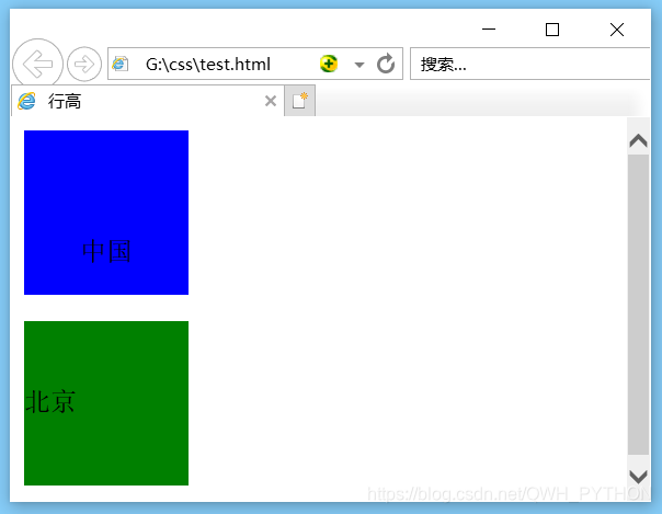
line-height典型案例
设置控件的line-height等于控件height,可以调整元素中的文本垂直居中
2、text-align
- 设置块级元素中文字的水平对齐方式
- 属性值
- left
- center
- right
3、letter-spacing
- 设置字符间距,即字与字之间的间距
- 属性值
- **px
- 1px
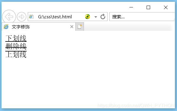
4、text-decoration
- 文本修饰属性
- 属性值
- underline:下划线
- line-through:删除线
- overline:上划线
- none:不做修饰
<!DOCTYPE html>
<html lang="en">
<head>
	<meta charset="UTF-8">
	<title>文字修饰</title>
	<style type="text/css">
		.box1{
			text-decoration: underline;
		}
		.box2{
			text-decoration: line-through;
		}
		.box3{
			text-decoration: overline;
		}
	</style>
</head>
<body>
	<div class="box1">下划线</div>
	<div class="box2">删除线</div>
	<div class="box3">上划线</div>
</body>
</html>
效果图
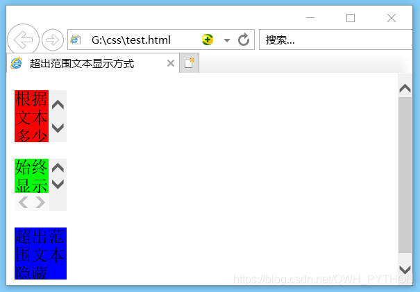
5、overflow(overflow-x和overflow-y)
- 控制超出范围文本的显示方式
- 属性值
- auto:根据文字多少自动显示滚动条
- scroll:始终显示滚动条
- hidden:超出范围文本隐藏
- overflow-x:水平方向的隐藏
- overflow-y:垂直方向的隐藏
<!DOCTYPE html>
<html lang="en">
<head>
	<meta charset="UTF-8">
	<title>超出范围文本显示方式</title>
	<style type="text/css">
		.p1{
			width: 50px;
			height: 50px;
			background-color: #f00;
			/* 根据文本多少自动显示滚动条 */
			overflow: auto;
		}
		.p2{
			width: 50px;
			height: 50px;
			background-color: #0f0;
			/* 始终显示滚动条 */
			overflow: scroll;
		}
		.p3{
			width: 50px;
			height: 50px;
			background-color: #00f;
			/* 超出范围文本隐藏 */
			overflow: hidden;
		}
	</style>
</head>
<body>
	<p class="p1">根据文本多少自动显示滚动条</p>
	<p class="p2">始终显示滚动条</p>
	<p class="p3">超出范围文本隐藏</p>
</body>
</html>
效果图
6、text-overflow
- 设置多余文字的显示方式
- 属性值
- clip:裁剪文本
- ellipsis:使用省略号代替多余文字
<!DOCTYPE html>
<html lang="en">
<head>
	<meta charset="UTF-8">
	<title>多余文字用省略号代替</title>
	<style type="text/css">
		div{
			height: 200px;
			width: 200px;
			background-color: blue;
			/* 超出文本隐藏 */
			overflow: hidden;
			/* 当文本溢出,省略号代替 */
			text-overflow: ellipsis;
			/*
				文本不换行,文本会在同一行上显示
				直到遇到<br>标签为止
			 */
			white-space: nowrap;
		}
	</style>
</head>
<body>
	<div>多余文字用省略号代替多余文字省略号代替</div>
</body>
</html>
效果图
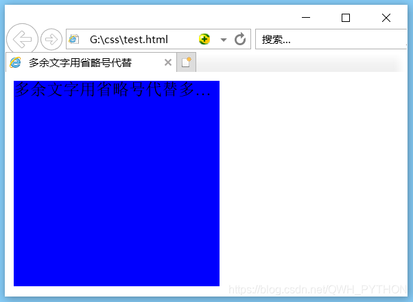
让每行多余文字显示省略号
1.white-space:nowrap:如果是,需设置行末不断行
2.overflow:hidden:设置控件超出范围隐藏域
3.text-overflow:ellipsis:设置多于文本省略号显示
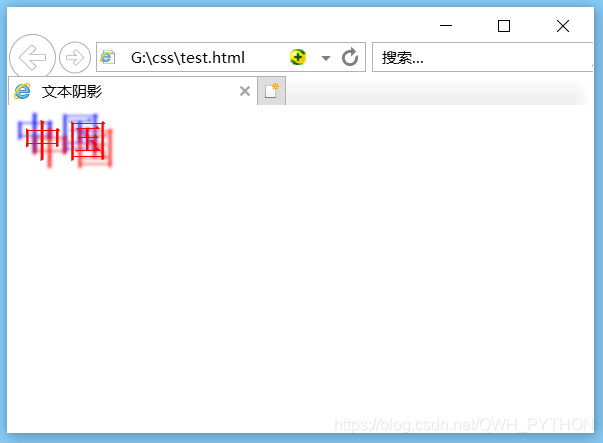
8、text-shadow
- 文本阴影
- 属性值
- 水平阴影距离:必写,数值越大,阴影右移
- 垂直阴影距离:必写,数值越大,阴影下移
- 阴影模糊距离:可写,数值越大,阴影越模糊。
- 默认为0,不模糊
- 阴影颜色:可写,默认为黑色
<!DOCTYPE html>
<html lang="en">
<head>
	<meta charset="UTF-8">
	<title>文本阴影</title>
	<style type="text/css">
		/*
		文本阴影可以同时设置多个阴影
		每个阴影效果之间用逗号分隔即可
		 */
		div{
			text-shadow: 5px 5px 2px red,-5px -5px 2px blue;
			color: red;
			font-size: 30px;
		}
	</style>
</head>
<body>
	<div>中国</div>
</body>
</html>
效果图
9、text-indent
- 首行缩进,可以使用像素值调整段落文字的首行缩进
- text-indent:32px;
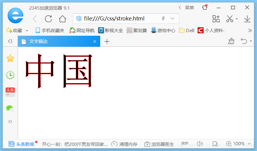
10、text-stroke
- 设置文字描边
- 只能在webkit内核浏览器中使用
- 必须使用-webkit-前缀
- 属性值
- 描边的粗细
- 描边的颜色
<!DOCTYPE html>
<html lang="en">
<head>
	<meta charset="UTF-8">
	<title>文字描边</title>
	<style type="text/css">
		div{
			-webkit-text-stroke:1px red;
			font-size: 100px;
		}
	</style>
</head>
<body>
	<div>中国</div>
</body>
</html>
效果图


 扫一扫
扫一扫


 89
89

 被折叠的 条评论
为什么被折叠?
被折叠的 条评论
为什么被折叠?
 到【灌水乐园】发言


