


本文介绍各种常用统计图形在Python 3中的绘制方法,主要使用matplotlib,有些图形也会用别的包来进行绘制,会在对应的小节中介绍其安装方法。
matplotlib安装:pip install matplotlib
文章目录
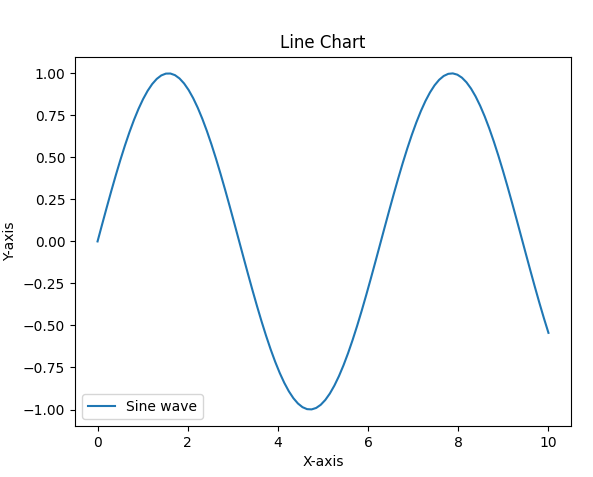
1. 折线图
import matplotlib.pyplot as plt
import numpy as np

x = np.linspace(0, 10, 100)
y = np.sin(x)

plt.plot(x, y, label='Sine wave')
plt.xlabel('X-axis')
plt.ylabel('Y-axis')
plt.title('Line Chart')
plt.legend()
plt.show()
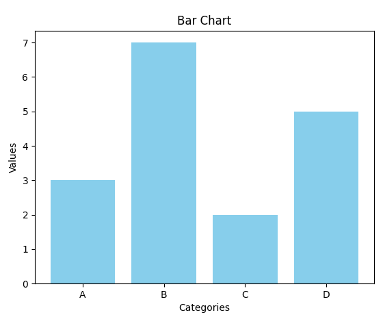
2. 柱状图
import matplotlib.pyplot as plt

x = ['A', 'B', 'C', 'D']
y = [3, 7, 2, 5]

plt.bar(x, y, color='skyblue')
plt.xlabel('Categories')
plt.ylabel('Values')
plt.title('Bar Chart')
plt.show()
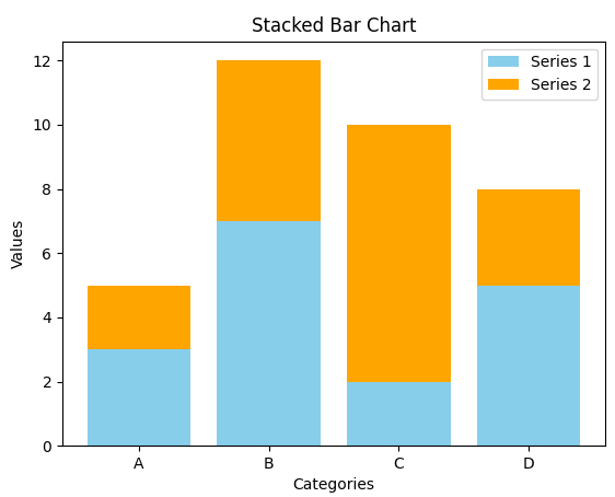
3. 堆积柱状图
import matplotlib.pyplot as plt

x = ['A', 'B', 'C', 'D']
y1 = [3, 7, 2, 5]
y2 = [2, 5, 8, 3]

plt.bar(x, y1, label='Series 1', color='skyblue')
plt.bar(x, y2, bottom=y1, label='Series 2', color='orange')
plt.xlabel('Categories')
plt.ylabel('Values')
plt.title('Stacked Bar Chart')
plt.legend()
plt.show()
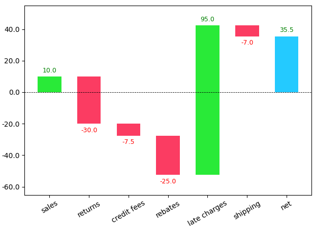
4. 瀑布图
waterfallcharts安装:pip install waterfallcharts(需要安装pandas:pip install pandas)
import matplotlib.pyplot as plt
import waterfall_chart

a = ['sales','returns','credit fees','rebates','late charges','shipping']
b = [10,-30,-7.5,-25,95,-7]

my_plot = waterfall_chart.plot(a, b)

plt.show()
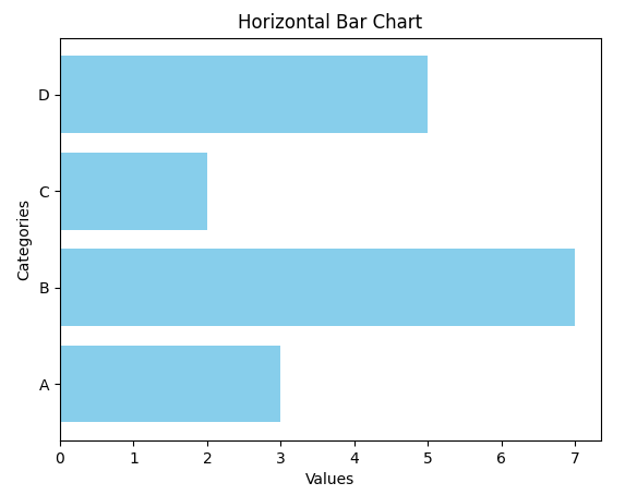
5. 条形图
import matplotlib.pyplot as plt
x = ['A', 'B', 'C', 'D']
y = [3, 7, 2, 5]

plt.barh(x, y, color='skyblue')
plt.xlabel('Values')
plt.ylabel('Categories')
plt.title('Horizontal Bar Chart')
plt.show()
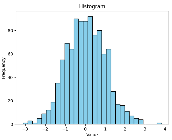
6. 直方图
import matplotlib.pyplot as plt
import numpy as np

data = np.random.randn(1000)

plt.hist(data, bins=30, color='skyblue', edgecolor='black')
plt.xlabel('Value')
plt.ylabel('Frequency')
plt.title('Histogram')
plt.show()
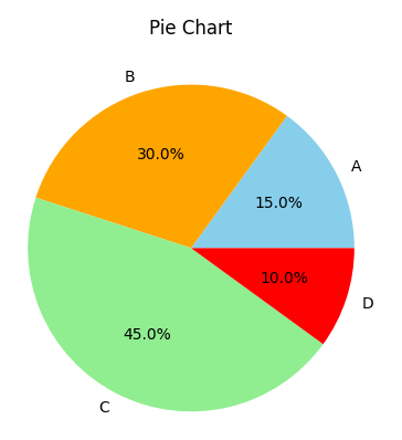
7. 饼图
import matplotlib.pyplot as plt

labels = ['A', 'B', 'C', 'D']
sizes = [15, 30, 45, 10]
colors = ['skyblue', 'orange', 'lightgreen', 'red']

plt.pie(sizes, labels=labels, colors=colors, autopct='%1.1f%%')
plt.title('Pie Chart')
plt.show()
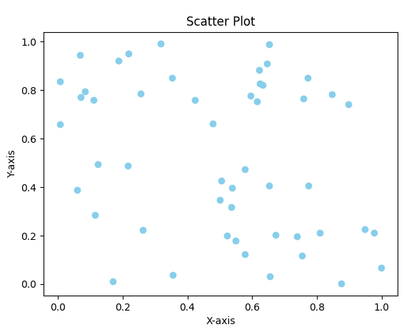
8. 散点图
import matplotlib.pyplot as plt
import numpy as np

x = np.random.rand(50)
y = np.random.rand(50)

plt.scatter(x, y, color='skyblue')
plt.xlabel('X-axis')
plt.ylabel('Y-axis')
plt.title('Scatter Plot')
plt.show()
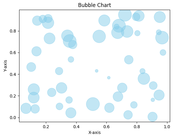
9. 气泡图
import matplotlib.pyplot as plt
import numpy as np

x = np.random.rand(50)
y = np.random.rand(50)
sizes = np.random.rand(50) * 1000

plt.scatter(x, y, s=sizes, color='skyblue', alpha=0.5)
plt.xlabel('X-axis')
plt.ylabel('Y-axis')
plt.title('Bubble Chart')
plt.show()
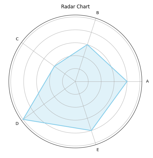
10. 雷达图
import matplotlib.pyplot as plt
import numpy as np

from math import pi

labels = ['A', 'B', 'C', 'D', 'E']
values = [4, 3, 2, 5, 4]

num_vars = len(labels)

angles = np.linspace(0, 2 * pi, num_vars, endpoint=False).tolist()
values += values[:1]
angles += angles[:1]

fig, ax = plt.subplots(figsize=(6, 6), subplot_kw=dict(polar=True))
ax.fill(angles, values, color='skyblue', alpha=0.25)
ax.plot(angles, values, color='skyblue', linewidth=2)
ax.set_yticklabels([])
ax.set_xticks(angles[:-1])
ax.set_xticklabels(labels)

plt.title('Radar Chart')
plt.show()
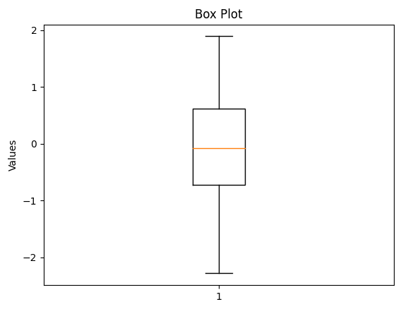
11. 盒形图
import matplotlib.pyplot as plt
import numpy as np

data = np.random.randn(100)

plt.boxplot(data)
plt.ylabel('Values')
plt.title('Box Plot')
plt.show()
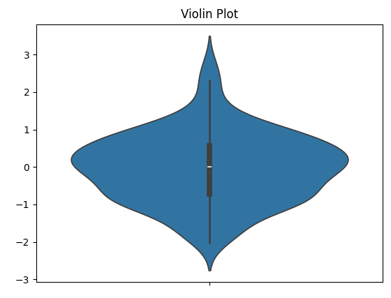
12. 小提琴图
(需要安装seaborn:pip install seaborn)
import matplotlib.pyplot as plt
import numpy as np

import seaborn as sns

data = np.random.randn(100)

sns.violinplot(data=data)
plt.title('Violin Plot')
plt.show()
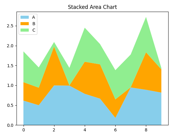
13. 堆积图/区域图
import matplotlib.pyplot as plt
import numpy as np

x = np.arange(0, 10, 1)
y1 = np.random.rand(10)
y2 = np.random.rand(10)
y3 = np.random.rand(10)

plt.stackplot(x, y1, y2, y3, labels=['A', 'B', 'C'], colors=['skyblue', 'orange', 'lightgreen'])
plt.legend(loc='upper left')
plt.title('Stacked Area Chart')
plt.show()
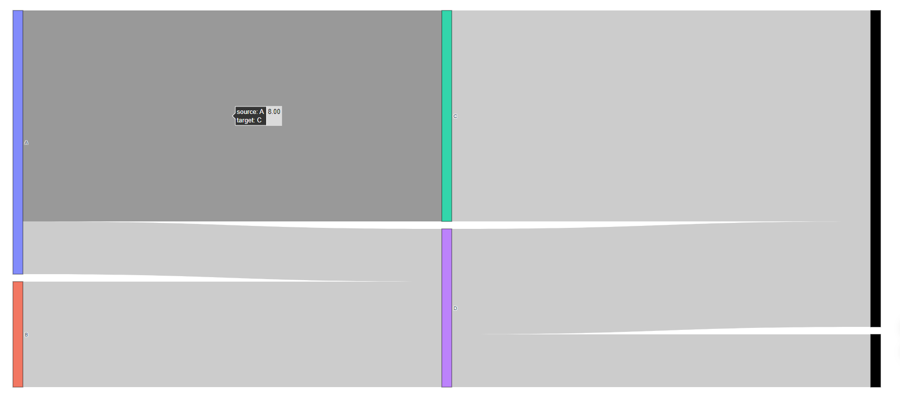
14. 桑基图
安装plotly:pip install plotly
import plotly.graph_objects as go

labels = ['A', 'B', 'C', 'D']
source = [0, 1, 0, 2, 3, 3]
target = [2, 3, 3, 4, 4, 5]
values = [8, 4, 2, 8, 4, 2]

fig = go.Figure(data=[go.Sankey(
    node=dict(pad=15, thickness=20, line=dict(color="black", width=0.5), label=labels),
    link=dict(source=source, target=target, value=values))])

fig.update_layout(title_text="Sankey Diagram", font_size=10)
fig.show()
在本地默认浏览器中打开:
15. 水球图
需要安装pyecharts:pip install pyecharts
from pyecharts import options as opts
from pyecharts.charts import Liquid

def liquid() -> Liquid:
    c = (
        Liquid()
        .add("lq", [0.67, 0.30, 0.15])
        .set_global_opts(title_opts=opts.TitleOpts(title="Liquid"))
    )
    return c

liquid().render('liquid.html')
(是个HTML动态图,我用Chrome浏览器打开的)
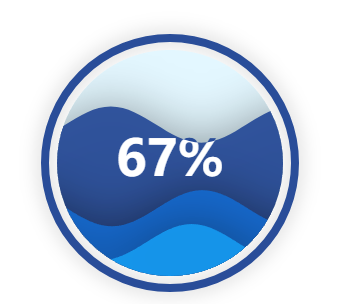
参考资料:15 pyecharts水球图 — python3-small-examples 1.2.378 documentation
16. Mekko图/市场地图
安装plotly:pip install plotly
import plotly.graph_objects as go
import numpy as np
import pandas as pd

year = ['2019', '2020', '2021', '2022']
data = {'brand 1': [20, 18, 14, 10],
       'brand 2': [10, 15, 20, 22],
       'brand 3': [6,   8, 10, 12]
       }

df = pd.DataFrame.from_dict(data)

df = df.T
df.columns = year
for c in df.columns:
    df[c+'_%'] = df[c].apply(lambda x: (x / df.loc[:,c].sum()) * 100)

widths = np.array([sum(df['2019']), sum(df['2020']), sum(df['2021']), sum(df['2022'])])
marker_colors = {'brand 1': 'darkblue', 'brand 2': 'darkgreen', 'brand 3': 'crimson'}

fig1 = go.Figure()

for idx in df.index:
    dff = df.filter(items=[idx], axis=0)
    fig1.add_trace(go.Bar(
        x=np.cumsum(widths) - widths,
        y=dff[dff.columns[4:]].values[0],
        width=widths,
        marker_color=marker_colors[idx],
        text=['{:.2f}%'.format(x) for x in dff[dff.columns[4:]].values[0]],
        name=idx
    )
)

fig1.update_xaxes(
    tickvals=np.cumsum(widths)-widths,
    ticktext= ["%s<br>%d" % (l, w) for l, w in zip(year, widths)]
)

fig1.update_xaxes(range=[0, widths])
fig1.update_yaxes(range=[0, 100])

fig1.update_layout(barmode='stack')

fig1.show()
在本地默认浏览器中打开:
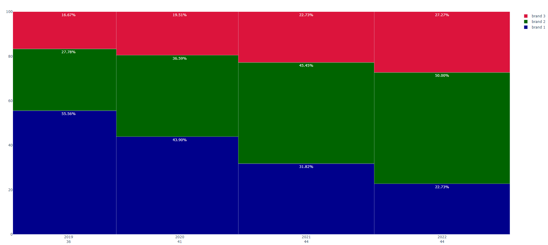
参考资料:Using Python to draw a mosaic | marimekko chart with custom colors and labels - Stack Overflow
17. Harvey Ball
嗯这个代码比较的大力出奇迹,但是怎么不行呢:
import matplotlib.pyplot as plt

fig, (empty, quarter, half, three_quarters, full) = plt.subplots(nrows=1, ncols=5, figsize=(18, 3))


empty.pie([100], colors = ['white'],
          wedgeprops = { 'linewidth' : 1, 'edgecolor' : 'black' })

quarter.pie([75, 25], colors = ['white', 'black'], startangle=90,
            wedgeprops = { 'linewidth' : 1, 'edgecolor' : 'black' })

half.pie([50, 50], colors = ['white', 'black'], startangle=90,
         wedgeprops = { 'linewidth' : 1, 'edgecolor' : 'black' })

three_quarters.pie([25, 75], colors = ['white', 'black'], startangle=90,
         wedgeprops = { 'linewidth' : 1, 'edgecolor' : 'black' })

full.pie([100], colors = ['black'],
         wedgeprops = { 'linewidth' : 1, 'edgecolor' : 'black' } )

plt.show()

参考资料:
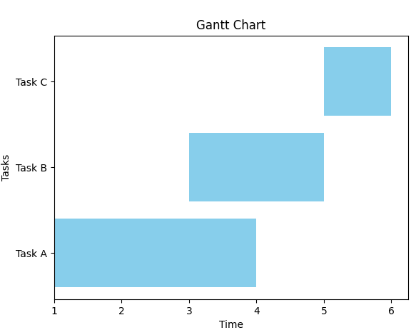
18. 甘特图
import matplotlib.pyplot as plt

tasks = ['Task A', 'Task B', 'Task C']
start_times = [1, 3, 5]
durations = [3, 2, 1]

plt.barh(tasks, durations, left=start_times, color='skyblue')
plt.xlabel('Time')
plt.ylabel('Tasks')
plt.title('Gantt Chart')
plt.show()
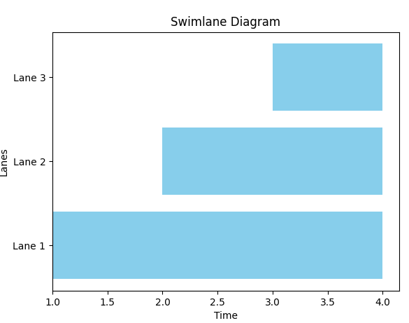
19. 泳道图
泳道图是跟甘特图差不多的东西:
import matplotlib.pyplot as plt

tasks = ['Lane 1', 'Lane 2', 'Lane 3']
start_times = [1, 2, 3]
durations = [3, 2, 1]

plt.barh(tasks, durations, left=start_times, color='skyblue')
plt.xlabel('Time')
plt.ylabel('Lanes')
plt.title('Swimlane Diagram')
plt.show()


 947
947

 被折叠的 条评论
为什么被折叠?
被折叠的 条评论
为什么被折叠?
 到【灌水乐园】发言


