


 本文详细介绍了CSS中的各种布局模式,包括单栏布局、两列自适应布局、三栏布局、圣杯布局和双飞翼布局。通过浮動、Overflow隐藏、Flex布局、Grid布局以及Table布局等方式,展示了不同场景下的布局实现,涵盖了从基础到高级的各种技巧。
CSS布局
单栏布局
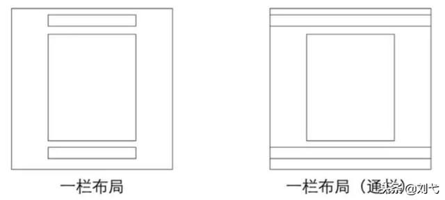
一栏布局
一栏布局:header,content 和 footer 等宽的单列布局
布局实现:先通过对 header,content,footer 统一设置 width:1000px; 或者 max-width:1000px (这两者的区别是当屏幕小于 1000px 时,前者会出现滚动条,后者则不会,显示出实际宽度); 然后设置 margin:auto 实现居中即可得到。
<!DOCTYPE html>
<html lang="en">

<head>
    <meta charset="UTF-8">
    <meta name="viewport" content="width=device-width, initial-scale=1.0">
    <title>单栏布局01</title>
    <style>
        div {

            max-width: 800px;
            margin: 0 auto;
        }

        .header {

            height: 100px;
            background-color: cadetblue;
        }

        .content {

            height: 500px;
            background-color: coral;
        }

        .footer {

            height: 80px;
            background-color: darkolivegreen;
        }
    </style>
</head>

<body>
    <div class="header"></div>
    <div class="content"></div>
    <div class="footer"></div>
</body>

</html>
布局如下:

一栏布局(通栏)
一栏布局(通栏):header 与 footer 等宽,content 略窄的单列布局
布局实现:header、footer 的内容宽度不设置,块级元素充满整个屏幕,但 header、content 和 footer 的内容区设置同一个 width,并通过 margin:auto 实现居中。
<!DOCTYPE html>
<html lang="en">

<head>
    <meta charset="UTF-8">
    <meta name="viewport" content="width=device-width, initial-scale=1.0">
    <title>单栏布局02</title>
    <style>
        div {

            max-width: 960px;
            margin: 0 auto;
        }

        .header {

            height: 100px;
            background-color: cadetblue;
        }

        .content {

            max-width: 800px;
            height: 500px;
            background-color: coral;
        }

        .footer {

            height: 80px;
            background-color: darkolivegreen;
        }
    </style>
</head>

<body>
    <div class="header"></div>
    <div class="content"></div>
    <div class="footer"></div>
</body>

</html>
布局如下:

两列自适应布局
两列自适应布局是指一列由内容撑开,另一列撑满剩余宽度的布局方式
1. float+overflow:hidden
利用float+overflow:hidden便可以实现,这种办法主要通过 overflow 触发 BFC,而 BFC 不会重叠浮动元素。由于设置 overflow:hidden 并不会触发 IE6-浏览器的 haslayout 属性,所以需要设置 zoom:1 来兼容 IE6-浏览器。
<!DOCTYPE html>
<html lang="en">

<head>
    <meta charset="UTF-8">
    <meta name="viewport" content="width=device-width, initial-scale=1.0">
    <title>两列自适应布局</title>
    <style>
        .parent {

            overflow: hidden;
            zoom: 1;
        }

        .left {

            float: left;
            background-color: darksalmon;
        }

        .right {

            overflow: hidden;
            zoom: 1;
            background-color: darkseagreen;
        }
    </style>
</head>

<body>
    <div class="parent">
        <div class="left">
            LeftLeftLeft
        </div>
        <div class="right">
            Right
        </div>
    </div>
</body>

</html>
布局如下:

注意:如果侧边栏在右边时,注意渲染顺序。即在 HTML 中,先写侧边栏后写主内容
但是这种写法不能实现两列等高布局,若要实现,则要在.left 、 .right中把padding-bottom设为足够大的值,并且设置margin–bottom为与padding-bottom的正值相抵消的值。
.left {

       float: left;
       padding-bottom: 999px;
       margin-bottom: -999px;
       background-color: darksalmon;
}

.right {

       overflow: hidden;
       zoom: 1;
       padding-bottom: 999px;
       margin-bottom: -999px;
       background-color: darkseagreen;
}
未设置前:

设置后:

2. Flex布局
将父元素设置为flex布局,主内容设置flex:1实现等分剩余空间。
<!DOCTYPE html>
<html lang="en">

<head>
    <meta charset="UTF-8">
    <meta name="viewport" content="width=device-width, initial-scale=1.0">
    <title>Document</title>
    <style>
        .parent {

            display: flex;
        }

        .left {

            background-color: darkseagreen;
        }

        .right {

            flex: 1;
            background-color: indianred;
        }
    </style>
</head>

<body>
    <div class="parent">
        <div class="left">
            LeftLeftLeft
        </div>
        <div class="right">
            Right
            <br>Right
        </div>
    </div>
</body>

</html>
这种方法可以实现两列等高布局。
3. Grid布局
将父元素设置为Grid布局,通过grid-template-columns:auto 1fr将两列内容设置为:一列由内容撑开,一列自动占剩余空间。
<!DOCTYPE html>
<html lang="en">

<head>
    <meta charset
最低0.47元/天 解锁文章


 扫一扫
扫一扫


 被折叠的 条评论
为什么被折叠?
被折叠的 条评论
为什么被折叠?
 到【灌水乐园】发言


