


 本文详细介绍了如何使用CSS的border属性来绘制不同方向的实心和空心三角形,包括基本原理、具体实现方法及常见应用场景。
关于CSS实现三角形很早以前就看到过了,今天突然心血来潮,想着不就是利用border来实现么,想着自己动手试一下,没想到这么简单的功能没写出来。。。
下面总结一下这个问题吧。
- 实现三角形的基本原理
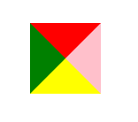
CSS
.triangle{
	height:0;
	width:0;
	border:40px  solid  transparent;
	border-top-color:red;
    border-bottom-color:yellow;
	border-left-color:green;
	border-right-color:pink;
}
效果如下
2. 上下左右三角形
以上三角形为列,其实只需要设置border-bottom:0;同时需要设置border-left和border-right。注意,border-left和border-right一定要设置宽度和颜色透明,我当初就是这点没注意没有写出来。
.triangle-top{
	height: 0;
	width: 0;
	border-top: 30px solid red;
    border-left: 30px solid transparent;
    border-right: 30px solid transparent;
    border-bottom:0;
}
效果如下:
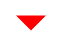
其他方向的三角形也是如此,就是三角形相邻两个方向的border是需要设置宽度和透明的。
- 空心三角形
CSS
	.triangle2{
			margin-top: 50px;
			margin-left: 30px;
			height: 40px;
			width: 125px;
			border: 1px solid #ccc;
			padding: 10px;
			vertical-align: middle;
			position: relative;
			box-sizing: border-box;
		}
	.triangle2::before{
			position: absolute;
			content: '';
			display: inline-block;
			height: 0;
			width: 0;
			border-right: 10px solid #ccc;
			border-top: 10px solid  transparent;
			border-bottom: 10px solid transparent;
			top: 10px;
			left: -10px;
		}
		.triangle2::after{
			position: absolute;
			content: '';
			display: inline-block;
			height: 0;
			width: 0;
			border-right: 9px solid white;
			border-top: 9px solid  transparent;
			border-bottom: 9px solid transparent;
			top: 11px;
			left: -9px;
		}
效果如下:
这个列子应该是实际应用中会比较常用的,巧妙的地方在于使用了::before和::after伪元素实现了三角形镂空的效果,还是有点意思的。
所以,CSS画三角形你学会了嘛!


 扫一扫
扫一扫


 1095
1095

 被折叠的 条评论
为什么被折叠?
被折叠的 条评论
为什么被折叠?
 到【灌水乐园】发言


